
by Chris Dayley • May 17, 2019


The Launch Analysis: How to Come Up with Great Testing Ideas
Let’s face it, every landing page and website needs optimization. Some need a lot more work than others, but every page and site could be improved with a little testing.
The question is, though: “How do you decide what to test?”
Between your headline, images, body copy, drop-down menus, sidebar, footer and everything else in between, there are countless elements to test on any website or landing page. If you decide to test the wrong elements, you could spend years testing your site without actually improving your conversion rate.
Fortunately, after testing hundreds of sites in almost every industry you can imagine, we’ve come up with a simple, 6-step way to analyze any website and identify which testing opportunities have the best chance of improving the performance of your site or page.
We call this the “Launch analysis”.
Note, this blog post was updated on May 17, 2019.
Launching a Test
As it turns out, getting people to do what you want them to do on your site (ie, convert) is a lot like launching a rocket into space. In either case, you need to maximize forward momentum and minimize resistance.
To get a rocket into orbit, the propulsion and guidance systems have to overcome gravity and air friction. To get a potential customer to convert, your CTA, content and value proposition have to overcome any diversions, anxiety or responsiveness issues on your site.
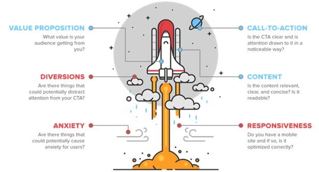
So, before you “launch” a test (get it?), you’ll want to look at the following momentum and resistance factors.
Building Momentum
The key to getting anything to take off—whether it’s a rocket or your conversion rate—is building enough momentum. If people don’t feel motivated to convert, they’ll leave without doing anything useful.
For example, remember the last time you really wanted something…wanted it so bad that you found any possible way to get it? If your potential customers really want what you’re selling, they’ll find a way to get it—even if they have to put up with a challenging site element or two.
With that in mind, there are three basic ways you can help your visitors build the momentum they need to convert on your website:
Value Proposition
For your website, your value proposition is like rocket fuel. It’s what gets people excited to convert. However, no matter how compelling your value proposition is, if you don’t communicate it effectively, your value proposition will sputter out before it gets anyone motivated.
As a quick example, here’s a page we did some testing on a few months ago:

The page certainly isn’t bad, but “Get Started on the Right Path: Prepare yourself for a better future by earning your degree from Pioneer Pacific College” isn’t the most compelling value proposition.
The math is a bit rough, but motivation typically equals perceived benefits minus perceived costs. Unfortunately, Pioneer Pacific’s value proposition does a good job of emphasizing all the perceived costs of attending their college while minimizing all the perceived benefits.
After all, most people go to college because they believe it’s the key to their future, not because they want to start a long, slow path to success.
To explain Pioneer Pacific’s value proposition in a more compelling way, we decided to focus their copy on the benefits of earning a degree (more money) and minimize the perceived costs by pointing out that college tuition is an investment:

This simple change increased form completions by 49.5%. The forms themselves weren’t any easier to fill out—50% more site visitors were motivated enough to complete them.
In my experience, most businesses have a hard time expressing their value proposition on their site. As a result, they miss out on a lot of potential customers!
This is why the Launch analysis starts with your value proposition. Ask yourself:
- Is my value proposition easy to find?
- Is it easy to understand?
- Is it compelling? (ie, does the cost benefit ratio make sense?)
- Does your target audience care about the costs and benefits you’re addressing?
- Are there costs or benefits that you should be addressing, but aren’t?
If you answer “yes” to any of these question, you may have just discovered a testing opportunity!
Call to Action (CTA)
Building momentum is great, but if that momentum isn’t pointed in the right direction, it won’t really get you anywhere. This is where your CTA comes into play. Your CTA is like the guidance system in a rocket. It tells your potential customers where they’re headed and how to get there.
With that in mind, it’s important to remember that your CTA typically needs to be very explicit (tell them what to do and/or what to expect). After all, your potential customers are depending on your CTA to navigate them to their destination.
For example, another one of our clients was trying to increase eBook downloads. Their original CTA read “Download Now”, but we hypothesized that changing the CTA to emphasize speed might improve their conversion rate.

So, we rephrased the CTA to read “Instant Download” instead. As it turned out, this simple change to the CTA increased downloads by 12.6%!
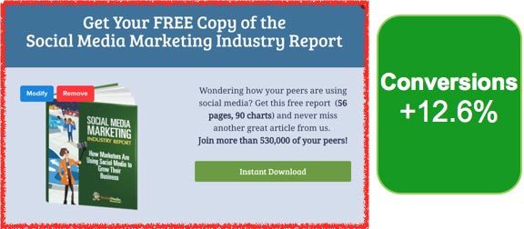
The download was just as instantaneous in both cases; but, simply by making it clear that users would get immediate access to this content, we were able to drive a lot more conversions.
Of course, there is such a thing as being too explicit (and not just the way your mind jumped to right now). While people want to know what to do next, they also like to feel like they are in the driver’s seat, so sometimes soft CTAs like “Get More Information” can deliver better results than a more direct CTA like “Request a Free Demo Today!”
As you start to play around with CTA testing ideas, it’s important to remember the 2 second rule: If a user can’t figure out what they are supposed to do within 2 seconds, something needs to change.
To see if your CTA follows this rule, ask a friend or a coworker who has never seen your page or site before to look at it for 2 seconds and then ask them what they think they are supposed to do next. If they don’t have a ready answer, you just discovered another testing opportunity.
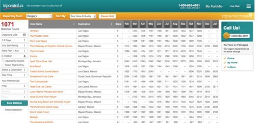
Case in point, on the page below, a client of ours was trying to drive phone calls with the CTA on the right. From a design perspective, the CTA fit the color scheme of the page nicely, but it didn’t really draw much attention.
Since driving calls was a big deal for the client, we decided to revamp the CTA. We made the CTA a contrasting red color and expanded on the value proposition.
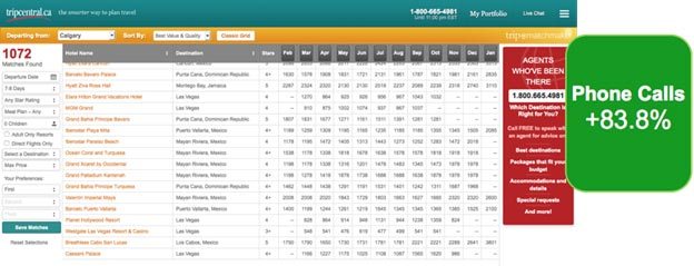
The result? Our new, eye-catching CTA increased calls by a whopping 83.8%.
So, if your CTA is hard to find, consider changing the size, location and/or color. If your CTA is vague, try being more explicit (or vice versa). If your CTA doesn’t have a clear value proposition, find a way to make the benefits of converting more obvious. The possibilities are endless.
4. Content
Like your value proposition, your content is a big motivating factor for your users. In fact, great content is how you sell people on your value proposition, so content can make or break your site.
The only problem is, as marketers and business owners, we have a tendency towards egocentrism. There are so many things that we love about our business and that make it special that we often overwhelm users with content that they frankly don’t care about.
Or, alternatively, we fail to include content that will help potential customers along in the conversion process because it isn’t a high priority to us.
To really get the most out of your content, you have to lay your ego and personal preference aside and ask yourself questions like “How much content do my users want?” “What format do they want the content in?” “Do mobile and desktop users want different amounts of content?”
As a quick example of this, we were working with a healthcare client (an industry that is notoriously long-winded) to maximize eBook downloads on the following page:
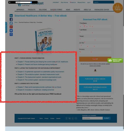
As you can see above, the original page included a table of contents-style description of what readers would get when they downloaded the guide.
We hypothesized that this sort of approach, with its wordy chapter titles and and formal feel, did not make the eBook seem like a user-friendly guide. There was so much content that it was hard to get a quick feel for what the eBook was actually about.
To address this, we tried boiling the copy down to a quick, easy-to-read summary of the eBook content:
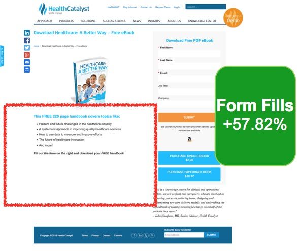
Incredibly, paring the content down to a very simplified summary increased eBook downloads by 57.82%!
However, when it comes to content, less is not always more.
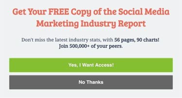
While working on a pop-up for Social Media Examiner, we tested a couple different variants of the following copy in an effort to increase eBook downloads & subscriptions:

Just like the preceding example, this copy was a bit wordy and hard to read. So, we tried turning the copy into bullet points…
…and even boiled the copy down to the bare essentials:

However, when the test results came in, both of these variants had a lower conversion rate than the original, word-dense content!
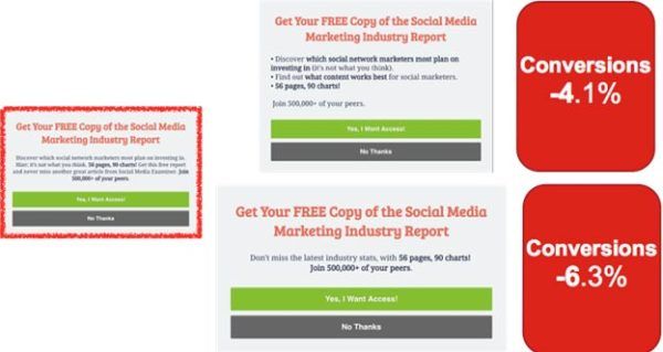
These results fly in the face of the whole “less is more” dogma marketers love to preach, which just goes to show how important it is to test your content.
So, when it comes to content, don’t be afraid to try cutting things down. But, you might also try bulking things up in some places—provided that your content is focused on what your potential customers want and need, not just your favorite talking points. Our suggestion: challenge whatever you have on your site. Try less, more, and different variations of the same. It should ultimately be up to your audience!
3. Diversions
Unfortunately, having a great value proposition, CTA and content doesn’t guarantee you a great conversion rate. To get a rocket to its destination, the launch team has to overcome a variety of obstacles.
Same goes for the Launch analysis.
Now that we’ve talked about how to maximize motivation, it’s time to talk about ways to reduce obstacles and friction points on your site or page that may be keeping people from converting, starting with diversions.
When it comes to site testing, diversions could be anything that has the potential to distract your user from reaching their destination. Contrasting buttons, images, other offers, menus, links, content, pop ups…like cloud cover on launch day, if it leads people off course, it’s a diversion.
For example, take a look at the page below. There are 5 major elements on the page competing for your attention – none of which are a CTA to view the product – and that’s just above the fold!
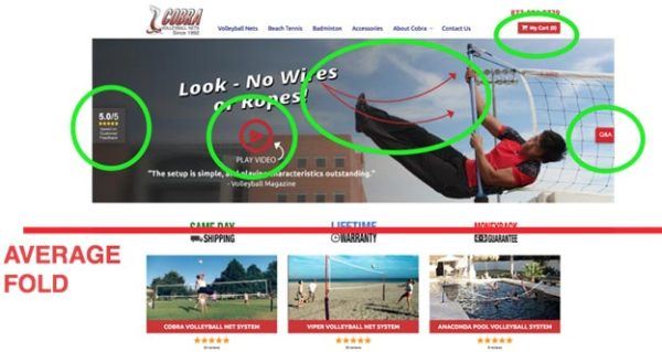
What did this client really want people to do? Watch a video? Read a review? Look at the picture? Read the Q&A? Visit their cart?
As it turns out, the answer is “none of the above”.
What the client really wanted was for people to come to their site, look at their products and make a purchase. But, with all the diversions on their site, people were getting lost before they even had a chance to see the client’s products.
To put the focus where it belonged—on the products—we tried eliminating all of the diversions by redesigning the site experience to focus on product call to actions. That way, when people came to the page, they immediately saw Cobra’s products and a simple CTA that said “Shop Our Products”.
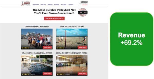
The new page design increased revenue (not just conversions) by 69.2%!
We’ve seen similar results with many of our eCommerce clients. For example, we often test to see how removing different elements and offers from a client’s homepage affects their conversion rates (this is called “existence testing”).
Existence testing is one of the easiest, fastest ways to discover what is distracting from conversions and what is helping conversions. If you remove something from your page and conversion rates go down, that item is helpful to the conversion process. If you remove something and conversion rates go up – Bingo! You found a distraction.
The GIF below shows you how this works. Essentially, you just remove a page element and then see which version of the page performs better. Easy enough, right?

For this particular client, we tested to see how removing 8 different elements from their home page would affect their revenue. As it turned out, 6 of the 8 elements were actually decreasing their revenue!
By eliminating those elements during our test, their revenue-per-visit (RPV) increased by 59%.
Why? Well, once again, we discovered things that were diversions to the user experience (as it turns out, the diversions were other products!).
If you’re curious to see how different page or site elements affect your conversion rate, existence testing can be a great way to go. Simply create a page variant without the element in question and see what happens!
2. Anxiety
Ever have that moment when you’re driving a car and you suddenly get hit by a huge gust of wind? What happens to your heart rate?
Now imagine you’re piloting a multi-billion dollar rocket…
Whether you’re in the driver’s seat or an office chair, anxiety is never a good thing. Unfortunately, when it comes to your site, people are already in a state of high alert. Anything that adds to their stress level (clicking on something that isn’t clickable, feeling confused or swindled) may lead to you losing a customer.
Of course, anxiety-inducing elements on a website are typically more subtle than hurricane-force winds on launch day. It might be as simple as an unintuitive user interface, an overly long form or a page element that doesn’t do what the user expects.
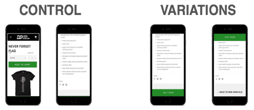
As a quick example, one of our eCommerce clients had a mobile page that forced users to scroll all the the way back up to the top of the page to make a purchase.
So, we decided to try a floating “Buy Now” button that people could use to quickly buy the item once they’d read all about it:
Yes, scrolling to the top of the page seems like a relatively small inconvenience, but eliminating this source of anxiety improved the conversion rate by 6.7%.
Even more importantly, it increased the RPV by $1.54.
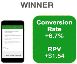
Given the client’s traffic volume, this was a huge win!
As you can probably imagine, the less confusion, alarm, frustration and work your site creates for users, the more likely they are to convert.
When you get right down to it, conversion should be a seamless, almost brainless process. If a potential customer ever stops to think, “Wait, what?” on their journey to conversion, you’ve got a real problem.
To identify potential anxiety-inducing elements on your site or page, try going through the whole conversion process on your site (better yet, have someone else do it and describe their experience to you). Watch for situations or content that force you to think. Odds are, you’ve just discovered a testing opportunity.
6. Responsiveness
Finally, the last element of the Launch analysis is responsiveness—specifically mobile responsiveness.
To be honest, mobile responsiveness is not the same thing as having a mobile responsive site, just like launching a rocket on a rainy day is not the same thing as launching a rocket on a clear day.
The days of making your site “mobile responsive” and calling it good are over. With well over half of internet searches taking place on mobile devices, the question you need to ask yourself isn’t “Is my site mobile responsive?” What you should be asking yourself is, “Is my site customized for mobile?”
For example, here is what one of our clients’ “mobile responsive” pages looks like:

While this page passed Google’s “mobile friendly” test, it wasn’t exactly a “user friendly” experience.
To fix that problem, we decided to test a couple of custom mobile pages:

The results were truly impressive. Both variants clearly outperformed the original “mobile responsive” design and the winning variant increased calls by 84% and booked appointments by 41%!
So, if you haven’t taken the time yet to create a custom mobile experience, you’re probably missing out on a huge opportunity. It might take a few tests to nail down the right design for your mobile users, but most sites can expect big results from a little mobile experience testing.
As you brainstorm ways to test your mobile experience, remember, your mobile users aren’t usually looking for the same things as your desktop users. Most mobile users have very specific goals in mind and they want it to be as easy as possible to achieve those goals.
Launch!
Well, that’s it! You’re ready for Launch!
Go through your site or page and take a look at how what you can do to strengthen your value proposition, CTA and content. Then, identify things that may potentially be diversions, anxiety-inducing elements or responsiveness issues that are preventing people from converting.
By the time you finish your Launch Analysis, you should have tons of testing ideas to try. Put together a plan that focuses on your biggest opportunities or problems first and then refine from there. Happy testing!
Incidentally, if you’d like me to do a Launch Analysis on your site and help you identify opportunities to improve your site or landing page performance, let me know here or in the comments! I’d love to help.


