4 Branding Mistakes You Can’t Afford to Make With Your Banner Ads
by Robert Katai • September 7, 2017
In the marketing world, everyone loves to talk about brand awareness, but many businesses make branding mistakes in their advertising that severely hamper their branding efforts.
Branding is more than just a catchy word marketers use to emphasize the power of content and it’s not something that your business has by default. In the past, branding was directly correlated with a name, a logo or symbol. Basically, branding was just that combination of elements that made a product or service easily recognizable by audiences. Its sole purpose was to distinguish a brand from its competitors.
Nowadays, branding is one of the most complex elements of running a business. It’s no longer something you can see or something palpable, but a perception. The feeling one person has when thinking of your brand or seeing its symbols.
To put it simply, branding is the sweet or bitter taste a consumer feels when they think about your business or products.
Websites, social media, advertising, banner-ads—all of these are part of your business’s branding strategy. In fact, any action your business takes could be viewed as part of your branding strategy.
In this article today, we’ll talk about some branding mistakes you can’t afford to make when you’re designing your banner-ads. Not only can these mistakes cost you a lot of money, they can also damage your business’s reputation, which is a fundamental part of how your brand is perceived.
Branding Mistakes to Avoid
Banner advertising is definitely not the place to mess up your branding. Why? Because as William Chitty and his co-authors said in their book, “Integrated Marketing Communications”, banner ads are effective in progressing a potential customer from unawareness of your product or service to “top-of-mind” awareness, in which your brand is the first that comes to a buyer’s mind.
This is why I believe that branding and banner advertising should go hand in hand.
Before we dive into branding mistakes, let’s start by taking a look at a brand with a consistently awesome banner ad branding strategy: Beats by Dre:

While this sort of approach isn’t perfect for every business, Beats by Dre avoids all of the mistakes wee’re about to talk about.
I know that usually people don’t write articles in which they tell you how NOT to do something, but I truly believe that if you know which are the mistakes you need to avoid, it will be easier for you to create a cohesive brand identity and maintain it.
So, let’s see what you shouldn’t do when designing a banner ad:
1. Not having a brand book
This is a lesson I learned early in my career. Do you know how frustrating is to work a lot on some visuals and strategies and afterwards…only to discover that there’s no foundation on which to build those strategies? I’ll tell you. VERY.
So, what is a brand book?
As this guide from Flipsnacks puts it:
“A brand book (also referred to as: brand guide, visual identity guidelines, brand manual, style guide, brand identity book or brand toolkit) is an official corporate document that explains the brand’s identity and presents brand standards. Some brand books are focused exclusively on the design aspect, while others include a company overview and communication guidelines as well.”
Basically, a brand book represents the foundation of your whole branding efforts and the first thing that should be on your list when planning to create a brand.
Actionable Tip
Make sure you ask for the help of a really good designer that can create a great brand book for you. This is something you might want to invest some money into.
If you don’t have a brand book, your banner ads will never really generate brand awareness. Yes, they might drive traffic, but they won’t create the sort of cohesive look and feel that is central to effective branding.
2. Not paying enough attention to colors
Colors play a really important role in branding and brand identity, but the power of color often underestimated by many business owners and even advertisers. Color can have a big effect on your target audiences and it’s a known fact that different colors trigger different emotions in people.
So why wouldn’t you take advantage of this little trick?
Actionable Tip
When creating banner ads, you must take into consideration a few color-related elements like brand color, potential backgrounds for your banner ads, font colors and the visibility of your logo.
According to a study, 93% of shoppers primarily respond to the visual aspects of marketing and color increases brand recognition by 80%. So, why not pay a little bit more attention to which colors you’re using in your banner advertisements?
Actionable Tip
Choose colors for your banner ad that complement your brand.
For example, Dental Marketing Guy has chosen turquoise to represent his brand throughout the internet. His choice is a well thought-out one, since it is said that this color encourages inner healing through its ability to enhance empathy and caring. This feel goes perfectly with his business which tries to help dental professionals with their marketing strategies.
3. Forgetting about your global audience
If your brand is an international one, there’s one more aspect you need to take into account when crafting your banner ads. When you deal with global audiences, different cultures may interpret your messages in ways you don’t expect.
Pepsi is a great example of how a great slogan in one country might have an entirely different meaning in another culture. When the beverage launched in China, Pepsi used the slogan “Pepsi Brings You Back to Life”. However, due to improper translation, the slogan in Chinese actually came across as “Pepsi brings your ancestors back from the grave”.
Imagine what a giant PR crisis they had to deal with in a country that worships ancestors like China does!
Actionable Tip
A little research never hurts. If you believe something that you’re using in your banner ads could hurt someone’s feelings or might be misunderstood, dig deeper and elucidate the truth.
You always need to remember that what you’re saying and what message you’re sending to your audience can be interpreted in different ways in different cultures.
As Justin Morgan (CEO at Dental Marketing Guy) said about the dental industry:
“Many dentists that I work with think of branding as the logo and possibly the web design. The fact is, your brand is what people are saying about you when you’re not around. It’s things like the way you give a pain-free shot or the attitude of your front office manager.
“Branding doesn’t start with your logo. It starts with you. The logo, web design and everything detailed in your advertising message isn’t the creation of branding. It’s merely the authentic and appealing reflection of your branding.”
Here’s a far-fetched example but that will help you understand this principle. Coke is one of the biggest brands in the world and their primary branding color is red.
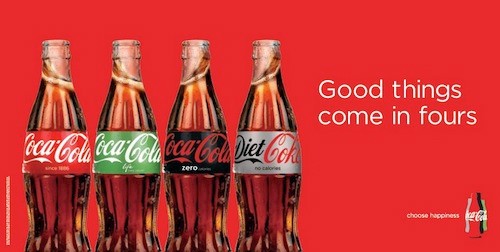
While red is considered to be the color of passion, energy and love in Western cultures, in some African countries red is associated with death. In those countries, Coca-Cola’s beautiful red branding would be the equivalent of slapping a “Warning: Poison” sticker on their bottles!
Not a great way to sell a soft drink.
So, if you’re running international banner ads, you can’t always just translate your text into the local language and call it good. You need to take some time to understand the local culture and ensure that your ad is communicating the right message.
4. Not taking credit for your mistakes
One of the first lessons we teach kids is to take credit for our mistakes and saying “I’m sorry!”. Of course, the ideal plan would be not to have to say you’re sorry, but if you’ve made a branding mistake, owning up to what you’ve done is proof of professionalism.
Unfortunately, I’ve seen lots of brands that—instead of coming forward and admitting they’ve done something wrong—just delete the offensive piece of content and refuse to give any comments about it.
Actionable Tip
Before doing anything, talk to someone that has been through a PR crisis. It will help you take a better decision on what to do and how to manage it.
If anything really does happen, make sure you handle the crisis quickly and with tact and humbleness.
Conclusion
Now that you know what are the things you shouldn’t do when designing a banner ad, you can get to work!
Remember to:
- Build a brand book for your business
- Pay attention to colors
- Remember who you’re doing it for (your audience)
- Always take credit for your mistakes
I hope you found this article useful and hope you’ll never need to resort to the fourth point.
Have you ever make a branding mistake? If you did, how did you manage it? Let me know in the comments section below.


