How Color Affects Brands, Image Ads, and Landing Pages
by Andrew Maliwauki • July 22, 2015
When it comes to designing killer online content, making it look great is only a small part of what you need. Whether you’re designing an image ad for a Display Network campaign or creating a conversion optimized Landing Page for a PPC account, effective use of color can help establish the right relationship between you and your customers, especially when combined with persuasive copy and solid design principles.
Color plays an enormous role in our ability to connect to an idea visually and emotionally. The psychological effect colors have on visitors can make them more or less willing to convert on your site.
Knowing what colors do can help you target target the moods your industry values on a level beyond words alone.
For this post I want to move beyond the usual Conversion Rate Optimization talk about contrasting colors and making a call to action stand out, and dig a little deeper into what your uses of color mean to your brand and how that affects your image ads, landing pages, and more. You might be surprised how color can affect conversions, so let’s take a look at what colors convey to the human mind.
Warm Colors
Colors like red, orange and yellow are in the spectrum of colors generally associated with happiness, optimism and urgency.
Red
The warmest of the colors, red is a dynamic color associated with strong emotions like passion, love, courage, strength, excitement, and aggressiveness. Red even has the ability to quicken the heart rate.
If your goal is to draw attention to your image ad or landing page, red is a good color to use; but, if you use it too much, it can be a little overwhelming.
One of the most iconic uses of the color red in the corporate world is in the Coca-Cola brand: the red is instantly recognizable and immediately stands out on store shelves and vending machines. You may or may not feel excited about buying a Coke, but that’s definitely the message their brand coloring wants to send.
Orange
Orange is probably your best bet if you want to convey a message of urgency. When I think of orange, I think of traffic cones and warning lights—things that you need to pay attention to. It’s no wonder so many call to action buttons are orange!
Other words associated with orange are vitality, happiness, and fun. Orange should generally be used sparingly, since its vibrancy can be overwhelming, especially when it’s a brighter shade.
Yellow
Yellow is a color of optimism, energy, youth, creativity and friendliness. It’s a fun color that evokes laughter, sunshine and comfort. However, as with any warm color, too much yellow can be irritating to look at, so it’s best used as an accent color.
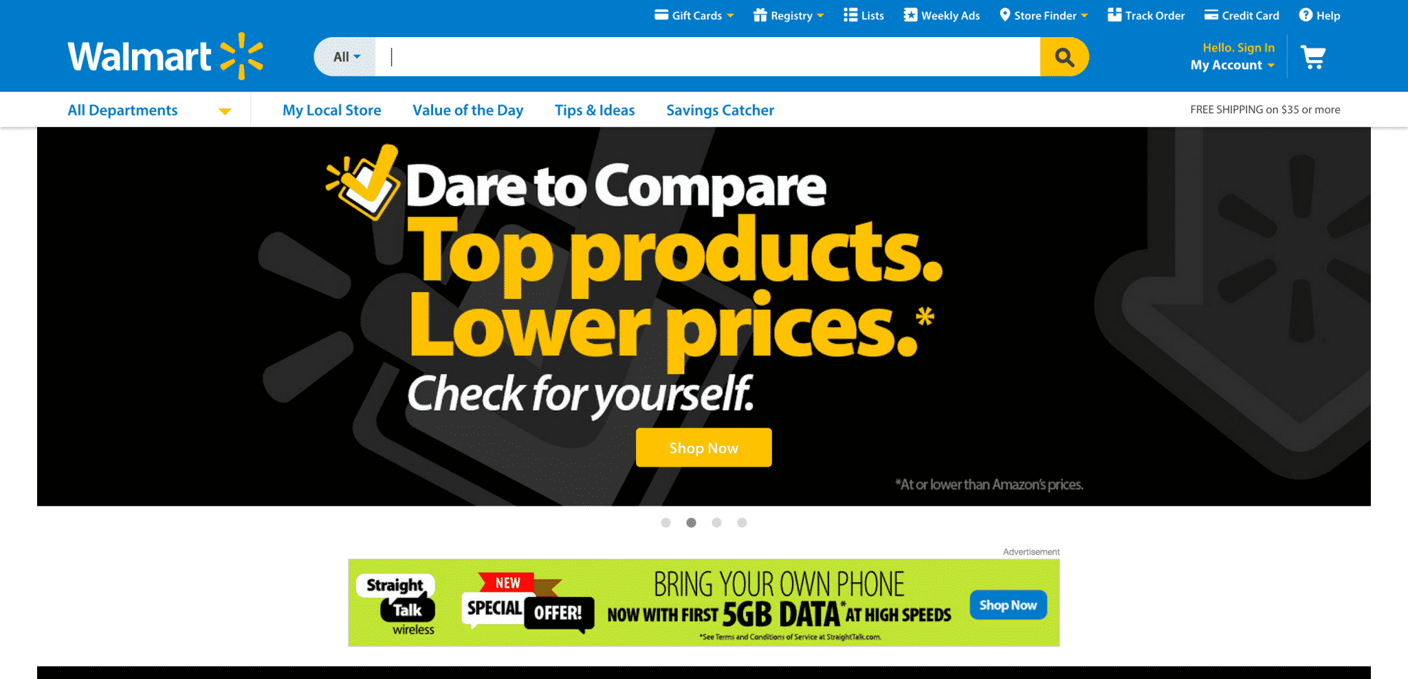
A good example of this is Walmart’s branding, which is primarily blue with yellow splashed into the mix. Hey, if looking at that little yellow sun isn’t your idea of fun, I don’t know what is!
Cool Colors
These colors include blue, green and purple and are usually more calming and soothing than their warmer counterparts, and they can also evoke feelings of sadness in some circumstances.
Blue
Blue is probably the most popular color for brands across every industry, being associated with calmness, trust, loyalty, and logic.
It’s easy to create a professional look in almost any industry using a light or dark shade of blue, which is why you see it everywhere. For example, you could probably instantly recognize the unique shade of blue used by Facebook even if you didn’t see the text spelled out.
Green
Green is one of the easiest colors for the eyes to process and is commonly associated with wealth, growth, and the environment. It’s also typically used to denote health, wellness and overall balance. Not surprisingly, you’re likely to see green in industries related to finance and health food.
Purple
Purple is the royal color, often used to calm or relax the viewer. Many beauty products use purple due to its luxurious connotation. Purple also communicates feelings of trust, spirituality and wealth.
Purple can be a very strong color, so it’s often used as an accent or with a lighter, lavender shade.
Neutral Colors
Neutral colors include, black, gray, white and various shades of brown. For image ads and logos you can get away with using bolder colors, whether they’re warm or cool, but for landing pages and web sites you’re better off primarily using lighter, neutral shades.
Neutral colors give your pages a clean, fresh feel that’s easier to read. Being generous with negative space on a page can also enhance the way you use other colors, for example, by drawing the eye to your call to action or hero shot, which makes users more likely to convert.
Conclusion
Most of this information probably doesn’t come as a big surprise to anyone familiar with color theory, but it can be a great resource to know how colors affect user psychology when you’re thinking about your company’s brand or building image ads, landing pages, or other assets with visual elements. I recommend split testing different color schemes with identical content to see how different colors perform for your business.
Finally, it’s helpful to remember that everybody reacts to colors in different ways, so these guidelines are going to be a little subjective. If you’re in an industry where every company uses similar color schemes it might be worthwhile to try something completely different just to stand out!
Now I’m curious to see what you think; how has color use affected your brand or the performance of your visual assets? Let us know in the comments!
Finally, if you’re looking for help creating awesome image ads or landing pages for your brand, let us know and we’ll show you some of what we’ve built as part of a broader conversion rate optimization strategy for your business.

