Why Didn’t Your Landing Page Convert?
by Aden Andrus • June 27, 2019
Ever wonder why so many people come to your landing page, look around for a bit and bounce? I mean, you put a lot of time and effort into crafting a beautiful page full of useful information that should make anyone want to convert.
Or maybe you didn’t.
Either way, your landing page isn’t converting and you don’t know why. Maybe you’ve even tried a variety of landing page best practices. You’ve tweaked your CTA, changed up your headline, tried a different hero shot…and still, nothing.
What’s going on?
Unfortunately, while landing page best practices can be a great way to milk more out of an effective landing page, if your page (and the marketing driving traffic to it) struggle with some common, fundamental problems, your page simply won’t convert people the way you need it to.
At the end of the day, good landing pages (and good marketing in general) don’t succeed because they look nice or “check all the boxes.” They succeed because they meet their audience’s needs and expectations.
In this article, we’re going to take a step back from the technical aspects of conversion rate optimization and take a look at some of the key problems that keep even attractive, professionally-designed landing pages from converting. Sound like a plan? Let’s go!
Your ad made a promise your landing page didn’t keep
We’ve talked about “message match” here on the Disruptive blog for a long time. To put it simply, the core message of your landing page needs to match the messaging in the ad that leads to it. This is true whether you’re running a paid search ad, a social media ad or even a video ad.
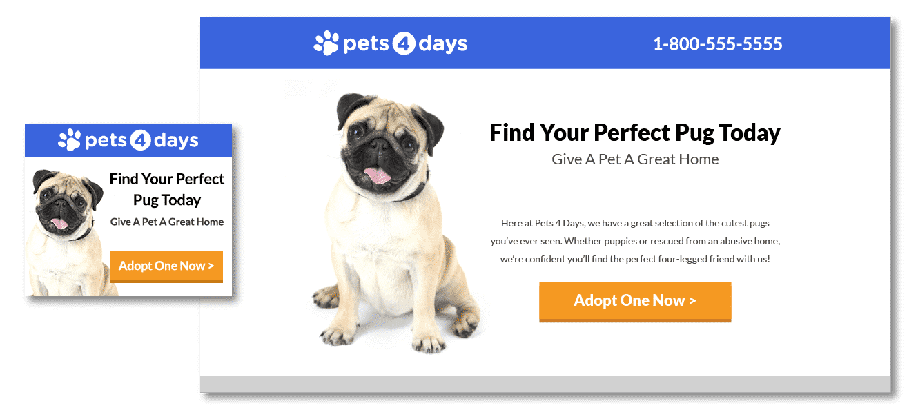
Unfortunately, when it comes to message match, a lot of the advice focuses on cosmetic elements. Does your paid search keyword show up in your headline? Does the color of your landing page match the color theme in your ad? Does the tone of the copy match the tone of the ad?
These are all good things to keep in mind, but if the actual content of the landing page doesn’t match the messaging in the ad that got people excited in the first place, the color of your page or whether or not you used exclamation points won’t really matter.
Your ad sets an expectation. Your landing page needs to meet that expectation. Otherwise, people get frustrated and confused…and then they leave.
Most people click on an ad because it seems to present a simple solution to a problem they’re struggling with. They’re looking for an easy answer, so making them work for it on your landing page is a sure way to dissuade them from converting.
So, if your ad’s core message is all about a particular discount, people who visit your page will be looking for a way to get that discount. If your ad talks about how your service benefits clients, people will be looking for proof of that on your landing page, along with a compelling argument that you can help them, too.
Regardless of what your ad messaging is or what its promoting, if your ad is getting clicks, the messaging is working for people. So, your landing page should reflect that same messaging. It’s as simple as that.
Your landing page asks for info you don’t really need
No one likes giving their personal information away. No matter how many times we’ve handed out our name, email address, phone number, company size, etc, each new ask feels like an imposition.
From a marketing perspective, this makes a ton of sense. It’s hard to get someone to buy if you don’t have their contact information.
However, you definitely can’t get someone to buy if they leave your landing page without giving you any information.
The problem is, often marketers ask for a lot of extra information—information that helps the marketer, not the customer. From the customer’s perspective, almost any information beyond whatever is necessary to get what they want feels extraneous.
If I want your eBook, it makes sense that you need my email address to send it to me. But my name? Company name? Company size? Why do you need any of that?
People may be willing to give out that information if they feel like what they’re getting in exchange is worth it, but only to a point. This becomes particularly important when it comes to gated content in today’s information-saturated world.
According to LinkedIn, 80% of tech buyers won’t give out their personal information to get at gated content. Sure, your gated content might be beautifully packaged and easy to consume, but that same content is probably available elsewhere, why not find a way to get it without signing up for yet another mailing list?
So, when it comes to asking for personal information, there are two basic rules of thumb: 1) make sure that what you’re asking for makes sense to your user and 2) offer meaningful value in exchange for someone’s information. Sure, snagging someone’s email, phone number, home address, annual income, interests, business size, etc benefits you, but if giving you all of that information doesn’t benefit the customer, they won’t convert.
Optional form fields
All that being said, there is a way to get at that information without offending your target audience: optional form fields. While most people dislike being forced to give out more information, people are often willing to divulge that same information when it’s a choice.
For example, one of our clients runs a retreat center for individuals and groups. At first, their standard form asked for name, email and phone number.
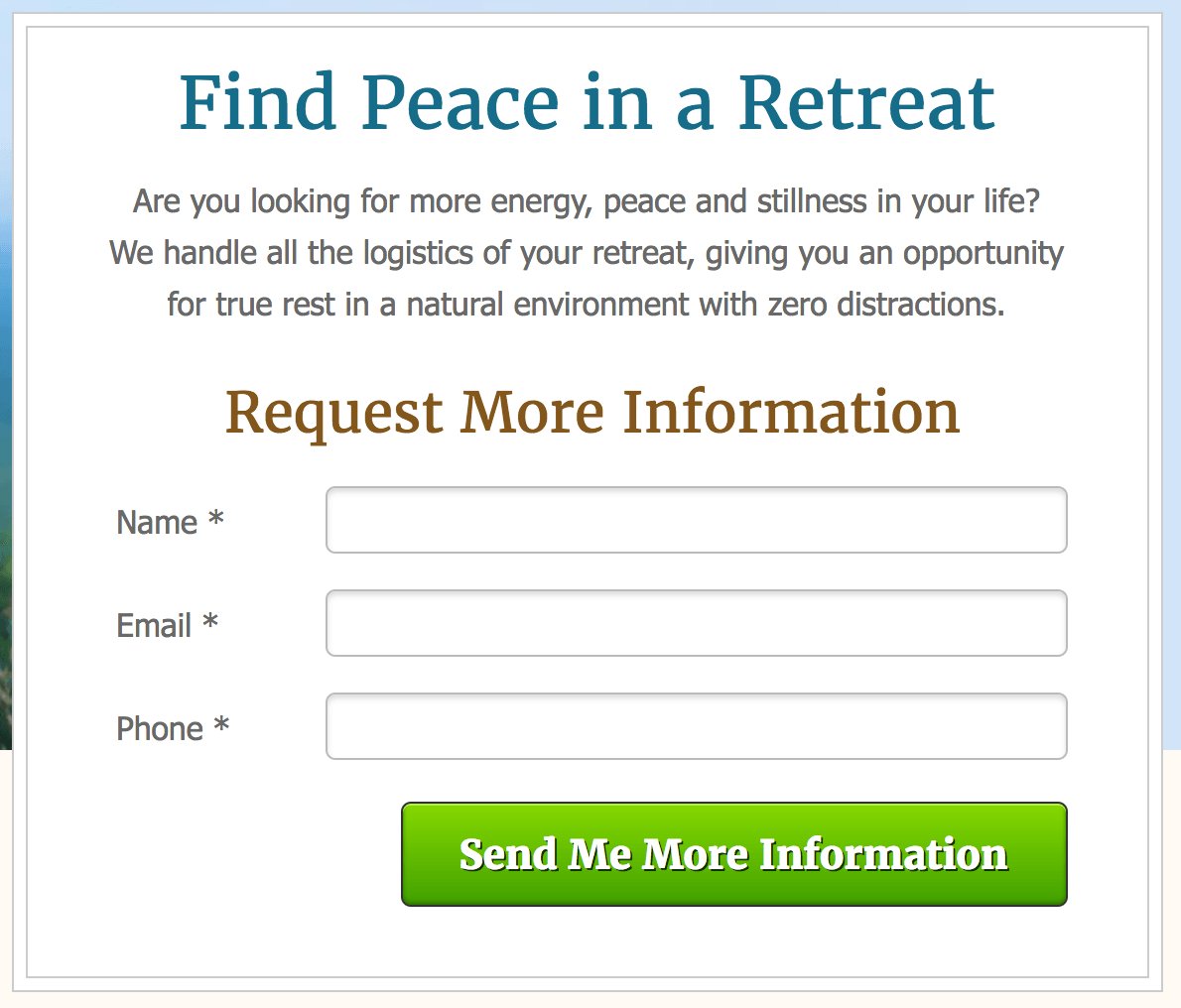
However, after talking with the client, they explained that a phone number wasn’t absolutely necessary, but they’d like to have it. So, we made that field optional.
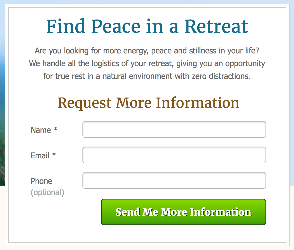
As a test, we wanted to see how big of a difference that field would make. Our first variant had only one difference: the phone number was required.
It’s hard to imagine the difference between the forms being any subtler, but that one simple change had a huge impact on our conversion rate. The form with the required field converted 43% worse than the optional field form.
You could easily argue that this just proves that people prefer forms with fewer fields. But here’s the thing: 30% of the people who converted on the form with the optional phone number field gave us their phone number.
So, if you don’t need a particular piece of information, but you’d really, really like to have it if possible, consider making it an optional field. Limit your required fields to an ask that makes sense with respect to what you’re offering, but don’t be afraid to give people the option to include more information.
Remember, people are a lot happier to be contacted when they volunteered their contact information than when they feel like it was extracted from them. Everyone loves having the option to choose, so if you can give people that option, they’ll be a lot more likely to convert and respond positively to your marketing in the future.
Your offer confuses people
The flip side of the whole ask-offer equation is the offer. If you want to convince people to give you their money or information, you need to make one heck of a compelling offer.
Unfortunately, if there’s one thing that kills a sale, it’s confusion.
If people are confused on your landing page, it doesn’t matter whether your product really is the best thing since sliced bread or your service has a thousand 5-star reviews and a testimonial from Oprah herself. No matter how good your product or service is, if your landing page confuses people, they’ll feel stressed, anxious and uncertain. And, as a result, they won’t convert.
So, when it comes to your landing page content, make sure you know exactly what you want people to do and why they should do it. Then, make both of those points clear to your visitors.
If you’re selling a service, explain how the service works and what it does for your clients. Then, make it clear what happens next after you convert. If you are selling a product, describe what the product does and how it solves a problem for your customers. Then, if you have any bundle offers, discounts or other incentives, make it clear what they get if they buy now.
It might seem basic to spell things out this way, but you want to make it stupidly easy for your potential customers to figure out what your product/service is, does and why they should care. When people understand those three points, they still might not buy, but it won’t be because they are confused. It’ll simply be because what you’re selling isn’t right for them in some way, which is okay—convincing someone to buy something they don’t want isn’t good for business anyway.
Your product or service is wrong
Of all the problems on this list, this is perhaps the hardest one for businesses to accept and address. Sometimes, your landing page doesn’t convert because you’re trying to sell something your target audience doesn’t want.
Maybe your price point is too high. Maybe you’re solving a problem that doesn’t really exist…or that most people don’t perceive as a problem. Maybe your solution is too unique or too conventional for your target audience.
Regardless of the reason, if you’re selling something no one wants, it doesn’t matter how good your landing page is—people still won’t convert.
So, if you feel like you’re doing everything right and you still aren’t getting conversions, take a look at what you’re actually selling. Do you have a meaningful competitive advantage over the competition? Are you communicating that advantage clearly? Why wouldn’t someone buy what you’re selling? Are your ads targeting the right audience?
Stepping back and taking a hard look at your market position can be uncomfortable, but it’s often a critical part of figuring out why your marketing isn’t working. After all, if the competition is making the same pitch as you, but their service costs less than yours, why would people convert on your page?
In today’s world of over-saturated markets, good marketing is just as dependent on what you’re selling as it is on how you’re selling. In many cases, solving this problem is as simple as revising your target audience and marketing approach. In others, you may need to go back to the drawing board and rethinking your entire business strategy.
The good news is, drilling down on your product/service and market advantage will help you solve all of the problems we’ve discussed in this article. After all, if you understand what your audience needs and how to effectively show that your business can solve those needs, you should have no trouble getting them to convert on your landing page.
Conclusion
At the end of the day, landing pages work when they meet your audience’s needs and expectations. If your landing page creates confusion and frustration, people simply won’t convert. It’s too much effort.
To ensure that people have a seamless, stressless experience on your landing pages, you need to understand your target audience. Figuring out what they care about and want out of your page is the key to creating a landing page experience that people will respond to. And ultimately, that’s a lot more important than adhering to specific best practices or making cosmetic changes to the design of your page.
By the way, if you’d like help with your landing pages, let us know here or in the comments. We’d love to help!
How do you improve landing page performance? What are some of the big problems you’ve seen with landing pages? What are some of your biggest frustrations with poorly designed landing pages? Leave your thoughts in the comments.


