Size Matters: Picking the Right Facebook Image Ads
by Cydney Hatch • February 20, 2018
If there is one thing I’ve learned in life, it’s that size matters. Whether its a coveted cake slice, height for riding a roller coaster, or buying clothing there is no getting around it! Size matters in many of our daily decisions!
But why and how does Facebook image ad size matter?
Simply put, picking the right Facebook image ads quickly distinguishes between quality campaigns and low end ones.
Quality, consistency and creativity will be your determining factors in making Facebook advertising effective for your business! But before we hop into those factors, lets cover some of the basics for 2018 Facebook ad sizing!
The Basics: Facebook Image Ads
When it comes to creating Facebook ads, most people spend most of their time finding eye catching images and testing ads to find the perfect combination that will get the most attention. Many businesses know that images are an important part of ad design and campaigns, since social media is full of compelling images that your ads need to compete with.
Below I hope to make Facebook ads an easy venture by sharing general Facebook business page sizing as well as discussing the many Facebook ad options available to you.
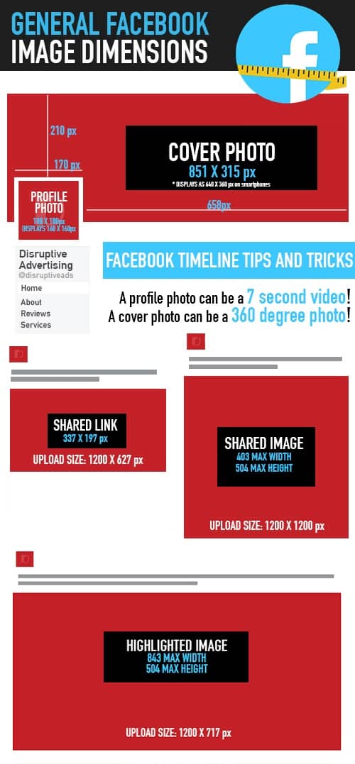
Facebook offers a great selection of ad options, but like any social platform, they are constantly changing their ad specifications.
It’s easy to set up Facebook ads if you have dynamic ads up and running, but to create your own ads on Facebook, you’ll need to follow a few steps.
- From Power Editor or Ads Manager, you’ll want to use either the Conversions or Traffic objectives.
- At the ad level, select the any of the format options.
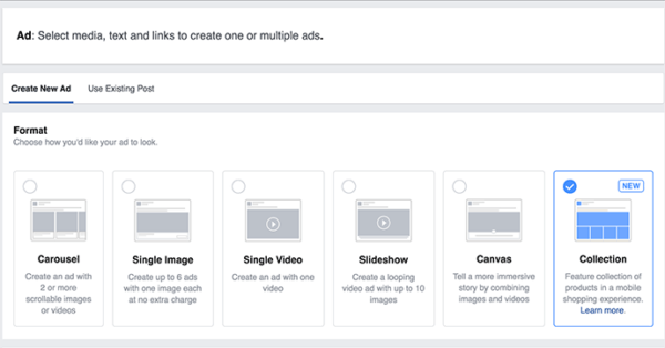
Formatting your images to be optimized for each of these options can be confusing at first—especially if you’re brand new to using Facebook image ads—but I am here to break them down for you! There are the three main image ad formats available:
1. Single Image Ad
Below are two examples of Facebook single image ads.
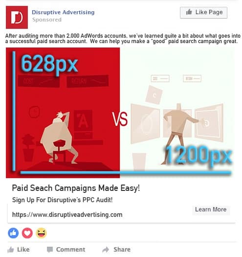
Single image ads are useful when you want to capture attention for your brand using a single image. A single image ad can be used across most placements. This is one of the quicker approaches to advertising, since you only have to plan and organize one image.
Facebook allows you to create vertical and horizontal single image ads. The advantage of using a vertical ad is that your ad will take up more space on smartphones as they have tall screens.
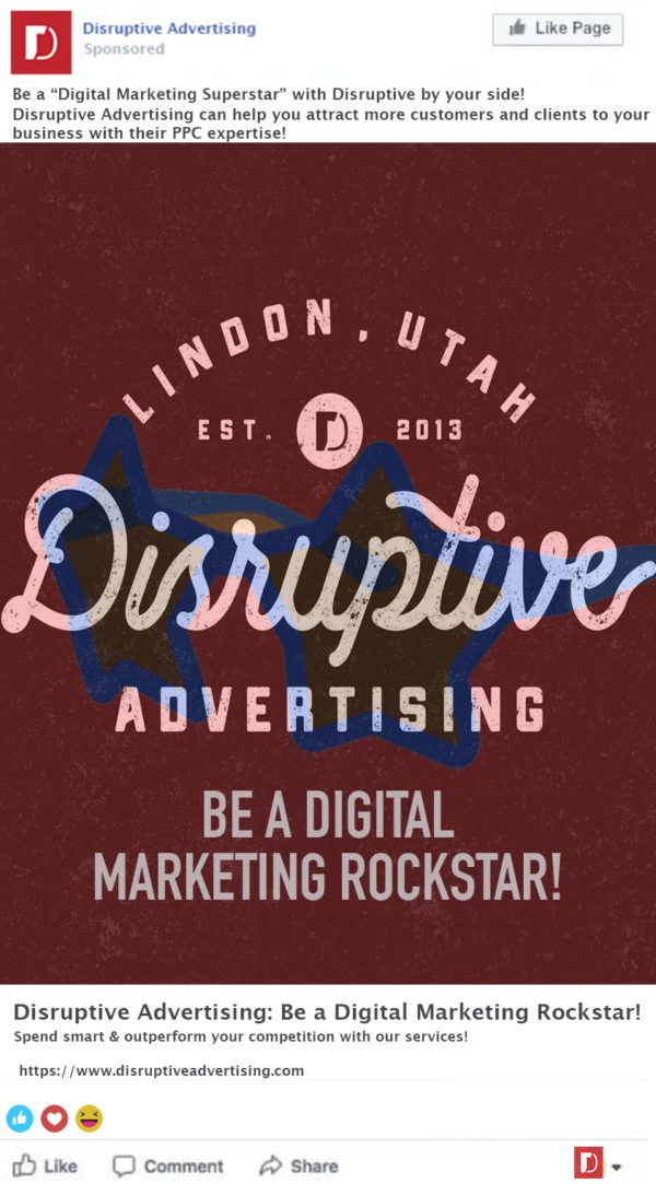
When you use a horizontal ad image, Facebook will automatically format the size for you which might distort your image, so consider who and what your intended audience is. If they are in a younger bracket, expect them to be viewing the ad on a smart phone which will be something to consider.
Single Image Ad Specs
- File type: jpg or png
- Image ratio: 9:16 to 16:9
- Images that consist of more than 20% text may experience reduced delivery
- Text: 125 characters
- Images cropped to 1.91:1
- Headline: 25 characters
- Link Description: 30 characters
- Minimum Image Width in Pixels: 400
- Minimum Image Height in Pixels: 150
- Aspect Ratio Tolerance: 3%
2. Carousel
Carousel advertisements are fun!
Why?
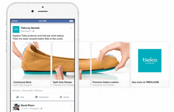
Carousel ads allow you to showcase up to 10 images or videos within a single ad, each with their own links! Using carousel is a creative option to highlight different products, showcase multiple items to share a sale promotion or tell a story about your brand! This is option is particularly helpful to eCommerce businesses as it optimizes visual marketing for products.
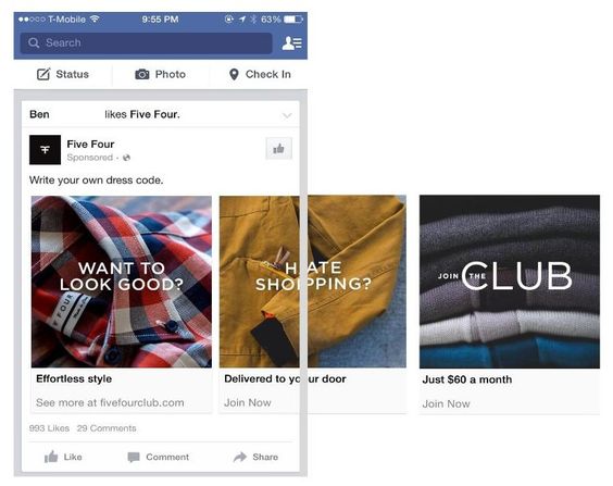
Some examples of effective Carousel advertising would be FiveFour (my boyfriends favorite clothing company) and Tieks shoes.
Tieks used Carousel ads creatively to highlight the quality features of their shoes!
FiveFour used each image as a way to tell a story and to point out customer pain points: If you hate shopping but want to look good, let us do the hard work for you! We will send you quality and stylish clothes right to your door!
Carousel Image Ad Specs
- Minimum number of cards: 2
- Maximum number of cards: 10
- Image file type: jpg or png
- Video file type: Supported file formats
- Video maximum file size: 4GB
- Video length: up to 240 minutes
- Image maximum file size: 30MB
- Recommended ratio: 1:1
- Text: 125 characters
- Headline: 40 characters
- Link Description: 20 characters
- Images that consist of more than 20% text may experience reduced delivery. Learn more about text in images.
- Minimum Image Width in Pixels : 400
- Minimum Image Height in Pixels : 150
- Aspect Ratio Tolerance : 3%
3. Collection
Collection is an ad format that allows you to basically create a digital storefront directly using Facebook. It makes it easier for people to browse and purchase products from their phones in a visual way!
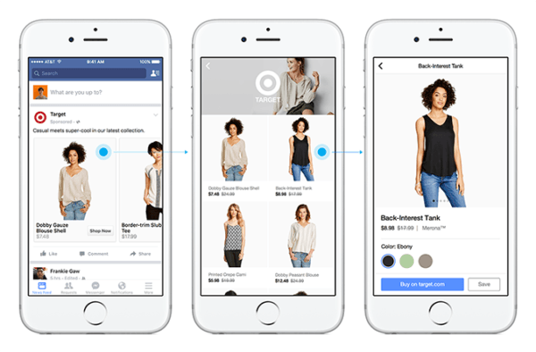
Since a collection ads are like a storefront you will need to create a beautiful cover image (like Target’s images above) or video. You will also need several product images that will be high-res and clear. When someone clicks on one of your collection ads, they will be moved to a Canvas image (example on the far left) which is full-screen rendition of your storefront images.
This is where quality images matter, you do not want images in this format to be stretch and distorted.
Collection Image Ad Specs
- Image or Video: The cover image or video that displays in your collection ad uses the first media asset from your fullscreen Canvas
- Headline: 25 characters
- Text: 90 characters
- Minimum Image Width in Pixels : 400
- Minimum Image Height in Pixels : 150
- Aspect Ratio Tolerance : 3%
Making the Most of Your Facebook Image Ads
Now that we’ve covered the basics of Facebook image ad formats, lets take it one step further. The details below matter because—like stated above—they quickly distinguish between quality campaigns and low end ones.
Quality, consistency and creativity will be your determining factors in making Facebook advertising effective for your business!Lets learn why!
Quality
It’s important to understand Facebook image size so that you don’t end up with stretched, pixelated or blurry images. No matter what website you land on, they will all have (the good ones that is) something in common: relevant and high quality photos. In a world where we are constantly bombarded with images, you will need to have quality images to excel in the marketing arena.
Nothing says, “these people don’t care” like poor quality images…
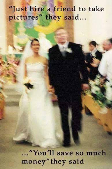
I think we have all clicked on a website and quickly dismissed it for having a low quality presence. Whether it’s dysfunctional styling, poor font choices or particularly low res images this can hurt your business.
Spend the money on visual marketing or at minimum get yourself a quality camera to shoot products of visuals yourself. Visual quality matters!
Consistency
Developing a strong visual brand strategy is the key to setting yourself apart from your competitors and helping your business grow. We have all scrolled through social media and recognized a brand from their images without even reading the name of the account. That’s no accident—that’s excellent branding, and it’s something you can start implementing right away.
@FancyTreeHouse is an incredibly popular Instagrammer who is a wonderful example of visual consistency. Her branding is incredibly youthful, fun and playful which attracts clients and people who appreciate her styling.
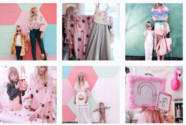
Her feminine, mostly-centered images on pink backgrounds are so identifiable, you know it’s her as soon as she appears in your feed (usually featuring something fluffy, unicorn-inspired or pastel). Her pairings of color and silhouettes are so eye catching!
So, with this example, consistency doesn’t mean you have to post the exact same thing over and over again. Your audience will quickly lose interest without variety! What will work is having a selection of colors, themes and ideas that all fit within a brand. This not only makes life easier for you to create and post content, but for your audience to recognize you too.
A consistent brand matters because:
- A constant brand looks more professional than one that is all over the place with their marketing.
- When you stay consistent people see you created something, not just something you created for marketing or promotional purposes.
- Customers and clients are more likely to trust a business that presents a professional, authentic, and clear brand image.
Creativity
Visuals are great for catching attention, but Facebook is full of stellar visual content. By thinking outside the box, you can draw in clients that have already “seen” many of the trends, fashions and visuals that many try to emulate for success.
If you want people to actually do something, you need to create unique content.
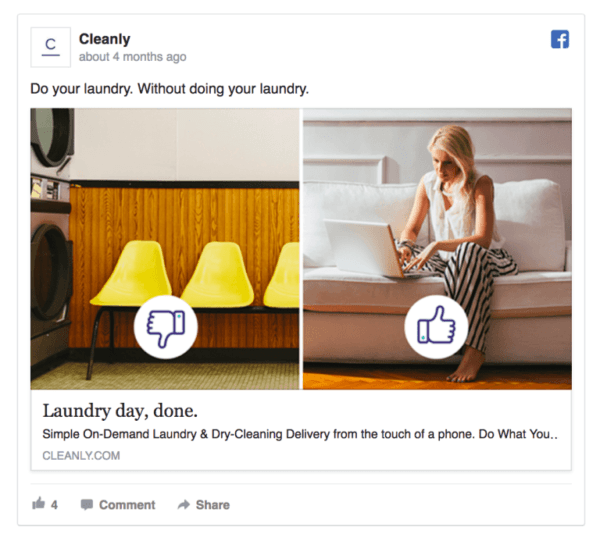
Creative content is eye-catching, but it’s eye-catching with a purpose. Cleanly’s ad above reminds people of a common problem by visually expressing a universal feeling. By doing this, we can laugh, feel and visually engage with the ad, while simultaneously getting a feel for how Cleanly can resolve our laundry hate issues.
This approach is not only visually appealing, but it also emotionally connects our dread of laundry with the solution: Cleanly!
Think outside of the box: think symbolically, metaphorically, literally and ultimately, creatively. Tell stories through different lenses. Use images to evoke emotions. By doing so, you will stand out amongst your competition.
Conclusion
And there you have it! Everything you need to know to about Facebook image ads and how to use proper image sizes to grow your business!
Effective ads are more than just a nice photo. They are strategic, high quality, consistent and creative!
When you put the time in to create quality image ads, it pays off. If you take the time to understand how to make Facebook image ads that stand and look great, you’ll ultimately come out on top of the competition.
By the way, if you’d like some help picking the right Facebook image ads for your business, let me know here or in the comments. I’d love to help.
Which Facebook image ads do you prefer? What are some of the best ads you’ve seen? Leave your thoughts in the comments!

