Should You Simultaneously Test Multiple Variants of Your Page?
by Trevor Anderson • July 26, 2016
Often in online marketing, conversion rate optimization and A/B testing are used as synonyms.
You want to improve the performance of a page (version A), so you create an alternate version of that page (version B), split your traffic between the two pages and see which page performs the best.
However, what most people don’t realize is that this sort of strict A/B test isn’t always the most productive way to test your site.
If you have the traffic, it may be in your best interest to run an A/B/C/D/etc test (even if it doesn’t roll off the tongue quite as nicely as “A/B test).
After all, the more variants you have, the more you can learn from each test.
Why You Should Test Multiple Variants
In a recent conference, Optimizely reported on what defined the world’s best testing companies.
Surprisingly, testing multiple variants was one of the four biggest predictors of testing success.
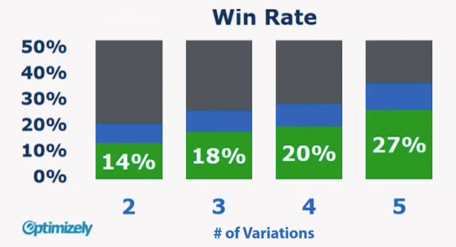
According to data collected from over 100,000 tests, 65% of tests ran on Optimizely had only 2 variations (control & variant 1). Only 17% of tests had 4 or more variations.
No surprise there, right?
But here’s where things get really interesting. Just 14% of experiments with only 2 variations produced a significant improvement in conversion rate. On the other hand, tests with 5 variations had a win rate of 27%.
That means your conversion rate is 90% more likely to improve if you test 5 variants instead of 2!
So, if you’re only doing A/B testing, you are wasting precious traffic and reducing your odds of success.
The question is, how?
With A/B testing, you’re essentially saying, “I believe that either the current design or my new design will work best for my target audience.”
But what happens if the variant performs better? Does that mean you’ve discovered the perfect version of your page?
Not by a long shot. Even with a successful A/B test, you need to keep testing to really create the perfect page.
Unfortunately, each successive A/B test introduces its own set of variables. Things like seasonality, competitor offerings, promotions and natural variance can make it incredibly difficult to make forward progress with strict A/B testing.
However, if you test multiple variants simultaneously, you can compare apples-to-apples and make much more aggressive progress with your tests.
Case Study
Recently, we ran a test for a client that wanted to get their site traffic from their main site pages to their “Find Your Local Chapter” page.
After much consideration and analysis, we decided to add a “Find Your Local Chapter” link to the client’s footer. That would get the link in front of as broad of an audience as possible and maximize the number of people who would click through the local chapter page.
Variant 1
Here’s what we initially put together:

Variant 2
When we first proposed the idea of adding this link to the footer, the client figured that including the link would do the trick—in other words, they were happy with one variant.
However, we knew we had enough traffic on the site to test more than one variant, so we put a second version of the link together:

Variant 3
Gut instinct told us that this new variant would probably perform better than our first attempt, but at Disruptive, we believe in testing, not gut instinct, so we decided, “Hey, we’ve got enough traffic to test 3 variants, let’s come up with something else!”
However, we hit a snag.
The first two variants fit the page color theme and design perfectly. But as we tried to put together our third variant, we were out of sleek-looking ideas.
We briefly discussed settling for 2 variants, but then we thought, “What have we got to lose? Let’s try something new!”
So, we took variant 2 and surrounded it with a bright blue, contrasting border that made it stand out from the rest of the page:

It was very different from anything we had tried on the page before, but we decided to run with the idea and include it in our test.
Results
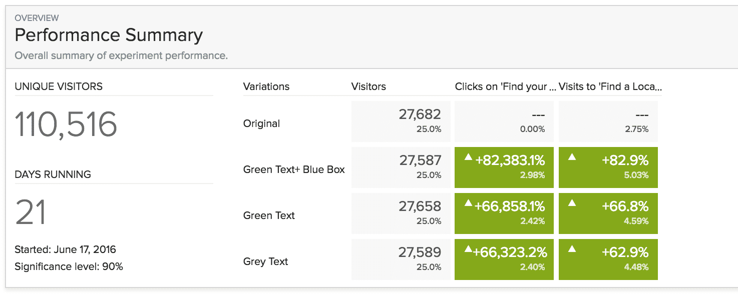
After three weeks and over 110,000 visitors, we had our winner:

Not unexpectedly, adding a link to “Find Your Local Chapter” to the footer increased traffic to the local chapter page by more than 60% in every case.
However, our shot-in-the-dark, “extra” variant was the hands-down winner. It increased traffic to the local chapter page by nearly 83%.
Had we simply run an A/B test between the link-less original footer and the new gray “Find Your Local Chapter” footer, we would have increased traffic to the local chapter page by about 63%.
That would have been a great success, but we would only have learned that adding a link in the footer increased traffic to the local chapter page.
By including additional variants (including a less aesthetically pleasing variant), we discovered that people wanted to visit the local chapter page. They simply didn’t know how to get to it.
Creating a high-contrast, button-looking link in the footer made it easy for site visitors to figure out how to get to the local traffic page.
It wasn’t the design we would have picked to win, but because we tested multiple variants simultaneously, we were able to quickly identify a much more effective variant.
Conclusion
In conversion rate optimization, there’s a temptation to focus on A/B testing. But, if you’ve got the traffic to test multiple variants, your tests are much more likely to produce the results you’re looking for.
It can take some extra creativity and effort, but if you can nearly double your testing success rate and cut your time to success, the results will be worth it.
By the way, if you’d like me to take a look at your site and give you some testing recommendations (including suggestions on how many variants to test at a time), let me know here or in the comments!
Have you tried testing multiple variants simultaneously? What were your results?


