A Call-to-Action for Better CTAs
by Allison Otting • July 22, 2014
Do your customers know where to go? (image source)
I’m super paranoid about running rampant through stranger’s houses. There are some people that will just walk into someone else’s home and just wander and open doors and snoop through closets and dressers (what is wrong with you?!).
I just can’t do it to the point where sometimes I will go without water or not use the bathroom because I simply don’t know where it is.
This is how people sometimes feel online, except they’re usually looking for a lot less survival things. You click on a page, it seems like you’re in the right place, but you just can’t find the answer to your question. So what do you do? You bounce because, unlike some awkward parties, you don’t have any reason to stay.
In celebration of my inability to ask people completely reasonable questions about where I can find a glass of water (I know, I know), we’re going to talk about Call-to-Actions, plus some tips on designing a solid CTA that won’t confuse anyone.
What is a Call-to-Action?
HubSpot defines it accordingly:
A call-to-action (usually abbreviated as CTA) is an image or line of text that prompts your visitors, leads, and customers to take action. It is, quite literally, a “call” to take an “action.”
You’ll most likely see a CTA in the form of a link, a button or even some text next to a phone number. This is the doorway to whatever action you want to take, and if you’re doing your marketing/targeting right, the client will want to take that action too. So the first rule is…
1. Have a CTA
Silly right? People don’t usually build houses without doors, but sometimes that guest bathroom is impossible to find…
 Really? It’s like you want me to pee on your carpet. (image source)
You need to make sure that your CTA is understandable and clear. Don’t use “Submit,” because that doesn’t tell people what door they’re entering.
Instead, tell them exactly what’s going to happen. Action words like “get” and “start” illustrate the exact benefit that they’re getting from clicking that button, whether it’s “Get my FREE Consultation” or “Start My Free Trial.”
Remember, people want to know where their going and what’s going to happen. Make your CTA clear and benefit driven, and ditch the vague words like “submit” or “go.”
2. Have only one CTA.
So, you finally do ask your friend where you can find the bathroom, but they make a sweeping gesture to half the house. You wander a little bit, and turn the corner. You’re then encountered by this:
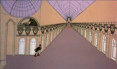 Bonus points if you can tell me what this is from. (image source)
This is how a potential customer feels on your homepage! Websites often have offers, blog posts, FAQs, navigational links and more. Every single one of these serves as a CTA and is a leak. If you want someone to sign up for a free trial, don’t lead them away with a link to your blog! Focus on one action for a higher chance of success.
Obviously this is hard to implement on the homepage of your website, but that’s where landing pages come in. They give you a way to target one service and one service only. If they’re leaving, they’re doing it through the door you’ve created for them, or by hitting the back button.
3. Show people where the CTA is.
Remember when Myspace was big and super customizable? You picked your background, you picked a song to start playing, and you could fiddle with the code to make it all your own.
My brother wasn’t really into the Myspace scene, but he still had one. The best part of his Myspace was the fact that there was no content. He hid every element on the page so that you’d have to move pixel by pixel to find links. The only thing that you could see was hundreds of somersaulting Santas.
 Can you picture it?
Obviously no one is going to think that making a page like that is a smart marketing move, but we often make landing pages with so much content and visual information that we can drown out the purpose: our CTA. There are lots of ways to make your call-to-action stand out on the page. Some of the best ways?
Use a contrasting color. Make it a substantial size. Point to it with directional cues or blatant arrows. Give it breathing room on the page. Put it in a place where people expect it. Make that thing shine.
4. Eliminate friction.
This is probably the most neglected step of making a CTA, and it’s maybe the most important. Friction can be created a few different ways when it comes to landing pages and websites. Here’s some of the most common problems, along with their solutions:
- Too many form fields. If you’re asking for a lot of information from someone, they’re going to be wary or not even want to spend time filling it out. Make whatever you’re offering worth the information you’re asking for, and cut out any fields that aren’t completely necessary.
- Sketchiness. People aren’t going to give you their email if you might sell their information or spam them. Give them reasons to trust you, whether it’s through a privacy statement or trust symbols. Read more about exuding trust here.
- Not enough information. When there is any risk involved, people will run the other way. They’re not going to spend any time or money on a product or service that they have concerns about. Address every question that they may have and give them the information they need to feel good about clicking your CTA. Note: downloading a free ebook will require a lot less information than financing for construction equipment. The more money and time that a person is committing = the more information you need to give.
- The form/page doesn’t work. This is possibly the worst one, and the thing that is going to tank your conversions. No one is going to kick down a bathroom door that is locked, and no one is going to stick around to figure out why your page is loading so slow or what your button doesn’t do anything. Test that everything works before you publish it, and make sure it’s so easy to understand that your grandma would know what to do.
Following these four tips will increase your conversions on your website and landing page, hands down. Like always, make sure your testing new CTAs all the time, because there is no one-size-fits-all when it comes to your call-to-action.
Have you found anything else to be successful when it comes to CTAs? Comment below. Have any advice for my complete social awkwardness? Go ahead and tweet me at @allisonotting.
And while you’re here, make sure to download our free guide on how to build high converting landing pages:

