Don’t Believe Case Studies: Conversion Rate Optimization For Landing Pages
by Allison Otting


As marketers and designers we love reading about great results that other companies are achieving with their landing pages. There are a million blog posts with data on the latest design trends and techniques. Often companies will showcase ways to guarantee a lift in conversions with case studies designed to open our eyes to the secrets of conversion rate optimization!

Well, if a good marketer stays informed and well-read, then a brilliant marketer thinks for themselves. Case studies are useful, but only if you take the right information from them. Here’s some advice on how to approach them.
Case Studies Are Not Copy-Paste Solutions
When I broke my foot in college, there were a lot of people who offered advice and stories about their broken bones. Some of them told me that I’d be on my feet again in two weeks, others said that it would be hurting forever. 95% the advice was not helpful for actually healing my foot. The truth is that every injury and recovery is different. Building landing pages is the same way.
If you’re running a cloud storage company and you read a case study about MailChimp’s amazing new landing page, you can’t assume that you’ll get the same results by copying their ideas. Even two different companies in the same industry will have different clientele with different needs and different opinions. Blindly mimicking another company without understanding that principle will waste your time and your precious traffic.
If you want a second opinion, Michael Aagaard wrote a great post that explains how case studies should be used as inspiration and not absolute truth.
Learning Conversion Rate Optimization Principles From Case Studies
When you look at a case study, rather than just copying the technique you want to understand the reason why it worked. Visual Website Optimizer often posts great case studies, so let’s use this one as an example.
This client offers truck driving lessons and wanted to get more sign ups from their website. What was the test? Replacing the stock photo image with a picture of a real student.
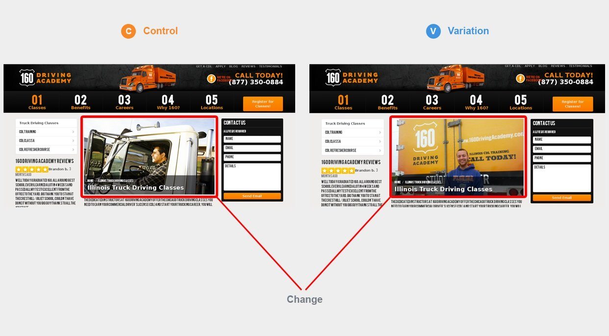
This page saw a 161% lift in conversions just from changing the photo. Some people might read this and think: I need to be changing my photos and then I’ll see a huge jump in conversions! This is not what you should do.
VWO does a great job of breaking down exactly why this variant won. What’s really going on is that we tend to ignore stock photos without even thinking about it. The second image, meanwhile, shows the company logo on a real truck, which solidifies the idea that they are a real company. Plus, there’s a real guy in it, which makes the user much more likely to think “Hey, that could be me.”
Understanding the psychology and principles behind the lift will help you apply those ideas to your site. Does your imagery make you look credible and established? Is there any element or image that makes your landing page look generic or spammy? You can create smart tests by weeding out similar points of friction on your landing page.
Let’s Look at Another Example
Optimizely did a test with the company Black and Decker. They wanted to test just the CTA text on their eCommerce sites. The question was whether “Buy Now” or “Shop Now” would convert better. Optimizely predicted that “Shop Now” would convert better because it was less committal and therefore less intimidating.
As my grandma often says to me… WRONGO.
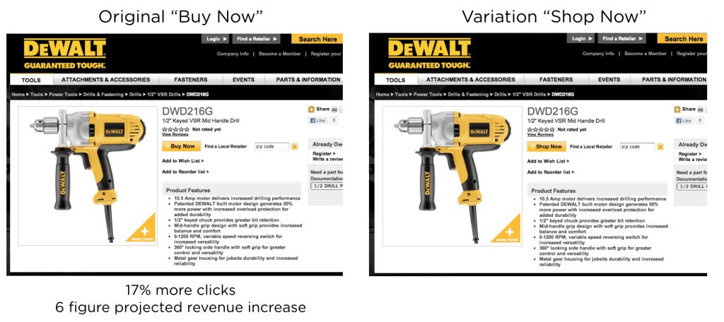
Using “Buy Now” performed substantially better.
What’s the wrong conclusion to make from this case study? That “Buy Now” is the best CTA to use for any eCommerce site.
The truth is, different products and different price points are going to affect how the user reacts. What if this site was selling a luxury yacht instead of drills? There will probably be a lot more thought and comparison shopping going into the process, and telling the user to Buy Now isn’t likely to change that.
So what’s the conversion rate optimization principle we should learn?
Your landing page acts like a marriage proposal. You’re asking the customer to convert, but asking too early won’t do you any good and could hurt your chances later. It’s your job to determine where you’re finding your prospects on the conversion funnel and give them the experience they need.

This is not what you want.
Black and Decker found that they didn’t need to talk about shopping for drills, but rather say “Look, I’m the drill for you and I want you to go ahead and buy me.” Their users were ready for a marriage proposal! Test your landing page’s content and language to see what level of commitment your prospects are ready for.
Now it’s Your Turn
Now, I said that reading case studies will improve your landing pages, but only when you read them correctly. Rather than copying the methods that other successful marketers and designers are using, examine the reasons for their success and think critically about how you can use the underlying psychology for yourself. You’ll only get the results you’re looking for with the unique application of general principles.
In general, be skeptical of any case study that says “Do this and you’ll get more conversions!” The real world is more complicated. In any test you run, whether it’s for landing pages, headlines, ads, or copywriting, make sure you have a reason why you’re testing a specific thing. Doing something because you saw another company doing it isn’t good enough! If you understand the psychology behind successful testing, you’ll be able to run more effective tests that improve results a lot more over time. Sometimes you’ll be wrong and the results will surprise you, but at least you’ll be starting from a stronger foundation.
Do you have any favorite case studies? Tell me what principles you’ve learned in the comments below!