Why Everyone Hates Pop-Up Ads (and What You Can Do About It)
by Aden Andrus • October 9, 2019
If there’s one type of online marketing that seems to produce universal frustration and outrage, it’s pop-up ads. We all hate them. In fact, everyone hates them so much that Ethan Zuckerman—the man who invented them back in the 90’s—has publicly apologized.
So why, then, do marketers still use them?
Whether it’s Zuckerman’s loathsome windowed display ads or the slightly less offensive on-site pop-ups you see on almost every business website, pop-up ads are everywhere.
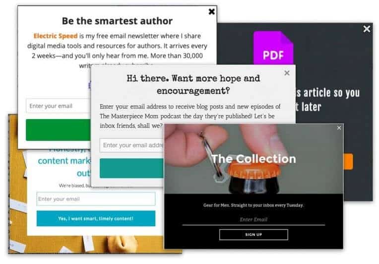
So why is something that is so universally hated…so universally used by marketers? Well, the fact of the matter is, they work.
In fact, after years of avoiding them, we finally gave in and started using them here on the Disruptive blog. And you know what? They really do work. Thanks to our pop-up ads, our email lists have grown by leaps and bounds over the past few months. More importantly, those emails have led to several new leads and sales.
As annoying as pop-up ads can be, if you approach them the right way, they can be an incredibly effective way to get email subscribers, drive leads and/or increase sales for your business. The trick is figuring out how to maximize effectiveness…while minimizing irritation.
In this article, we’re going to talk about exactly why people hate pop-up ads, why they work so well and how to create pop-up ads for your site that actually work—both for you and for visitors to your website. Let’s get started!
Why Pop-Up Ads Work
Pop-up ads work for the same reason that people hate them: they interrupt the user’s experience. The ad shows up and people must interact with it in order to get back to what they were doing.
Just like television commercials and YouTube ads, pop-up ads force advertising onto users. It solves the problem of banner blindness by compelling to pay at least a little attention to your ad—even if all they’re doing is trying to get rid of it.
And, in advertising, even a little attention can be a big deal.
Now, according to Zuckerman, the original idea behind pop-up ads actually had nothing to do with forcing people to pay attention to the ad. Instead, Zuckerman needed a way to “associate an ad with a user’s page without putting it directly on the page, which advertisers worried would imply an association between their brand and the page’s content.”
However, in solving that problem, Zuckerman inadvertently solved the problem of banner blindness, too. Now advertisers had a way to get their ads in front of their target audience—whether they liked it or not.

Of course, pop-up ads have certainly been abused over the years. Even when they’re not being used to get people to click on shady links or sign up for dubious services, they’ve often been used so aggressively that most people instantly look for a way out as soon as they’re hit with a pop-up.
In fact, 73% of people automatically disapprove of pop-up ads. There are over 200 million active daily adblocking software users, and all major web browsers have some sort of built-in pop-up blocker.
But despite that, pop-up ads work…if you know how to use them.
Our pop-up ads here on the Disruptive blog have conversion rates of 1-7%. Other sites have reported clickthrough rates of 2%, 1,375% more email subscribers and 162% more leads. Sumo assessed almost 2 billion pop-ups and found that the average pop-up has a 3.09% conversion rate.
Clearly, while people say they hate pop-up ads, their actions say otherwise, which is why marketers keep using them. However, if you don’t approach them the right way, expect a lot of backlash—from users and Google. A poor pop-up ads experience hurts everyone, but if you use the right strategy, you can get great results.
Creating a Better Pop-Up Ad
Pop-up ads work best when they offer value, rather than directly ask for something. After all, just by interrupting their browsing experience, you’re already putting them in a negative frame of mind, so you need to provide value to turn the tables.
You can think about it this way. If you’re at home relaxing on a Saturday and you suddenly hear a knock at the door, answering it is an inconvenience. It’s interrupting what you’re doing.
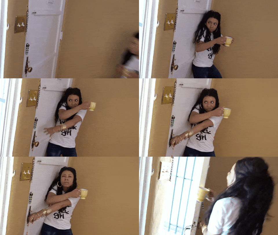
Now, if you answer the door and it’s a pushy salesperson, that only adds insult to injury. But, if it’s a neighbor with cookies, all of that irritation instantly evaporates. Yes, it’s still an interruption, but you’re okay with it because you get something valuable out of the exchange.
The same idea applies to pop-up ads.
Pop-up ads are generally disliked because they’re often an unwanted interruption that asks irritated people to buy something. It’s like knocking on a stranger’s door in the middle of the night and asking them for money.
However, if your pop-up ad offers something that people want—like a discount, valuable content or a free demo—it won’t be nearly as offensive. After all, you’re giving them something that they want, and people don’t mind being interrupted for that.
With all of that in mind, here are a few ideas to help you create your own value-based pop-up ads:
First-Time Buyer Discounts
One of the biggest challenges in ecommerce is getting people to buy for the first time. Most people who are shopping online are doing the digital equivalent of window-shopping. They’re evaluating their options and waiting for something to jump out at them.
Well, nothing jumps out quite a pop-up ad—especially a pop-up ad offering a discount.
For example, check out the pop-up that appears as soon as you land on Revolve‘s website.
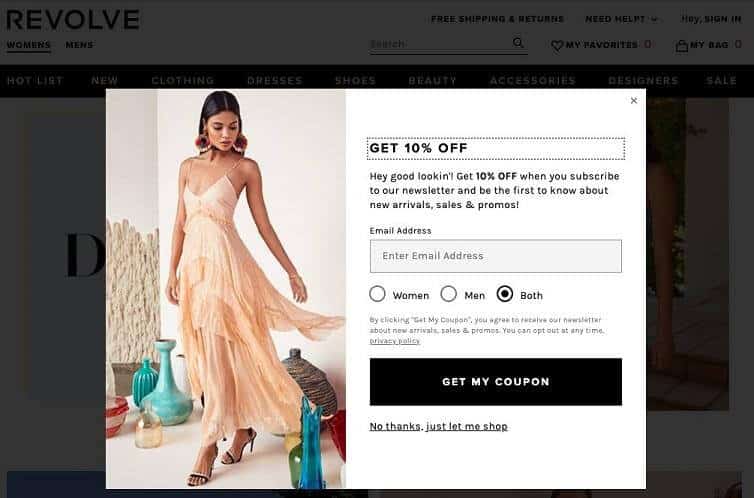
In effect, this pop-up is like hiring someone to stand in front of your brick-and-mortar store and hand out coupons. It works for businesses with a physical location…and it works for online businesses, too.
In fact, this works even better for online stores than brick-and-mortar ones because you get something in exchange for the coupon: the visitor’s email address.
Depending on how interested a visitor is in what you’re selling, they may be willing to sign up before they’ve even decided to buy. After all, if they don’t sign up now, they run the risk of having to pay extra for the item if they do decide to buy it later.
But, whether they choose to buy or not, getting a visitor’s email is a win for you. After all, you now have their email address, which gives you all kinds of new marketing options you can use to bring them back in the future.
Value that the customer actually wants + long-term value for your business? That’s a win in my book, which is why this pop-up strategy is something that almost every ecommerce business should consider trying.
Exclusive Content
For non-ecommerce businesses, things are a little bit trickier. Fortunately, discounts aren’t the only value that you can offer in a pop-up ad.
For example, if you have a blog or some other sort of open content resource, you’re already a step ahead in the game. You’re already providing value in the form of content, so offering additional value in exchange for someone’s contact information feels like a natural next step.
The classic approach here is to create eBooks, white papers or other content upgrades that people can access in exchange for their email address. The idea is that if they love your freely accessible content, they’ll really love your exclusive (also referred to as “gated”) content.
Another way to approach this is to tease users with the beginning of your content, but require them to give you their email address in order to access everything, as shown in this example from the Backlinko blog directory:
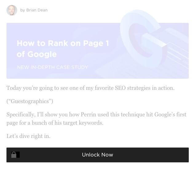
When you lock something away, it increases the perceived value of that thing. It’s a twist on scarcity marketing, and it definitely works. Put that now “high-value” offering into a pop-up ad and now your pop-up doesn’t feel like an interruption…it feels like a special opportunity.
Limited Time Offers
Another great way to use pop-up ads is to promote limited-time offers. Here, the value to your audience is in the notification itself. It’s almost like a public service announcement. Without the pop-up, people wouldn’t know about the time-critical of what you’re promoting and they might miss out.
This sort of tactic works best when you have an inherently time-limited offer that people want to be aware of. Some businesses try to manufacture urgency with artificial timers, but these usually feel false or contrived. A time-limited offer is only compelling when it’s truly time-limited.
For example, if you check out the Growth Marketing Conference’s homepage, you’ll see a countdown timer pop-up ad at the bottom of the page. This pop-up makes it clear that pricing will be changing soon. So, if you don’t act now, your tickets will cost you more later.
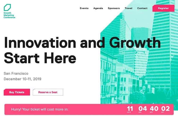
Rather than feeling forced, this pop-up feels more like a helpful reminder that just happens to create a sense of urgency. This is what gives it its power. Rather than trying to force people to buy and buy now, limited time offers like this one provide useful information…that just so happens to encourage people to buy right away.
These types of pop-up ads work particularly well when used in scrolling header or footer bars. This sort of set-up makes them feel even less like an intrusion and allows you to really capitalize on that “I want you to get the best deal possible” feeling that comes with limited time offer pop-up ads.
Conclusion
At this point, you hopefully have a good feel for why advertisers still use the much-maligned pop-up ad. When used correctly, it grabs your users’ attention…but in a way that actually provides value.
The ideas suggested above are just a few ways to create pop-ups that people actually like. If you’d like some specific suggestions for your website or landing page, let us know here or in the comments. We’d love to help!
In the end, pop-up ads work like most advertising. When you provide value, people respond well. When you try to take advantage of people or force them to buy from you, they get mad.
People don’t hate pop-up ads, they just hate bad advertising. And, unfortunately, pop-up ads have historically represented some of the worst of online advertising. But, in your newly educated hands, that doesn’t have to be the case for your pop-up ads.
How do you feel about pop-up ads? Love them? Hate them? Do you agree with this article’s take? What are some of the best (or worst) pop-up ads that you’ve seen? Leave your thoughts in the comments below.


