How to Optimize Your Product Pages for Higher Conversions
by Emil Kristensen


Your product pages are where it’s decided whether or not you generate revenue: they either convert users or they don’t.
But there are many types of conversions to consider, and not all of them directly contribute to a sale, though they’re impactful nonetheless. These are defined as micro and macro conversions, which are:
Micro: on-page actions that users take that don’t necessarily produce tangible revenue but might at some point in the future, such as:
- Subscribing to a newsletter.
- Downloading a content asset like a whitepaper or case study.
- Sharing a piece of content or commenting on it.
- Clicking through to additional informational pages on a site.
Macro: bottom-of-the-funnel actions that directly correlate to revenue potential, such as:
- Adding a product to an online shopping cart.
- Creating a profile and filling out billing information.
- Making a purchase.
- Requesting a demo from a sales rep.
So how do you design and optimize your product pages to capitalize on as many conversions as possible?
Simplify Your Forms
One of the biggest mistakes online brands make is creating landing pages that are simply too confusing and obtrusive. There’s either too much going on or there’s not enough to actually entice a site visitor to move further down the funnel (toward an eventual purchase).
If a visitor navigates through your site to a product page (or lands on one via organic search), he or she has arrived there with clear purchase intent—that’s why these pages exist. But if the form fill he or she is prompted to populate creates a conversion obstacle, you’ve broken a cardinal user-experience rule.
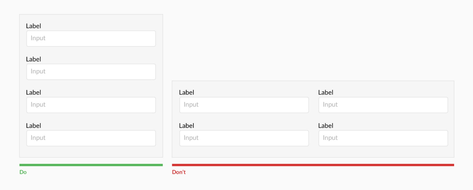
Source: UX Design
Pages should be frictionless—so easy to digest and maneuver that they can even lead to upsell opportunities or, at a minimum, a pleasant, memorable interaction.
Unclear forms that have too many fields of entry can deter purchases, especially if users’ browsers aren’t set up with auto-saved personal information. Ask yourself if every single row of entry on a form is actually necessary and then reduce the copy that’s needed to complete the form.
You should also validate entry errors in real time, not AFTER the entire form is filled out. By highlighting exactly where information is incomplete or inaccurate as soon as that information is provided you can allow users to quickly remedy mistakes without the frustration of redoing the entire form.
Here are examples of a form that immediately corrects a user action when errors are made:
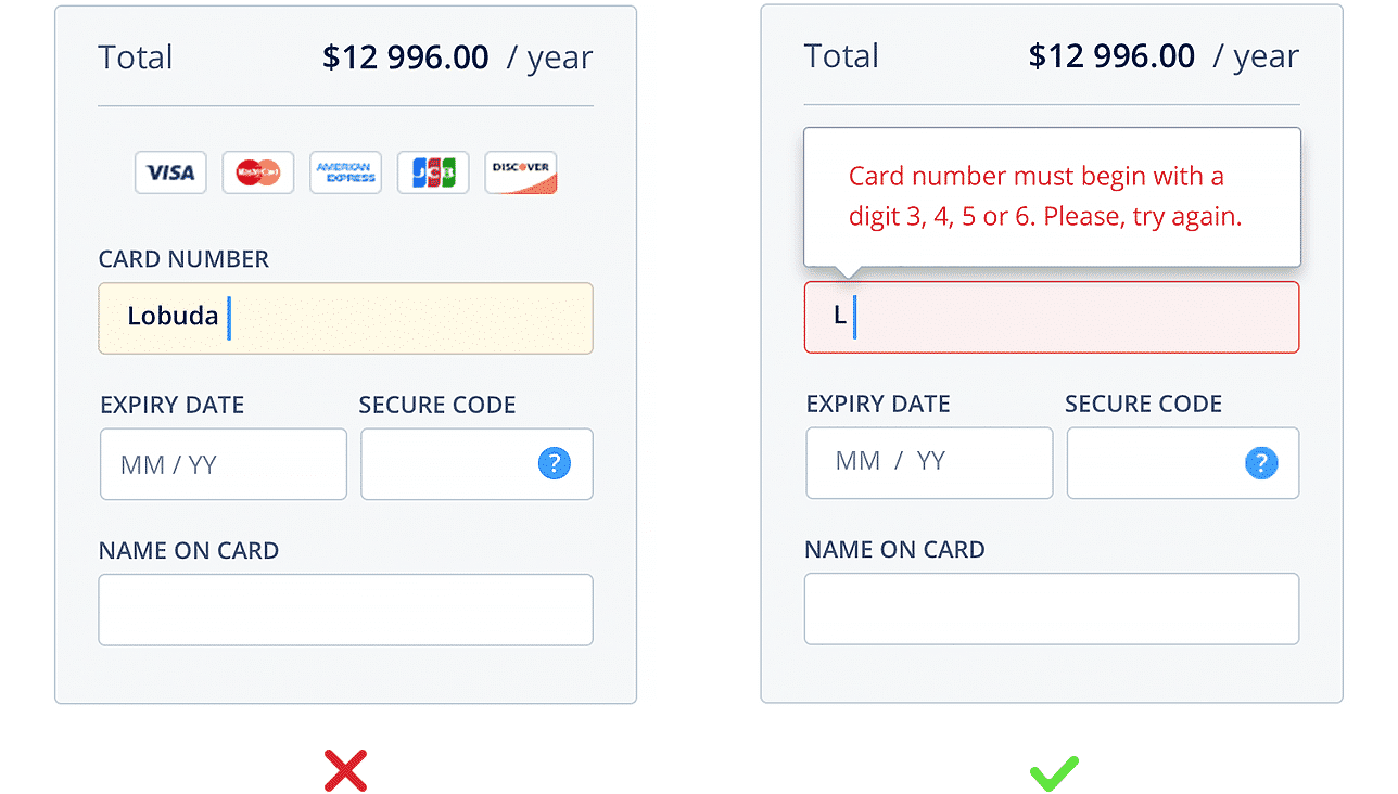
Source: UX Planet
Use One Clear Call-to-Action
Too many CTAs can cause user delays and general confusion as to how to proceed next. On a product page, simple confusion can lead to a bounce, producing missed sales opportunities.
There should be one type of CTA per page, often taking the form of:
- Add to shopping cart.
- Checkout now.
- Buy now.
- Access coupon code.
Take Netflix, for instance. There’s no way to be misled by the intent of this page and the CTA that is used:

Source: Netflix
Depending on the website, just 4% of site visitors convert on first visit—the other 96% may return to purchase at some point in the future or never at all. So you need to make it as clear and easy as possible for those 4% of sales-ready visitors to check out on their first try.
Within the first three seconds of landing on a page, a user will decide if he or she has found what was originally sought: Your CTAs should enhance product pages to maximize conversion potential within this three-second window.
Include Stellar, Interactive Visuals
When dealing with digital media environments, the human element can be lost in waves of text or excessive scrolling. What site visitors—humans—need is photographic or video confirmation of what they are buying, downloading or accessing and what they stand to gain from doing so.
That’s what makes Amazon’s continuous product page updates so practical. The ecommerce giant continues to stand in the shoes of average users and then builds out new on-page elements that can facilitate a better experience and, hopefully, a faster checkout.
For example, Amazon uses “Look inside” and “Listen” features to allow book readers the chance to capture a glimpse of a book’s contents before they purchase:
 You can accomplish similar user-friendly nurturing in a number of ways, such as:
- Image carousels.
- 360-degree angles.
- Click-and-grab panoramic views.
- Sneak previews.
- Augmented reality features.
Making your product pages more dynamic and interactive helps seal the deal in the eyes of visitors.
Incorporate Social Proof
Social proof is an amazing phenomenon, one that can surpass nearly any other tactic for boosting customer loyalty and conversions.
By definition, it is the concept of consumers conforming to the behaviors of others on the belief that others’ views are correct. In practice, social proof is emblematic of groupthink—if others are purchasing a product, then you should as well.
Roughly 70% of people look at product reviews before making a purchase. In addition, people trust product reviews 12 times more than they do brand-created product descriptions or sales copy.
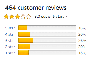
Source: Amazon
All of this is to say that your product pages should include user ratings, commentary, and customer testimonials to further mobilize visitors toward a purchase. You can embed positive Facebook comments on your pages, use a rotating carousel of customer quotes from Google My Business or feature a star-rating system akin to Yelp or Amazon reviews.
Once visitors see that your product is well-regarded by other buyers, they immediately feel more at ease, more confident and more likely open up their wallets.
Incorporate Product Suggestions
There are first-time customers and repeat customers. One way to turn the former into the latter is to incentivize them to add more to their carts either now or in the future.
Similar to social proof, including product suggestions on your product pages lends additional credence and confidence to a user’s actions. In other words, not only are you telling a customer that he or she is making the right decision by purchasing from you, but they’re also good candidates for benefiting from other products as well—and this logic is backed by the historical data of other customers’ purchases.
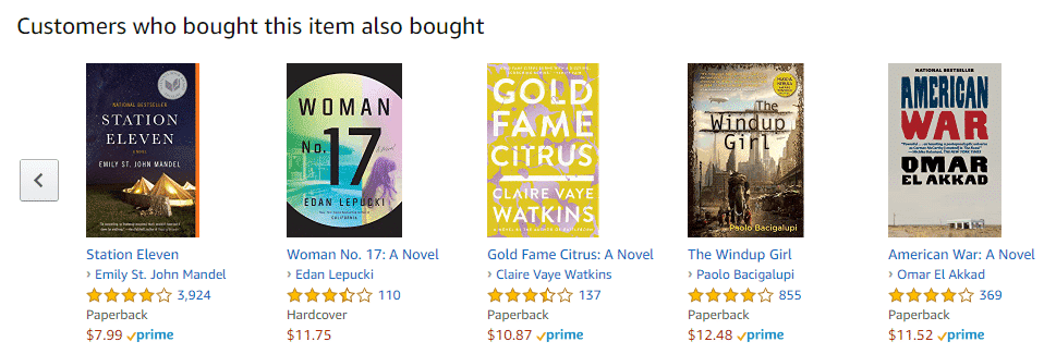
Source: Amazon
“People also bought” features help visitors frame their purchases in a way that makes them more comfortable while also leading to organic upsell opportunities.
Implement Structured Data for Rich Snippets in Google
When users search for a product or website organically via Google, they’re most likely to click on either a) one of the top three search results or b) paid ads that appear at the top of SERPs.
The first three positions in Google listings receive 60% of all click-throughs, and one of the best ways to make your page stand out in SERPs is to use rich snippets.
Rich snippets are the small pieces of additional context that Google provides within SERPs, typically for physical products. Seen below, Google features star ratings, the number of user reviews and a short link to find the product—all in addition to the traditional Google listing.
To gain this type of SERP advantage, you can mark up your product pages with schema, which is a coding language that instructs Google to present more info to users when they search online. You can use this simple tool which walks you through the entire markup process.
As your pages receive more traffic, you have the potential to convert an even larger amount of users.
Optimize Page Speed
Page speed is a significant Google ranking factor, and if your pages take too long to load, then Google is less likely to crawl and index your pages: It’s as simple as that.
From a user-experience standpoint, few things are as abhorrent as a page that obstructs the conversion process: You want to buy, but the page you’re on is unimpressive and suspiciously lacking in professionalism. As we stated before, every moment of delay increases the potential of a page bounce.
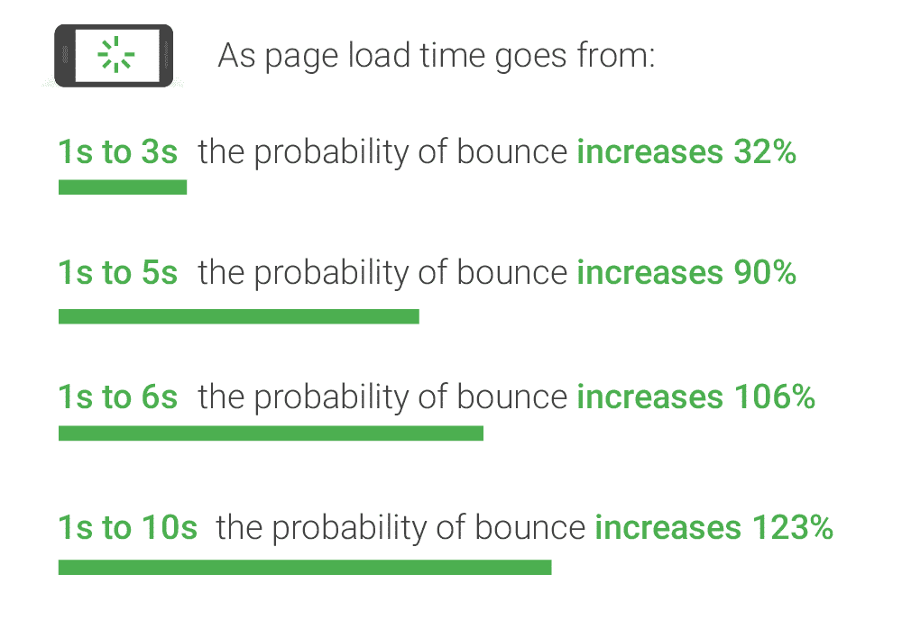
Source: Think with Google
Use Google’s PageSpeed Insights tool to learn how to improve your web pages, which should be loaded in two seconds—ideally sooner. You might need to compress image files, remove unnecessary on-page elements or take a look at plugins, extensions and additional code that could be slowing down page rendering.
Conclusion
More and more, companies are optimizing existing web assets instead of creating new ones because it can be more cost-efficient to upgrade past investments than allocate resources toward unknown, untested content.
And that’s the key to conversion rate optimization—testing new avenues for driving higher conversions. For a product page that receives 100 visitors a month and converts five of them into paying customers, an increase of just one or two more conversions equates to a 20-40% jump in the number of purchases. That’s a hard realization to pass up.
Any conversion rate tips you’ve found useful recently?