5 of the Best Shopify Themes for Maximizing Sales (and Why They Work So Well)
by Trevor Anderson


Whether you’ve been conducting your own research on ecommerce platforms, or somehow ended up stuck in their never-ending Facebook campaign to attend a dropshipping training (speaking from experience)…you’ve probably heard of Shopify.
Simply put: it’s everywhere.
And you know what? For many reasons, if I were starting an online shop, I would use Shopify without blinking twice. I’ve been around the block several times with ecommerce sites, and in my perspective, Shopify fits the bill for nearly everything you could need to use it for.
The only hesitation I would have about Shopify is the templates. Through my work in conversion rate optimization, I have come to cringe at hearing the word ‘template’. Why? Because the best converting sites and strategies just aren’t something you can template-ize! If it were that easy, we’d probably be out of a job pretty fast.
Shopify themes and templates just aren’t custom-built to fit your audience. No matter which template you go with, you’re bound to have beef with one part or another until it’s been tested and customized.
The problem is, a lot of stores just don’t have the time and resources to run A/B tests on their site and tweak the template until it is perfect.
But not to worry. Below, I’ll share some of my favorite Shopify themes I’ve worked with and why I think they convert well (and not so well) right out of the box.
5 Shopify Themes that are Designed to Produce Sales
Let’s take a look at 5 different Shopify themes that are already well-designed to produce sales. These are presented in no particular order and I’ll reveal my favorite Shopify theme for maximizing sales at the end of the article, along with some tips for improving the conversion rate of any Shopify theme.
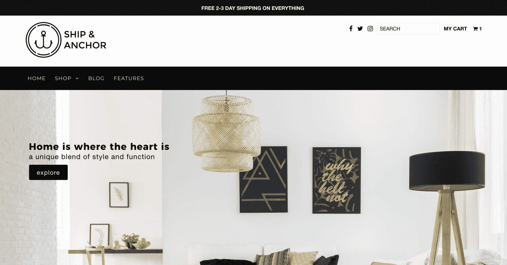
1. Styles
As a template, Styles’s design doesn’t really pigeon-hole it into a particular industry, and I like that. Because honestly, you could make most themes fit a number of industries.
View demo store here.
There are a couple of elements to this theme that really help to drive sales.
First, the smaller banner lets you move from vanity to salesmanship fast. I love that, as our testing shows that big banners tend to produce low sales. Remember, your site is about creating a user-friendly experience, not about promoting your logo.
In addition, the filtering options on Styles’s category pages are a dream come true. While not the prettiest, the ability to filter down options and find the perfect product is a huge driver of conversion for high-price, highly-customizable items (think auto parts, technology, instruments, and more).
Things to Tweak or Test
Unfortunately, while these elements are great, Styles’s design has a few problems that may keep you from maximizing your conversion rate.
To begin with, while the banner is small, that reduced size doesn’t give you a lot of room to place unique value propositions or a call to action. But, if you insert images onto your pages with text overlaid on top of them, that is easily rectified.
My real problem with this template is the out-of-the-box search experience.
Search traffic on ecommerce websites often has a conversion rate 2x-4x higher than the rest of the site, so a search bar that blends into the page is a waste of potential. To make matters worse, on mobile, the search bar is hidden within the menu. From our experience, moving the search bar to the top of the page can increase internal searched (read: high-converting traffic) by 15-40%.
Finally, the search results page on Styles leaves something to be desired. Grid format search results limits the information that can be displayed prior to the user clicking through to a product display page (PDP), whereas a list format allows the user to see at least part of the product descriptions to determine which is the right product, increasing the likelihood that they’ll make a purchase.
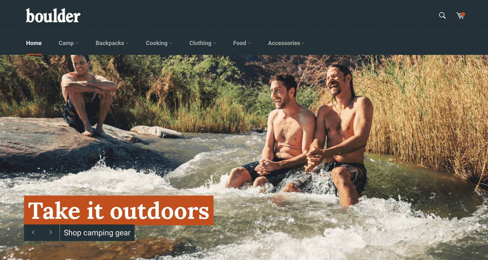
2. Venture
The Venture Shopify theme is free and an excellent solution for outdoor products and adventure sports stores.
View demo store here.
There’s a lot to like about this Shopify theme. The homepage banner allows for a good amount of text (great to explain your unique value propositions) while also reserving a large amount of space on the HP for other categories you want to feature.
The product pages on Venture are also clean and don’t look cluttered. This is great, because you can feature large product images and really showcase the item with minimal distractions. I also LOVE when you can feature top products in the menu of a site. Users like feeling like they are becoming part of a group and giving them easy access to top selling items expedites that process.
Things to Tweak or Test
If you choose this template, keep in mind that it’s easy to go overboard with Venture.
Since this template is made for stores with larger product catalogs, store owners/admins may be tempted to feature all product categories on the home page. That’s a trap! Overwhelming your users can have adverse results. Instead, test and opt for simplicity.
In addition, I wish the product pages on Venture came with a bit more customization out of the box. From our experience, highlighting important information (price, the add to cart button, and product info) increases user attention on actionable content, and increases conversion rates. To accomplish that on Venture, you’ll have to add some extra code to the theme.
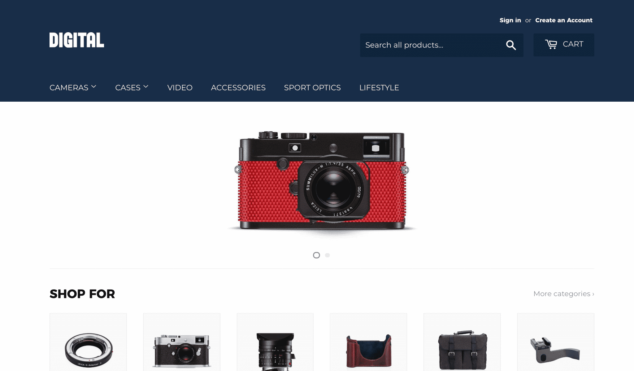
3. Retina
If you’re looking for a more modern design with all sorts of current bells and whistles, Retina is a great Shopify theme to consider. Large photos, social media plugs, you can find most of it on this theme.
View demo store here.
One of my favorite features of this Shopify theme is the “quick shop” buttons on the category pages. These open to a simplified product page and are a great alternative way for the user to shop. If you sell low price items (or items with little customizing), the “quick shop” window can increase cart additions substantially.
In one of our A/B tests on a large ecommerce site, we found that:
- Removing “quick shop” windows decreased cart additions by 17% and conversion rates by 6%.
- Placing more prominence on the quick shop option increased cart additions by +8% and conversion rates by +3%.
- While additions to the cart from a “quick shop” window are not as high-intent as those from a product page, the volume of cart additions resulting from this option creates enough conversions to outperform the alternative.
In addition, the filtering options on the category pages are a dream come true. While the results aren’t the prettiest, the ability to filter down options and find the perfect product is a huge driver of conversion for high-price, highly-customizable items (think auto parts, technology, instruments, and more).
Things to Tweak or Test
Sadly, the Retina theme isn’t free (like Styles and Venture). $180 isn’t an expensive price point for a well-designed shop, but if you’re bootstrapping your store, planning on making major modifications, or planning on theme-hopping (switching themes every couple months to figure out what theme produces the most sales), paying for a theme is a hard pill to swallow.
Another potential problem is those ghost buttons (transparent buttons with a thin border) in the home page banner. Those are pretty high on my list of things to avoid. Testing in the past has shown that swapping a ghost button for a brightly colored button can increase clicks on the button up to 50% (that’s a lot, considering it’s the main button people see when they arrive on your page).
The background-less menu on the home page also makes it harder for the user to scan and find the appropriate way for them to search and explore the site and including social media icons in the header isn’t great for sales.
After all, by the time you get a user to the site, you want them to buy! Placing links that take them away from the site so prominently on the page doesn’t make any sense.
Finally, the product pages themselves could use some work. The half-menu to the left of the product images makes the page busy, as well as divides the user’s focus between learning about the selected product and returning to a higher level page.
The add to cart button being below the fold is also a negative aspect of this page, as it makes the ‘next preferred action’ ambiguous upon page load. And if only 20% of users scroll down a page, that could spell trouble.
Overall, while the built-in “quick shop” option is great, you’ll probably want to make a lot of modifications to this theme to really optimize it for sales, which can make the $180 price tag a bit hard to swallow.
4. Fashionopolism
We’ve worked with a lot of clients that use Fashionopolism. The theme is decently versatile and has some features that aren’t readily available on other themes.
View demo store here.
One of the great things about this Shopify theme is the fact that it includes a pencil banner for promos across the site right out of the box. If your business is promo-heavy, this is a must have.
In addition, as you scroll down the page on desktop, the menu is sticky! Sticky menus allow the user to jump pages and navigate the site without having to scroll back to the top. This is a big source of frustration for users on long pages, so with this theme, you’ve already addressed a big user experience (UX) concern.
The product flags that come with this theme (corner banners for new, on sale, etc. products) are an important way to delineate how certain categories differ from others on the site. For stores with large amounts of return traffic, this helps returning users quickly identify what has changed since they last visited.
This theme also places the cart icon in the middle of the page at the top of each mobile page, which is excellent for sites where multi-item purchases are common. This gives users who are want to look at additional products an easy way to get back to their cart. The pop-out cart that shows when an item is added to the cart is also an excellent way to entice the user to go to the cart (much better than many themes that don’t do anything when an item is added).
Things to Tweak or Test
The downside to Fashionopolism’s menu is that it lacks callouts that would draw the attention of the user to the category pages. Considering these are likely important categories for the user, this could be a problem for sites with multiple large-scale categories.
While placing the cart button front-and-center on each mobile page is great, much like the Styles theme, the search bar is hidden within the menu. Potentially losing out on 15-40% of your sales is huge and if you have a mobile-first store that needs to be highly-searchable, this should take some of the wind out of your sails.
Finally, if you choose to go with this theme, you’ll want to be careful about what images you choose to place under your text. The text over the images that comes stock on this theme doesn’t have a background, so you’ll want to make sure that the text is still legible and words don’t collide with dark elements in photos.
5. Vantage
I’ve seen more sites use Vantage than I have any of the others featured here. It’s become a magnet of sorts for start-ups, and it’s easy to see why.
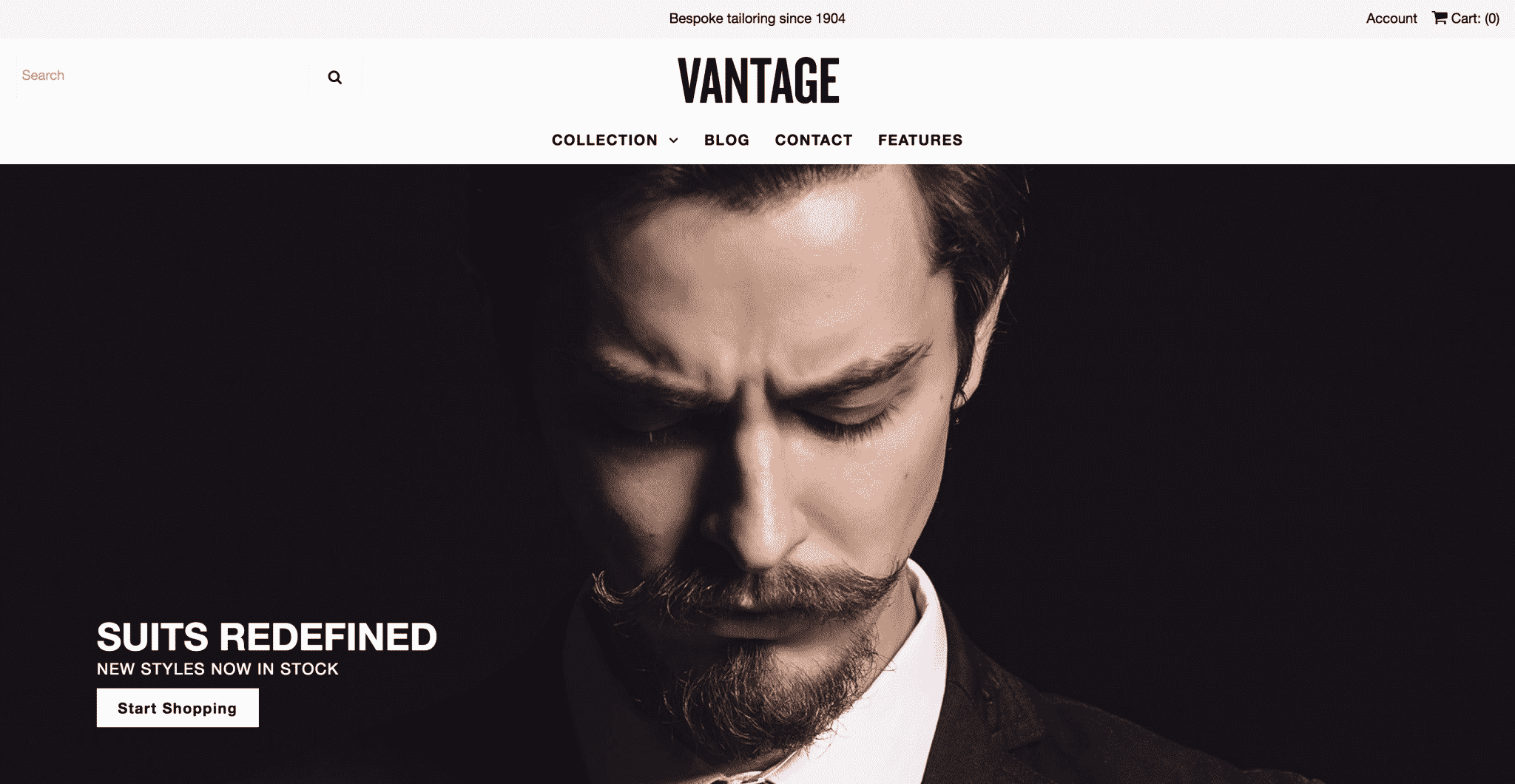
View demo store here.
Part of the appeal of Vantage is the fact that a lot of the sales-promoting elements we’ve already discussed are built into the base template. For example, Vantage offers a sticky menu on desktop, a pencil banner to feature promotions site-wide and an easily visible cart icon on mobile.
The search function on mobile is also better than several of our other options here, as there is an icon at the top of the page on mobile that opens the search page when tapped (a secondary search bar is in the mobile menu). It’s not optimal, but it’s certainly a better setup than placing it in the menu.
The product flags that come on this theme (corner banners for new, on sale, etc. products) also do a good job of delineating how certain categories differ from others on the site. For stores with large amounts of return traffic, this helps returning users quickly identify what has changed since they last visited.
Finally, Vantage places the cart icon in the middle of the page at the top of each mobile page, which is excellent for sites where multi-item purchases are common.
Things to Tweak or Test
The biggest disadvantage of Vantage is the lack of drop-down options in the upper menu, as well as the size of these drop-downs, which make the menu on desktop much more difficult to use than one of the bigger menus, like Venture. The menu on Vantage also lacks the ability to upload featured products into the drop-down.
My Favorite Shopify Theme
At this point, you hopefully have a good feel for what to look for when you are filtering through different Shopify themes. There are so many pros and cons to each theme that you could make an argument for any that you consider to be the best option for your ecommerce store.
Personally, if I were starting a store today, I’d go with Venture. The theme converted well right out the box when we began working with it and—over the year-and-a-half that I’ve spent working with and optimizing Venture—I have yet to run into modifications that the theme couldn’t handle.
For example, here is a fully optimized version of Venture that we’ve worked on with one of our clients:
If you compare that to the demo store version of Venture, you can see that we’ve made a lot of tweaks to the overall store design.
Since testing different elements in your ecommerce store is the best way to increase sales, having an adaptable Shopify theme that you can easily modify and test is incredibly important. In addition to delivering great results out-of-the-box, Venture is also easy to test, which makes it my favorite Shopify theme.
Of course, the store you run may not be the best suited for this theme, especially if you have a very small product collection. But, if your site has several categories to display, and a high amount of new visitors that would benefit from recommended products and product images that show all the details of the item, Venture may be the theme for you.
Testing Your Shopify Theme
Now, picking your Shopify theme is just the beginning. No theme is perfect out-of-the-box for your specific store, so you’ll want to start A/B testing as soon as your site starts getting decent traffic.
Why? Well, let’s take a look at just one test we ran on the Venture theme for a client.
This particular client sells 371 products that fit into about 12 different categories,, so the Venture theme was a good fit for their business and they were getting great results. However, they wanted to see if they could improve things even more.
At first, before they started working with us, this client redesigned their home page in the hopes of increasing sales. Putting their heads together, the marketing team had come up with a collection of products that with high margins and/or high sales volume and decided that would be a good lineup to place on the home page.
Many companies take this same approach to their site design. It’s not a bad approach, but it can cause problems if you don’t take the time to test it.
So, that’s what we did. Since the page was new and unproven, our approach was simple. We theorized that many of the products on the page were not the perfect fit for a consumer, and the overload of possibilities decreased the likelihood of purchase.
In the initial round of testing, we created 10 variants where we removed one different element from the page in each variant. So, as a whole, we tested the entire page…removing one element at a time.
Here’s it works. In this test, we removed the beard care section from the page (this is a mobile version of the client’s home page):
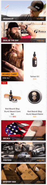
Astonishingly, this test revealed six winners and produced a combined lift (between all of the variants) of thousands in revenue in 2 weeks. The top 3 variations improved conversion rates by margins of +9.4%, +18.07%, and +10.9% over the baseline. Talk about a big win from a small test!
In fact, this was just the beginning of testing on the home page for this site, it gave us a great starting place for our later tests.
The moral of the story? Picking the right Shopify theme is important, but if you really want to get the most out of your ecommerce store, you can’t stop there. The real secret to ecommerce success isn’t templates—it’s testing.
So, once you’ve got your new Shopify theme up and running, make sure you take the time to test your store (to learn more about how to do this, check out this article!).
Conclusion
When it comes to Shopify themes, many ecommerce business owners look for a “pretty” template that matches their personal aesthetic. There’s nothing wrong with that, but remember, the point of your ecommerce site isn’t to look nice. Your site needs to sell product.
For that, it’s important to look for a theme that is designed to sell. Fortunately, there are a variety of Shopify themes that provide a great user experience out-of-the box. Now that you know what conversion rate optimization (CRO) elements to look for, you can set your site up for success from day one.
Then, to really take your ecommerce results to the next level, you’ll need to tweak and test your theme. Effective CRO testing can increase sales by 50% or more, so it can quickly take your store from good-to-great!
By the way, if you’d like help picking a theme for your store or want help testing a Shopify theme, let me know here or in the comments. I’d love to help!
What Shopify themes have you used and what modifications have you made to the theme to make it convert better than it did right out of the box? I’d love to hear your favorites in the comments below!