Tight Deadlines, Long Nights and a Website Redesign
by Manny Lopez
A couple weeks back our marketing director pulled the design team into a meeting room and began to explain his vision for a new beautiful website for Disruptive Advertising.
Being a graphic designer, I was very excited to give our website a new look and feel. Our original site had been slowly cobbled together amidst the rapid growth of a successful start-up and was in desperate need of an overhaul.
Our end product was both a lot better looking and much more successful from a conversion rate standpoint, so I thought it would be helpful to describe our redesign process. Since a website redesign is a fairly intensive process, this article will be part one of two and will cover a lot of the brainstorming, research and design work that went into our development process.
Meeting with the Marketing Director
Before even bringing the design team and developer in, our marketing director had spent a lot of time researching effective website design, reviewing previous site iterations and landing page tests and defining our audience and the message we wanted to convey.
As a result, by the time we started brainstorming actual design elements, we had a pretty clear vision of what we were trying to achieve. Even then, though, we spent several hours discussing everything from look and feel to messaging to overall style. There were a lot of good ideas; but, since our main goal was to build a successful site rather than pad anyone’s ego, we based our ultimate design off of iterative tests we had previously conducted.
Finally, after extensive discussion, we were off to the races.
Meeting With Our In-House Developer
One of our first steps for this major website refresh was to get together with our developer to discuss functionality. When taking on a project of this magnitude you really have to make sure that your designer and your developer are on the same page and work together during the entire project.
In this meeting, we discussed the “must haves” of the website and special functionality that I wanted to incorporate in my design. We also discussed the importance of making sure the code was written to accommodate site-wide changes very easily. Despite our best efforts, we knew that new tests would lead to eventual site optimization, so it was critical to create a design that was both immediately effective and flexible enough to accommodate future changes.
With both of us on the same page on functionality, I was on my way to brainstorm the design.
Meeting With the Design Team
Here at Disruptive Advertising, we have a team of four designers including myself. This is a great advantage because we all have a different style and perspective when it comes to design.
We really wanted to make the new website clean and focus our graphics on two very important aspects of our company core: people (our clients) and data. This really helped us narrow down the style and subjects for most of the illustrations that we ended up creating.
Typography was another major subject that we needed to discuss. We all agreed that we needed to update our companies typeface. Now, asking a bunch of graphic designers to agree on one typeface can be impossible but, luckily, we were able to agree on two font faces. Once we had a clear path for the design, it was time to get to work.
Building the First Page
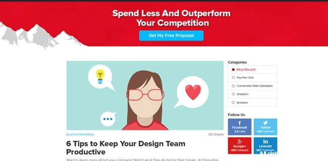
With other website re-design projects I’ve worked on, I started with the homepage design and expanded out the look and feel into the other subpages. With this project, we really wanted to ramp up our blog so we started with that page.
The goal for the blog was to make it simple, clean and easy to read. I knew that I was going to use a lot of white space throughout the entire website, so I kept that in mind. Before I opened up Photoshop or sketched any wireframes, I made a list of blogs that I read on a regular basis and I decided to write down what I liked and what I didn’t like about the blogs.
After an hour or so I started to see a pattern to the blogs that I liked!
Keep in mind that these blogs ranged from graphic design blogs to technology blogs and even some sneaker blogs. To avoid giving into too much personal bias, I decided to learn what other blogs people were visiting and maybe ask them what they like and what they would add to the blog to make it better.
So, I decided to ask my beautiful fiancé about the blogs that she liked to visit on a daily or weekly basis. Her list ranged from fashion blogs, to cooking blogs and a few wedding blogs. 😉 After surfing these blogs and getting some input from our marketing director, I felt like I had a good understanding of what makes a good blog that people wanted to visit daily.
Putting It All Together
It took quite a bit of time and effort to determine what would work best for our site redesign. Even after we had a clear idea of what we wanted, it still took quite a bit of research to nail down the details. However, the end result turned out both good-looking and converted better, so the work seems to have paid off.
You can check out the blog page here. In the next installment, I’ll go over how we set up the rest of the site and some of the results we’ve seen since the reboot.
To Be Continued…


