6 Ways to Get More Conversions from Your Web Forms
by Aden Andrus • July 5, 2019
If you’re trying to drive leads for your business, odds are that web forms are a key part of your conversion funnel. Once people have clicked on your ads, you want them to either call you or fill out your form so you can reach out to them.
But are your web forms helping or hurting your conversion rates?
There aren’t a lot of people out there who get excited about filling out web forms (if you happen to be one of them, please let me know in the comments, I’d love to do a case study on you), so if you need people to fill out a form, you need to figure out how to make the process as painless as possible.
After all, even the best landing or web page won’t perform very well if your form fills people with fear.

To help you get the most out of your web forms, let’s take a look at a variety of ways to make forms more user-friendly. Some you may have heard of or even tried before and some might be completely new, but all of them are worth testing out.
1. Offer an Incentive
While asking someone to fill out a form might not feel like a value exchange, to your customers, it is. By completing your form, they’re actually giving up one of their most valuable assets: their personal information.
Once they complete your form, who knows what you’ll do with that information? We’ve all filled out enough web forms to know that giving out your email means (at a minimum) signing up for yet another endless email drip campaign. Giving away your phone number means unwanted calls. Giving away your home address? It’s scary to think what a business might do with that.
To make people feel okay about giving you such a valuable asset, you want to offer something valuable in return. That value can be any number of things: a discount on your products, access to an interesting newsletter, an eBook download…the list goes on.
In marketing, we often refer to these as lead magnets. They make filling out your web form feel less like a freewill offering and more like a true value exchange.
However, if you aren’t offering enough value in exchange for people’s information, your potential customers won’t be sold on completing your form. So, if you’re not getting great conversion rates on your form, consider upping your offer.
For example, these days, unless people really love your blog content, offering a newsletter with your latest content may not be enough to incentivize them to sign up. But, if you offer an intriguing eBook in addition to the newsletter, you might get a lot more form completions.
2. Create a Contest
According to the Form Conversion Report 2015 from Formstack, if you want the best possible conversion rates—create a contest.
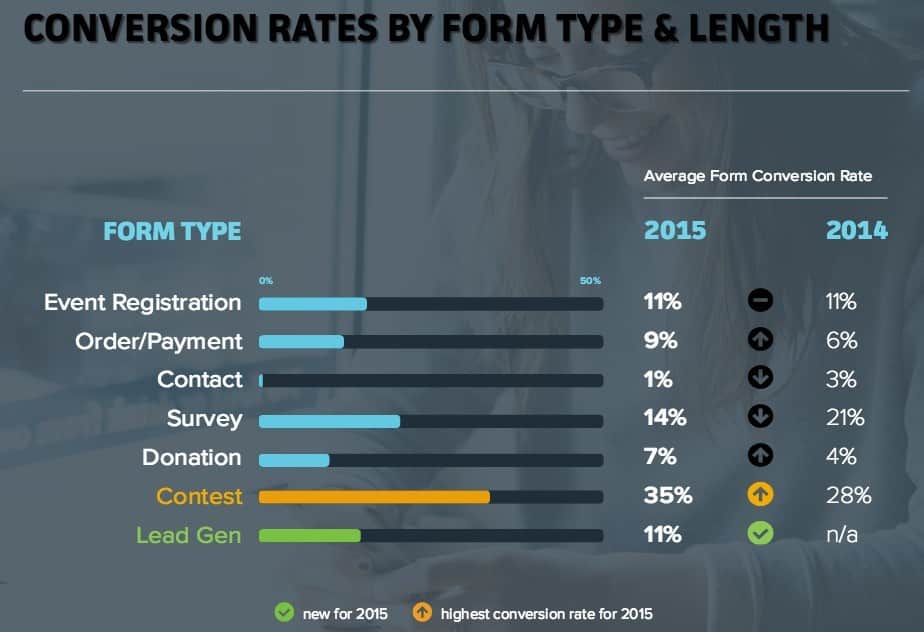
As discussed in the previous section, people want to feel like they’re getting something valuable in exchange for their personal information. With a contest, you can offer something your customers really want…but you only have to offer it to one of them to get lots of people to complete your form.
Or, as Formstack put it:
People love having a chance to win. Which means contest forms are a great way to capture new leads and engage with your audience at the same time.
For truly great results, consider integrating your forms with your social media profiles. According to Formstack, the conversion rate for contest forms more than doubles when you integrate your forms with your Facebook page.
Contest forms work particularly well for ecommerce businesses. For example, here’s a contest Feedmark.com—an equine health supplements website—used to get people into their lead funnel.
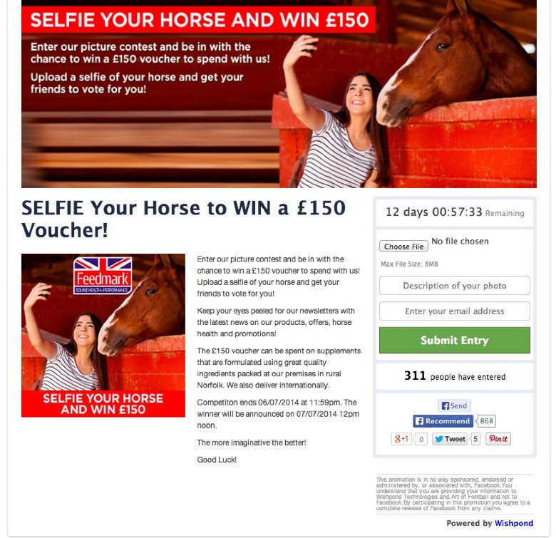
Not only does a contest like this create leads, you can also use it to produce user-generated content—and all for the low price of handing out a few prizes. It’s ironic how unwilling people are to hand out their personal information…until there’s a chance that they could win something cool.
3. Try Intelligent Web Forms
Name…email address…phone number…home address…most websites ask for one or all of these on their webforms. And, there’s nothing worse than filling out all of that information on one form…and then having to fill it all out again on another form on the same website.
In many cases, this hassle is enough to stop people from completing subsequent forms. After all, you already have that information, why do you need it again?
Well, if you’re facing this sort of problem on your website (something that’s particularly common for businesses that engage in content marketing), you may want to look into intelligent web forms.
Smart or intelligent web forms—available from HubSpot and a variety of other platforms—hide form fields that your users have already completed. So, if they’ve already given you their phone number, they won’t be asked to supply it again on a different form.
This allows you to do something called “progressive profiling”, where you gain additional information about a user every time they engage with one of your forms.
As HubSpot puts it:
“[Progressive profiling] allows you to set up iterative forms that enable you to designate which questions appear based on what you already know about a particular lead. That way, every time a lead fills out a form, you are progressively collecting valuable new information about them while keeping your forms short and easy to complete.”
So, if you have a marketing funnel that uses a lot of eBooks, white papers, surveys, calculators or other lead magnets to nurse information out of potential clients, you might want to consider using intelligent web forms to increase your conversion rates.
4. Keep Your Web Form Fields to a Minimum
Since completing a web form is an ask, it should come as no surprise that the more fields you have, the lower your conversion rate will probably be. After all, the more information your require someone to give, the more resistant they will be to providing it.
For example, we tested a client in the IT industry who had a simple Name/Email/Phone form. In order to introduce an email follow-up campaign, we added a checkbox box to let customers know that they could expect an email. We even made it pre-checked to minimize friction.
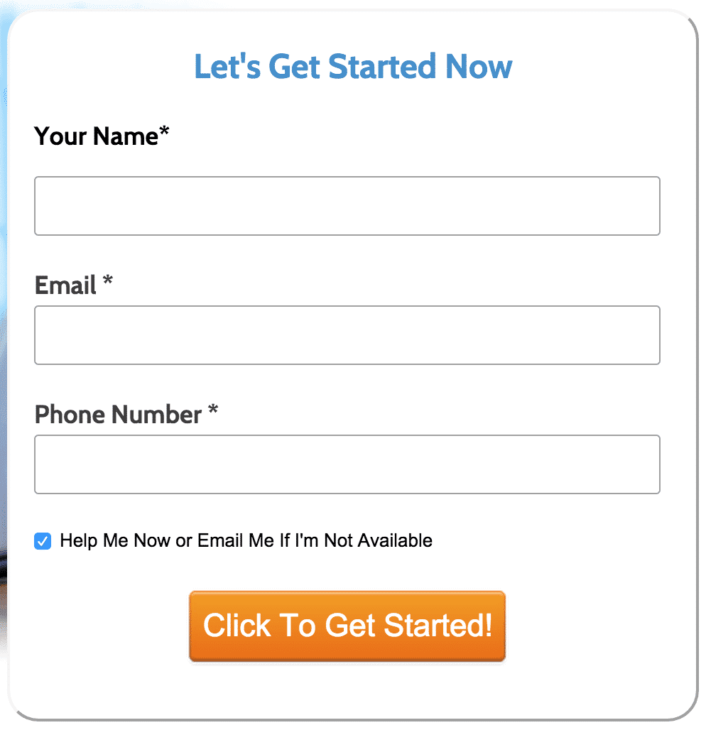
The results? Well, it didn’t work so well.
After testing this form against a form without the checkbox, it became clear that this little, “low-friction” checkbox was lowering our conversion rate by 5%. In our test, that was the equivalent of more than 1,700 missed conversions.
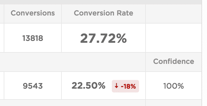
As to why that happened, it’s a little bit guesswork without being able to ask the customers, but most likely the checkbox was just enough to create a little bit of doubt in the minds of a few more people. “Wait, aren’t I getting help already? Now you’re going to email me too!? Maybe this is a bad idea!”
As another quick example, we had a client in the investment industry that wanted to pre-qualify leads so only people with a certain net worth signed up, so we added a checkbox that said “I certify that my net worth, including income and assets, is over $100,000.” They also wanted to confirm that the customers had read a specific legal disclaimer, so we added a checkbox for that as well.
However, two checkboxes made our form look long and intimidating, so we combined them into a single field that said something short and sweet like, “I certify that my net worth is over $100,000 and that I have read the legal notice posted below.”
That change increased conversion rates by nearly 50% without noticeably affecting lead quality. We also ran a test with no checkboxes at all, which more than doubled conversions, but client feedback indicated that most of the leads were unqualified, so they decided the tradeoff wasn’t worth it.
5. Get Creative with Long Forms
So, what do you do when you can’t trim down your form fields? Give up and assume that your form will never convert?
Well, for starters, just because a form is long, that doesn’t mean that people won’t be willing to convert if it’s designed well. Here’s a quick look at how form field counts and conversion rates vary across industries.
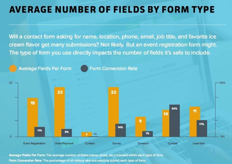
As you can see above, if people are signing up for something where they expect to provide a lot of information (like an event or ecommerce purchase), they’re much more willing to complete a lot of fields.
Even for other form types, you can still get away with a lot of fields if you’re smart about how you approach things. Here are a few tricks to try:
Multi-Step Forms
A big, long form can feel both intimidating and like a huge ask. But multiple small, sequential forms feel a lot more manageable. According to Formstack’s report, multi-step forms can have up to triple the conversion rate of a single-page form.
To make things even better, consider adding a progress bar. This will help people keep track of how far they’ve come and encourage them to keep going.
Offer a Save Option
There’s nothing worse than getting partway through a really long form, getting interrupted and then losing all of your progress. It makes completing a long form seem even more daunting.
The solution? Give users an option to save their progress. Even if most people don’t take advantage of the feature, knowing that they have the option can help increase your conversion rates.
Try a Horizontal Layout
If most of your users fill out your form on desktop, one way to make long forms more manageable is to change up the format. Instead of sticking to the standard vertical form layout, try switching to a horizontal layout.
So, if you have a lot of radio buttons or checkboxes, consider putting them in a horizontal line to make your form look shorter. Alternatively, you can place short form fields in columns that users can work through. There’s no guarantee that this option will perform better than a standard layout, but for certain types of forms, it’s certainly worth testing.
6. Advertise at the Right Time
Finally, while this isn’t technically a web form tactic, when people see your form can have a big impact on how likely they are to complete it. So, if you want to increase your conversion rate, you may want to take a look at when you are running ads that drive traffic to your form pages.
For example, here is some data from Formstack on what days and times produce the most form conversions for different types of forms:
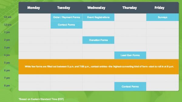
While this is a good starting place, the best data will come from your own campaigns. For example, if you’ve set up conversion tracking in Google Ads, you can run a report in the Report Editor that shows which hours and days receive the most conversions, have the lowest cost per conversion and the highest conversion rate.
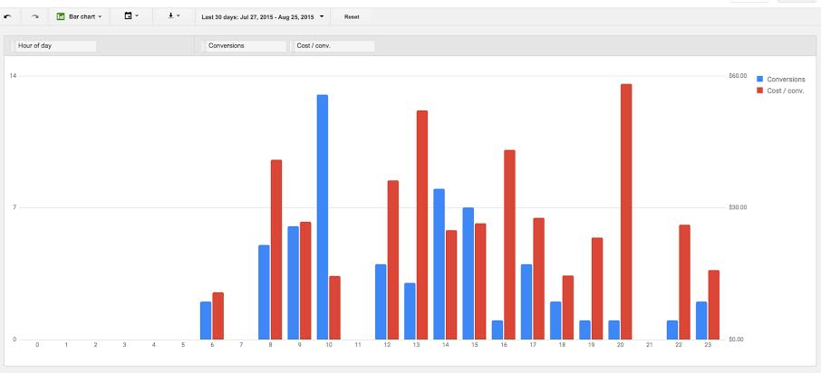
In this report, it’s clear that this client gets the majority of their conversions at 10:00 am. 8:00 pm is a terrible time for them to run ads. Not only do they hardly get any conversions, but the few conversions they do get are also incredibly expensive!
Using this data, it makes sense to increase bids at 10:00 am to get the most out of their peak conversion time and lowest cost-per-conversion. It’s also probably worth skipping the 8:00 pm hour to avoid paying a lot for very few conversions.
You can run the same sort of report for days of the week to identify when your audience is most likely to convert. This sort of assessment is often particularly helpful for long forms, since they are more inconvenient to complete than short forms. After all, if your potential leads don’t have enough time to convert when they click on your ad, they won’t fill out your form—even if they’d otherwise be interested.
Conclusion
Optimizing web forms isn’t always easy, but with the tactics in this article, you have a toolbox full of ways to improve the performance of your forms. Feel free to try a few of them and see what works.
By the way, if you’d like some help optimizing your landing pages, web forms or advertising campaigns, let us know here or in the comments. We’d love to help.
How do you approach web form optimization? Have any tips you’d add to this list? Leave your thoughts in comments below.


