Creating a Website Testing Strategy: How to Consistently Double Conversions
by Lydia Ogles • April 26, 2018
Conversion rate optimization (CRO) should not be a guessing game. It’s easier than picking out a birthday present for your Dad or finding a good hairstylist. The next step in testing should always be clear as you strategically change elements on a website to create the best possible conversion process.
However, if you don’t approach things the right way, CRO can feel like pulling ideas out of a hat and hoping you get something right. But, there is a better way.
In this article, we’re going to talk about how to come up with a website testing strategy that allows you to progressively test and improve your website.
3 Testing Website Mistakes
Sadly, there are 3 HUGE mistakes made when testing a website:
#1: Spending endless time improving an element that actually hurts conversion rate. That’s like putting glitter on a face mole….
#2: Improving elements that don’t really have that much influence on the conversion rate. This is like wearing a power tie to an interview. Sure, it might help a little, but is that what you should have spent 2 hours deciding?
#3: Endlessly adding new elements to the page looking for that surprising spike in conversions. This is like having more and more children until one turns out how you expected…but is that really the best way to get what you want?
At Disruptive, we remove moles instead of glittering them, prepare for interviews instead of picking ties and all our children turn out perfect the first time…
Testing the Right Way
Okay, all jokes aside, Disruptive is good at website testing because we use a 3-phase website testing strategy that allows us to avoid the 3 problems I mentioned.
Here’s how we approach things:
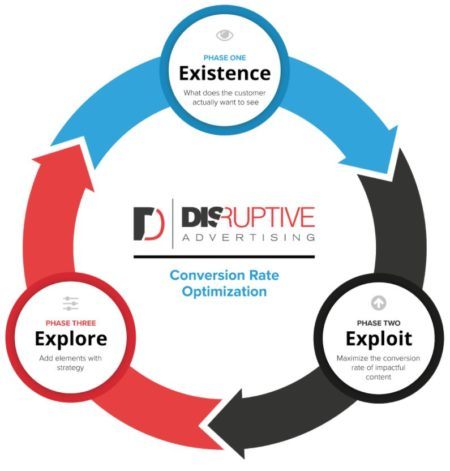
The infographic above shows these 3 testing steps:
- Phase One: Existence – Testing whether or not certain elements should be on a website by removing them.
- Phase Two: Exploit – Iterating on elements and working to improve them.
- Phase Three: Explore – Introducing completely new elements / designs to the site to see how the audience responds to them.
The brain father of these phases, Chris Dayley, describes it this way:
“Each of these tests helps us to learn specific things about the audience, and can be used individually if needed. However, these tests are most powerful, and of the most value to your clients, when they are used together as part of a progressive strategy that gets better and better over time.”
A Good Website Testing Strategy in Action
One of our clients runs a massive recipe blog. They get millions of visitors a month, but before they started working with us, only about 15% of their traffic visited their Menu Plan Site (their main money-making page).
To make matters even worse, only 2% of their traffic was actually converting!
This is where we came in. Tons of traffic, great product, but no purchases. It was time for some strategic conversion rate optimization.
Testing Phase #1: Existence Testing
Now, if you haven’t put together a website testing strategy before, your first instinct might be to redesign your site.
DON’T!
Remember, mistake #1 was assuming a little freshening up will solve all the problems. While this may work for humans (a good shower never hurt anyone), there are a few steps you really should take first. Let’s take a step back and look at phase one.
The first testing phase in Disruptive’s website testing strategy revolves around removing different elements of the page. Often, this test alone can increase your conversion rates.
For example, if you remove an element and the conversion rates increased, you’ve identified something that was distracting people. If you remove an element and your conversion rate takes a dive, you’ve found something very important to the audience and conversion process.
You will want to do this for each page on the website, prioritizing by traffic and potential impact. The most important aspect of this test is learning what helps and what hurts the overall conversion process.
The Client
For this client, we wanted to start by increasing traffic to the menu plan page, so we tested removing different elements on the homepage (section about the Meal Plan, Email Signup, Links to Cookbooks, and a lovely About Us section).
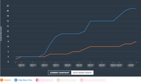
Removing the Meal Plan section increased the overall conversion rate by 256% from .24% to .45%.
Wait What? Removing the section linking to the menu plan page—the revenue generator (leaving only the link in the navigation bar), made the most money?
YES! THIS IS WHY WE TEST.
An additional metric we measured was email submissions. Results showed removing the meal plan section also had 0% impact on the likelihood that visitors would sign up.
Now the question was, what do we do with this information?
Testing Phase #2: Exploit
Phase 2 is all about maximizing the conversion rates of elements already on the page. If a section of your page or site is hurting your conversion rate, get rid of it! If you’ve identified sections that help your conversion rate, look for ways to improve those sections further.
The Client
In this example, the conversion rate did not decline when any of the sections were removed, telling us that no elements below the hero image had any positive impact on conversion rates in their current state…yikes.
To fix things, we started by testing email submissions. With the menu plan removed, it was email’s turn to shine on the page!
We tested different locations and content. We learned a free eCookbook offer was very motivational to visitors, with this information, we were able to create a winning variation that had increased email submissions by 255% and boosted revenue by 67%!
Testing Phase #3: Explore
Once you’ve removed distracting elements and optimized your important elements, it’s time for Phase 3. These are the tests that everyone gets most excited about.
With Phase 1 and Phase 2 behind you, there are logical next steps about what to add to the website. There are three main tests that we use in this phase:
- Redesign Tests – You have found the correct placement & test, now change ONLY the design. Change the color scheme, design principles, fonts, button styling, layout, etc.
- New Feature – Look at new elements that should be added to the page
- Competitor Copycat Tests – Test changes competitors are using that agree with your findings from Phases 1 and 2
With this knowledge there is a very clear direction about what should and shouldn’t be added to the homepage.
The Client
Based off the insights we obtained during our previous tests, we decided to add an element focusing on the incredible recipes to this client’s site. As visitors try more recipes, they are willing to come back and purchase the meal plan. Some of these recipes will be directly from the eCookbook.
Now, what were the end results? This test is still in progress, but given what we’ve learned from previous tests, there is no doubt this added section will have a powerful influence on visitors and their willingness to purchase a meal plan. I’ll let you know once the tests are complete!
Conclusion
The right website testing strategy transforms CRO from a guessing game into a logical, methodical way to improve website performance. Sure, it takes a little more time and planning, but the results are almost always far better.
At Disruptive, we’ve found that using the 3-fold website testing strategy discussed in this article is a great way to avoid the 3 big mistakes most websites make in their CRO efforts and allow us to deliver consistently awesome results for our clients.
By the way, if you’d like some help putting together your own website testing strategy, let me know here or in the comments. I’d love to help!
How do you approach CRO testing? What does your website testing strategy look like? Leave your thoughts in the comments.


