No Traffic? No Problem! 3 Ways to Test Your Low Traffic Landing Page
by Allison Otting • August 24, 2016
In digital marketing, data is king. Facebook is constantly using us as guinea pigs in some of the largest scale experiments in the world.
Unfortunately, not every company gets 1.71 billion users visiting their site on a daily basis. If you’re a small geo-targeted company, or a niche luxury product, it’s hard to get enough traffic to split! And forget about drawing statistically significant conclusions based on A/B test conversion rates.
However, I’ve worked with hundreds of clients that have struggled with low traffic landing pages. While data is the ultimate way to determine what works, there are a few creative solutions that can give you some enlightening data.
Five Second Tests
Five second tests are a simple way to find out how real people respond to your landing page design.
Basically, you show your page (or whatever design you want to test) to someone for five seconds. Then, you can ask them about what they saw and what they remember.
Although it isn’t concrete conversion data like you would get from an A/B test, running a 5-second test can actually give you new insight into how people interact with your landing pages that you can’t get from an A/B test.
After all, no one ever sends you an email after they don’t convert and says, “I was confused by your headline and CTA…I thought this page was going to be about starting your own retail company, but it ended up being a coupon site.”
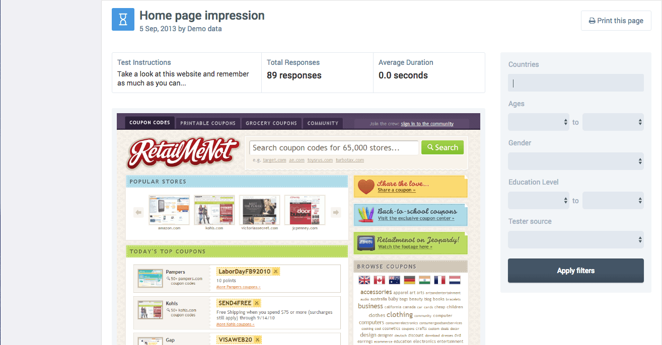
One of the best ways to run a 5-second test is to use UsabilityHub’s original tool. UsabilityHub automates the entire process for you and then delivers a nice little report that tells you what stood out to people about your page.

You can break down results according to demographics (image courtesy of UsabilityHub).
This is a really great way to determine whether the purpose of your page is clear. If someone doesn’t know what you do after looking at your page for 5 seconds, then you probably need to make some serious changes.
UsabilityHub has plenty of other cool tests you can run. Check out their site for more information.
Now, UsabilityHub can be a little slow unless you sign up for a Pro Account ($99 a month at the time of writing this), but there’s also a low-tech way to do this—run your own five second test!
Show your friends, customers, and colleagues your page for 5 seconds, and then ask what they remember. Make sure to ask the same clear questions and document your answers.
But you should know…
While five second tests are a great way to get insights into how people interact with your page, there are some things you should take into account:
UsabilityHub’s system has run on karma systems in the past (you take a test, you get a tester), but they now have a paid tester program. That means the people taking your tests are people looking to make some extra cash or they are other marketers like you.
That means it isn’t very likely that the people looking at your page match your buyer persona.
As a result, UsabilityHub’s testers probably don’t have the same pain points as your target audience and may not notice or interpret elements on your page the same way your target audience does. So, keep in mind that your 5-second test results may not be completely representative of how your actual market interacts with your page.
In addition, 5-second tests occur in a different context than paid or organic traffic. These testers know that they’re part of a test, and will not have the exact same experience as those who are finding you because they typed “Nashville Plumber” into Google.
Because of this, 5-second tests are best used for determining headline, image and UI clarity.
All that being said, if you have a low traffic landing page, 5-second tests can be a great way to learn more about how your page is perceived.
Heat Maps
Heat maps are visual representations of where people’s cursors are lingering or where people are directly clicking on a page. The warmer the color overlay is, the more people are interested in that section of your site!
Even if your landing page doesn’t get very much traffic, you can still use heat maps to optimize your page.
For example, one of my clients helps event organizers find speakers for their event.
Our original paid search traffic landing page focused on the benefits of using their site rather than their competitors (no risk booking, honest reviews, easy invoicing etc.). We then directed them to a form to get them in touch with someone who could find them the perfect speaker.
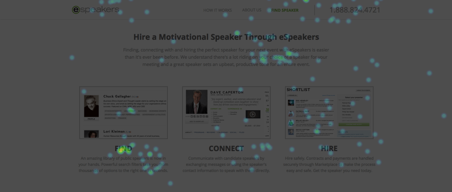
To see what their users were looking at and clicking on, we ran a heat map study. Here’s what we found:
Good news! Lot’s of people were clicking on the “Find Your Next Speaker” call to action…but they weren’t filling out the form.
The question is, why?
For the answer, let’s look a little further down on the page:
It turns out that users were clicking on the “FIND” subhead as well. That presented a problem, since that text wasn’t a link to anything.
So, according to the heat map, people were most interested in the parts of our page that included the word “find.” This told us a lot about our traffic. They weren’t necessarily interested in filling out a form—they wanted to find a speaker!
To address this, we changed the page to clickthrough directly to the client’s directory search, while still presenting the benefits of eSpeakers. We also linked the “FIND” subhead to the directory to make sure we didn’t lose any clicks.
The result? Their conversion rate is 11x higher.
Pretty cool, right? We didn’t have enough traffic to split test, but looking at how their traffic was interacting with their page gave us an insight that we could use to improve our conversion rates.
There are dozens of companies that offer heat maps, so you’ll have to decide which one you like best when it comes to pricing and features.
But you should know…
B2B vendors will try to sell you on the miracle of heat maps, but heat maps are far from perfect.
Heat maps do not track where a user is looking. They only track where people click or rest their mouse.
We wish that we could hack into users’ webcams and track their eyes big brother style, but we just don’t have that option. Tracking eye movement requires a costly experiment with laboratory test subjects.
(image courtesy of indiatvnews.com)
As a result, heat map data can be heavily influenced by one user hovering over one section for a long time. That means your test could come up with some misleading data because one guy realized his dinner was burning.
The only way around this is to know how your heat map tool works and look for strange elements in your data.
In addition, heat maps often work a little differently on mobile, since there is no cursor to track.
CrazyEgg offers scroll heat maps so you can know what full section of your site users are spending the most time on. Always take desktop vs mobile data into consideration.
On Page Surveys
Have you ever started leaving a site, but then had a survey question pop up? Or maybe you were asked a question after you filled out a form?
Remember how I said that people don’t usually tell you why they left your page without converting? On page surveys can help you uncover that information.
Imagine if you were told exactly why someone chose you over a competitor. What would you do if you knew exactly why someone left your site? You could even get people to tell you why they’re visiting your site today.
These data sets are usually smaller because they’re only the opt-ins from your existing traffic, but there is a lot less interpretation involved. You get direct answers to important questions.
There are a lot of great providers for these triggered surveys, but Qualaroo, VWO and Qualtrics are some platforms we’ve worked with in the past.
But you should know…
Surveys give you precious insights, but they can also lead you astray. Look for trends rather than using one opinion to represent all users.
This solution is also really ideal for finding UI problems or missing information. If you want to learn more about figuring out UI issues that could be breaking your site or landing page, check out this post! (you’ll also learn about shark attack statistics).
Bonus (Mandatory) Suggestion!
While all the above suggestions give you data to work with, I have one more tried and true method that we use in low-traffic split tests. Evaluate your lead quality!

It’s a great practice to track your closing rate and the quality of your incoming leads.
As a business owner, lead quality tells you if your marketing is actually making a difference and it can keep your agency in check (they can’t hide behind vanity metrics like clickthrough rates).
If you have two very different landing pages, start tracking what leads are coming from which variants. You could be getting slightly more conversions from variant A, but a higher close rate on leads from variant B could mean a higher profit.
Testing Low Traffic Landing Pages
If your landing pages don’t get a lot off traffic, it might be hard to pull off a classic A/B test in a reasonable time frame. However, that doesn’t mean you can’t test a low traffic landing page.
Using 5-second tests, heat maps and on page surveys, you can learn a lot about how people interact with your pages without creating a single variant!
Incidentally, if you’d like me to take a look at your traffic and landing pages and give you some recommendations on how to improve your conversion rates, let me know here or in the comments. I’d love to help!
Not sure how to effectively test your landing page? Let me know in the comments, and maybe I can give a couple suggestions.


