The Foolproof Formula to Craft Crazy Effective CTAs
by Ana Gotter


When people visit your site or see your ad, what do you want them to do? The answer probably depends on which page of the site they’re viewing or which ad campaign, but it will always be true that all your marketing content and copy has been created for the purpose of inspiring action.
And, when it comes to inspiring action, no copy is as essential as the CTA.
Calls to action (CTAs) are snippets of concise copy that tell customers exactly what you want them to do. Phrases like “shop now” or “contact us” often provide the framework of the CTAs. And having the right CTAs is essential, especially when you consider the facts:
- Adding a single CTA to emails increased clicks by 371% and increased sales by 1,617%
- Adding CTAs to your Facebook Page can increase CTR by 285%
- More than 90% of visitors who read your site headline will also read your CTA
Clearly, you need an effective CTA to increase conversions and drive sales. In this article, we’re going to go over everything from the language you should use to suggestions for where it should appear on your site, and how to tweak it depending on how you’re using it.
What Type of Language Should My CTA Use?
Placement and design can heavily influence the effectiveness of your CTA, but the biggest factor in how well it works will be the language that you use.
There are several things that you want to do when writing CTAs:
- Be exceptionally concise. You want to tell visitors exactly what you want them to do without creating distractions.
- Use direct action verbs like “stop,” “start,” “join,” “try,” “contact,” and “shop,” and “learn.”
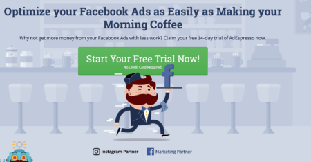
- Incorporate low risk/high reward framing, like “Start your free trial now.” This shows customers that they’re getting something for free with no risk or cost to them. “Learn More” is also a good CTA that offers low risk and no pressure for customers.
- Be conscious of positive or negative framing. You can say “Ready to start increasing your conversions? Learn how we can help!” The negative version of this CTA, which is the negative framing, would be “Sick of leads slipping through the cracks? Learn more about how we can help.” The latter would probably be more effective. For negative framing, words like “worried,” “confused,” and “frustrated” are all good places to start.
- Use first person (me) or second person (you). Both of these options work well, and “start your free trial” or “start my free trial” both get the point across. By using first and second person, this makes the CTA more personal- even if it’s not. I’ve had good luck with both and personally prefer the second person for CTAs, but ContentVerve saw an enormous 90% increase in CTR by using first person phrasing on their CTAs.
As you craft your CTA, remember—the right language can have a huge impact on how people respond!
Introduce the CTA with the Right Benefit
Now, think about the goal that you want to accomplish. Do you want to increase conversions, have customers sign up for a lead magnet, or get them to contact you?
Next, ask yourself, what would motivate someone to do what I want them to do? The answer is your CTA.
Two examples of this might be:
- By contacting a marketing firm, they’ll get more conversions: “Sick of your conversions falling flat? Learn more about how we can help you.”
- By downloading your eBook on freelancing, they might learn how to pitch more effectively and get more assignments: “Land more work than ever with my top 10 pitching secrets. Download your free eBook now.”

Sometimes, the CTA format will be too short to get this full benefit/action instruction across. Even if your actual call to action isn’t completely descriptive of what people get for converting, your CTA should still be focused on how converting benefits them, not you.
Tweaking Your CTA
A CTA placed at the end of your blog will look very different than a CTA placed in a button or on a small widget in your site’s sidebar, even if you’re trying to accomplish the exact same goal. It’s always a good idea to start by writing out the most short-form CTA possible, and then expand it to meet other needs.
Here are a few different types of CTA to consider:
CTA Buttons
Well-designed sites should have custom, clickable CTA buttons instead of just hyperlinked text. Many PPC campaigns will also give you the option to do add CTA buttons.
These CTA buttons can help drive results significantly by capturing the eye and offering a definitive “click here to [complete action].” You can’t get much more to-the-point than that. It’s probably why Copyblogger found that CTA buttons increased their clicks by 45%.
The biggest challenge of clickable CTA buttons is that they don’t give you a lot of room to play around with. The longest you can go is something like “Start your free trial!” Because of this, you’ll need to use the text around the CTA to explain why you should click, like what we did here on our home page of Disruptive Advertising.

The CTA buttons themselves should have minimal text. This is important. Nobody wants to click a button that’s twelve words long, and it won’t look great on your site either.

“Contact Us,” “Learn More,” and “Sign up now” all do exceptionally well because they look good and they’re direct. Use the copy around them to explain why users should take action, and you’ll be good to go.
Long Form CTAs
Long form CTAs are perfect for landing pages, in blog posts, or on certain pages of site copy. You have more than a few words to get your point across, and it can even stretch across two sentences. In some cases, like the end of a blog post, you can even an include an offer like free shipping or a discount code.
We’ve already seen examples of this earlier up, where you can ask a question or setup a scenario as a lead-in for the CTA. Like your formal CTA, these introductory statements can be either positive or negative.
You may use a negative framing on your home page to really grab users attention right away, but use positive framing on certain blog posts because you know that readers who got the end will have warmed up to you some (hopefully).
Some (very made up) examples include:
- “Ready to impress your friends and family with this stellar recipe? Purchase the Cuisinart Icecream Maker today and get free shipping!”
- “Frustrated with your crappy boss and annoying coworkers? Learn more about how MortgageOne can help you launch your small business today.”
- “Never miss a chance to get the latest steals and deals. Sign up for our newsletter today!”
Although these longer-form CTAs may not be quite as to-the-point as a button CTA, they do a great job of tying your existing content to a natural call-to-action.
Where Should I Place My CTAs?
Ideally, you’ll have multiple different types of CTAs in plenty of different locations. Landing pages, for example, often have at least two CTAs- one above and below the fold. Every single PPC ad should have them, and you should always have a CTA button enabled for your Facebook Page.

When it comes to your site, identifying the best placements will increase their effectiveness even further. It’s the last step in the formula to maximize its efficiency. While your specific placement may vary depending on the layout of your individual site, Grow & Convert released some great information about the estimated conversion rates for different locations of CTAs. Here’s what they found:
- Sidebar: 0.5 – 1.5%
- Generic, end-of-post: 0.5 – 1.5%
- Pop-ups: 1 – 8%
- Sliders and bars: 1 – 5%
- Welcome gates: 10 – 25%
- Featurebox: 3 – 9%
- Navbar: varies
Obviously these numbers have a lot of leeway; 1%-8% is a pretty big stretch. They do show, however, that having your CTA front and center on your site in some form will give your CTAs the most potential to drive conversions.
In general, make sure that your CTA immediately follows copy that tells them why they should click. Answering the “why” before the “how” will work in your favor. You should also ensure that your CTA stands out (using colors like red, orange, or yellow can help with this), and that it isn’t surrounded by a ton of clutter on your site.
Conclusion
CTAs are an essential part of marketing copy, which is why plenty of social media PPC platforms actually use built-in CTA buttons to increase conversions.
Using our foolproof formula, you can create your CTA and tweak it for every placement it will go to. Keep in mind that split testing will always work in your favor to help you identify what works best for your business and your audience.
What do you think? What are the biggest challenges you’ve had when creating your CTAs? Which strategies do you use to boost clicks and conversions? Let us know in the comments below!