
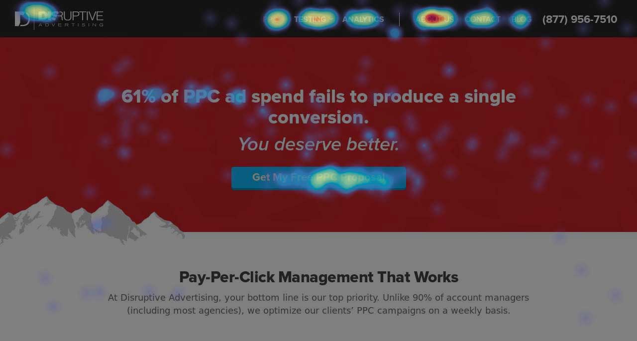
4 “Guaranteed” Ways to Improve Your Conversion Rates
by Chris Dayley • August 30, 2016


One question I get asked quite often is, “Are there tests I can run on my site that will guarantee that I see a lift in conversion rates?”
The answer I most often give (out of necessity) is something like this:
“There is never a way to guarantee that a test is going win. But, if you use best practices from your industry and learn from tests that don’t win, you will eventually be able to guarantee that your testing process generates a lift in conversion rates.”
Sounds like a political answer, right?
The truth is, while there may not be certain tests that will guarantee results, there are principles that always work. You just have to find the right way to use them with your audience.
During my latest webinar with SEMRush I highlighted how several of these principles could be used to improve the performance of existing sites.
You can watch the webinar here:
However, I wanted to go into a little more detail on some of these principles. With that in mind, let’s take a look at a few key principles you can use to guarantee improvements in conversion rates over time.
1. Make the Next Step Obvious
If you think about it, your potential customers really don’t know what they are supposed to do on your site. They come to your page for a specific reason, but then it’s up to you to convince them to convert.
But, if you want people to convert, you need to make it clear what they need to do to convert.
Unfortunately, very few sites do this well—and a big part of this problem starts with your designers.
Designers love to design things that match. I mean they really love it.
9 out of 10 sites I have worked with have some version of the following on their site:
- A color pallet or “brand colors” that include 3 or 4 colors that are used throughout the entire site.
- Most of these colors are neutral colors, like grey and blue.
- Headlines, buttons, links, and designed graphics will all use the same color
- Nothing really contrasts the design, or jumps out and says “look at me!”
Here is an example of the above from a site I audited in the webinar:
Looks nice, right?
There is one big problem though—nothing stands out on this page! If I gave this page a quick 2-3 second glance, it would not be immediately obvious to me what I should do or click on.
If you’re wondering whether or not your site does a good job of clearly communicating what you want people to do, open your page, get up from your computer and stand about 10 feet back from your monitor.
Can you easily tell what to click on?
Our brains are attracted to contrasting colors. If there is no color contrast, visually everything looks the same to our brains, so we are forced to try to read to figure out what to do.
That sounds awful!
Even if you want your users to read your copy, you need to make it easy for people to pick out what is important in your text. When our brains feel forced to read to figure out what to do, it’s frustrating…and guess what? Frustration is not good for conversion rates.
Here is an example of a test we ran where using color contrast to our advantage made a HUGE impact:
The original version of the page looked nicely uniform, but the actual form was hard to find on the page. So, we tried making the form orange instead.
Making the form more obvious increased form completions by 146.2%!
Don’t worry about what you think your “brand” colors should be. Branding is important, but if people have a hard time converting on your site, your brand isn’t going to mean a whole lot.
2. Put the Right Content on Your Page
I have news for you—if your audience feels like they have to use the navigation to find the page they want, you have a problem with your site.
You should know your audience well enough to know what 1 or 2 pages are the next best step for them in their customer journey. That next step should be the call to action on your page.
If people are frequently using your navigation, that means they are having a hard time finding what they were looking for. On Wikipedia, this isn’t a problem.
In marketing, it means something is wrong with your landing page.
Sometimes, what you think your audience needs to see next isn’t what your audience really wants. If you’re not sure what the right next step is in your customer journey, pull up your analytics reports or run heat mapping on each page of your site and figure out where the majority of your users head after they land on your page.
Don’t send them where you want them to go next—send them to the page they want to see next.
For example, here’s a heat map we gathered from one of Disruptive’s landing pages. Look at where the majority of our traffic was clicking:
A number of people were clicking on the “about us” link. What did that tell us? People are not getting enough information about our company on this page to make a decision.
To address this, we have a couple of options:
- Add a small section of “about us” content to the page.
- Put a button on the page that takes them to the about us page. That way, they don’t feel like they have to search for the answer they are looking for.
I think this goes without saying, but the longer someone has to spend searching for the content they want, the less likely you are to convert them.
3. Make Your CTA Easy-to-Find
Every page on your site should include an obvious call-to-action (CTA) that takes the user to the next step in the customer journey.
Now, there are times when putting your CTA in a less obvious place can help your conversion rate, but in general, the more obvious your CTA is, the more likely people are to convert.
This is especially true for eCommerce-type companies, where the whole point of the page is to get someone to make a purchase. If you make it hard to figure out how to buy, people won’t be completing many transactions.
Here is a test we ran for a client on a checkout page—all we did was get the full form above the fold!
In the original, the form is so long that the CTA is way past the fold.
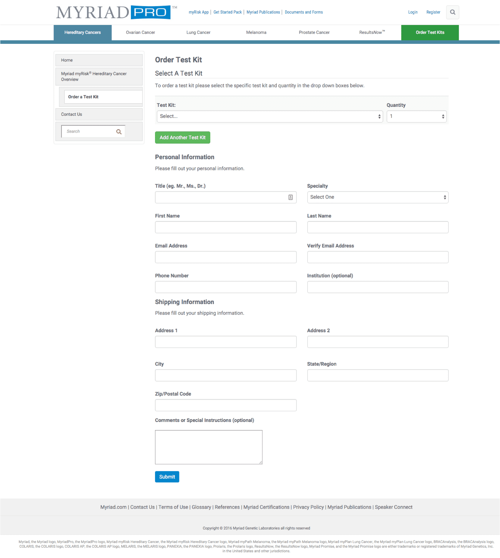
So, we changed up the form to make it fit above the fold…
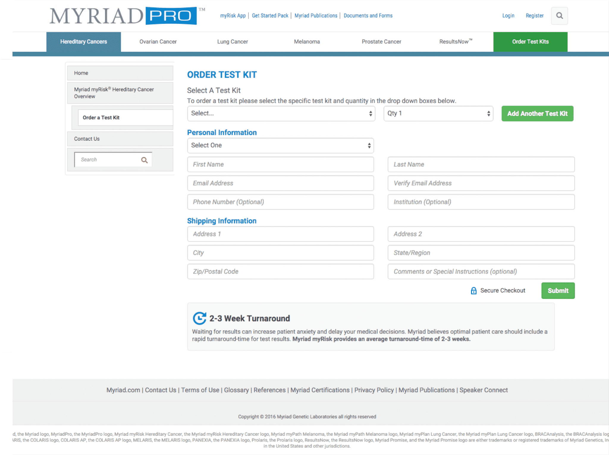
…and their test kit order rate increased by 61%!
It’s not that people don’t scroll on websites—they obviously do. It’s that people don’t like feeling like they have to scroll on a page to find what they are looking for.
For most businesses, the CTA should be the first thing people see on a page. This gives them the reassurance that they already know what to do.
Of course, if they need more convincing, the rest of the page is there to help them make the decision, but at least they know what they are deciding to do (or not to do).
4. Remove Distractions
Anything you see above the fold that isn’t related to the main reason people came to your page is a distraction.
These can take many forms, but the most common offenders are things like “related offers” on e-commerce sites, promotions that are displayed sitewide, ads, links to other pages or sidebars.
For example, here’s a page from a site I recently reviewed. See how long it takes you to spot the call to action:
Why are these distractions so harmful to conversion rates?
Again, our brains love, even crave simplicity. Whenever our brains feel like they have to engage at a higher level to figure out what to do, we get frustrated.
Many times when I ask business owners why they have distracting content on a page, there is very little thought behind it. It’s usually something to the effect of “Oh, it’s just part of our site template” or “I wanted to make sure people saw this” or “what if people don’t want whatever the main offering on the page is?”
But remember, your traffic is on your page for a reason. If you think people might also be interested in something else you offer, mention that offer further down the page.
Your above-the-fold section should be reserved for the main offering of the page, whether that is content, or a call to action (add to cart button, form, link, etc…).
Conclusion
Anyone who guarantees that a specific test will improve your conversion rate is selling you something. However, when coupled with a solid testing strategy, there are several site optimization principles that you can use to reliably produce results.
In this article, we’ve talked about some of the most common reasons for poor conversion rates. Fortunately, with a few tweaks, you can often get your page put together right and delivering the conversions your business needs.
By the way, if you’d like me to take a look at your site and give you some ideas you can test out, let me know here or in the comments. I’d love to help!
What are some other common CRO mistakes you see companies make?


