4 Key Differences Between Homepages and Landing Pages
by Sarah Rodriguez • July 28, 2015
You hear the term “landing page” often, especially when delving into digital marketing. But what is a landing page and how is it different from your company’s current site?
Working in the CRO industry, I get this question a lot. Although landing pages might seem almost identical to a regular homepage, there are some key differences that make them important to your digital marketing campaign.
The purpose, goals and often even the traffic source of a landing page are different from those of a homepage, so it’s critical to make sure that you optimize both for their intended purpose. To do that, you have to understand how the two differ in 4 key areas.
1. Audience/Purpose
The first major difference between your home page and your landing pages is your audience.
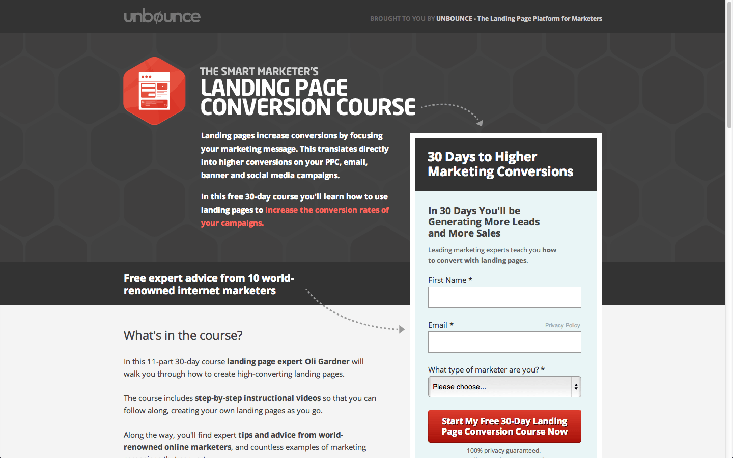
Landing pages are exactly what they sound like. It’s a “page” someone “lands” on after clicking on one of your ads. Here’s an example landing page from Unbounce, the landing page experts.
Specifically with paid search ads, the viewers of your landing page have already shown interest in your company or product. For example, someone might search for “Car Repairs in (your city)” and then click on your paid search result.
You know this person is looking specifically for car repairs in your area and so you can assume they are further down the sales or conversion funnel than someone that happens upon your site organically.
With these digital ads, you can target certain demographics who are more likely to convert. This means your landing page needs to be tailored to this type of audience. They are less likely than organic traffic to be simply exploring your site, so your landing pages should only show them the information and content they are going to need to push them to converting.
That being said, you don’t want your traffic to feel ambushed, but you can get away with a lot more selling on a landing page than you can on your homepage.
2. Links
Landing pages only have one goal: convert traffic. Homepages, on the other hand, have to wear a lot of hats.
For example, on a typical homepage, there is usually some sort of navigation bar up near the top. There might also be several more site links in your footer, or social media links on your blog. You need all of these links to help your visitors get to where they need to go or interact with your site in the way you want.
On your landing page, however, you shouldn’t have any of these links. Keeping your viewers on your landing page until they convert is your main goal, so you should try to avoid these potential distractions.
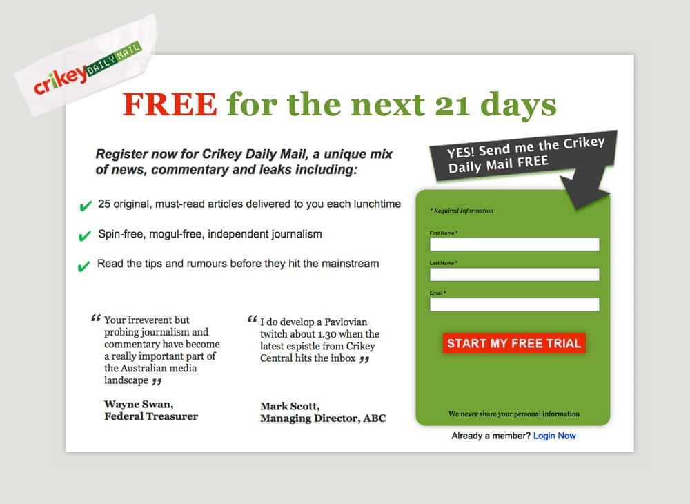
Here’s a great example of simple and effective landing page that gets right to the point. There are really only 3 options: 1) Convert, 2) Login, or 3) Leave the Page.
Think of it like this. Say you have links to your social media accounts up at the top of your landing page that show off your 10,000 page likes. This is helpful social proof that encourages your visitor to convert…until they actually click on your Facebook icon.
Your visitor heads to Facebook to check out your page; but, as soon as they get to Facebook, they see 2 new friend requests. In that instant, you’ve lost them. Suddenly, that visitor you worked so hard to get onto your landing page is now scrolling through their Facebook feed and they’re unlikely to ever give your site a second glance.

It’s best to find ways to give your audience the information they need without taking them off the page. For a long page, you can have a nav bar that scrolls them to the correct section of your landing page or show off your social media follower count directly on the page.
If there is a reason that you absolutely need to link to another page (eg. Privacy Policy) try using a lightbox function or at least have the link open in another window or tab. By limiting the options on your landing pages, you improve the odds that your page will do what it’s supposed to: convert.
3. Content
Although you might use some of the same information you put on your homepage, a landing page should only have content that is specific to the offer, product, or service that you are trying to promote.
Unlike organic traffic to your homepage, you know what ads and search terms brought your visitors to your landing page. As a result, your landing page should be specific to those searches or ads.
For example, you are a company that sells all types of fruit. Someone searches for “bananas” and clicks your ad. Now, instead of taking them to your home site where you are showing off the many types of fruits you offer, you should be pointing these ads to a landing page specific to bananas. Why are your bananas the best? What type of offer do you have for banana sales specifically?
Similarly, if you are a law firm who works on a variety of cases, but someone is looking for legal copyright services, make a landing page with content based on your experience with copyright law. The person who clicks on your ad doesn’t care about your trademark defense services, so don’t distract them with irrelevant content!
Ideally, your landing pages should be set up so that someone who clicks on your ad arrives at your page and thinks, “Yes! This is exactly what I was looking for!”
4. Call-to-Action
One of the biggest difference between a homepage and a landing page is that a landing page is action-oriented. In other words, landing pages should have some type of Call-to-Action (CTA) that encourages your viewers to convert.
A CTA can be anything from filling out a form to calling a phone number or even plain buying your product. But, regardless of what your CTA is, it needs to be obvious and straightforward. For example, “Get Your Free Evaluation!”, “Call Us Now!” or “Get Started Today” are great examples of CTAs.
Often, having a specific offer associated with the CTA helps to boost conversions. So, instead of “Call Us Today”, try something like “Call Today for 10% Off”. This makes your audience feel like they are getting something in return for their info and incentivizes them to act now.
In contrast to landing pages, your homepage likely does not have a strong and prevalent CTA (which is perfectly ok) because it’s mostly used as a resource. Landing pages, however, should set themselves apart by visually and verbally driving your viewers to convert.
Conclusion
You might be able to say that it all comes down to focus. Your homepage has lots of info, lots of sources and lots of links. The purpose of a company site is to provide plenty of information and resources to potential customers.
A landing page has a specific message, relevant content and is tightly focused. Its purpose is to convert, whether that means generating leads, prompting phone calls, increasing sign-ups or initiating an online chat with potential customers. In other words, a landing page is a simplified and more concise version of a homepage with a specific call-to-action.
Although homepages serve many critical purposes, landing pages capitalize on the specific audience targeting and conversion tracking options available through paid search, making them a crucial part of pay-per-click and other digital advertising methods.
If you’re interested in trying out a landing page for your site or in having Disruptive set up some high-converting landing pages for your company, click here or leave me a comment below!
Now it’s your turn. How do landing pages contribute to your online presence? Have they worked well for your site?


