Can You Trust Your A/B Testing “Sixth Sense”?
by Chris Dayley • July 5, 2016
I’m often shocked at how confident people are in their A/B testing “sixth sense.”
I hear it almost every day—from clients, friends, business owners, designers—everyone tells me that they know what site elements will drive the most conversions.
In fact, a lot of these people tell me they have a pretty good “sixth sense” or gut feel for what is going to work best. Some tell me that years of experience have led them to “just know” what is going to work.

The truth is…most of them are full of it.
To prove this, a little over a month ago I ran a fun little experiment while speaking at Searchlove in Boston.
Here’s what happened:
The “Sixth Sense” Experiment
After hearing so many “conversion experts” talk about their UX “sixth sense”, I devised a simple experiment to see how well marketers could predict the winner of a test.
Recently, I had run a successful test for a client that had increased form completions by 146.2%.
I knew which version of the page was the winner, but I decided to ask the audience which variant they would pick to win.
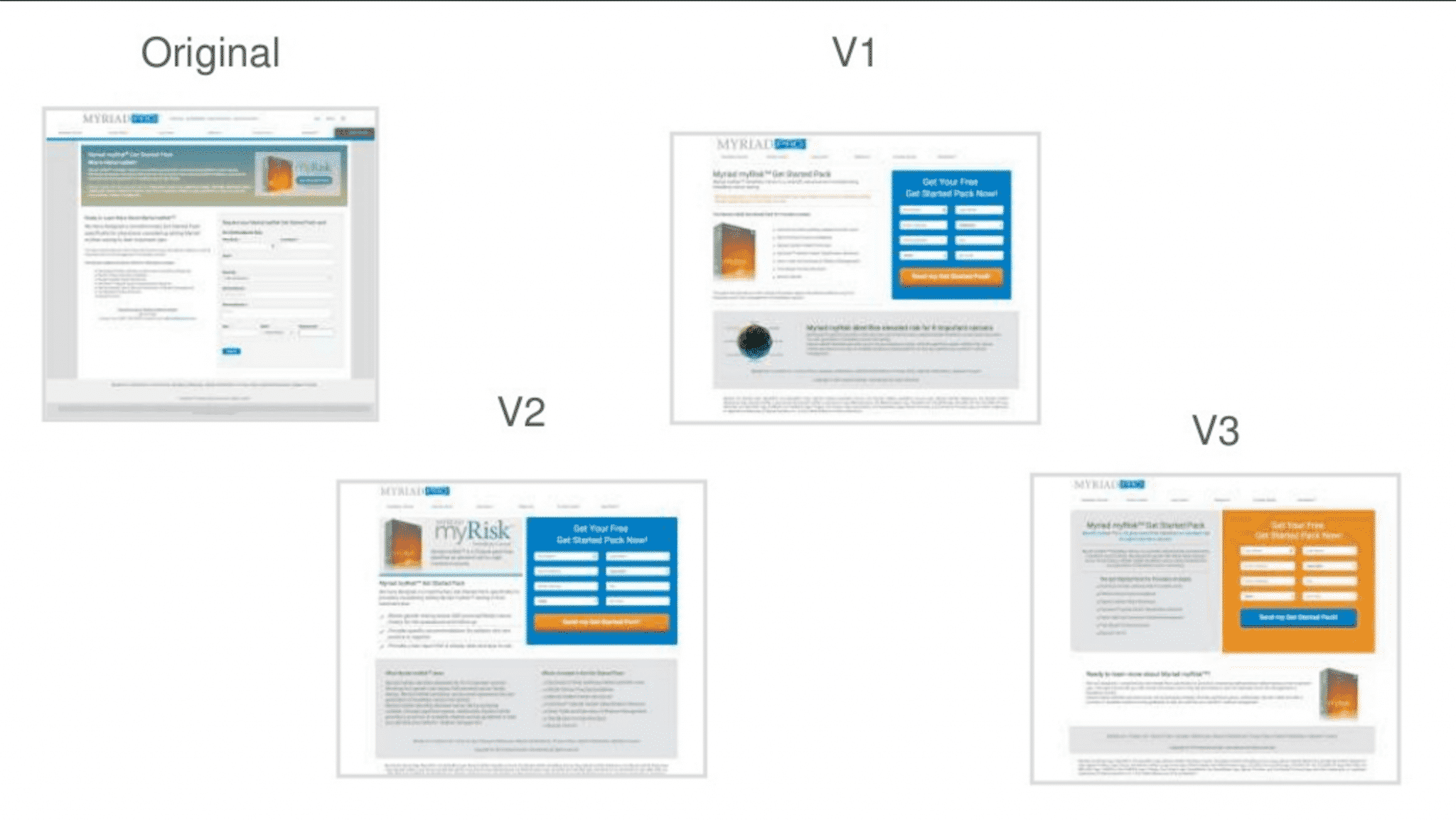
I gave the Searchlove audience a link to a survey, which contained the following page designs—all they had to do was guess which design was the winner!

Simple enough test, right?
Here were the results:
- Original: 0%
- V1: 32%
- V2: 42%
- V3: 26%
Now, only one of these pages actually improved form completions by 146.2%, so clearly that vaunted “sixth sense” wasn’t all that accurate.
But that’s not the whole story.
Unbeknownst to my audience, I was running an A/B test on them.
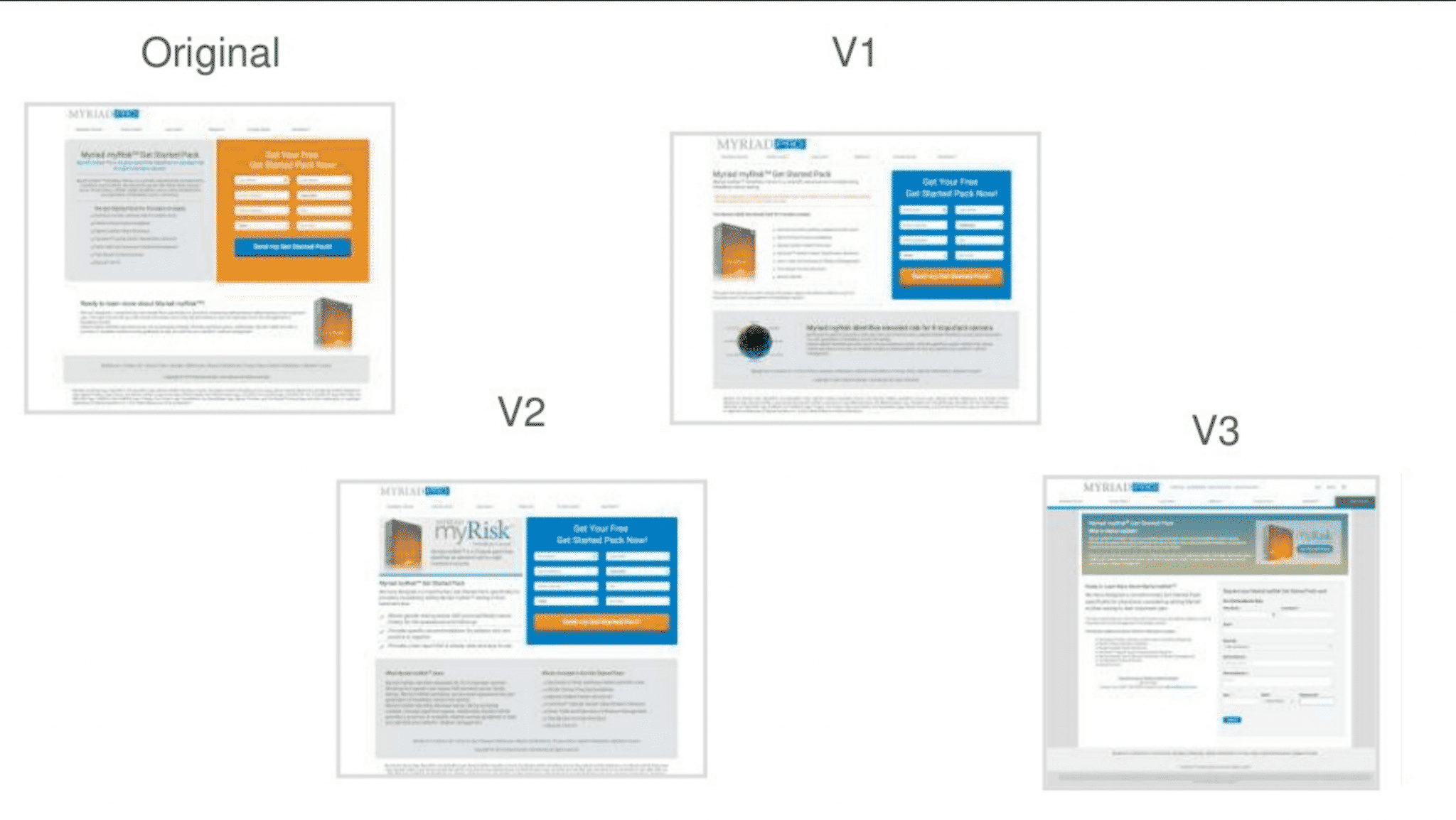
Half of the people who clicked on my link were sent to a variant page, where I had changed the images a bit.
On my variant survey page, I swapped the client’s original page with the third variant we built for them.
So, instead of looking like this:
 The survey looked like this:

Here’s how the people who ended up on this page voted:
- “Control”: 0%
- V1: 14%
- V2: 66%
- V3 (real control): 20%
In both cases, V2 was the all around winner (42% of the votes in the first group, 66% of the votes in the second group).
But the thing is, V2 wasn’t the top performer…
What Happened?
When you look at those results, you might be surprised…or you might just bust up laughing. I know I did.

The question is, why did people choose what they chose?
Selective Perception
Clearly, people were biased against the control, because the control didn’t get a single vote in either group.
At first, that surprised me, but then I realized that this was a clear cut case of selective perception.
I hadn’t told my audience that the control couldn’t be the winner, but because I was a testing specialist, they automatically assumed that the winner must be one of the variants.
After all, why would I show a case study where I didn’t improve things?
It’s a logical assumption, but a flawed one.
Unfortunately, this sort of selective perception is a very common problem amongst testing “experts.” As humans, we assume that newer is better.
So, if an alternative page design incorporates new features (video hero shots, flat art, minimalistic design, etc), most marketers will assume that it will perform better.
Similarly, if a variant design follows “best practices” and incorporates new elements (“better” call-to-action, shorter page, more engaging content, etc), most marketers will assume that your page will get more conversions.
But are those assumptions grounded in fact?
Sure, a beautiful, modern, best practice-worthy page might earn you a spot on a beautiful pages-type blog post, but you don’t need your page to make other marketers happy—your page needs to make your target market happy.
But, if you ask a marketer what kind of page will perform better, he or she will probably pick the newer, best-practice compliant page.
In other words, most people assume that the pages they like will do better. After all, if they like it, everyone will like it!
False-Consensus Effect
Sadly, as smart and experienced as we might be, we all fall victim to something called the false-consensus effect. Basically, we believe that other people perceive the world in the same way we do.
If you love making lists, you assume everyone would be better off with a good list system. If you take problems head-on, you assume that others will be upfront with their concerns. If you find chatter distracting, you assume that noise must decrease everyone’s productivity.
If a certain approach to web design tickles your fancy…that approach must be best for everyone!
Now, to be fair, as adults, we know that that not everyone shares our perspective, but the false-consensus effect still taints our thinking.
I mean, people can’t really be that different, can they?
Unfortunately, people are very different, so you can’t use your own opinions and experiences to predict what will or won’t work for your audience. Experience helps, but even experience is tainted by your individual perspective.
As a result, the only reliable way to know what your audience responds best to is through testing.
Are You Guessing or Testing?
With all of this in mind, let’s address one final problem with making marketing decisions based on “sixth sense” intuition: Most marketers test their guesses.
Because most marketers believe so strongly in their gut instincts, even marketers who conduct routine tests often base their tests on what instinct tells them their potential customers want.
In other words, they don’t have a testing strategy in place—they are just testing their guesses.
Is it any wonder, then, that only 1 in every 7 A/B tests is a success?
Intriguingly, a 1 in7 success rate means that 86% of A/B tests fails to yield meaningful results. In my test, only 13% of marketers successfully predicted the winning page.
So, if I had to pick a number, I’d say that most people’s A/B testing “sixth sense” is wrong 86-87% of the time.
But the thing is, your audience is telling you what they want with each test—you just aren’t listening!
As a result, you leave your target customers wondering:

So, if you really want to optimize your website, you need to listen to what your data is telling you—not your gut instinct.
Instead of relying on that testing “sixth sense” to determine what you are going to test, create a testing strategy. Decide in advance what you want to learn with each test and then use what you learn with every test to guide the next test.
There’s nothing supernatural about effective marketing, it’s just good old fashioned science.
Conclusion
Most marketers—even testing “experts”—can’t predict exactly what changes to your site will improve your conversion rate. Their “sixth sense” simply isn’t that good.
That being said, your marketing instincts have their place—they can be a great way to come up with new testing ideas! However, if you really want to get results from your website testing, you need to prove those ideas with science.
By the way, if you’d like to talk to me about your testing ideas or approach, let me know here or in the comments. I’d love to help!
If you’ve read this whole article, you’re probably curious which variant produced the best results. Tell you what, tweet me at @chrisdayley about this article and I’ll tell you!


