Should You Try a Long Landing Page?
by Andrew Maliwauki


Chances are you’ve either attended a conference, watched a webinar or read an blog article that told you specific, sure-fire ways to improve landing page conversion rates.
While many of these ideas are helpful (especially if you’re new to landing page design), if you’ve been building pages for a while, you know that there are no “hard and fast rules” in landing page design.
In particular, one of the most popular recommendations is to keep your landing pages short, sweet and to the point. This advice certainly works for a lot of companies, products, and services, but this idea doesn’t apply to every page.
Let’s go over some of the most common misconceptions in landing page design to see if you should test out a long landing page.
1. Above the Fold
Naturally, let’s start at the top: what do you absolutely need above the fold in your header?
A) To Scroll or not to Scroll?
One of the biggest myths in landing design is the idea that all your most important content must fit above the fold. That way, no one misses a beat when your page loads up.
This sounds logical, but the truth is, studies show that the overwhelming majority of web users naturally scroll on most websites. That means what you show “above the fold” isn’t nearly as important as most marketers think.
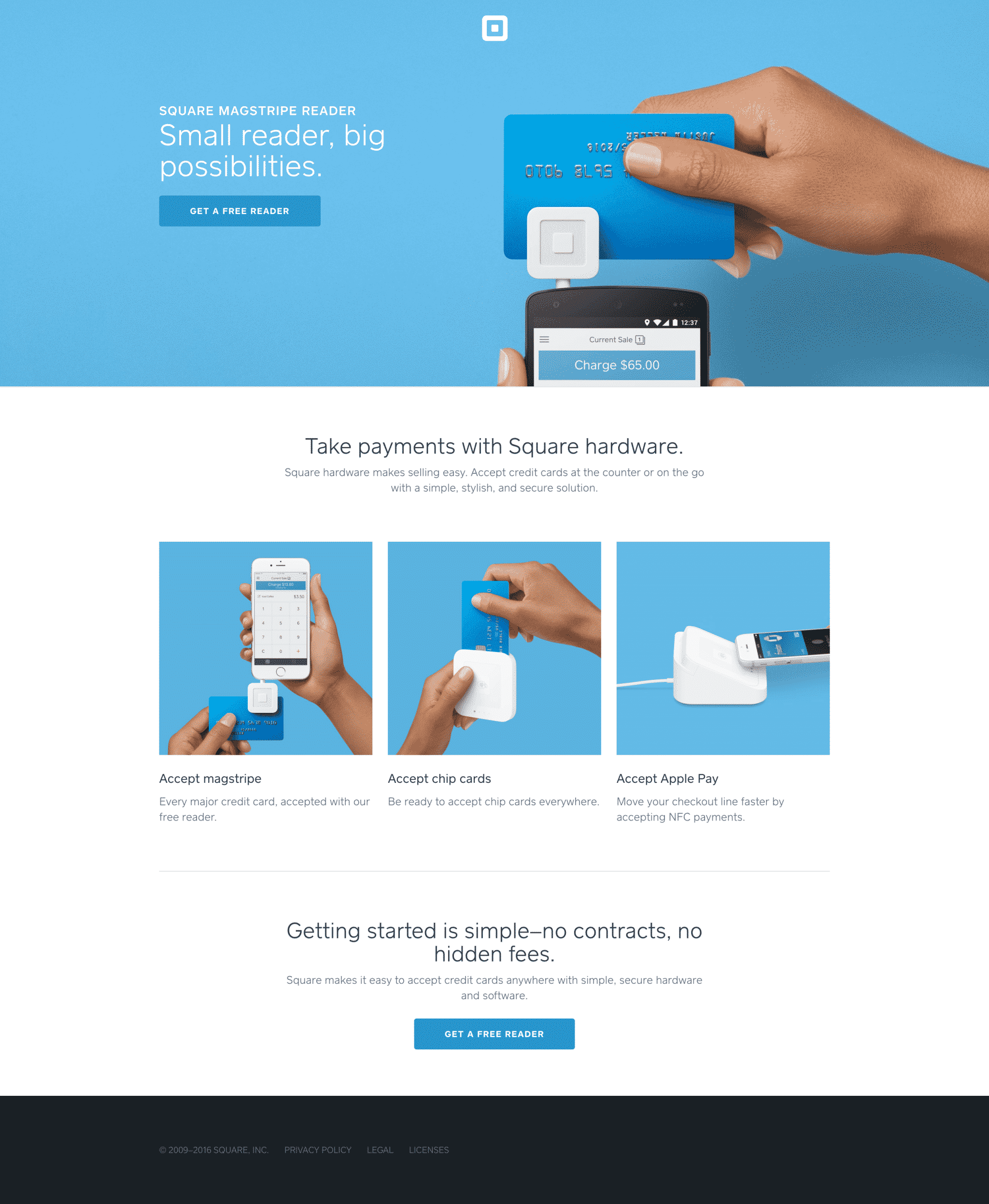
With a product or service that is simple and straightforward (like Square), chances are you can get away with just giving a short, benefit-driven explanation of why the product is amazing and a CTA or form.
On the other hand, a more complicated product such as custom accounting software may need a little more explanation to really sell the idea to potential users.
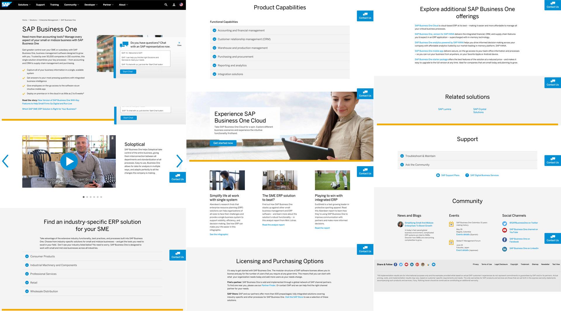
Wow. That is a long landing page.
Keeping your audience in mind while creating your page will help you determine how much content to include above the fold.
In addition, what you know about your audience will help you decide whether or not you should place your CTA or form above or below the fold.
Put yourself in a prospective customers shoes. What would you need to know to feel comfortable buying?
Once you know that, you’ll have a good feel for what you need to include on your page.
B) The Hero Shot
A picture is worth a thousand words and often times finding the right image can make or break your landing page.
Your hero shot should do a few things within seconds of loading up:
- It should convey a sense of how the product or service is used.
- It should help viewers understand how your offer will make their lives better.
- Your target audience should self-identify with the image (in other words, they should think, “Yes! That’s me!”).
As a result, choosing the right hero shot is often one of the toughest parts of creating a new landing page.
You typically only get one chance to make a first impression—with a solid hero shot, you can immediately connect with your audience and save a lot of space on trying to communicate the same ideas in your body text.
C) Header / Nav Bar
Finally, you should always have a concise and useful nav bar on all of your landing pages.
Whether it’s fixed or static, providing easy access to key elements of your page with smooth scroll links and a simplified CTA can go a long way to reinforcing the message of your product or service.
As a general rule of thumb, I use headers that are as thin as possible in order to save as much screen real estate as possible.
2. The Body
We hit on this idea in the previous section, but now let’s dig into how much content to include on the whole page—not just “above the fold.”
Landing page length can be a tricky thing, as too short of a page may seem sketchy to some users and an overly long page won’t get read.
The solution? Make your copy an engaging, non-stop thrill ride of well-presented information.

Okay…so that’s not exactly what we’re after.
It goes without saying that the attention span of the average web browser is pretty short, and if you can’t get them reeled in within seconds, then you’re probably dead on arrival.
To avoid this, avoid the typical kiss of death: long, imposing paragraphs of text.
Instead, find ways to break up your content with either real images or useful illustrations and graphics that make your content more visually appealing.
Giving your copy a more infographic feel not only looks better, it also makes data, statistics and other information much easier to absorb and understand in a reasonably short amount of time.
That being said, keep in mind that more expensive products or services typically need more information to convince your audience that your product is legit and worthy of spending their time and hard-earned cash.
3. Wrapping Things Up
With the bulk of your content now laid out in a spectacularly visual and engaging manner, you can now focus on driving your last point home.
Try and summarize everything you’ve shown in one to two sentences, add a call-back CTA and make it stand out!
Chances are, your average visitor isn’t going to scroll all the way back up and review your content (unless it’s just really that good) so make sure you finish on a high note!
Conclusion
Hopefully, these tips will not only help you create more engaging, higher converting pages but also reinforce the idea that these are simply things to try, not magic bullets.
As with anything in the realm of digital marketing and advertising, testing is the name of the game, so find out which method or idea works best for you and run with it!
By the way, if you’d like me to take a look at your product or offer and give some recommendations on landing page length and content, let me know here or in the comments!
Let’s hear your ideas now: what have you noticed with your landing page length tests and how did you solve drop-off rates? Sound off in the comments below!