How the Automotive Industry Uses Landing Pages
by Brandon Weaver • March 17, 2016
The automotive industry covers a wide range of products and services, including things like insurance, rental cars, body shops and mechanics, equipment leases, the classic buying and selling, along with many others.
To compete and stay on top of your competitors, PPC advertising can be a very effective way to market your automotive business (but often expensive and waste of money if you’re not doing it wrong).
However, creating great ads in your pay-per-click account is only half of the PPC advertising equation. The other half is where you send people who click your ad.
But it’s not just about Google AdWords or Bing Ads. Brands in the auto industry continue to use social media ads, email marketing, etc. to generate brand awareness and new business.
Regardless of where your traffic comes from, if it isn’t going to a dedicated landing page, you’re going to struggle to drive conversions.
Why Landing Pages are Important for the Automotive Industry
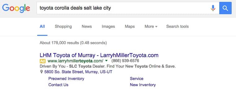
To illustrate this point, here is a search query for “Toyota Corolla deals Salt Lake City:”
When I click the ad, I land on this page:
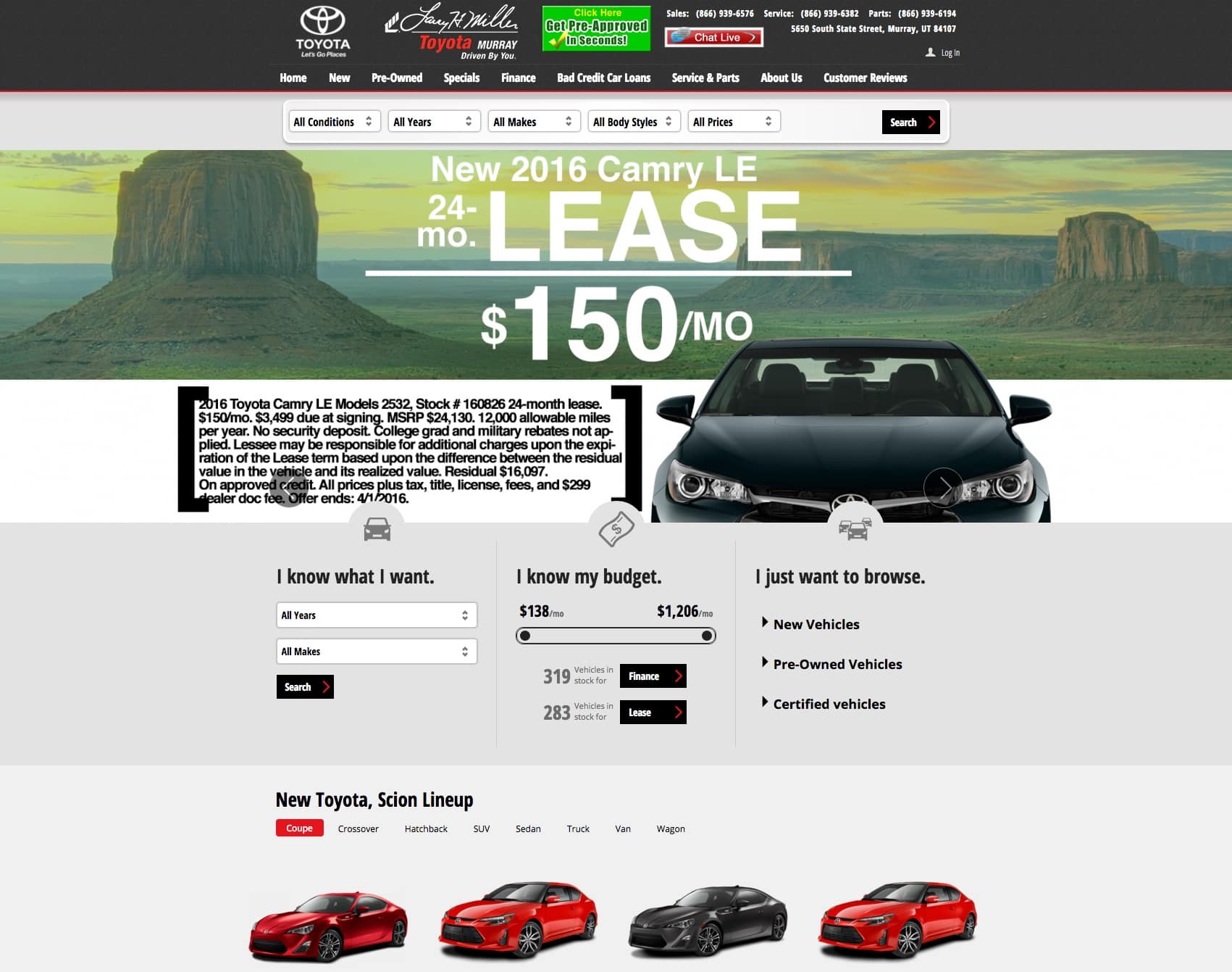
Yikes! We just ended up on Larry H. Miller Toyota’s homepage—complete with a rotating slider image.
Where is the Corolla I was looking for and what deals do they have to offer me?
Can’t seem to find that Corolla, but I do see information about the Camry, the Scion, how to search for new and pre-owned vehicles, and drop-downs galore.
Huh?
There are too many choices for me to consider and I don’t see anything remotely close to my search query. That’s it, I’m leaving this page faster than the slider rotates.
A few days later I performed the same search, with a slightly better (albeit still not great) experience:
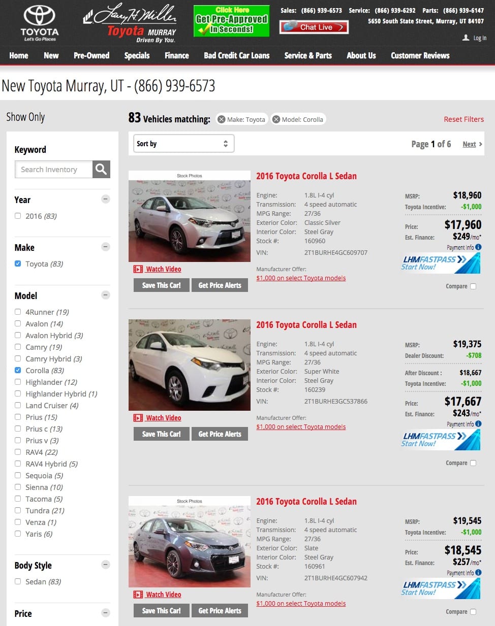
This is their product page. At least this time I see cars related to my search and specific details that could help me in my quest to find a new Corolla.
However, this page is still not designed for converting users from PPC ads. For starters, there is a full navigation menu at the top, every single Toyota model available on the left, and a complete footer on the bottom. Way too many choices and options for me to consider.
Sorry, Mr. Miller, you lost me again.
The problem is, Mr. Miller paid for my clicks—potentially quite a bit. Was it worth it for them?
Where to send your prospects
Clearly, home pages and product pages are not designed for converting new customers.
As the example above shows, the typical homepage is busy with many distractions, includes a navigation menu, footer, etc. If your goal is to increase conversions—for whatever you’re offering—you’re better off building a landing page.
Landing pages are standalone pages that have no distractions and are focused on one goal. The goal can be to get a free demo, download an ebook, sign up for a free trial, or—as is the case many times in the automotive industry—get a free estimate.
How the Automotive Industry Uses Landing Pages
Now, let’s take a look at a few different business types in the automotive industry and how they’re using landing pages to grow their business. We’ll analyze what they’re doing well and what could be improved.
The following auto industry landing pages are a small sample built with Instapage software.
1. Get a free estimate
Mirage Auto Body
Mirage Auto Body is using the landing page below for an AdWords campaign that is strictly for capturing non-phone leads directly from the ad. 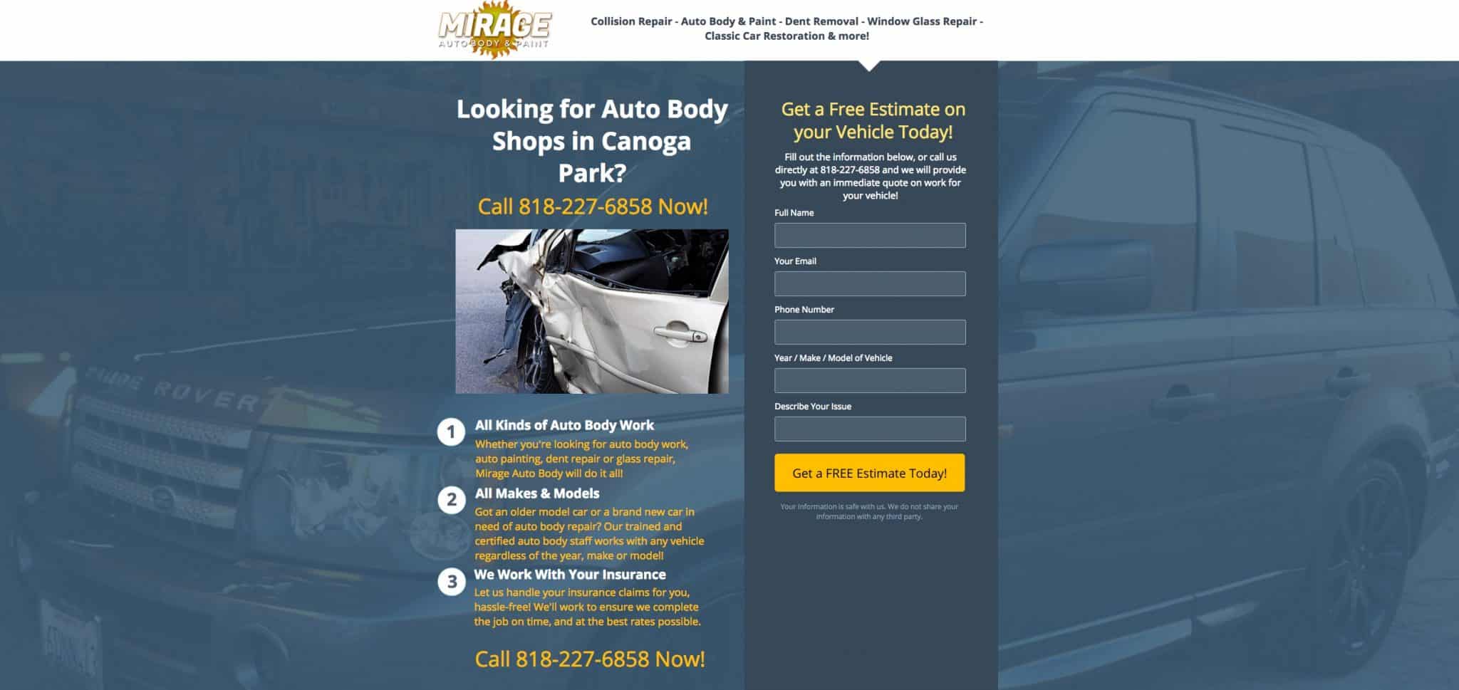
What they’re doing well:
- The image of the smashed fender coincides well with the headline, “Looking for Auto Body Shops in Canoga Park?” because clearly the owner of this vehicle needs body work.
- The form asks for appropriate information. This page is about getting a free estimate, so it makes sense that Mirage Auto Body would request name, email, type of vehicle, and the issue.
- The copy is listed in bullet points that quickly explain the body shop’s expertise and unique value proposition.
- “Free” is capitalized on the CTA button to emphasize there is no payment obligation.
- They list their specialties at the top of the page so there is no confusion as to the type of service they offer customers.
- The short blurb underneath the CTA button lets visitors know their information is safe and will not be shared with third parties.
What could be improved:
- The arrow pointing to the form acts as a visual cue to have the visitor complete the form. However, it’s too small and could be larger to really grab the reader’s attention.
- The CTA color is the same as much of the copy on the page so it doesn’t grab your attention as much as it should. Given the page’s color scheme, a red CTA may work better.
- More white space. The spacing on the bullet points could be increased. Right now, they’re too close together and more space would better help the reader understand all of the benefits Mirage Auto Body provides.
The Auto Hospital
The Auto Hospital Reno understands its customer base and uses its Facebook traffic to drive visitors to this landing page.

What they’re doing well:
- The image is relevant and it’s obvious the man is performing car repairs.
- The headline informs you of their value proposition—Auto Hospital Reno will fix your car fast and get you back on the road.
- The “20 years of service” badge lets visitors know they’ve been in business a long time serving the local area—which means they’re not a new business.
- The customer reviews are not singular-focused. They vary based on type of comment and also tell you which site the comment can be found, Google + or Yelp.
What could be improved:
- The semi-transparent box on top of the background image makes the copy a little difficult to read.
- The CTA color could be more contrasting. The red doesn’t help the CTA stick out as the most important element on the page.
- The phone number is not click-to-call. Why not make it even easier for interested customers to contact you?
- The copyright is 2015. If that’s the case, what else is outdated? How old are the reviews?
2. Event RSVP
Jim Gauthier Chevrolet
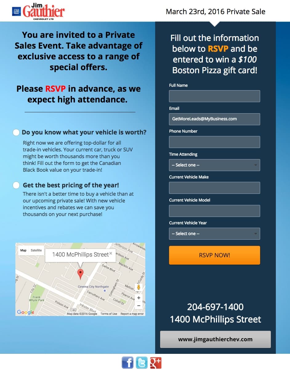
Jim Gauthier’s dealership uses this landing page specifically for its monthly private sale events, held twice per month. They invite select customers to each event and send them an invitation in the mail, which includes the link to the page below.
The private sale events are exclusive so they don’t promote the page on social media, Google AdWords or their main website.
What they’re doing well:
- The orange CTA button contrasts very well with the navy blue background.
- The orange “RSVP” text matches the orange CTA button.
- The date of the event is very visible at the top of the page and sits right above the form.
What they could improve:
- Competing CTAs distract from the main goal of this page (to RSVP).
- The gray CTA button directs users to Jim Gauthier Chevrolet’s homepage. This is a no-no for landing pages because it serves as an exit point.
- What exactly do visitors get when they convert on the form? The first bullet point on the left says you will receive the Canadian Black Book value of your trade-in. However, above the form it says you’ll be entered to win a Boston Pizza gift card. Do you get both? A little more clarity would be beneficial for visitors arriving at this page.
- Why include the social buttons on the bottom? If the event is private and invite-only, why give visitors a chance to promote on social media and “dilute” the event’s exclusivity?
3. Truck leasing
Connect Lease
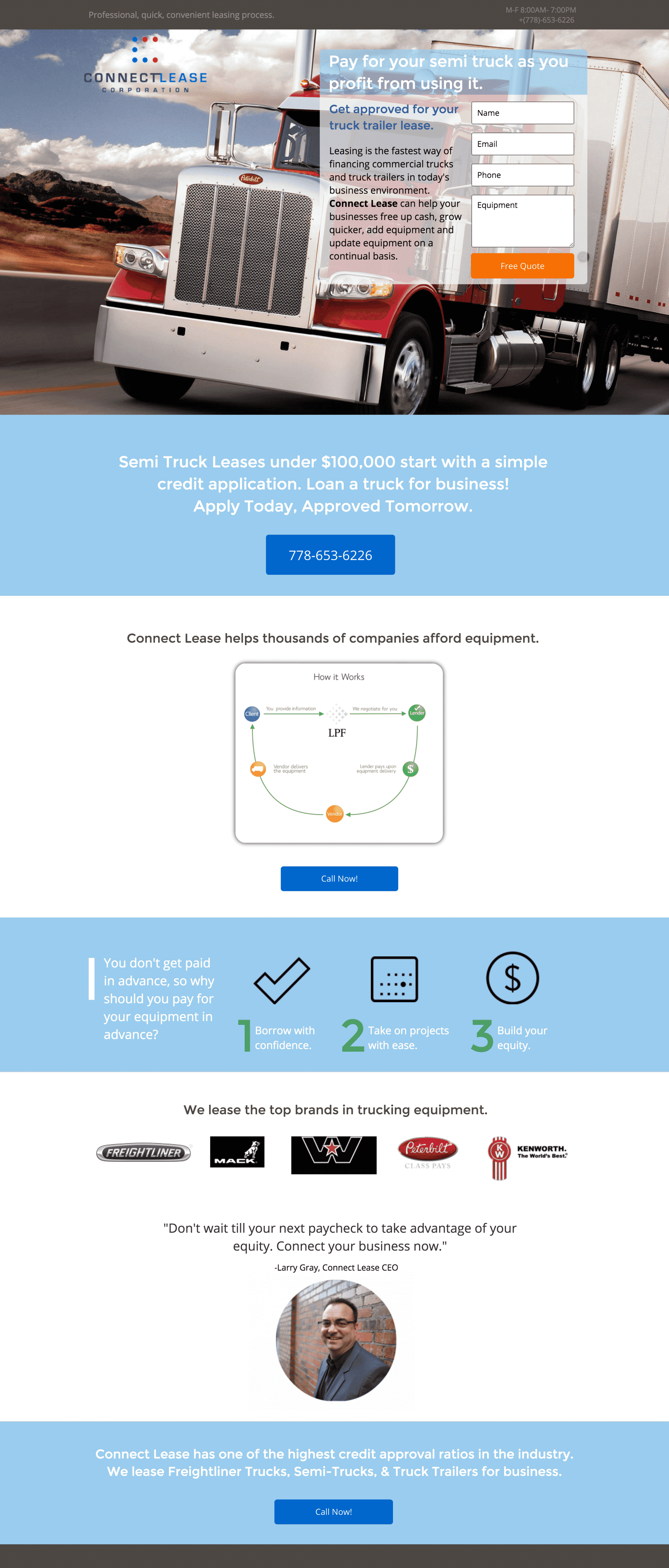
Connect Lease has implemented a multi-channel approach with its landing page. Instead of relying on a single channel to drive traffic, the company drives traffic to the page using Google AdWords, social media updates, and email marketing messages.
What they’re doing well:
- The image is relevant to the business and the headline because it shows a semi truck driving down the road.
- The phone number in the top right corner and the blue CTA are click-to-call. This makes it easier for a prospect to call Connect Lease if they don’t want to convert on the form.
- The 1-2-3 sequence explains the value of leasing a semi truck with Connect Lease.
- The truck brands they lease to customers are highly visible on the page demonstrating they offer the most trusted brands in trucking equipment.
What could be improved:
- The company’s logo is hyperlinked to their homepage, which provides an exit point from the page.
- The “Call Now” CTAs could be designed bigger to draw more attention to them.
- The “How it works” box could be larger showing the sequence of events that occurs when you lease a semi truck.
- Competing CTAs (Free quote and phone number) create friction. What is the more important goal for the page? To fill out the form, or call the business?
Now It’s Your Turn
By no means are the industries evaluated here the only types of automotive business that can use landing pages.
Whether you’re an insurance company, a muffler shop, glass repair, car audio service, tire shop or everything in between, landing pages can be an effective way to generate new business for your company.
Just remember, when creating your prospect’s conversion sequence, you need to:
- Send your ads to dedicated landing pages
- Message match the ad headline to your landing page headline
- Have only one goal and include no exits points on the page
Hopefully the examples provide inspiration of what to do and what not to do when building your next landing page. The difference will amaze you!
With all that said… where do you send your ads?

