Tight Deadlines, Long Nights And A Website Re-Design (Part 2)
by Manny Lopez • September 30, 2015
We recently redesigned Disruptive Advertising‘s website, and I wanted to record our process to hopefully help you in your next redesign. This article is in two parts, so if you want to learn more about the research and conceptualizing of our new look, make sure you read part one.
Today we’re going to dive into the building and implementation of our new design across the entire site, and how that affected our traffic and visitors in a quantifiable way.
New Look & Content
Our first priority for our redesign was to make a better experience on our blog. Once that was in place, we had made the branding and style guide for the rest of our site.
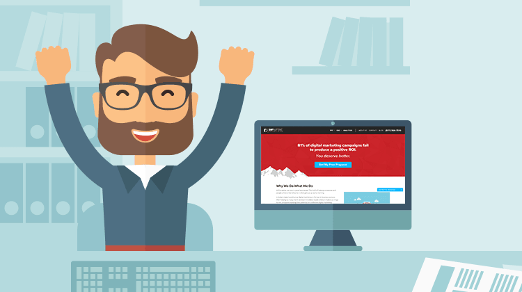
We built the remainder of the pages using this new look. I wanted the graphics to reflect two major aspects of our business; real people and data driven results. With this in mind, I knew that we needed to create vector illustrations to really give it a colorful, fun and inviting look, while still conveying what our services are.

- Yes, we make pigs fly.
With art direction on the right track, we put together our content. We wanted the copy to educate and invite the user to either learn more through our calls to action, or contact us directly.
I’m not a copywriter, but our marketing director was able to craft some great content for the site. Without well crafted content, a redesign is a pretty face with nothing interesting to say! I’d recommend spending just as much time on your copy as you do on your visual elements when you’re going through a redesign.
If you can’t afford a seasoned copywriter, a great resource to learning the ropes of copywriting is Copy Hackers. You can check out this great presentation by Joanna Wiebe on improving your copywriting from this year’s Call to Action Conference.
Push It To Development
Its a bitter sweet moment for me as a graphic designer when I hand off my Photoshop files over to be developed. It must be the same feeling that parents experience when they drop their kid off for the first day of kindergarten. Luckily, I knew who I was trusting my baby with.

- When he’s not coding our site, he’s juggling hatchets.
I worked directly with our in-house developer to make sure that the mockup design was replicated as closely as possible on the web. While working together we were able to focus on the user experience without having to sacrifice a clean visual experience.
You might be tempted to have your site built out for $5, but the results are going to reflect that price. The development of our site went smoothly due to the fact that design and development worked together so closely.
We were able to find solutions for the various problems that we encountered together. After some very very long nights, and a lot of Spotify playlists, we had our redesign up on our staging site.
Testing The New Site
By this point all the parties involved with building the site were stricken with sleep deprivation, and I was reaching the point of caffeine overdose. It’s hard to catch all the mistakes in something you’ve been staring at for days, so we recruited the remainder of the Disruptive team for quality assurance.
The task was simple: you find a bug on the site, you get $5! The challenge was accepted by everyone in the office, and it brought dozens of issues to our attention without breaking the bank.
You’ll always want to make sure you do a thorough quality assurance check, whether you do it in-house or outsource. A broken site (or a silly mistake) on a different browser or device will cost you leads. Use tools like respelt to run spell checks on your page for free, or scan your full site for a small fee.
The Results
I know what you are thinking: what difference did all of this effort make?

It’s been two months since we launched the site redesign, and we’re seeing some really great results. Below are some notable statistics about our new site’s performance.
- Organic traffic to our site has increased by 15%
- After the launch, our site conversion rates have doubled
- We’ve gotten 250% more traffic to our blog
- Our bounce rate has dropped by 15%
- Users spend an average of 25% more time on the page
Conclusion
We designed, we coded, we conquered. A site redesign is a lot of work, but can pay off for your company in a big way. Spend the time to research and improve your site in a methodical way!
Do you have questions about the redesign process? Want to tell us about something we missed? Leave a comment below!


