Valuable Lessons from 3 Experts at CTA Conference
by Sarah Rodriguez • October 21, 2015
Two weeks ago, I was fortunate enough to attend Unbounce’s CTA Conference in Vancouver. The city was beautiful, and I was able to hear some great presentations from knowledgeable experts in the conversion rate optimization and marketing industry. I encourage you to check out (at least one or two) of these presentations, which can all be watched for free in full here.
In the meantime, I’ve put together some of the highlights from three of my favorite speakers from this year’s CTA Conference.
Understanding the Intersection of Copy, Design, Interaction & Psychology (By Oli Gardner)
Oli made it very clear that he HATES bad marketing. He showed us a recent Google search that he did for “Vancouver whale watching tours.” Some of his results included advertisements for restaurants and bear country tours…
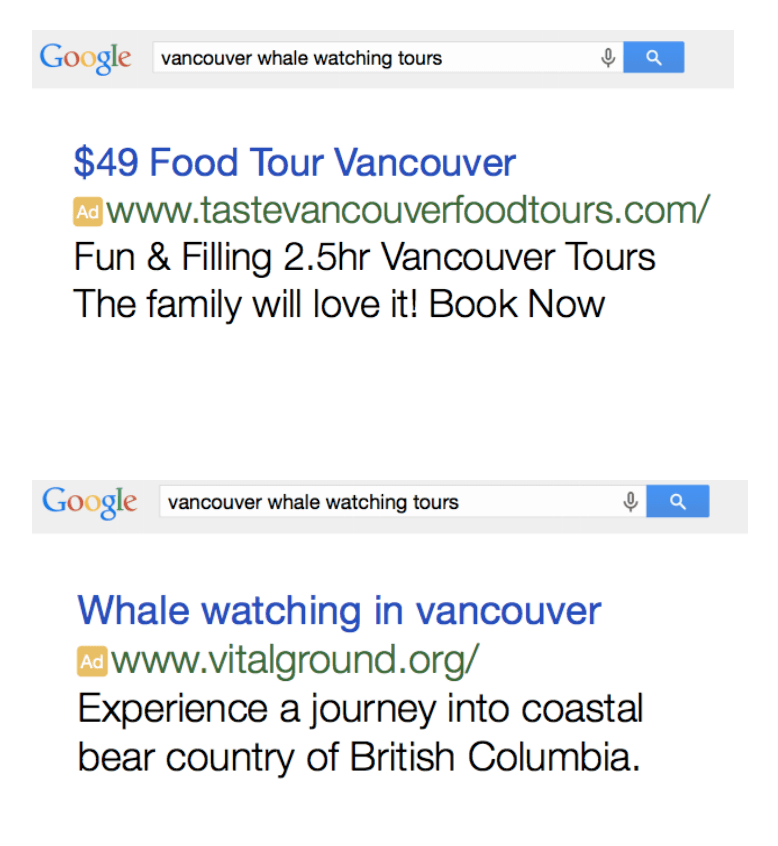
Bad experiences for your users can be avoided by simply following Oli’s four corners of marketing. Below is a summarized version of these four points and how they can be applied to your own campaigns:
1. Copy
You need to ask yourself what your headline and sub-header says about your solution. Write your headlines with your customers in mind, showing them what you do and why you are the best choice for them.
2. Design
Never start a marketing campaign without a dedicated landing page! Make sure your landing pages aren’t distracting from your call to action, and that you’re directing viewers attention to where it counts.
3. Data
There are some landing page elements that often (but not always) hurt conversions. They include adding more than one link, placing distractions in proximity to the CTA, interaction models (carousel images), and UI trend features.
If you’re using a template from a site like themeforest for your landing pages, you should avoid templates that use a lot of trendy elements.
4. Psychology
According to Oli, the most persuasive word in the English language is “because.” Instead of listing the features of your product or business, tell your viewers how your business will directly affect and improve their lives.
Oli is one of the most experienced CRO testers in the industry, and it was such a pleasure hearing his advice about optimizing landing pages, ads, and online campaigns.
I strongly suggest you to watch his full presentation here. It’s full of actionable advice, and is extremely entertaining.
Psychological Tactics to Convert Your Leads into Customers (By Talia Wolfe)
Talia talked about how we can use emotional targeting to convert more customers. Most people consider themselves to be rational people who can weigh outcomes and make the right decision. The truth is, we’re largely driven by emotions.
Talia showed brands that know the power of emotion and use it to create ads that show people how to become their ideal self by using their product. Here’s a few of those examples:
Drinking Coca-Cola makes you an awesome, sexy and youthful person — according to this advertisement:

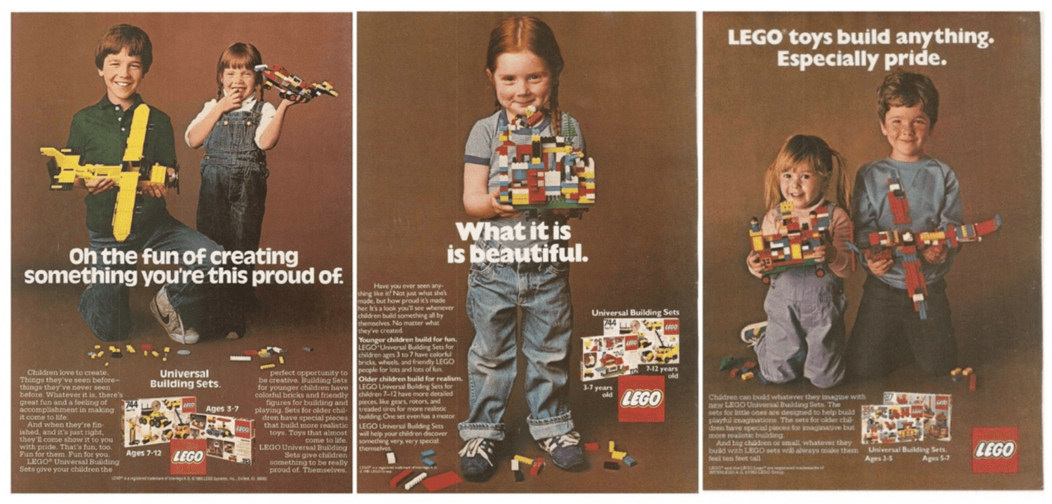
Old LEGO ads were not about the product, but the feeling of happiness and pride that comes with building something on their own:
It’s not about Nike shoes. It’s about becoming a better and greater version of yourself:
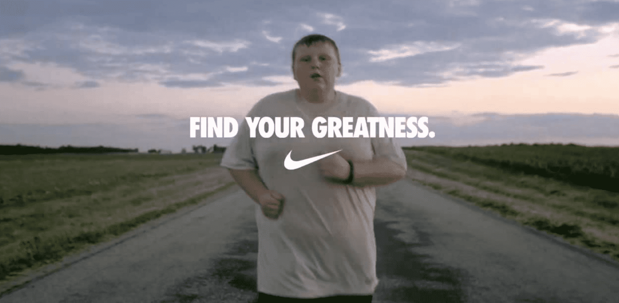
She continues to talk about how marketers can change their ads, landing pages and campaigns to stir the emotions of our consumers by understanding “It’s not about changing their life, but about empowering them to change theirs.”
Along with this idea, Talia talks about testing concepts and not just elements. As a conversion-focused designer, it’s easy to just duplicate a variant, tweak a few things, and send it out to test. In order to get the best results, it’s really important to actually take into account your viewers emotions and experience when seeing your campaigns.
When designing my next landing page, I’ll ask about who our client’s target demographic truly wants to be. Thanks Talia!
To watch her full presentation, click here. She’ll walk you through some fantastic case studies, and teach you more about what she calls the three pillars of emotional targeting. You can also read an article along the same thread by our own lead designer.
How to Conduct Solid, Data-Driven Conversion Research (By Michael Aagaard)
Michael had a lot of information to share during his CTA Conference presentation, and all the data to back it up. If I had to walk away remembering one thing, it would be to research before you test.
Michael shared a quote from Albert Einstein that is very relevant to marketing:
“If I had one hour to save the world, I would spend 55 minutes defining the problem and only five minutes finding the solution.”
Testing something without any research or understanding to back it up can be a huge waste of time, because you don’t know what problem you’re trying to solve. Michael explains that if we can take some time to understand why the user is or isn’t converting, then we can focus our energy on fixing the right problem and get bigger results.
Michael worked with a client whose site helped users search for music or entertainment for any event they were planning. The client wasn’t getting enough leads through the form on their site, so he looked over the page.
The first thing that stood out to him was the huge form, which asked for complete information about the upcoming event and its host. He figured that the users just wanted to contact an entertainer!
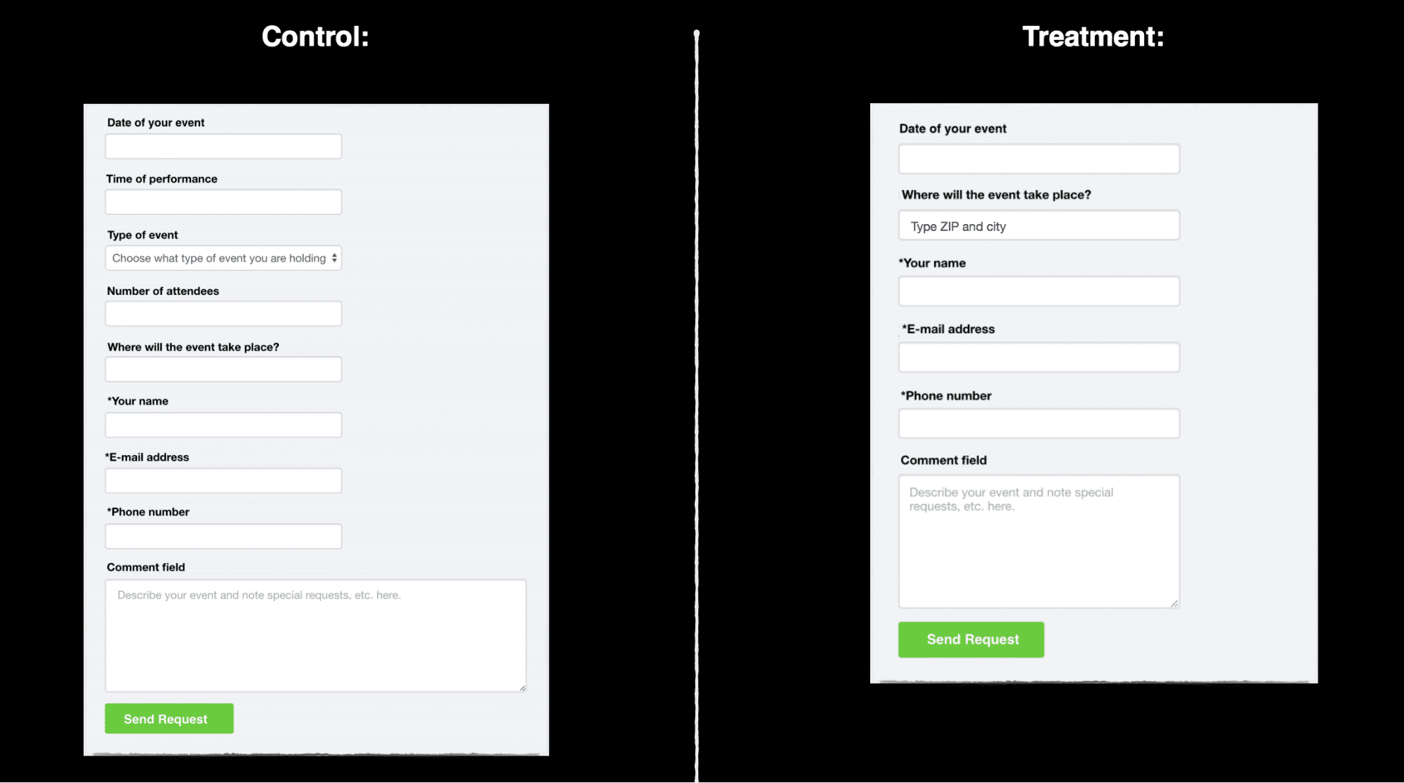
So the client allowed him to remove 3 form fields, creating a new form with less friction. 4 weeks, 512 conversions, 95% confidence, and… 14.23% drop in leads.
With a bruised ego, Michael decided to take a step back and find out why the form might not have been working.
Through some research, he found that the form element with the highest interaction was the “type of event” — which Michael had removed in the first test. The lowest interaction fields were event location, email, and phone number and the optional comment field (which is where people just quit).
So to improve the form, he decided to keep all of the fields but made a few researched tweaks to the form.
He moved the highest interaction element — type of event — to the top, and tweaked the label copy. He specified some of the fields with more details that people were worried about (Only enter the location if you booked it already, we’ll only email you for your event info, and wrote that the comment field was optional)
4 weeks, 671 conversions, 96% confidence, and… 19.21% increase!
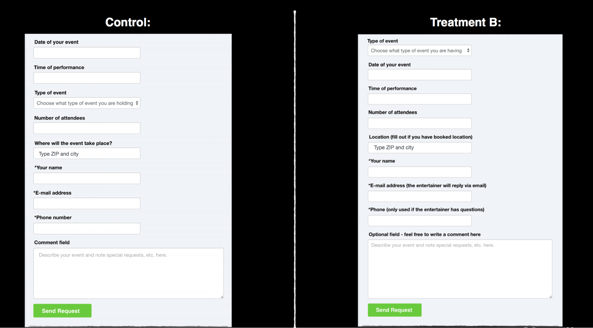
This is one of many examples that demonstrates how testing ideas based off of research can save you time, traffic, and increase your conversions!
Watch Michael’s full presentation here to see how he applied this same principle to Unbounce’s own landing pages. He’ll also give you some names of brilliant research tools that you can use to figure out what might be going wrong on your page.
——-
Call to Action Conference was full of great information and a lot of principles that can be implemented immediately. Take some time to view some of the presentations. You might even decide to attend next year! If you do, I’ll see you there.
Questions about any of the information here? Want to share your own insights from CTA Conference? Let me know in the comments!

