
What is a Landing Page? Do I Need One?
by Aden Andrus


Spend much time in online advertising and you’ll start to see the term “landing page” everywhere. But what exactly is a landing page? What makes it different from any other page? Why are landing pages so important?
To be honest, while online marketers love to throw this term around, we’ve done a pretty poor job of defining it. In this article, however, we’re going to fix that. We’ll take a look at what a landing page is, what goes into an effective landing page and some landing page tools you can use to create your own landing pages.
Fair warning, this article is a fairly comprehensive introduction to landing pages, so it’s not the quickest read. But, by the time you’ve worked your way through this content, you should have a solid understanding of landing pages and how to use them to improve your online marketing.
What is a Landing Page?
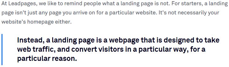
Simply put, a landing page is the first page you “land on” after clicking a link. In this sense, a landing page could be almost anything: your home page, a blog post, a product page, a lead capture page…you get the idea.
However, as simple as this definition is, when we talk about “landing pages” in online marketing, we usually mean a page that is specifically designed to receive and convert traffic from an online marketing campaign. Using this alternate definition, a home page wouldn’t qualify as a “landing page“—it isn’t designed to convert traffic from a specific marketing campaign.
To be honest, I blame a lot of the confusion over these definitions on the landing page experts. Most of the best landing page content comes from landing page experts who own—or are employees of—landing page creation and hosting companies.
Now, don’t get me wrong, these guys really know their stuff, but they make money when people use their company’s landing page tool to create landing pages, so it’s in their best interest to write content like this:
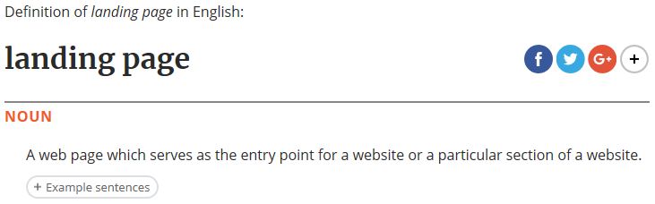
Compare that with the Oxford definition:
Can you see why so many get confused about what a landing page is? The definition changes depending on who’s talking! (and what they’re selling!).
Honestly, it would probably be best if we just created a new term for this new, alternate definition of landing pages, but in the absence of a new term, you’ll just have to stick with this rule of thumb:
If an online marketer is talking about “landing pages”, they’re probably talking about pages that have been specifically designed for a particular marketing campaign.
With this rule in mind, when I talk about landing pages in the rest of this article, I’ll be referring to pages that are specifically designed to get traffic from a marketing campaign to do something (in marketing, we refer to these actions as conversions).
Here are a few examples of things you might want people to do on your landing page:
- Make a purchase
- Become a lead by submitting a form
- Call you
- Reach out to you via chat
- Subscribe to a newsletter or email list
- Register for an event
All of these conversion actions accomplish the same basic goal: they progress people towards becoming a paying customer. And, ultimately, that’s the goal of any landing page—regardless of what definition you use.
Landing Page Elements
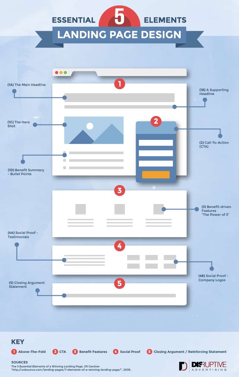
Now that we’ve cleared up what a landing page is and how we’re going to use the term in this article, let’s talk about the 5 essential elements of landing page design. For reference, here’s a handy infographic that shows you how each element fits onto a page:
To embed this infographic on your site, use this link:
As you can probably imagine, not every landing page will fit this mold, but this infographic gives us a good framework for discussing what goes into an effective landing page.
1) Above-the-Fold Content
“Above the fold” is a term online marketers stole from the newspaper industry that refers to the first content a user sees. For a newspaper, “above the fold” is a literal term, but online marketers use it to describe content in the top 600 pixels or so of a landing page.
Since it’s the first thing your users see on your page, your above the fold content—much like a good front page story—is the key to drawing potential customers in, so you’ll want to make your above the fold content as compelling as possible. Let’s take a look at some common above-the-fold content:
1A) Main Headline
A good headline (and hero shot) is like a lighthouse for your potential customers. It tells them, “Yes, you’re in the right place and here’s what you can expect…” But, your headline needs to be more than an overview of your page—it needs to pique the reader’s interest in some way.
Depending on your business, what you’re selling and what you want people to do on your page, you’ll probably want to use different types of headlines.
For example, if you run a pilot certification program and you want people to sign up for your course, you might use a headline like “Learn to fly today!” On the other hand, if you want people to sign up for your email list, “Learn more about flight school” might be a better option.
The key to writing a great headline is understanding who your audience is, why they are on your landing page and what problem they’re hoping you can solve for them. Once you know those three things, it’s fairly easy to come up with headlines to try.
1B) Supporting Headline
If it’s a little hard to address the who, why and what of your audience in your headline, you can expand on things with a supporting headline. Think of your supporting headline as your opportunity to fill in important details.
Your headline should always be the most important and compelling argument for taking whatever action you want someone to take, but sometimes a little extra detail can be the push people need to actually convert.
For example, here’s one of Disruptive’s landing pages:
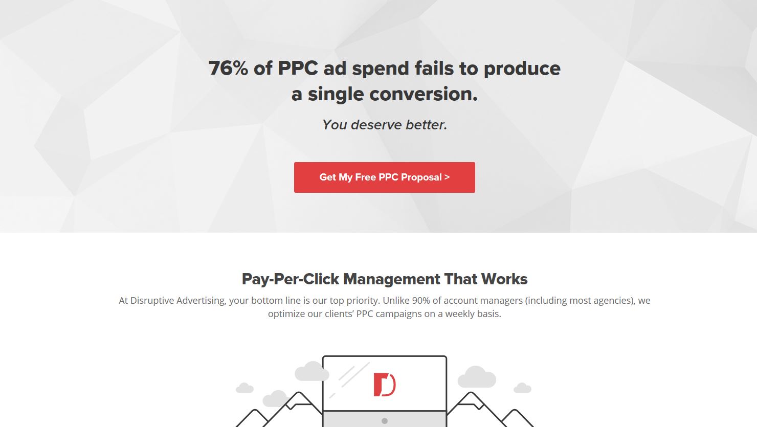
Most of our potential customers feel like they are wasting money on PPC advertising (which, sadly, is almost always true). They’re usually business owners or marketers who got to this page by searching on Google for something like “ppc agency” and clicked on our ad.
With that in mind, the headline of this landing page immediately confirms 3 things to a visitor:
- Everyone is wasting money on PPC—which means you’re right to be concerned about your own campaigns
- We are experts who know PPC well enough to help—because we’ve run the numbers and know how much ad spend is being wasted
- They are where they expected to be after clicking on an ad for a PPC agency
All together, this headline addresses the who, why and what of our audience, but it’s kind of a dismal message. So, rather than leave people feeling like their campaigns are doomed, we use a supporting headline: “You deserve better.” Or, in other words, with Disruptive, you won’t have to waste so much of your PPC ad spend.
As you can see, the main message is in the headline, but the supporting headline adds important detail that makes the main headline more compelling. Not every landing page needs a supporting headline, but when used effectively, a good supporting headline can make your landing page much more compelling.
1C) Hero Shot
Of course, your main and supporting headlines can only say a few words. It can be hard to get someone to have an emotional response in just a sentence or two. That can take hundreds-to-thousands of words.
Fortunately, for that, we have pictures.
In many ways, your hero shot can be just as important as your headline. Your hero shot is the aesthetic component of your landing page that tells people, “yes, you’re in the right place and you can trust this company” without them even realizing it.
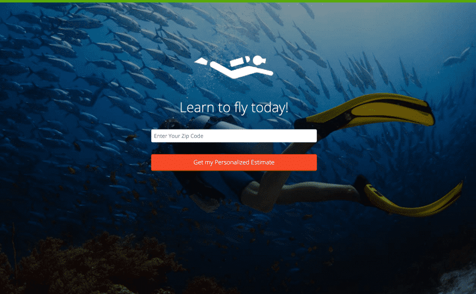
To highlight this, let’s go back to our flight school example. Which of the following pages do you think would be more compelling to an aspiring pilot?
This one?
Or this one?
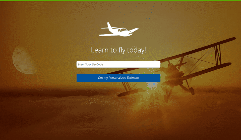
Odds are, the second page would drive a lot more conversions. But why? The headline is exactly the same on both pages!
The answer, of course, is the hero shot. Even though the headline on the first page reads “Learn to fly today”, anyone who clicks on a pilot certification ad and ends up on a page with a scuba diver will immediately assume that something is wrong. They want to fly, not swim, so how did they end up on a page about scuba diving?
While this example is a bit extreme, it highlights an important point: your hero shot can make or break your headline (to learn more about picking the right hero shot, check out this article).
1D) Benefit Summary
This section doesn’t always end up above the fold, but when it does, it’s important. Essentially, the benefit summary is the hook that pulls people from your above-the-fold content to the rest of your page.
Essentially, your benefit summary should say, “Hey, here’s what you’ll get if you do what I’m encouraging you to do. See how great it is? You should either convert or scroll down to learn even more!”
That being said, the benefit summary is your elevator pitch. If you decide to use one, you’ll want to keep it short, simple and to the point. You can get into more detail below the fold.
2) Call to Action (CTA)
Although most companies place a call-to-action (CTA) above the fold, since your CTA is what you’re asking your visitors to do on your landing page, it deserves its own section in this article.
But, before you can create your CTA, you need to decide what you want people to do on your landing page. This is important, because otherwise you can end up with no CTA or multiple different (and even conflicting) CTAs.
Both of these situations are bad.
For example, clicking on Spotify’s PPC ad brings you to this landing page:
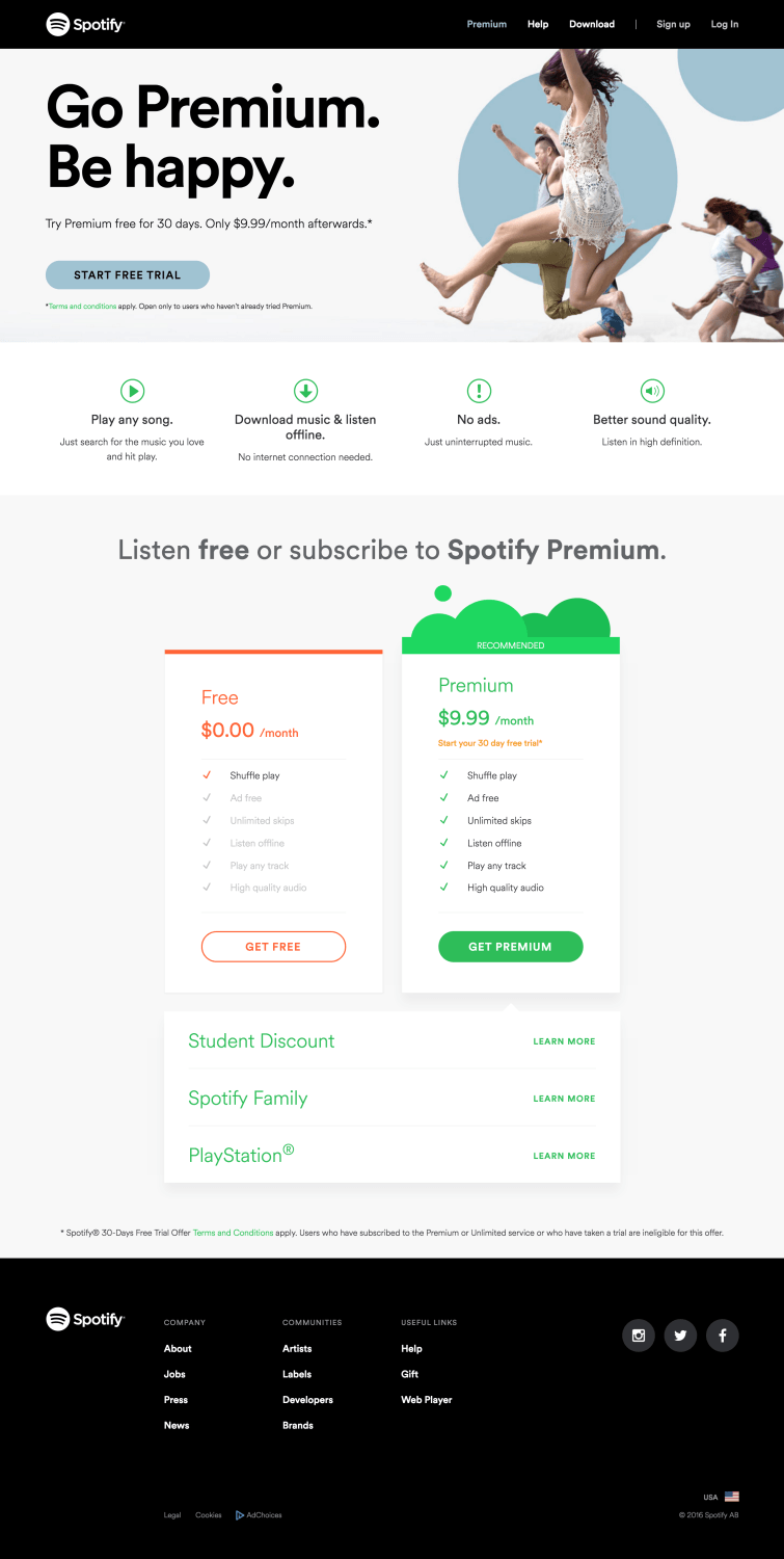
There are way too many options here.
After a bit of head scratching, it looks like the goal of the page is to get people to sign up for Spotify’s free month of premium service. However, the page also gives you the option of listening for free to their non-premium option.
This page also happens to be their home page, so there are options for “Download,” “Sign Up” and “Log In” in the header (and that’s ignoring all of the clickable elements in the footer!). All of these options make it hard to know exactly what you are supposed to do on this page. In fact, if you scroll below the fold, you may not even be sure what you’re signing up for.
In contrast, here is Neil Patel’s CTA:
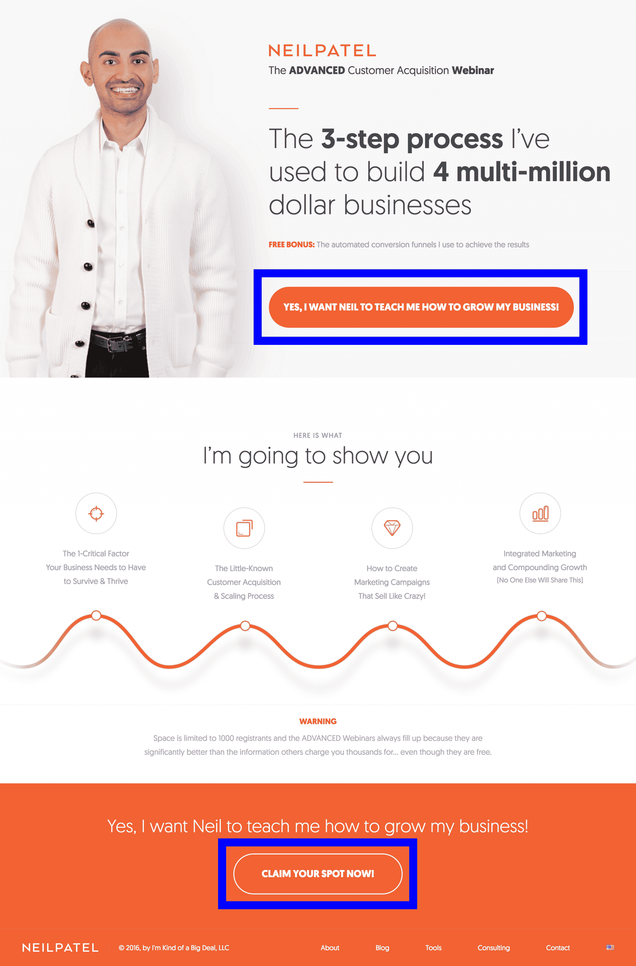
The CTA is simple and consistent throughout the page. If you’re looking to grow your business, his page quickly makes it obvious that you have found someone who can help you with that and then encourages you to take the next step to make it happen.
In addition, the CTA is obvious and straightforward. Most people on the internet are looking for quick information, so the easier you make it for them to find and absorb your CTA, the more likely they are to convert.
For example, “Get Your Free Quote!”, “Contact Us Now!” or “Get Started Today” are great examples of CTAs.
Having a specific offer or benefit associated with the CTA also helps to boost conversions. Specific offers make your audience feel like they are getting something in return for their info and incentivize them to act now. So, instead of “Contact Us Today”, try something like “Contact Us Today for 10% Off”.
Finally, making your CTA a color that stands out from the rest of the page and placing it prominently will make it easy to find and act on. Simple enough, right?
3) Show Them the Benefits
If someone starts scrolling through your landing page, it means you’re doing something right. Whether it was your ad, headline, hero shot or something else, people who read your whole landing page are basically telling you, “I’m interested. Sell me on why I should convert.”
The only problem is, most businesses don’t know how to talk about themselves or what they are selling in ways that matter to their potential customers. Why? Well, all businesses struggle with egocentrism. After all, you spend all day, every day thinking about and improving your product or offer. It’s natural to want to talk about all the special things that make your business unique!
The only problem is, the people on your landing page don’t care.
See, most people struggle with egocentrism, too. They don’t care how many countless hours you’ve invested into that nifty feature. They may not even care about the feature at all. Most visitors to your site are asking themselves one simple question:
Will this make my life easier?
Depending on what you’re selling and who you’re marketing to, you might answer that question in a number of different ways. For example, if bug-free software is a big deal to your potential customers, you may want to focus on how fine-tuned your software is. You might want to include a section about your support team, how many users you have, how you handle errors…you get the idea.
The important thing is to keep the focus on how your bug-free software will make their life easier—not how awesome your business, product or offer is.
4) – Social Proof
Unfortunately, most people instinctively distrust marketing material. Generally speaking, most marketers tell the story that puts their offer in the best possible light. After all, marketers make money off of telling people their product is great. Maybe your offer is as good as you say it is, but it’s hard to believe someone who gets paid to talk about how awesome their offer is.
On the other hand…an actual customer? They’ll tell it like it really is.
As a result, testimonials are the simplest way to add social proof to your landing page. Unfortunately, because they are so easy to put together (or even fabricate), testimonials often don’t carry a lot of weight. So, if you want your testimonial to be believable, you need reputable, verifiable sources.
With that in mind, here are some ways to put together believable testimonials.
- Cite high authority sources. If other business leaders (particularly leaders of recognizable businesses in your industry) are willing to say you’re great, that must mean you’ve got something pretty cool.
- More details = more believable. If your testimonial includes enough detail (name, location, job title, etc) that it would be easy to track down your source and verify the quote, the testimonial will be more believable.
- Include pictures. Along the same lines, photos further establish the authenticity of your testimonial. After all, if your testimonial was comfortable with you using their photo, your reader can feel comfortable with giving you their business.
- Video testimonials. Video testimonials take this principle even further. Video testimonials are even harder to fake and come with the added benefits of inflection and body language. If your video testimonial shows genuine enthusiasm for the product, you can bet that your audience will be interested in your offer.
- Embed content. If you have rabid reviews on Twitter, pull them into your site. Reviews on third-party sites can’t be tweaked to perfection, so they feel more raw and real.
- Include a variety of testimonials. Everyone knows that only a small portion of your customers will be willing to put themselves out there on your behalf. So, if you have several testimonials, a lot of people must love your company (sliders are a great way to feature multiple testimonials without sucking up too much real estate on your page).
According to Reevo, customer reviews increase sales by 18%. But, you can’t just put any old testimonial up on your site. Instead, you want to feature the kind of reviews that make your potential customers think, “You know what? I’d be stupid not to convert” (to learn more about how to effectively use social proof, check out this article).
5) Closing Argument/Reinforcing Statement
A good landing page should naturally lead a user to the conclusion that converting is in their best interest. To do that, however, you need to know exactly what you want them to do and why they might not want to do it. Then, throughout your landing page, you address their concerns and sell them on the value of what they get in exchange for converting.
In particular, if someone makes it through to the end of your landing page, you have a final opportunity to convince them to convert (incidentally, this is a good place for another CTA). With your closing argument/reinforcing statement, you should summarize everything you covered in the rest of your landing page and then throw in any additional selling points you think might seal the deal.
Honestly, most people won’t read your closing argument/reinforcing statement, but for the people who do make it all the way through your page, a good conclusion can be the difference between them hitting the back button or converting.
Creating Your Own Landing Page
Now all of this landing page theory is nice, but reading about landing page design and actually designing an effective landing page are two very different things. If you want to create landing pages for your marketing campaigns, you have two basic options: 1) build the pages directly on your site or 2) create the landing pages using a landing page tool.
Building Landing Pages on Your Own Website
The first option is fairly straight-forward. Like any other page on your site, you create and host your landing pages on your own website. The only difference is that you are creating campaign-specific pages, instead of regular site pages.
However, many businesses prefer not to add dozens or hundreds of additional marketing pages to their website—especially if they don’t plan on running a particular marketing campaign forever. In addition, creating a landing page on most websites can be a real headache, so unless you have solid design and coding skills, building your landing pages on your own website might be overwhelming.
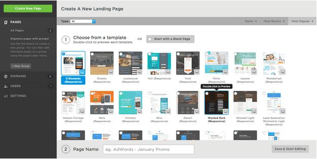
Using a Landing Page Tool
This is where the landing page tools I mentioned earlier come into play. Landing page tools allow you to build and even host your landing pages using a third-party service. Yes, you have to pay a fee for most landing page tools, but they offer easy design interfaces and testing options that make them a great option.
Here’s how the big players break down:
Unbounce
Unbounce was one of the first landing page building and testing services that allowed marketers to create landing pages without involving the IT department. Over the years, it’s become one of the most robust landing page development and optimization options out there.
Unbounce is a great option for most businesses that really want to get the most out of their landing pages. I’ll admit to a little personal bias here, but it really is a great platform.
Unbounce is flush with features, highly customizable and offers an easy-to-use interface for both page design and testing (something we’ll get into in a minute). Even if you are just learning to use their interface, Unbounce comes equipped with a variety of built-in templates (and you can buy more from ThemeForest), making it easy to put a decent page together and start testing.
Unbounce also features a powerful mobile optimization design platform, which is becoming increasingly important in today’s mobile-centered world. Furthermore, it integrates with most customer relationship management (CRM) platforms like Salesforce (and you really should be using a CRM) as well as Google Analytics, Zoho, Campaign Monitor and 60+ other 3rd party apps, allowing you to track your landing page results and leads in a variety of ways.
Essentially, Unbounce is a great fit for intermediate-to-advanced online marketers or novice marketers who care enough about their results to put a little time into learning a new system. At Disruptive, we’ve used Unbounce for years to drive great results for our clients and it’s become one of our favorite landing page platforms.
However, if you’re just looking for a plug-and-play, get-credit-and-forget-it landing page platform, Unbounce is probably going to be overkill. That being said, if that’s what you’re looking for, you probably don’t need a landing page platform anyways.
Instapage
If you don’t have the time to learn a robust system like Unbounce, Instapage is an excellent option. The name is no misnomer, their templates are incredibly easy to use.
Of course, going with a template means you won’t have the flexibility to really get the most out of your landing pages, but it also simplifies the design process substantially. Plus, Instapage does offer some A/B testing options, so you still have the ability to figure out which template and content works best for your audience.
Generally speaking, the more competitive your industry, the more effective and customized your landing page needs to be. You have to set yourself apart from the competition and a template usually won’t cut it. If you know you need a focused, conversion-optimized page to make your online marketing profitable, Instapage probably isn’t your best option.
Webflow
If you’re really looking to get the most out of your A/B testing, you might consider looking into Webflow. Unlike the other landing page platforms listed here, Webflow is primarily designed for building websites rather than creating landing pages.
Although Webflow isn’t a classic landing page design tool, it’s included in this list because it’s easy enough to use and implement that you can readily design pages on your site for use as landing pages.
Because the pages are part of your overall site architecture, you can use robust site testing tools like Optimizely or VWO to really improve your page/site performance. Unfortunately, while most landing page tools have built-in A/B testing features, they typically lack the options and level of detail available from more dedicated site testing tools.
So, if you want to take your conversion rate optimization efforts beyond simple A/B testing, Webflow is probably worth considering.
LeadPages
While I give LeadPages a hard time for their definition of “landing page”, LeadPages is a really good landing page tool. It’s probably most similar to Unbounce in terms of options and customizability.
The only real downside is the fact that you have to start from a template and are limited by the original options of the template, which can be frustrating if you want elements from multiple templates simultaneously.
That being said, one of the more interesting features of LeadPages is the way they let you sort templates by conversion rate. Don’t get your expectations too high, though, conversion rates rarely translate directly from site to site or product to product. Still, it is nice to have an idea of which pages are performing best for other companies.
Overall, LeadPages is a lot like Unbounce. You can customize and test to your hearts content and the platform is fairly simple to learn and use. Can’t go wrong with that!
All of these landing page tools are good options for creating landing pages. It all depends on what your business needs are and how much you want or need from your tool (for more information about landing page tools and how to make the most of them, check out this article)
Testing Your Landing Pages
Unfortunately, even if you use the right landing page tool and follow every landing page best practice, there’s no guarantee that your landing pages will work the way you want. People are hard to predict and—even if you think you have a great feel for your target audience—it can be hard to predict what sort of landing page design will deliver the results you need.
To really get the most out of your landing pages, you’ll need to test different designs.
Fortunately, it’s not hard to create a successful landing page testing strategy—one that teaches you something with every test. It takes some planning and documentation, but a solid testing strategy will save you a lot of time and dramatically increase your profitability in the long run.
Once you’ve created a decent landing page, it’s time to come up with a hypothesis about how your target audience might interact with your page. Go back to the who, what and why that you used to create your headline. Does your page fit all of your target audience’s needs? Are there alternative ways that you could address the same needs?
Once you have a few hypotheses, build your testing strategy around those ideas.
For example, there might be a few different ways to write or present your CTA. Your first attempt might be the perfect version of your CTA, but there’s probably a better way to present your CTA that you can identify with a few tests.
To see if changing CTA improves your conversion rate, you can put together a spreadsheet like this:
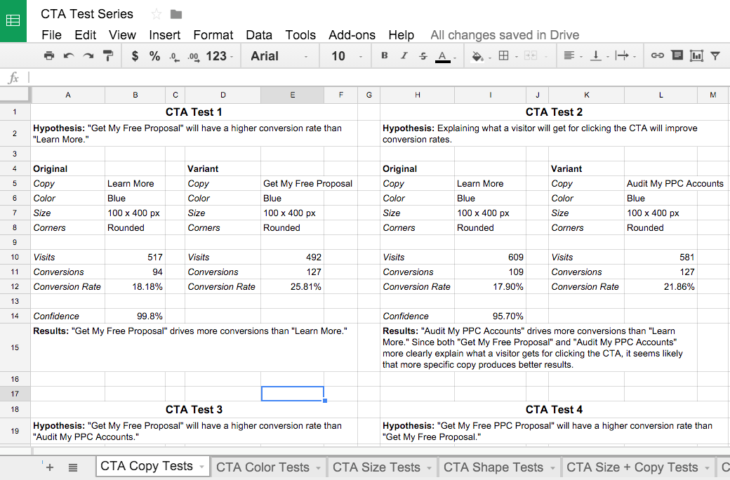
See how each test sets up the next test? You learn something from each iteration and then use that to guide your next test. Plus, everything is thoroughly documented, so if anyone ever wonders why you made a certain choice, you’ve always got a handy reference!
You can use this approach to test a wide range of landing page hypotheses. If you do it right, each test will provide more information about your audience and help you achieve the dramatic sorts of results you’re looking for.
Conclusion
While the term “landing page” can apply to any page on your site, in marketing, a “landing page” usually refers to a specific page created for a specific marketing campaign. These types of landing pages can do wonderful things for your online advertising by creating targeted experiences for your traffic.
In this article, we’ve gone over the nuts and bolts of landing pages. We’ve covered what they are and how to create and test them. Of course, this is just the tip of the iceberg. Try building a page or two and then come check out some of our other landing page content for more in depth content (click here to check out additional content).
By the way, if you’d like help putting together some landing pages, let me know here or in the comments. I’d love to help!
Do you use landing pages? What has your experience been like? Any other tips you’d add to this article? Leave your thoughts in the comments!


