What’s Really Killing Your Conversion Rate?
by Allison Otting • October 1, 2015
Sharks are the menace of the ocean. They have the creepiest beady black eyes, and two rows of teeth. I mean, I’ve been on the Jaws ride at Universal Studios, and it is terrifying. According to this lady, we should just avoid the ocean completely.
But here are the facts: The U.S. averages less than one shark fatality every two years. Despite their fearsome looks and murderous reputation, sharks are fairly harmless.
However, nature is dangerous. Looking at the statistics, I can tell you who the REAL menaces are.
Deer. Deer kill an average of 130 Americans every year. In the time that a shark kills one person in the U.S., deer have killed 260 innocent souls!

You monster.
I guess it’s just human nature. We often get hung up on things that seem scary, while ignoring the real dangers all around us.
Marketing campaigns are no exception. People tend to obsess over certain landing page and website problems while ignoring the mistakes that are silently killing their conversion rates. Here are some of the most common “sharks” and “deer” of online marketing campaigns.
The Sharks

There are a bunch of things that we are distracted by on our landing pages, but there are two that I often see clients or marketers wasting their time and testing dollars on: page design and calls-to-action.
I know, instinct is telling you that these are website killers, but the importance of these elements is often over-dramatized. Here’s why:
Design
As a designer it pains me to tell you this, but occasionally design just doesn’t matter. Let me explain.
Good design is arranging everything in a way that makes so much sense that it almost seems invisible to the user. Have you ever been on a site where everything is where it is supposed to be? It’s lovely.
Design has a second half, which is much more well known and that everyone thinks they’re an expert in: making things look pretty. This is where I see people go astray.
Why Design Doesn’t Matter
It’s easy to get lost in the drop shadows, text color and white space of a landing page. The more people you add to a project, the more you’re slowing down the process and sabotaging your success.
For example, the client doesn’t like the photo of that doctor (his smile is crooked), your CEO wants the button to be a slightly different color (he read that green means go), and your account strategist thinks that the phone icon looks too old school. Sound familiar?
Instead of creating new optimizing tests, you’re spending days trying to please everyone. Here’s the hard truth: most of the time I’ve never even seen these little personal preference changes make a difference.

You’re burning through money AND designers.
Don’t Fix What Isn’t Broken
About a year ago we had an app client. Their page was simple and dated, but it was getting a lot of traffic, and was converting really well. We figured that the best way to bump up the conversion rate even more was to polish the page and make it look modern and clean.
We were completely wrong.
We attempted over 5 redesigns with the exact same content, and every single one failed. For some unexplainable reason, users preferred the dated look. My designer ego was bruised.
However, when we focused on tweaking the copy of the page, we continued to see conversion lifts until it was converting 45% better than when they first started working with us.
I’m not saying you should ignore design, but make sure your content is in tip top shape, or it won’t even make a difference! You also need to make sure your designers are trained in CRO “best practices,” because even the highest class designer can make a beautiful landing page that doesn’t convert.
Adding More CTAs
I’ve seen many clients panic as I was putting together their landing pages. They start doubting whether the call-to-action (CTA) we’re running is really what’s going to rake in more conversions and profit.
“What if they are really looking for this other product?” “What if they’re not ready to buy and they just want to follow us on Instagram?” “There’s not enough information on the page; add a link to the homepage!”
No. No. NO.
If you want to give people options, send them to your home page. Diluting the message of your landing page with extra CTAs will not increase conversions or help your company in the way you think it will.
It all comes down to a key principle: Attention Ratio. Here’s an explanation from Oli Gardner of Unbounce fame.
If you didn’t have the attention required for that video (ba-dum-tsssh), I’ll break it down for you now. Every link you add to your landing page is competing for your user’s attention.
So, if you add a home page link, a relevant blog post, and your youtube channel, you have reduced your odds of them converting by 75%.
Ouch.
If you want to address different types of traffic, you don’t need more CTAs—you need more landing pages. Set up a good conversion funnel that you can shuffle your users along in a natural journey. Then, when they land on your landing page with one big BUY NOW button, they’ll be ready to do just that.
The Deer

I don’t think it’s effective to bring up problems without giving you solutions, so let’s take a look at what’s REALLY killing your conversions.
As a licensed bow hunter in the state of Idaho (and passionate CRO specialist), let me guide you on your hunt for those deadly deer.
Usability
THIS is the real issue lurking behind what you think is a design problem. Users are facing a plague of unusable landing pages.
Here are a few common usability mistakes:
- Your form is difficult to use or too long.
Are you using in-line form labels? They can look nice, and save you space, but can be a pain to use. Labels suddenly become obscured for users that use the tab key to switch between fields, and double checking the form is suddenly impossible because you can only see your own entries.
It’s also possible that you’re asking for so much information on your form that your users give up and leave. Determine what fields are important for your team to contact and qualify your leads, and then make sure your user has no questions about filling out that form (what do you need my email for, anyway?).
- The call to action is difficult to find.
If you want your traffic to convert, you have to show them exactly where and how! Buttons can often be hidden by the latest design trends or crammed into a space with other content. Give your call to action the space and contrast that it needs to be noticed.
- Your page isn’t mobile optimized.
Even if you have a mobile version of your site, is it really optimized for your mobile users? Text needs to be legible, menus need to be accessible, and everything has to be accommodating for fat fingers.
Look at every element of your page and approach it from a mobile user’s perspective. A slow page or unintuitive functions will cause your users to bounce.
- There are legibility issues on your page.
Complex backgrounds, bad color combinations and huge blocks of text can make your page hard to read and understand. Walk through these 5 common legibility mistakes and see if you’re committing any of them.
- Your page takes too long to load.
This could be a result of the scripts you’re running or images that are too big in file size. Make your images as small as you can—without sacrificing quality—and take your target demographic’s internet speed into consideration.
If you’re not sure how your page is performing, you can find out where your page is lagging with Google’s PageSpeed Insights tool).
Usability—not personal style—should always be the motivation behind design choices and optimizing your usability will help you keep traffic on your page.
Michael Aagaard, senior conversion optimizer at Unbounce, tells us that effective tests come from finding and researching your issues when looking for what to test next. Use the tools you have at your disposal to root out those usability issues.
Now that your site is easy to use, you have to make sure that the content itself fits with what you audience needs, which brings us to the importance of…
Relevance
When you use a search engine, you are looking for sites, services or products that are relevant to your interests, needs or wants. AdWords even rewards advertisers that create better experiences for Google users. A great and relevant landing page boosts your quality score, giving you a better ad rank and saving you money on your bids!
The importance of relevance isn’t just limited to AdWords algorithims, though. The more specific and relevant the experience is to what your user is looking for, the more likely they are to convert.
Let’s take a look at the two parts of your page where relevance matters:
Copywriting
Think of your paid search ads as way-finding signs for whatever your user is looking for. They want leather messenger bags, so your ad might say “Leather Messenger Bags – 30% off!” Your user clicks, only to find themselves on a website with handmade leather goods, but no focus on messenger bags and absolutely no mention of the discount.
Message match is essential to creating a relevant and exceptional experience for your potential customers. Anytime you run a test on your landing page or ad copy, re-examine the connection between your copy and you r ads and establish if it really makes sense in context.
Another place where copy writing is important is in your CTAs! Your button copy is the catalyst for turning a click into a conversion. Make your call to action relevant to their needs and the reasons they came to your page in the first place. Don’t give them a white paper if they are ready to buy.
Imagery
Are the pictures on your landing page relevant or are you using generic pictures to save time? If you’re using the latter strategy—stop!
Here’s a quick example of the importance of using specific hero shots and imagery:
Case Study
Bonding Solutions offers all sorts of surety bonds for every need. We have a general bonds landing page, but we built a landing page just for auto dealer bonds. Since the general page was converting well, we changed the copy and used it as our baseline variant.
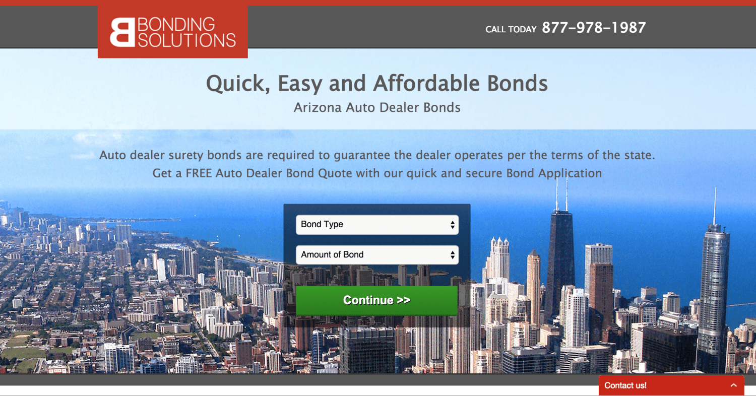
It’s not a bad landing page, but there’s nothing that really screams “auto dealer bonds.”
So, I made a variant that uses a photo of cars instead of a cityscape and made some other minor design decisions to accommodate that change. My hypothesis was this: a more relevant picture will cause less users to immediately bounce and ultimately boost conversion rates.
Here’s what it looked like:
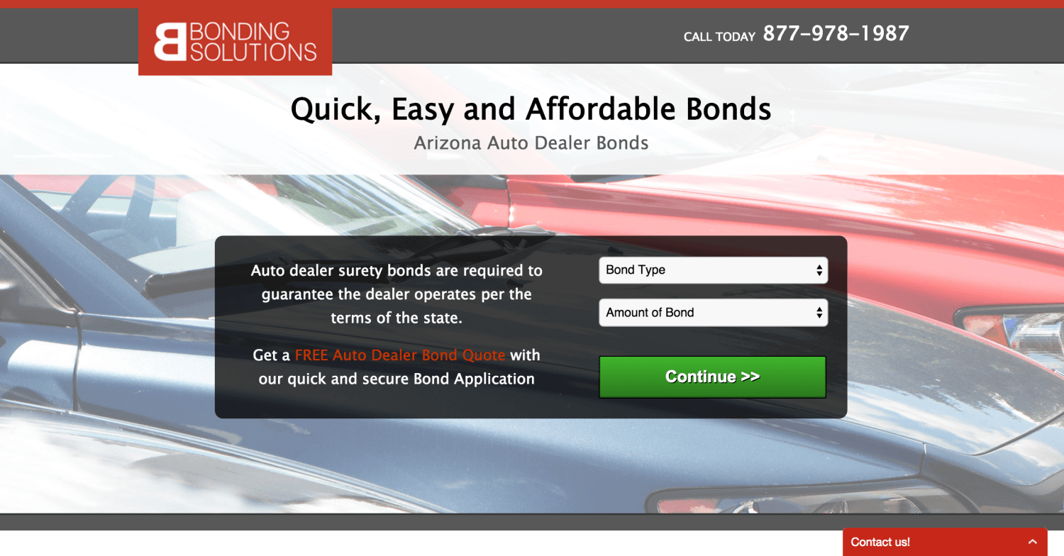
It turned out that my hypothesis was right! Simply making the hero shot more relevant resulted in a 32% increase in conversions, all without changing a single piece of copy.
We absorb images very quickly, so having a hero shot that is relevant to what your user is looking for could cause them to stick around a little longer and see what you have to offer.
The World is Still Afraid of Sharks…
…but you need to be thinking about the “deer” hiding in your websites and landing pages. While it can be easy to focus on design and CTAs, you’ll see more results if you focus on how your site’s relevance and usability are affecting your audience.
If you’d like us to take a look at your landing pages and give you some feedback on the “deer” killing your conversion rates, let us know! I’d be happy to put my bowhunting experience to good use.
Can you think of any seemingly innocent problems plaguing marketers today? Let me know in the comments!


