5 Places You’re Forgetting to Put a Call to Action
by Allison Otting


The other day I was trying to help my brother set up the domain “otti.ng” (yes, I know you’re jealous that our last name is a complete URL) and as he was trying to link it to his blog, he came across this page with a big green button:
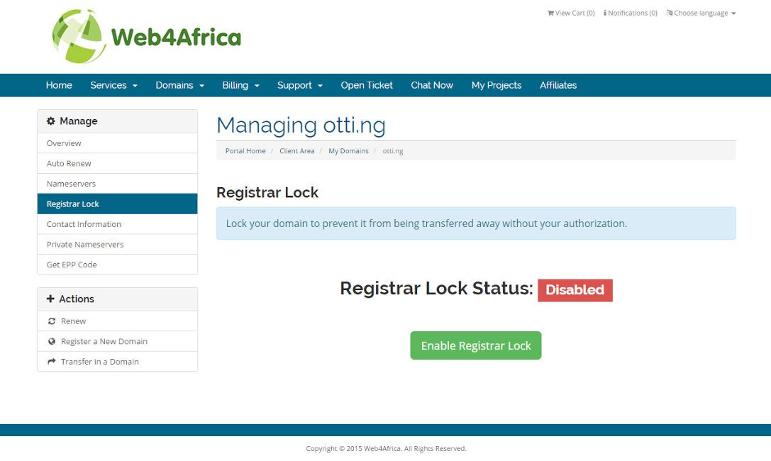
As he clicked it he told me in a surprisingly reverent tone “This button makes me feel powerful. It makes me feel like I’m really doing something. Your company should use buttons like this.”
I told him that we actually do use buttons like that, because Disruptive understands the incredible power that comes from a great call-to-action button.
We’ve all heard that you need a strong CTA on your landing pages, but I see countless companies miss out on other places where they could be making a sale (or getting someone into their drip campaign). Here’s are 5 places you should check to make sure you aren’t missing out on conversions.
1. Sprinkled Throughout the Page
Now, I know you’re only supposed to have one CTA per page. At this point that is etched deep into the conversion bible.
That doesn’t mean you can’t repeat that CTA as many times as you want.
I recommend that you always cap each end of your landing page with a CTA. If you’re using a lead gen form on your page, you’ll want a way to get to that form. These buttons, rather than taking you to a new page, can smooth scroll the user right to that form. You can even have each button take you to a lightbox form, something we’ve seen success in implementing.
What if your product is more complicated? Are two end cap CTAs enough?
No! Generally your landing page’s purpose is to persuade the user to convert.
With pricier and more complicated purchases or conversions, your page is going to be a lot longer because the user will have more fears and reservations. If you answer all their questions halfway through the page, there’s no need for them to read further! Give them a way to go ahead and convert!

You want this to happen on your landing page.
The longer your page is, the more times you should repeat your CTA. At Disruptive, our rule of thumb is to have a CTA—with a new benefit each time—placed after every two or three page sections.
2. Fixed Headers
What if you don’t want to clog up your landing page with big buttons? “I want to be more subtle, Allison!” Well, there is another way to ensure that your user always has access to a CTA.
Fixed header bars allow navigation, CTAs and phone numbers to follow a user down the page no matter what. This functions in the same way that the repeated CTA does. You want your user to always have a path to the one thing you want them to do!
Don’t forget that calls to action don’t have to be just buttons. For a lot of companies, especially in service industries, users want to call and speak to someone immediately.
Scrolling headers with a phone number and a CTA as simple as “Call Now” can bring you in a ton of conversions. Just make sure that you’re using a call tracking number so you know how many of your calls are actually coming from your landing page.
If you’re using Unbounce for your landing pages, we’ve created a quick guide for you on how to make a scrolling header as well as a bunch of other nifty tricks. Hello Bar also specializes in adding super effective scrolling header CTAs for websites.
3. Your Image Ads
I have seen plenty of image ads that are beautiful, but they don’t ask you to do anything. As one of Disruptive’s designers, I know that it can be tough to fit everything you want on one image ad, but you should never sacrifice the CTA for another piece of information.
Here’s an example. Look at these two ads side by side.

While the first one speaks to the wants of their demographic, it doesn’t ask them to do anything. They look at it and say “Hmm, that sounds interesting. How do I get this pass? Do I just show up?” The second one suggests action! That big, clickable button demands to be clicked, bringing them to your targeted landing page and giving them what they want: a “Free 3 Day Pass.”
Need more information on your image ad than can usually fit? Animated ads are a great way to fit more into less. Just make sure they’re no bigger than 150KB for AdWords! For example:

4. Your Blog Posts
Blog posts are great for SEO and building up your reputation in your industry, but they’re also a valuable way to gain customers and get some users in your drip campaign. Therefore, there should always be some sort of CTA on your blog.
Here are a few of the possibilities:
- Leave a comment
- Read another article
- Download an eBook
- Sign up for a webinar
- Subscribe to a newsletter
- Get a quote
- Sign up for a free trial
Companies like HubSpot, Unbounce, ConversionXL, Kissmetrics and Visual Website Optimizer all implement this strategy to great effect. When you start doing this you stop treating your blog posts like SEO fodder and start treating them like landing pages. All traffic is valuable, so start inviting your readers to commit to your company at some level.
5. Pop Ups
I don’t think many people enjoy pop ups and there are a lot of divisive blog posts about whether or not you should use them. However, you really can’t deny their effectiveness.
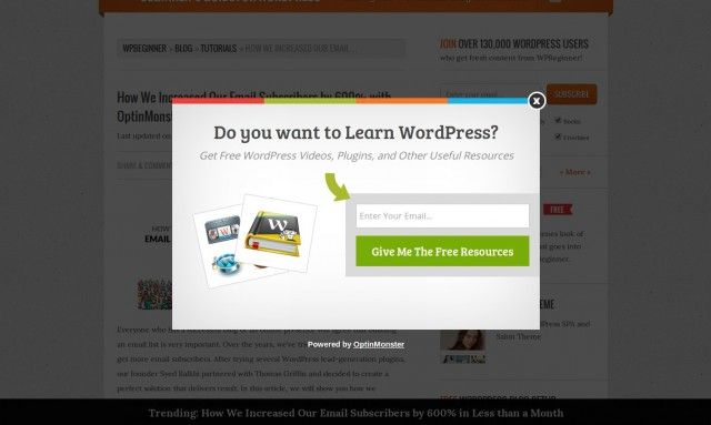
OptinMonster implemented the pop-up pictured below on their site that triggers when you’re about to leave, and they saw their email sign ups increase from 70–80 a day to 445–470 a day. That’s a lot more users that they’ve now connected to.
Are you using pop ups to ask your users to act? If you’re not, you might be missing out.
If you still shudder when you read the word “pop ups,” there is help! These are not the pop ups of old. Many companies that offer an easy pop up tools have made efforts to make them as user friendly as possible!
You can mark your pop up to be triggered when they reach the end of the page, scroll back up, or even when they’re headed for the back button. You can even have your CTA pop in at the bottom or the side of the page if you’re worried about your user experience. Tools like OptinMonster or PopUp Domination can help you get started.
Conclusion
Your call to action is one of the most important components of your page. After all, if a visitor doesn’t do something when they visit your page, you’ve missed an opportunity.
By making sure you aren’t missing out on these 5 underused CTA placements, you will be well on your way to ensuring that your site converts as many users as possible. By the way, if you want to learn some more best practices for your CTAs—check out this blog post! (see what I did there?).
Know of any other CTA spaces that I’m missing? Let me know in the comments.