4 Cart Abandonment Emails That Are Not “Please Come Back”
by Jake Rheude • April 8, 2020
Mariah Carey or Darlene Love may be able to win someone back singing “Baby, please come home, but your ecommerce store isn’t going to be so lucky. Your best bet is to send prospective buyers cart abandonment emails that are exciting, funny, or compelling enough through text and visuals to get them to open and click.
It’s all about engaging them, enticing them, and eliciting the feelings and emotions that made them like you in the first place.
So, instead of begging, you need to unleash that inner diva and win them over again. Here are four of the best ways you can do.
Why Your Cart Abandonment Emails Matter
So, before we get into campaigns and examples, we need to have a quick chat about why you should be sending these emails. Yes, setting them up can be a pain, and there’s no guarantee everyone will come back to you. It can feel like wasting time, but we promise that it isn’t.
There’s a great stat roundup from Moosend, and it tells us that for ecommerce:
- 69% of shopping carts are abandoned, on average. That’s more often than not, someone chooses not to buy.
- However, a little less than half of people open these emails, and 21% of people who get them click through.
- 50% of people who click will finish the checkout process.
If we look at 100 ecommerce sales for your business, the numbers tell us that without a cart abandon email campaign, you will make 31 sales. If you add in the abandonment, you will get about 38 sales.
Your closing rate per 100 people adding something to the cart jumps from 31% to 38%, and that increase can make the difference in how you expand, your marketing dollars, being able to hire additional staff, and so much more.
Plan these after you ensure that your emails aren’t hitting the spam folder.
By the way, all of the images in this post come from Really Good Emails, which is a fantastic resource for marketers. You can sort and search for emails, like cart abandonment emails, to see what others are doing. Use it and other resources (like this blog post!) to find what you like.
Fun With Urgency
Emails can be boring, annoying and frustrating. When sales are any of those three, it can be a big ol’ pain and make people not want to buy from you. So, go the opposite route when possible and be fun, easy, and make your case without any concern or heavy stress.
Though, we do want a little stress. Get there by creating some urgency around the cart. Hold the deal for a brief time and let them know. You’re not directly pressuring to “BUY NOW!” but you are letting them know that the cart and any offers won’t last forever.
Dyson has a well-known example of this type of cart abandonment email.
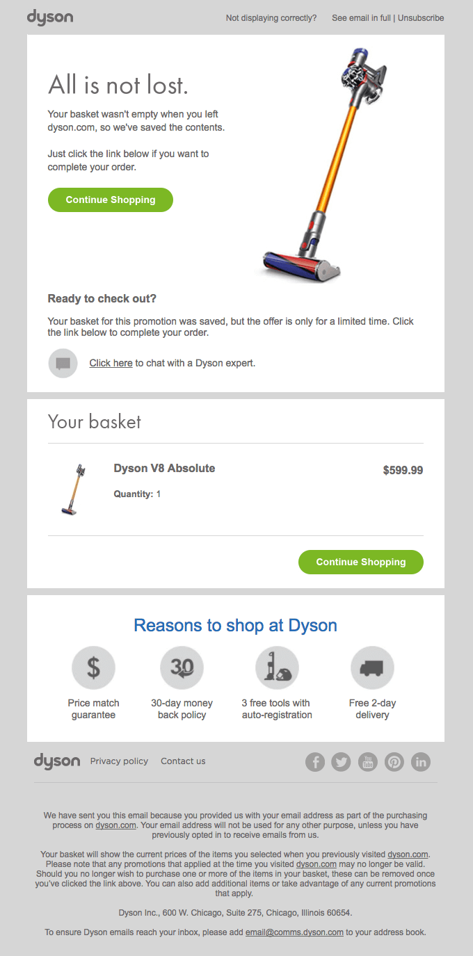
Dyson is light and fun, being playful right from the top. The CTA buttons are all the same and send you to the same place. And it even feels like it is doing you a favor by helpfully saving your cart.
At the same time, you’re told that the offer is limited and, if you like the product and price, it’s compelling enough to go ahead and shop. It’s a good guide to keep your content fun but still get people interested in buying sooner rather than later.
Social Proof and Support
Let’s move on to something light and airy, like a good night’s sleep or a great nap when stuck inside all day. Casper, the mattress company, gives us that feeling with a lot of its marketing, and its cart abandonment emails are just the same.
They send a few in the days after you abandon, but this early email is one of our favorites.
What works is that we instantly get the motif of their brand and desire. “Come back to bed” is the CTA to get us to click, and it reminds us of what they do and why we were looking at their products. If you’re having back pain from a poor mattress, for example, you’ll instantly remember that too as soon as you see the first line of text.
Then, we get hit with social proof of someone saying the exact thing we, as the audience, want to say after we buy a new mattress.
Not only does this method benefit from word of mouth and reviews that audiences online tend to trust more than anything at all, but the specific quote is targeted at the research someone will do around a mattress. It aims to give the reader the answer they want, but uses a customer to do so.
It’s a good double-tap and the two buttons specifically support the two places the reader might be emotionally: ready to buy, or hesitant and wanting to learn more. The text and image are great. They’re simple and direct, and you also kind of want to be Joe from Miami who is sleeping so well.
The Deal Maker
Roughly 60% of cart abandonment is due to costs, delays, hidden fees and other shipping concerns. So, plan for these concerns when setting up your ecommerce website.
You should also plan for them when you set up your email campaigns. If shipping or price are the big reason your customers bail, use cart abandonment emails to counter those concerns. Now, most marketers won’t recommend that you use them in the first cart abandon email because you don’t want to teach people that they’ll always get a discount.
That math is up to you because open rates for cart abandon emails do tend to decline as the campaign goes on, so you’ve got to balance making a deal and landing the most customers.
Now, to the fun part. Here’s a solid example of people making those deals to win someone over.

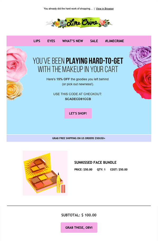
Lime Crime gives a great offer in this light that we want to look at right now. They’re a little silly and give us some great content up top with the savings of 15%.
Not only is that there with a reminder of the cart, but then we get the message around the saving on shipping with a specific cost. On the business side, these offers can help you plan for price changes on your side, as carriers keep raising their rates.
This example order reaches the threshold for free shipping, which makes it compelling right away.
However, sharing the cap also reaches someone with a lower cart value. They might be willing to add in a few items to get free shipping, and potentially overcome an objection they had. The CTAs are strong and easy to see, and the copy is fun. It feels like the brand entirely, and if you already shop there, it’s speaking your language.
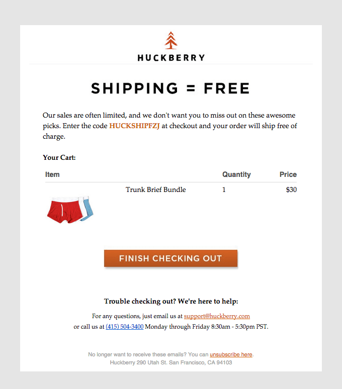
If you want to go the most direct route, this Huckberry email could be right up your alley.
Highlighting Alternatives
Sometimes, people abandon carts because they look at the products in there and think, “No, that’s not quite right.”
They’re looking at something and realizing it might not accomplish what they want, whether that’s a new sense of style, being able to weed the garden easier, getting the perfect taste on a rack of ribs, or another goal we can’t quite know.
These shoppers are still looking, and you might be able to win them back with some additional options, add-ons, or alternatives to accomplish the most common goals for your product. You can try showing accessories and things the main goods need, highlight your best alternative or include things that shoppers like them also liked.
Vans gives us a notable example of that here:
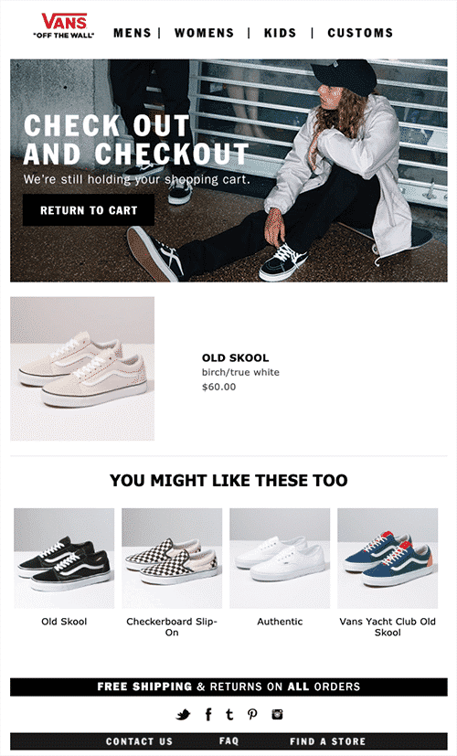
Image Source: ActiveCampaign.
For many shoppers, shoes are extremely personal, and they want to get things just right before they buy. Vans capitalizes on this by showing variations on the item originally added to the cart as well as some true alternatives that have a very different look and feel.
The base shoe is the same in the original as well as the two shoes on either end of the product carousel below. However, the middle two pairs give us a very different feeling. And, we really like the way it’s presented as you’ll like these “too” because it engages and makes you feel like you can still like the first pair but might be inclined to pick up a second.
It’s compelling, not in the reader’s face, and doesn’t beg. We’re invited back for what we thought we wanted, or to try something new.
Conclusion
While they might not always seem like it, cart abandonment emails are an important part of your ecommerce marketing strategy. If you don’t take the time to figure out an effective approach, you can lose a lot of potential sales.
Get them right, though, and you’ll be set up for success! We’ve given you a bunch of good ideas to get you started, now it’s your turn to come up with your own emails and bring people back to their abandoned cart!
How do you approach cart abandonment emails? Have any tips to share? Leave your thoughts in the comments below.

