Specifics Sell: How to Use Specificity to Double Your Conversion Rate
by Aden Andrus • May 9, 2019
Specifics sell. It’s a simple axiom, but one that I swear by in online advertising.
After all, which of these headlines is more compelling? “Get more from your advertising budget” or “‘What could you do with 20% more leads?”
Both of these headlines describe the same fundamental value, but the first is fairly nebulous and raises a lot of questions:
- Why will you be able to get more from my budget than me?
- What sorts of results should I expect?
- How are you any different than the dozens of other advertising agencies who make this exact same claim?
But who doesn’t want 20% more leads? True, a landing page headline like “What could you do with 20% more leads?” does provoke some questions, but in this case, they’re the sorts of questions you want from a potential client:
- How soon can I expect all of those leads?
- What is your secret?
- Why shouldn’t I sign up?
These sorts of questions are the sorts of questions you get from someone who’s already sold. Specifics allow people to envision themselves buying your product or working with you and—since you control the narrative—you can ensure that that vision is full of sugar plums.
See what I mean? Specifics sell.
Specifics Sell: A Case Study
Now, this all sounds nice, but does it really work in real life? To answer that, let’s take a look at a case study from a client of ours.
This particular client operates in the accounting sector. They have a free online registry that connects business owners across the country with accountants.
Simple enough, right?
Originally, this client was using fairly generic pages for their ads, but we thought, Specifics sell, so let’s see what happens if we use more specific imagery on our pages.
So, we came up with 3 different variants to test.
In the first variant, we used a cityscape hero-shot that was specific to one of their biggest markets: New York City.
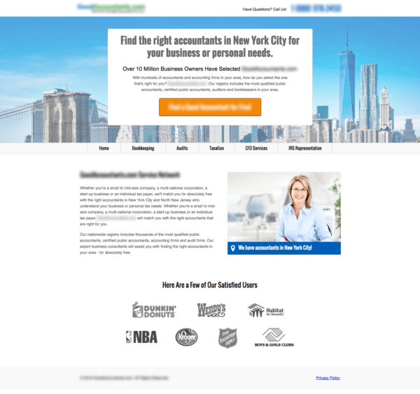
This page had a decent conversion rate of 5.88%. That was acceptable, but only slightly better than the generic pages they had been using before.
In the second variant, we decided to shoot for something even more specific and use an image of a happy, smiling woman for our hero shot. We figured this would give visitors a point of reference for what their lives would be like if they used the client’s registry (“I could be happy and smiling like her if I use this service!”).
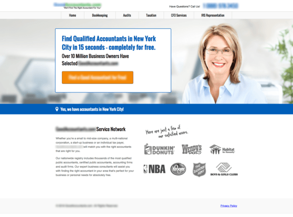
This variant performed 62% better than the cityscape variant had. Why? Because it was more specific.
However, we still weren’t finished. If going from “Look, it’s the city where I live” to “My life will be like that if I use this service” increased conversions by over 60%, we figured that using an image that helped visitors visualize themselves meeting with their new accountant would work even better.
So, we tested a variant featuring an office setting:
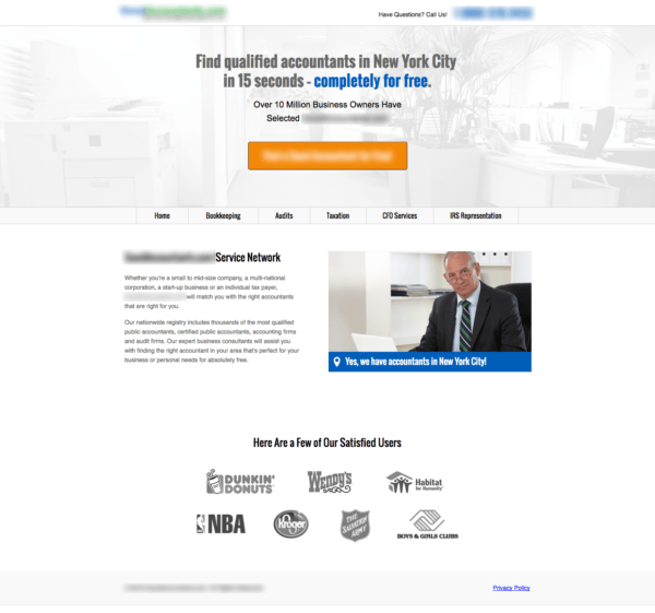
As it turned out, this page had a conversion rate of 10.4%—nearly double the conversion rate of the cityscape page!
Why? You can never be 100% certain, but the evidence seems to indicate that people felt more connected to this imagery. It helped them to envision themselves using the service and think, “Yes, this is me. This is what I want.”
Once they were sold on the specifics of that experience, why wouldn’t they convert?
Getting Specific
Of course, even the best, most specific imagery or copy won’t get everyone to convert, but specifics really do sell. So, if you’ve got a page that isn’t converting well, try making it more specific!
Here are a few suggestions:
Imagery
- Use pictures of your actual business location or offices
- Use pictures of your staff, particularly staff members (doctors, receptionists, account managers, etc) that a potential customer will primarily interact with
- If you cover a large local area, use pictures that are specific to that region or city (ideally, these pictures should be readily recognizable as from that area)
- Use pictures showing customers at your office, store or restaurant
- Use pictures showing what it is like to use your product or service
Copy
- Mention specific results that you have achieve
- Use statistics from your company that help your customer imagine what they will get from your product or service
- Use quotes and testimonials from existing customers (especially if they describe specifics about what your business has done for them)
- Focus on your customer’s experience
Remember, the more specific and relevant you can be to the visitors who are on your page, the better your results will usually be. It takes more time and effort to come up with this sort of content, but the results will be worth it.
Conclusion
See why I love this axiom? Specifics really do sell. They are more believable than generalities or platitudes and they help people to imagine a world where they are using your product or service.
And often, if you can get someone to picture themselves using what you’re selling, you’re a lot more likely to get them to actually buy.
By the way, if you’d like some help making the content on your site or landing pages more specific, let me know here or in the comments. Like I said, I have a passion for specificity, so I’d love to help!
Do you agree with this axiom? How do you use specifics to improve the performance of your pages?


