The Ultimate Guide to Creating a Killer Ecommerce Website
by Aden Andrus • May 14, 2018
So, you’ve decided to create (or recreate) your ecommerce website! It’s a lot of work, but whether you’re an established retailer or an aspiring digital entrepreneur, you’ve come to the right place.
In this article, we’re going to walk you through the process of designing and building an ecommerce website. For the purposes of this post, I’m going to assume that you already know what you’re going to sell online and have your supply chain set up, but if not, feel free to check out this blog post for advice on how to do that.
I want to make sure that you are set up for success, so we’re going to dive into the details here. It’s a lot of content, so you may want to bookmark this post and come back to it as you work your way through setting up your ecommerce website.
Let’s get started!
Note, this post was updated in May of 2019.
Creating an Ecommerce Website
There are a lot of different steps to creating a high-quality ecommerce website that will drive sales for your business. To make navigating this article easier, here’s a quick overview of what we’re going to cover. That way, if you want to jump to a specific step in the process, all you have to do is click on the appropriate step and you can start reading from there.
- Picking the Right Ecommerce Platform
- Setting Up Your Ecommerce Website
- Selecting a Template that Will Sell
- Creating Effective Product Pages
- Adding Features to Your Site
- Optimizing Your Ecommerce Website
This article is over 7,000 words long, so hopefully this will make navigation a bit easier. Now let’s get into the nitty gritty!
Picking the Right Ecommerce Platform
To really succeed at ecommerce, you need to pick the right ecommerce platform. Okay, so if you’re really handy with coding and have all the time in the world, I suppose you could create your own ecommerce solution, but that’s probably not what you’re looking for.
So, before you create your ecommerce website, you need to pick an ecommerce platform.
The good news is, there are a lot of ecommerce platforms out there. The bad news is, lots of options can make it hard to figure out which platform is right for your needs. If you’ve already started looking into your options, you’ve probably seen firsthand how many different features you have to choose from.
Even in a blog post like this, comparing and thoroughly evaluating every ecommerce option out there would be overwhelming and frankly not very helpful. So, in this article, I’m going to focus on 5 of the most popular ecommerce platforms: Shopify, 3dcart, Magento, Volusion and Big Cartel.
However, since I’m well aware that these “Big 5” aren’t the only options out there, we’ll take a look at how these ecommerce platforms measure up in 5 areas that matter to you as a potential customer: pricing, ease of use, templates, plug-ins and customer support. That way, even if a platform we don’t discuss catches your eye, you’ll have a good framework to evaluate them.
1. Ecommerce Platforms: Pricing
If you’re like me, when it comes to picking an ecommerce platform, the first thing you think is, “How much is this going to cost me?” After all, many ecommerce businesses take a little while to start producing meaningful profit and it can be a bit scary to spend a lot of money on an ecommerce platform with no assurance of revenue.
With that in mind, let’s take a look at the relative prices of these platforms:
| Ecommerce Platform | Cheapest | Middle | Most Expensive |
|---|---|---|---|
| Big Cartel | $0/mo | $19.99/mo | $29.99/mo |
| Volusion | $15/mo | $35/mo | $135/mo |
| Shopify | $29/mo | $79/mo | $299/mo |
| 3dcart | $29/mo | $79/mo | $229/mo |
| Magento | $0/mo | $2,000/mo | $3,417+/mo |
As you can see, Big Cartel is hands down the cheapest option on our list, especially for someone who is just getting started. Even their most expensive option is the same price as Shopify’s cheapest option.
While it’s hard to say “no” to free, pricing isn’t the only factor to consider (otherwise, this article would be over). If you’re going to put a lot of time and effort into creating a profitable ecommerce store, picking a platform that will meet your long-term needs is probably more important than picking the cheapest platform.
For example, if you are planning on having a large online inventory, Shopify is a great platform to consider. It scales incredibly well and can handle the demands of large amounts of traffic with ease. If your store takes off, you’ll be grateful that you decided to start with a $9/month platform instead of a free one.
As a brief side note, if Magento’s price tag is giving you a heart-attack, bear in mind that Magento is a crowd-sourced ecommerce platform. If you are decent at coding (or know someone who is), you can easily set up a powerful ecommerce store for very little money.
However, if you aren’t particularly tech-savvy, you’ll need to hire a developer (either through Magento or directly), which can get pricey fast.
Despite my frugal nature, I recommend choosing your ecommerce platform based on what your needs (and anticipated needs) are, rather than how much the platform costs. In the long run, picking the right platform will be worth a lot more than saving a few dollars (or even a few hundred dollars).
2. Ecommerce Platforms: Ease of Use
If you’re new to ecommerce, ease of use is probably a big priority. Features are great, but all the features and customizability in the world won’t mean much if you don’t have the knowledge and expertise to use them.
Fortunately, all 5 of the ecommerce platforms we are discussing in this article are fairly easy to use and they all come with a setup wizard that will walk you through the process of setting up your store. However, creating your first store isn’t the only ease of use factor to consider.
Once your store is set up, there’s a lot to stay on top of or optimize. How an ecommerce platform manages your inventory and the design functionality options it offers all play a role in how easy a platform is to use in the long run.
Shopify
Shopify makes setup incredibly easy. It has a very straightforward dashboard for adding products, customizing your site design and more. If you happen to be switching from another platform to Shopify, Shopify has a slick import option as well.
After your store is set up, Shopify also makes it easy to add additional products, including titles, descriptions, price and several other handy fields. Regardless of what you are specifically trying to do, Shopify has handy tips all over the place, making it the most user friendly platform on this list, in my opinion.
Volusion
Like Shopify, Volusion makes it easy to set up your store. Although it’s not quite as attractive as Shopify’s dashboard, Volusion’s store creation process isn’t hard to follow, so you can quickly get up and running.
Adding products afterward is also a simple affair, but things do get more complicated if you want to change how your site looks after the initial setup process. At this point, you basically need to know how to code to change anything, which isn’t great since your first design is rarely perfect.
Big Cartel
Early on, Big Cartel’s ease of use ranks right alongside most of these other platforms. Setting up a store with Big Cartel is a breeze.
However, Big Cartel is specifically designed for artists and makers who want an easy way to sell a few items online, so it’s long-term options are very limited. You only have a few templates to choose from and almost no store customization options. To break away from Big Cartel’s core setup options, you’ll need to some serious coding.
3dcart
Setting up a store with 3dcart isn’t quite as straightforward as setting up a store with Shopify or Volusion, but that’s primarily because 3dcart offers a ton of features you can use to customize your store.
If all those features sound a bit intimidating, don’t worry, 3dcart has tons of tutorials you can use to get the most out of the platform and a clean wizard that offers a setup process that is about as easy as Shopify’s.
Unlike some of its competitors, 3dcart does not have a drag-and-drop visual editor, but it does at least have a limited visual editor you can use to edit your site—even if your CSS or HTML kung fu is weak. This is great for people who are new to ecommerce, since you can customize your store without having to hire a developer.
Magento
As I mentioned before, Magento is an open-source ecommerce platform, which means it’s an ecommerce platform designed for developers, by developers. As a result, it’s high on features and customizability…and low on ease of use. Don’t expect to get very far with Magento without a developer.
3. Ecommerce Platforms: Templates
A new visitor to your ecommerce store forms an opinion about your brand within 0.2 seconds. What produces that opinion? It’s not your product, price or copy—it’s your site design.
People instinctively distrust poorly designed websites, so if your store doesn’t look good, it may be hard to bring in sales. Unfortunately, not everyone is a natural artist and hiring a designer to compensate for your creative shortcomings can be expensive.
This is where templates come in handy.
All of the ecommerce platforms on this list offer at least a few design templates you can use to give your store a polished, professional look, but there are a couple of platforms that really stand out in this area: Shopify and Magento.
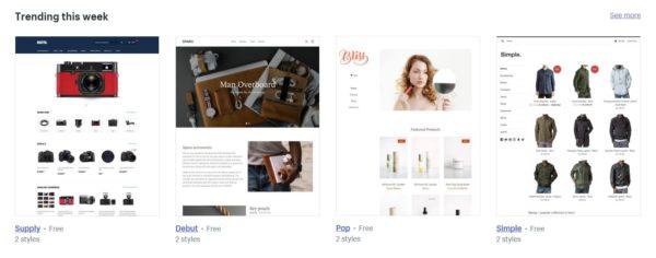
Shopify offers dozens of beautiful and functional themes (aka, templates) for you to choose from. Some of these are free and some cost $140-180.
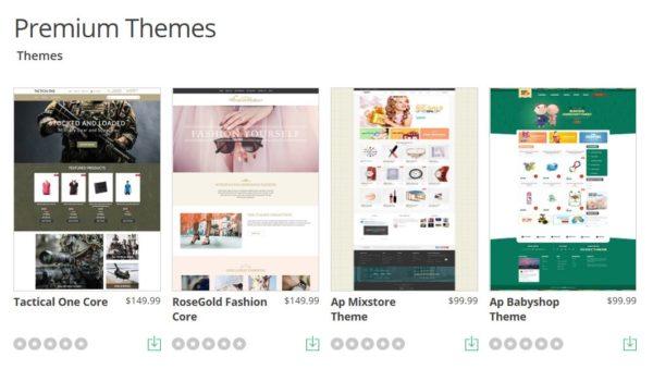
Similarly, Magento offers dozens of paid and free themes on the Magento marketplace:
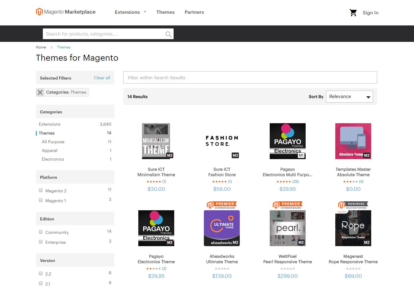
You can also find a lot of Magento and Shopify themes on third-party websites like Themeforest or TemplateMonster, so you have literally hundreds of theme options to choose from with either platform.
Historically, 3dcart didn’t have a lot of themes and the ones they did have looked quite dated. Now, however, 3dcart offers almost as many free and paid themes as Shopify or Magento. The themes might not be quite as polished as the ones on Shopify or Magento, but with how easy it is to customize your design on 3dcart, that’s an easy problem to fix.
All of 3dcart, Magento and Shopify’s themes are beautifully designed and do a good job of convincing potential customers to buy. In addition, with all of these templates at your fingertips, these ecommerce platforms make it easy to give your store a unique look and feel that sets it apart from the competition.
By comparison, Big Cartel and Volusion don’t offer much in the way of templates. They only offer a few themes and those themes are incredibly basic. Combine that with how difficult it is to customize your design on these platforms and you may need to pay a designer and a developer to get the kind of design you want.
4. Ecommerce Platforms: Plug-Ins
Another factor to consider when picking an ecommerce platform is the plug-in options they offer. While it would be nice if every ecommerce platform offered every possible app and add-on you could need, different businesses need different plug-ins, so most platforms don’t make every plug-in part of their standard package.
The good news is, even you’re not a developer, plug-ins give you the ability to customize the functionality of your store.
Some plug-ins give you options like a “free shipping” bar or coupon pop-ups that help improve your user experience (and their odds of making a purchase). Others give you additional options on the back-end of your store, like checking to see if your pages are optimized for search engines.
When it comes to plug-ins, Magento definitely takes the cake. The Magento marketplace offers literally thousands of extensions you can use to do almost anything you can imagine on your ecommerce website.
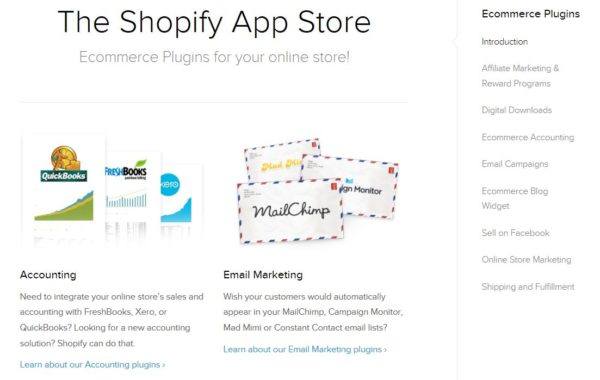
By comparison, Shopify offers far fewer plug-ins (called “apps”), but the ones they do have are very handy and customizable, so you can typically find a way to get your site to do what you want—even if you don’t have thousands of plug-in options.
3dcart also has a number of plug-ins, but they don’t have as many as Shopify and it can be harder to find them.
Big Cartel and Volusion again come up short in this department. Volusion only offers one app and Big Cartel doesn’t really offer any (they technically have “plug-ins” you can enable, but it’s more like turning on specific features, like Google Analytics tracking). Again, while these platforms can be great if you have the expertise on hand to develop your own custom plug-ins, without a developer it may hard to customize your store.
5. Ecommerce Platforms: Customer Support
Finally, one thing many aspiring ecommerce business owners fail to consider is the customer service options that come with their chosen platform. Let’s be real, if you’re creating your own store, tutorials and guides can only get you so far—from time-to-time, you’re probably going to need to talk to a human.
Here, Shopify, Magento and 3dcart are the clear winners. Both of these ecommerce platforms offer 24/7 phone, chat and email support.
Volusion, by comparison, offers 24/7 email and chat support, but may not always be available for phone support. But, if you’re like me and prefer typing to talking, that may not be a problem.
Unfortunately, Big Cartel comes in last place with regards to the accessibility of their customer service department. As long as nothing bad happens at night and you’re okay with waiting for them to respond via email, everything should be okay…but if you have a critical problem outside of normal business hours, you’re on your own.
Of course, all of these ecommerce platforms have a knowledge base that should cover the majority of issues you could potentially run into. This is particularly true for Shopify and Magento, which have the largest user base and thus the most forum activity and user-generated content.
Honestly, for most problems, it’s easiest to use the platform’s existing knowledge base, but for those times when you can’t find a solution online, good customer service can be a lifesaver.
To sum all of this information up, there is no “right” platform for every ecommerce website. Many retailers could do well with almost any of these platforms. Shopify, Magento, Volusion or even Wix or WooCommerce…it doesn’t matter as long as you pick the platform that best fits your needs.
Setting Up Your Ecommerce Website
Once you’ve picked a platform, getting set up is pretty easy. The account creation process is fairly straightforward and you’ll usually be asked to give your name, the name of your business, your business address and billing information, among other things.
After you’ve created your account, you’ll be taken to the platform’s storefront builder, which typically looks something like this:
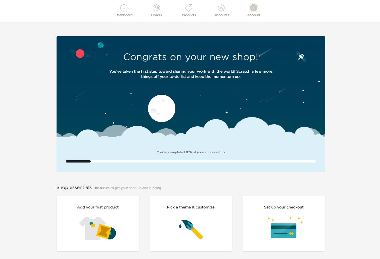
Big Cartel’s storefront builder.
The storefront builder is where you’ll do the majority of your store management tasks (adding/managing product pages, sales, inventory, payment processing, shipping, etc), so it’s a good idea to spend a few minutes getting familiar with the interface.
The easiest way to learn about how to use your storefront manager is visually, so here are links to some great video tutorials on how to use some of the more popular storefront builders:
By the way, if you prefer written tutorials, feel free to search our blog for detailed instructions on how to set up and manage a store using your chosen ecommerce platform. We have articles on almost every major platform, so you should be able to find the help you need. If not, let me know in the comments and I’d be happy to help you out!
Selecting a Template that Will Sell
While most ecommerce platforms go to great lengths to make it easy to learn the basic mechanics of setting up and managing your store, creating an ecommerce website that actually works for your customers is up to you.
Since hiring a designer to create the perfect look and feel for your website (and a developer to implement that design) is expensive, most ecommerce businesses opt to use the next best thing: a pre-designed template or theme.
As we discussed earlier, most ecommerce platforms have a number of free and paid templates that retailers can use to customize the look, feel and function of their ecommerce website. Here are a few places you can look for templates:
With all of these options, it’s tempting to just look for a design that suits your tastes.
Unfortunately, how much you like a template isn’t a great predictor of how your audience will respond to it. The best way to figure out what your audience wants out of your website is to test different elements of your site (more about that later), but since you’re just starting out, here are a few things to keep in mind as you choose and customize your template:
Smaller Banners = More Sales
In general, big banners encourage site visitors to focus on your business’s branding elements (logos, etc). Smaller banners encourage visitors to focus on your products.
As we’ve tested various websites, we’ve found that smaller banners mean more sales for your business. There’s a temptation to want to pick a theme that will really feature your logo, but remember, your site is about creating a user-friendly experience, not just promoting your brand.
For example, the Styles theme keeps the header banner content short and puts the focus on the products:
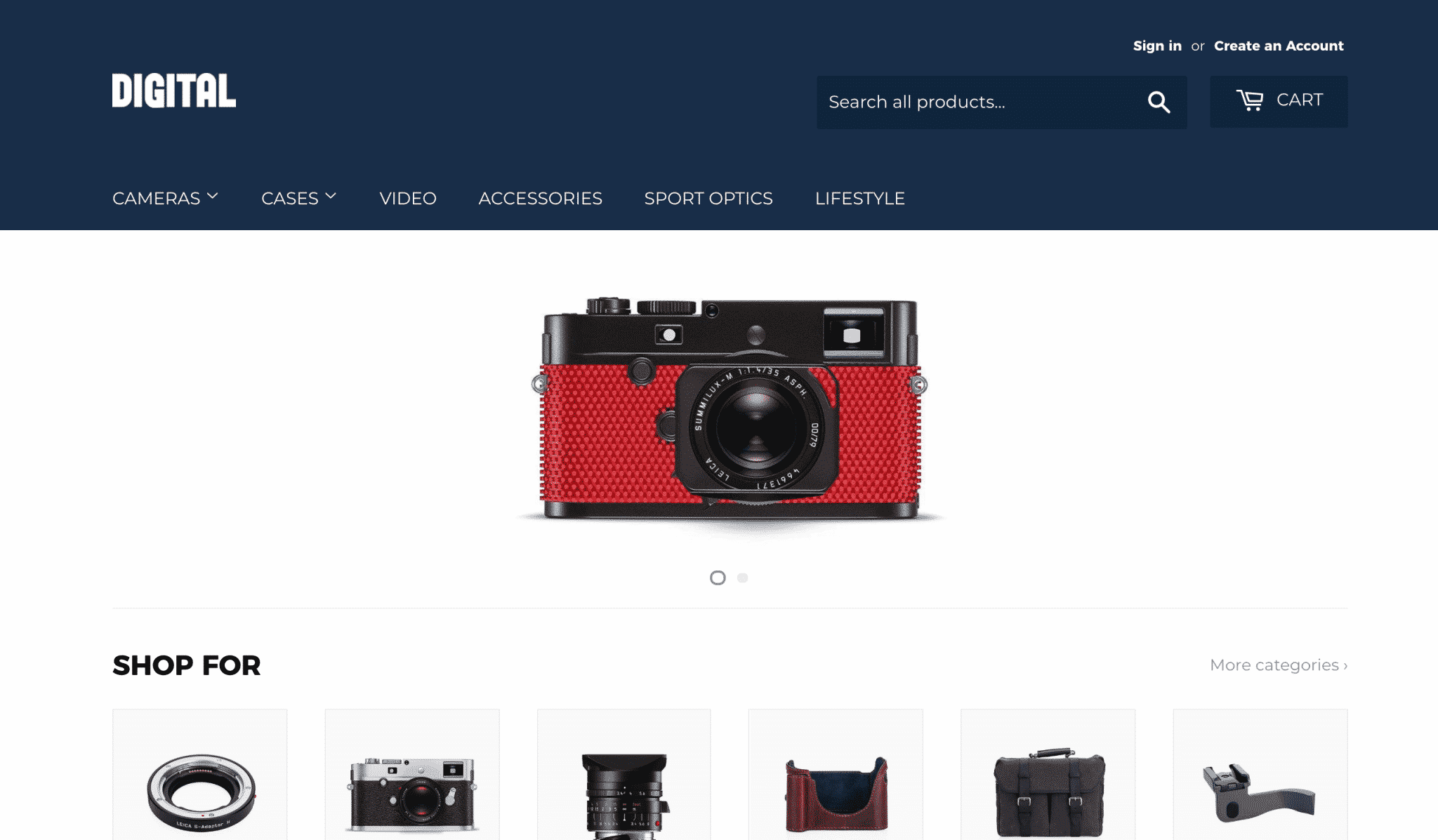
View store demo here.
However, while small banners tend to perform better, keep in mind that a small banner doesn’t give you a lot of room to talk about your unique value proposition or place a call to action. But, by inserting images onto your pages with text overlaid on top of them, you should be able to still address those points on your pages.
Make Sure the Search Experience is Great
In our experience, people who search for things on ecommerce sites are often 2-4x more likely to buy than visitors who use navigation buttons, so a search bar that blends into the page is a waste of potential. From our experience, moving the search bar to the top of the page can increase internal searches by 15-40%.
For example, the Kavir theme does a good job of making the search bar easily accessible:
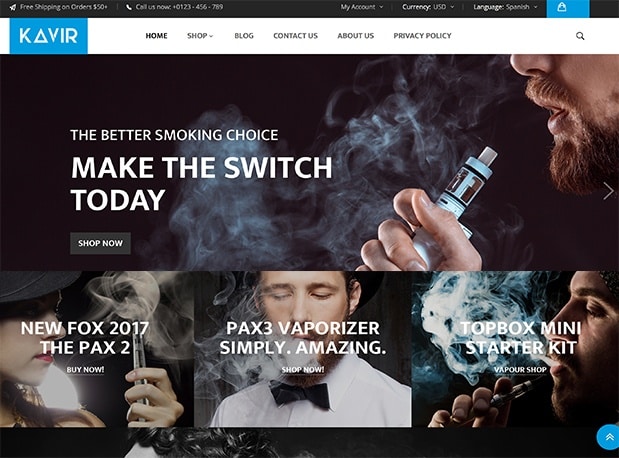
View store demo here.
Of course, some templates make the search bar easy to find on desktop and then bury it inside the menu on mobile, so keep an eye on that as you pick your theme. Kavir does a great job of this as well:
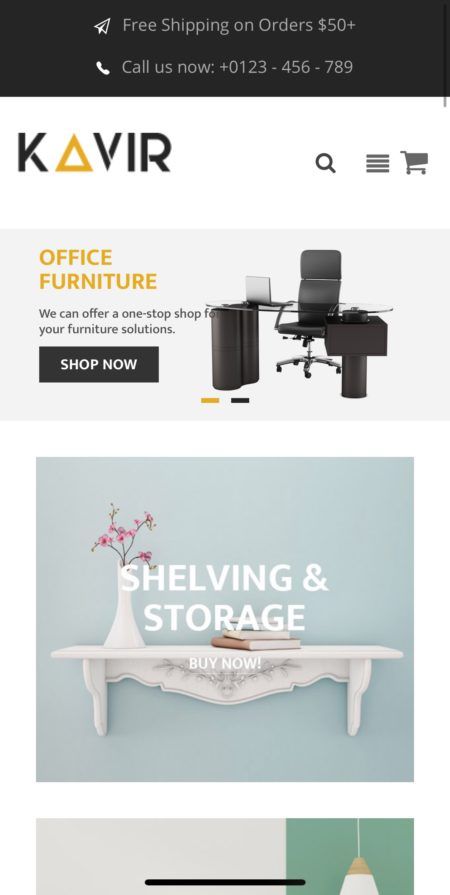
Unfortunately, Kavir’s search results page leaves something to be desired. Grid format search results limits the information that can be displayed prior to the user clicking through to a product display page (PDP). In contrast, a list format allows the user to see at least part of the product description to determine which is the right product, increasing the likelihood that they’ll make a purchase.
Look for “Quick View” Buttons
“Quick view” buttons on search and/or category pages that open a simplified product page are a great way to enhance your store experience. If you sell low price items (or items with little customizing), the “quick shop” window can increase cart additions substantially.
You can find this feature in a variety of themes like Athlete (featured below). Alternatively, if you love a template without this feature and don’t mind paying to add it, there are a variety of extensions that you can use to get this feature on your store:
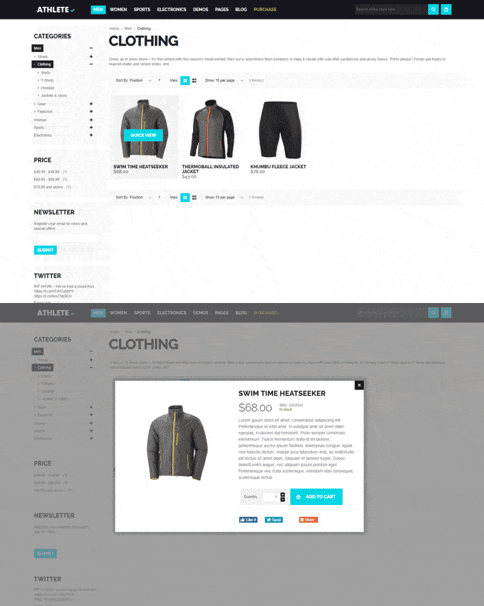
View demo store here.
In our site tests, we’ve found that removing “quick view” windows decreased cart additions by 17% and conversion rates by 6%. Placing more prominence on the quick shop option increases cart additions by +8% and conversion rates by +3%.
While cart additions from a “quick view” window are not as high-intent as those from a product page, the volume of cart additions resulting from this option creates enough conversions to outperform the alternative.
Of course, if you really want to make the most of your category and search results pages (and you should), look for a theme that pairs “quick shop” buttons with great filtering options like the ones found in the Magetique theme.
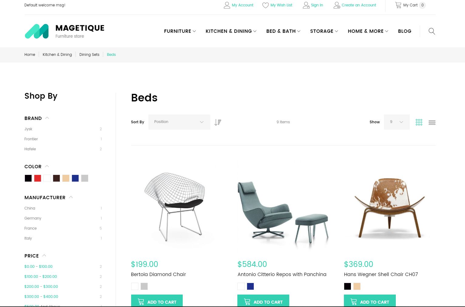
View demo store here.
The ability to filter down options and find the perfect product is particularly important if you’re selling for high-price, highly-customizable items (think auto parts, technology, instruments, etc).
Avoid “Ghost” Buttons
One thing to watch out for in a Magento theme is ghost buttons (transparent buttons with a thin border) in the home page banner. Our tests have shown that swapping a ghost button for a brightly colored button can increase clicks on the button up to 50% (that’s a lot, considering it’s the main button people see when they arrive on your page).
For example, be very careful with a theme like Retina:

View demo store here.
Can you see how hard the buttons are to read?
To be fair, if you’re careful about your design choices, you can get away with “ghost” buttons. For example, in this rendition of the Fona template, the designer created a lot of visual contrast between the text and the image in this particular screenshot, which helps the “ghost” buttons stand out:
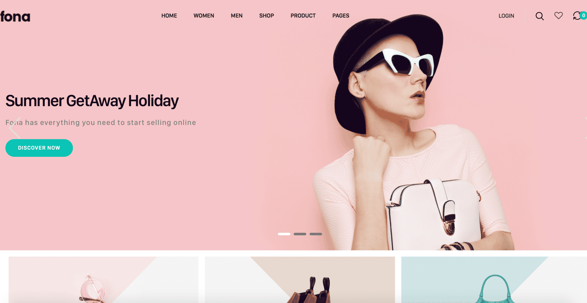
View demo store here.
However, while you can work around “ghost” buttons in your final design, picking a theme that features “ghost” buttons means you’ll always have work around that with the imagery you choose to use. Otherwise, you can end up losing a lot of potential sales.
Keeping these elements in mind can help you choose a template that is more likely to drive sales from day one, but you’ll still want to test things to get the most out of your ecommerce website. But, for now, let’s focus on getting your product pages set up right.
Creating Effective Product Pages
It’s fairly easy to add products and product pages to your store in most ecommerce platforms. However, if you really want your products to sell, you need approach your product pages the right way.
The easiest way to show you how to set things up right is to show you an example, so let’s take a look at how to effectively set up product pages in Shopify. Like most ecommerce platforms, when you add a product or create a product page, Shopify gives you a variety of fields to complete.
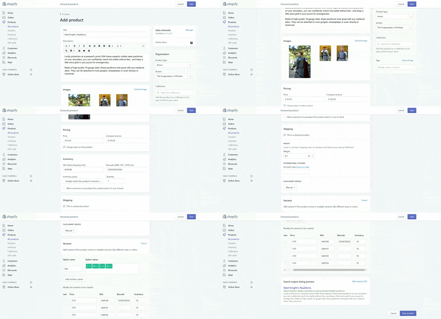
Most of these fields are fairly straightforward product organization or shipping fields. You should be able to complete these fields using the information in your product catalog.
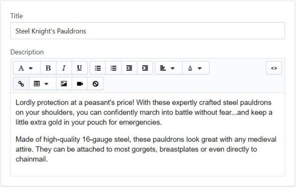
However, getting your title, description and images right can have a huge impact on the success or failure of your store. Outside of work, I create and collect costumes, so I’m going to use a pair of pauldrons (medieval shoulder armor) to discuss how to effectively complete these fields on your product pages.
Title & Description
Your title and description field contain text that tells your potential customers what your product is, how it’s made, what it does and other important information.
In addition to telling your customers about your product, your title and description are what Google will look at for determining which organic searches your product can show up for.
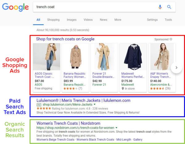
It’s important to note that these organic search result placements are different than paid search text ads or Google Shopping ads.
If your product page ranks organically for a particular search, you can get clicks to your page for free. However, there’s no guarantee that your product page will rank organically—even if your product is a perfect match for someone’s search.
You can improve the likelihood that your product page will show up for a relevant search by optimizing your title and description (this is called “search engine optimization” or “SEO”), but even the most optimized page can still struggle to rank—especially there is a lot of competition for your target keyword(s).
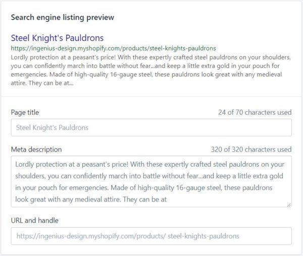
To tweak how your title, meta description and URL will appear on Google, expand the “Search engine listing preview” at the bottom of the “Add products” page:
With Google Shopping ads and text ads, you have to pay for every click. However, if you’re willing to spend enough, you can guarantee that your product page shows up for relevant searches.
There’s a lot of debate out there about what constitutes a “good” product title and description. But, most experts agree, your product page content should cater to your customers.
So, if you’re selling an expensive product to an audience that cares all about the specific details and features of that product, your description should cover all of those features in detail. On the other hand, if you’re selling a cheap, run-of-the-mill item, you might want to keep your description short and sweet to avoid overwhelming potential customers.
Images
In online shopping, image quality matters…a lot! Since people can’t actually examine your product in person, they are forced to rely on your images to make a decision.
So, if you don’t have great images, you probably won’t have great sales, either.
Image Optimization
Ideally, it’s best to have high-quality, clear images taken from a variety of angles. In addition, if your product has special features that you want to highlight (detailed embroidery, hand-carved trim, etc), it’s a good idea to include specific photographs of those features on your page.
Another great way to get more out of your images is to feature them in actual use. This helps people envision what owning or using the product will be like.
For example, most people who are interested in buying medieval armor want to look like (or have their significant other look like) a studly, manly knight, so including pictures like this might help convince people to buy:

Images used with permission (Source).
As you photograph your products, make sure that your lighting and color schemes match the feelings you want people to associate with your product. Hi-tech products look best in clean or high-contrast environments, while eco-friendly products work better with more natural hues, tones and backgrounds.
If photography isn’t your thing, many products come with high-quality photos from the manufacturer. If that isn’t the case (or you think custom photos will sell better), you can also find a professional photographer through Shopify Partners.
Loading Speed Optimization
Unfortunately, images are something of a double-edged sword. While high-quality images are great at convincing people to buy, they can also slow down your website.
Most people will only tolerate a page load time of about 2 seconds, so if those beautiful photos don’t load quickly, they could end up killing off potential sales instead of aiding them!
As a general rule of thumb, each image should be less than 70 kb.
Now, most high-quality photos are a lot bigger than 70 kb, so you’ll probably need to resize them for your product page. The easiest way to do this is to use photo-editing software like GIMP (free, but clunky) or Adobe Photoshop (easy, but costs money).
To resize your photos in Photoshop, open your image in Photoshop and click File > Export > Save for Web:
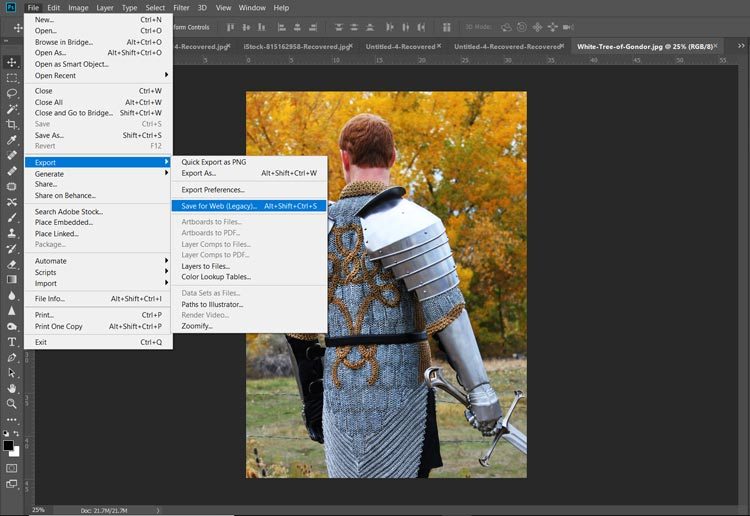
From there, you can play around with a variety of settings until you find the right balance between file size and image quality (color-coded to match where they show up in the image below):
- Quality. Lower numbers = lower image quality and lower file size.
- File format. In terms of file size, JPEG < GIF < PNG. But, the same rule applies to image quality.
- Optimization. Checking the box tells Photoshop to optimize your image for web use (decreases image size).
- Color. Fewer colors = lower image quality and lower file size.
- Image size. Allows you to choose the actual number of pixels in your image. Fewer pixels = smaller image and lower file size. Keep in mind that if you save an image at smaller size than it will be shown on your page, your image may be stretched to fit your page, resulting in heavy pixelation and/or image distortion.
You can see the file size in the bottom left-hand corner of the window. This number—along with a preview of your final image—will update as you make changes to your export settings.
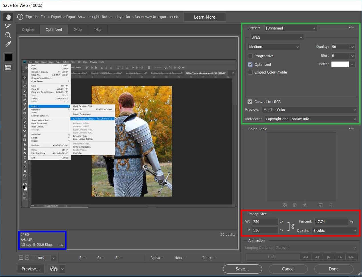
Yes, I’m saving my “Save for Web” screen shot in the “Save for Web” window. I just couldn’t resist adding an “Inception” moment here…
Photoshop’s “Save for Web” tool (other photo editing programs have similar tools) make it fairly easy to balance image quality and file size. That way, you can make sure that your pictures really sell your products without compromising on load speed.
Adding Features to Your Site
As you can probably imagine, an electronics store probably wants different features on their website than a custom T-shirt business does. As a result, most ecommerce platforms offer a variety of plug-ins you can use to add special features to your website.
Some ecommerce platforms—like Magento and Shopify—offer almost endless customization options, while others only offer a few standard plug-ins.
Here are some good places to look for plug-ins for your store:
Here again, you’ll want to be thoughtful about which plug-ins and features you add to your ecommerce website. Sometimes features help drive sales and sometimes, they drive sales away.
Plug-ins are another great testing opportunity, but to give you some direction while you’re setting up your ecommerce website, let’s take a look at a few different types of plug-ins to consider:
Reviews Plug-ins
One of the best ways to convince people to trust your products and your store is with reviews. A plug-in like Yotpo (available on multiple ecommerce platforms) is a great way to collect and display this sort of invaluable user-generated content (UGC).
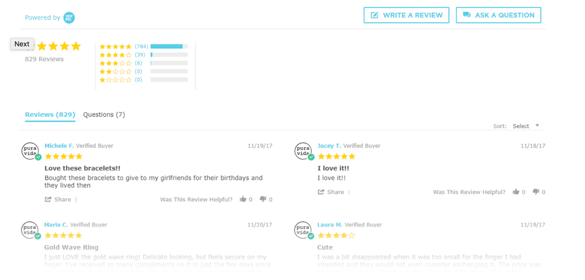
A good reviews plug-in like Yotpo will:
- Send well-timed emails to customers asking for reviews
- Give you a way to display reviews on your ecommerce webiste
- Give you full moderation control
- Help push traffic from Facebook and Twitter
- Display your product ratings on Google Shopping
Since even just one good product review can lead to a 10% increase in sales, ensuring that your website can collect and feature reviews on your products is a near-must for almost any ecommerce website.
Shopping Cart Plug-ins
The better your shopping cart experience is, the more sales you will get. With cart abandonment rates floating around 80%, anything you can do to make your shopping cart experience easier and more intuitive is a step in the right direction.
Using a simple plug-in like Persistent Cart to keep your customers’ shopping cart items, well, in their shopping cart is an easy way to improve your cart experience. Similarly, you can use plug-ins like WishList Plus to give people a way to save items they aren’t quite ready to buy.
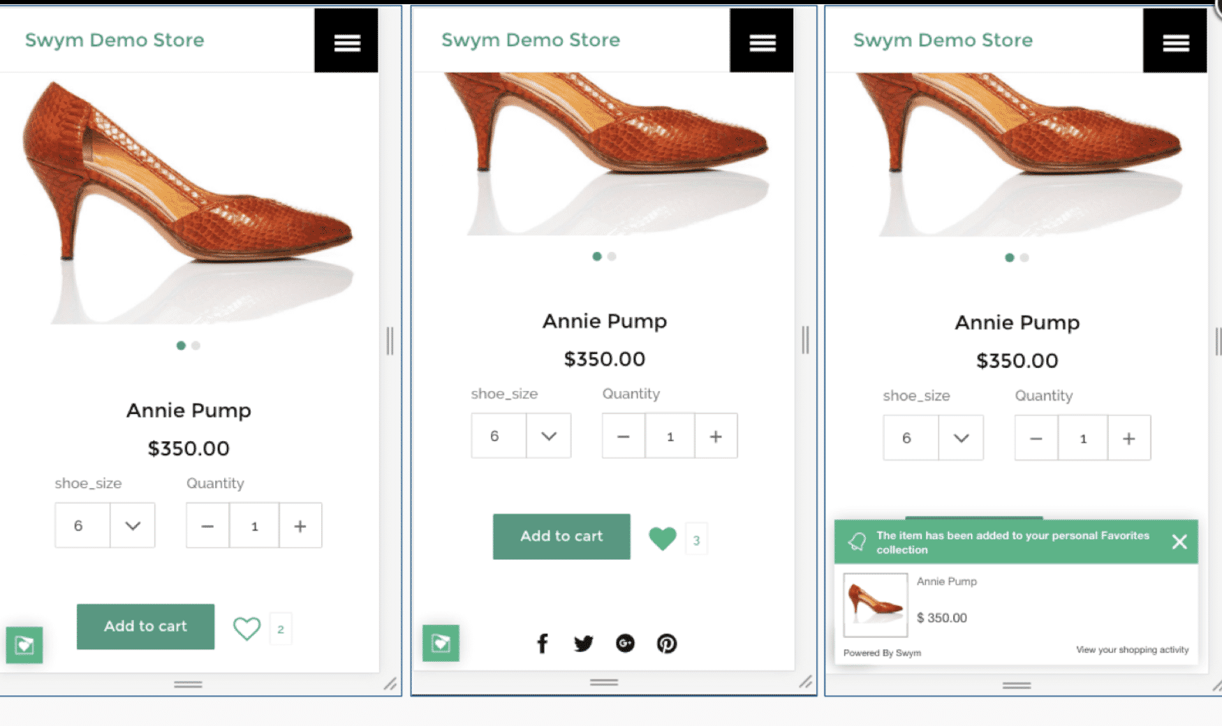
If you can get people to create an account to save their wish list to, you can use a plug-in like Mageware’s Abandoned Cart Email Extension to send cart abandonment emails encouraging people to come back and make a purchase. Cart abandonment emails have increased sales by 8-12% in some studies, so these types of plug-ins can be worth their weight in gold.
Product Info Plug-ins
Sites that empower customers sell more than sites that don’t. It’s a simple but undeniable fact. Using a plug-in like the Wiser Product Recommendations app or Product Compare allows you to give customers the information they need to pick the best product for their needs.
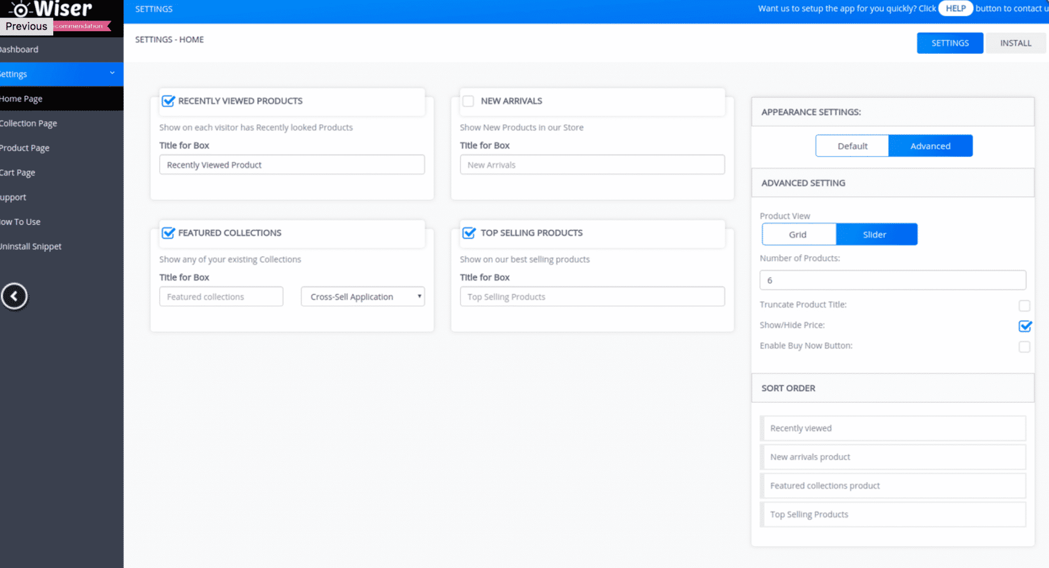
If you offer a lot of different products, you can use these sorts of plug-ins to create an Amazon-like experience for site visitors, showing them featured products (which are often upsells), best selling products, recently viewed products, new arrivals, or those similar to what they’re currently looking at. The sky’s the limit!
Live Chat Plug-ins
Many online shoppers prefer live chat to other forms of communication and having it available on your site can increase conversions immediately. A live chat plug-in like Tidio’s Live Chat or Tawk.to Live Chat allows you to answer order or product questions quickly and can make a world of difference to your customers.
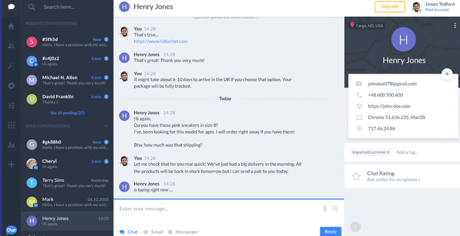
A good live chat plug-in should offer the following features, at a minimum:
- Insight into exactly who is on your site, so you can reach out and offer help
- Automated messaging
- Mobile-support
- Multi-language support
Most live-chat plug-ins are quite affordable, so they are well worth considering.
Adding the right features to your ecommerce website can significantly improve the user-friendliness of your site and, as a result, increases sales. Of course, the right set of plug-ins for your business will depend on your ecommerce platform, target audience, product offering and business needs, but this list should help get you pointed in the right direction.
Optimizing Your Ecommerce Website
At this point, you know enough to get your ecommerce website launched. However, that’s just the beginning. As your customer base grows, you’ll want to start optimizing your website for maximum performance.
To do that, you’ll need to do something called “conversion rate optimization” (CRO). Simply put, the conversion rate of your ecommerce website is the number of sales you get in a given time frame, divided by the total number of people who visited your site or landing page (multiplied by 100%).
Conversion rate = (sales / total visitors) * 100%
For example, if your site had 17,492 visitors and 2,305 sales last month, your conversion rate is 13.18%. Easy enough, right?
While calculating your conversion rate is simple enough, optimizing your conversion rate takes a lot of time, thought and work. However, the results are worth it. In our experience, CRO testing consistently increases our clients’ ecommerce conversion rates by 20-50% in a matter of months…and things just get better from there.
In other words, if you aren’t testing your ecommerce website, you could missing out on countless sales!
To help you get started, here are a few different ways to get more sales out of your website through CRO testing:


