More than a Pretty Face: Ecommerce Website Design
by Cydney Hatch • May 31, 2018
I think we all have heard the phrase “she/he is more than just a pretty face.” It is a phrase that basically states that a person/thing is more than just it’s aesthetic appeal, it has depth and meaningful content.
This attitude should translate to how we treat ecommerce website design. Unfortunately, I frequently hear people say that:
- “web design is a waste of money…”
- “website design does not directly translate to sales, so put it on the backburner..”
- “Let’s just get the website up and we will come back to design later…”
- and lastly, “web design is a waste of time…”
No! You are losing so much depth, strategy and value to your business when you have this mindset.
Although you should not be investing all of your budget and time into an ecommerce website design, there needs to be a delicate balance of functionality, speed, SEO rankings and thoughtful craftsmanship. The way your site looks tells potential customers whether they want to interact or do business with you in just a fraction of a second.
One glance can turn someone into a customer, or force that person to click away. People are drawn to ideas more than they are drawn to companies or products. The details matter.
In this article, we will discuss some basic ecommerce website design basics as well as beautiful website designs that will help you see that website design truly does translate to more than “just a pretty face.”
Ecommerce Website Design Musts
So, what makes a stellar ecommerce website design that will keep customers coming back?
Well, good design is a BIG part of it. If you question that, read some of these statistics:
- “38% of people will leave a website if they find the layout unattractive or difficult to navigate”
- “Given 15 minutes to consume content, two-thirds of people would rather read something beautifully designed than something plain”
- “Google: 53% of mobile users abandon sites that take over 3 seconds to load”
Want to avoid driving away potential customers? Work on design, because it is more than just a “pretty website,” it is your business brand experience. It does matter.
It all starts with basic and thoughtful design, usable technology and function and a user-friendly experience. I have talked to many businesses about branding, good design and taking action, but it’s shocking how many people still fall flat when it comes to their visual designs.
When creating your site, here are a few basic ecommerce website design “musts” you should consider:
- Strong Logo and Branding
- Stylized Typography (but also easy-to-read typography)
- Customized and Defined Color Palettes
- User-Friendly Interface Tools
- Integrated Social Media Application
- Simple Navigation and Clear Page Categories
- Creative and Strong Images that Reflect Brand
- Targeted and Creative Content and Ad-Copy
- Simple Call to Action Elements
- Strong Brand Story and Objectives
- Modern Design and Function (Including elevated use of video)
Ultimately, it’s truly up to each brand to figure out what every target audience needs and how to best serve, inform, entertain and engage them. Test all of the different elements on your site frequently, including video, images, content and design to see how your audience responds. Your audience will constantly evolve and it’s your job as an ecommerce business to evolve with your customers!
In the planning phases, think about first impressions, your overall image, importance of information, branding and how the user will interact with a site to help ensure you create the best website design possible.
Ecommerce Website Designs I Love
Let’s look at some great ecommerce website designs I love and how they fulfill a lot of the “musts” laid out above.
DryBar
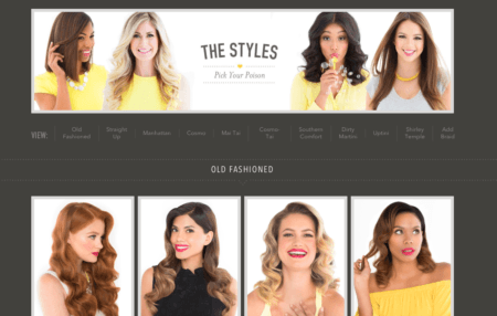
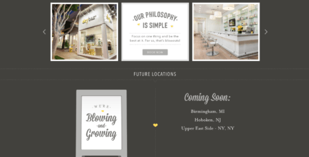
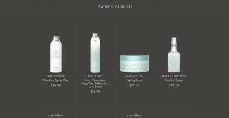
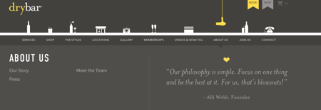
Drybar has a defined and great color scheme (consistent and branded in photography and design) paired with subtle animations that give this site both style and personality. It has high-quality, styled and simply defined photography style that is consistent across all of its pages. It shares meaningful content with cute alliterations, photography and style that keeps customers wanting to read and engage.
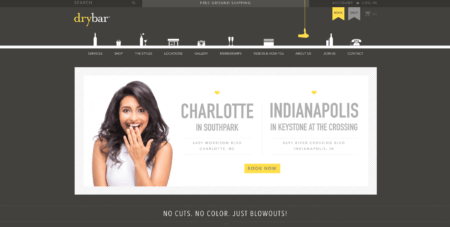
Mouse over the little hairdryer and it bounces on its cord *below yellow hairdryer icon). Hover over the icons at the top and a tiny animation gives you some feedback.
How cute, right? Touches like this make the site fun to use without being overwhelming or annoying.
Drybar also shares meaningful video content on services and products that makes customers come away feeling informed and that they want to try their hair products! I mean, I want to try this finishing wax spray!
Drybar “blows” ecommerce website design out of the water! They are making many women want to “comb over” and visit their many store locations! Okay, okay, all of Drybar’s cute plays on words got the better of me there…
Poppy & Pout
Poppy & Pout is a 100% natural & cruelty-free cosmetics company that currently wholesales at a lot of popular and hip locations including: Whole Foods, Anthropologie, Urban Outfitters and Nordstrom.
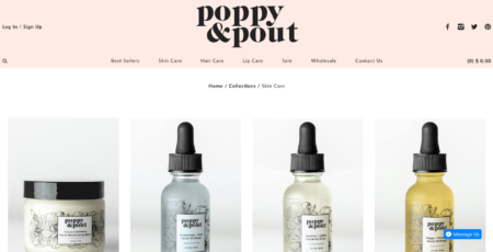
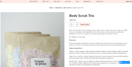
As a lot of their sales come directly from those stores, their site is very straight-forward.
Why?
Many might snub the site, thinking it doesn’t have an “About Us” page, it’s plain, etc, but the purpose of this site is to get people to buy products they already are familiar with. They are buying refills of products they have found in these store, so they just skip a step of “selling” and making their website design beautiful but straightforward.
What is genius about this company is the way it focuses on driving customers to their social media pages. On those pages, they continue to combine function and style with consistent, beautifully feminine photography. They also push people to become “influencers” and self promote their products.
Poppy and Pout truly understands the power behind word of mouth promotion coupled with quality product, brand and design.
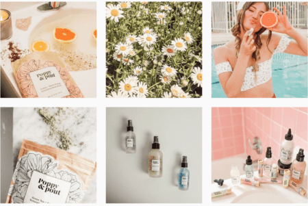 A popular ecommerce trend is stop motion video, which Poppy & Pout uses to beautiful effect, again in a minimalistic, straight-forward and product-focused way!
https://www.facebook.com/poppyandpout/videos/1628158210731181/
I not only love these products, but I love their site. It is bright, stylized and feminine. Their product photography is high quality, clean and the design is overall just strong. Logo, brand and website. It all beautifully works together to focus on what people love: the products!
SimplyChocolate
I LOVE this site!
Simply Chocolate is a chocolate company based in Denmark that uses animation throughout their ecommerce website design.
Simply Chocolate’s ingenious, fun site design gives each product time to shine. It uses the parallax effect beautifully, allowing customers to scroll down and see chocolate bars floating above meaningful content with other fun animations like crumbling and unwrapping as you want to know more information about a specific bar.
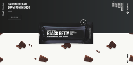
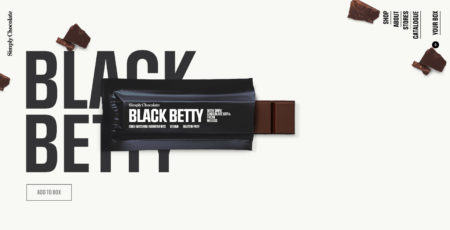
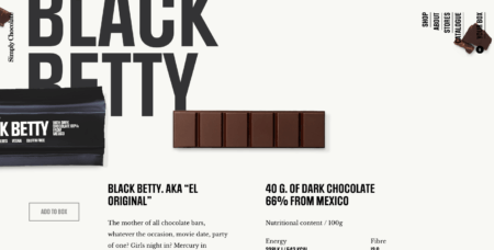
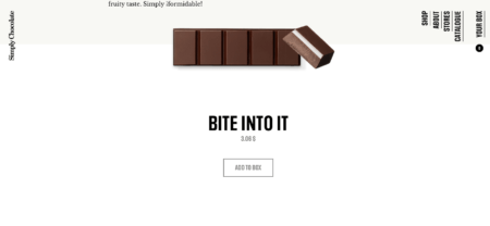
Simply Chocolate’ site typography is bold, clear to read and engaging!
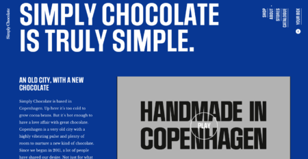
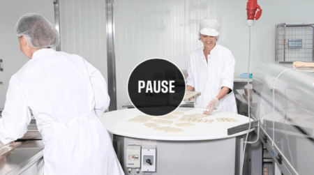
Their video gives a great introduction to their company and they give off “friendly vibes” introducing the team in a consistent, creative and designed way!
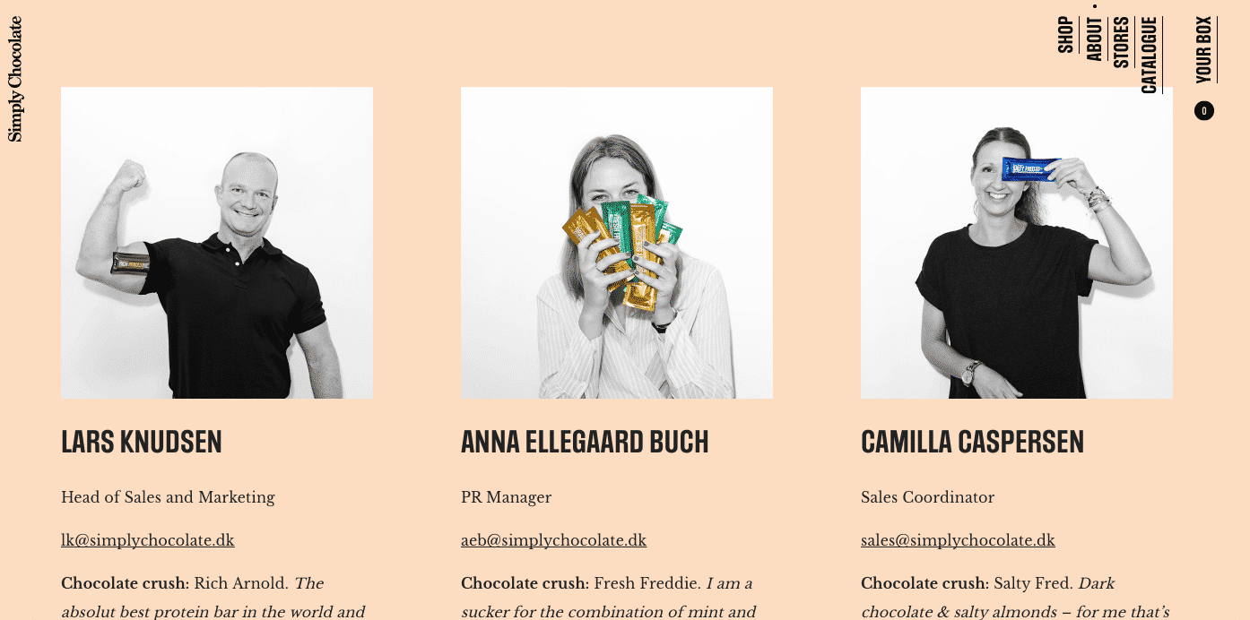
Simply Chocolate’s ecommerce website design is thoughtfully consistent with a European underground, modern and clean feel many find visually appealing.
The Practical Man
This men’s ecommerce website is a joy to experience. Men’s sites are usually bland, overlooked and not as visually charged…but not The Practical Man!
The Practical Man’s site design shakes things up and makes me happy.
A blocky layout, bold type and strong color palette give this site for men’s sportswear a distinctive, memorable style. Unlike many ecommerce sites, where an unusual aesthetic is confined to the homepage, the design here is consistent throughout.
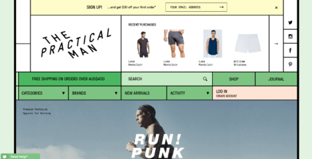
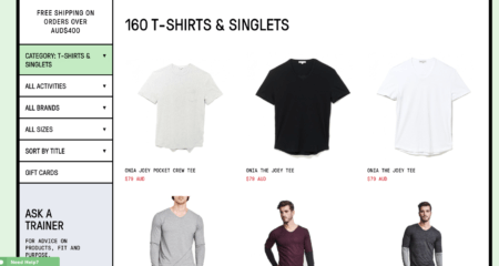
Honestly, the design is simple, modern and digitally styled to appeal to the male eye, but even as a woman, I absolutely love how well it pairs style with function. The categories, navigation bars etc just flow. The fact that the categories, navigation bars and general function pieces are large and chunky just make them easy to work with and satisfying to use.
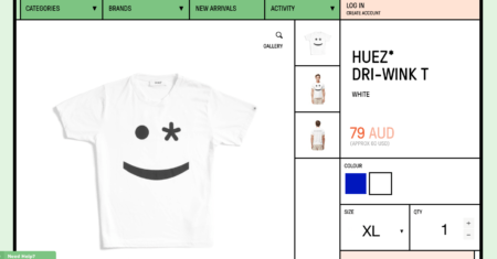
I love the oversized information, buttons and images! It’s just aesthetically nice and different than most clothing ecommerce businesses.
Banksy
I’ll admit that I am a bit biased here because Banksy is my favorite artist, but I really do love his website.
Banksy is an anonymous England-based graffiti artist, political activist and film director. His satirical street art combines dark humor with graffiti executed with a distinctive stenciling technique. His works of political and social commentary have been featured on streets, walls, and bridges of cities throughout the world.
His site, although not particularly an ecommerce-focused, shows the power and interest behind art and minimalism and how it can really be helpful. Studies have shown that the best websites are usually the most simple and this is a wonderful example.
 Banksy’s minimalistic approach to navigation is helpful and visually appealing. The typography is styled to reflect his brand and compliments his “product” or in this case artwork.
His images are high quality and function beautifully with slideshow features that help customers and artist followers speed up the viewing process or enjoy the slideshow.
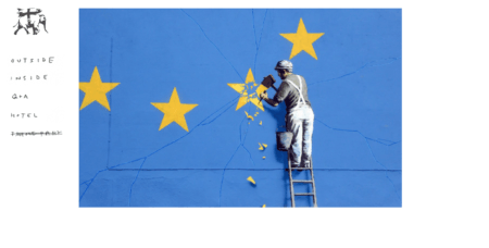
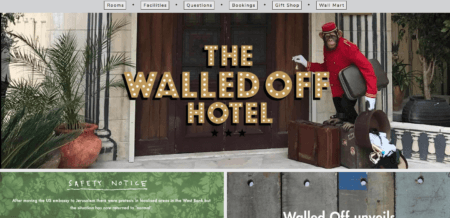
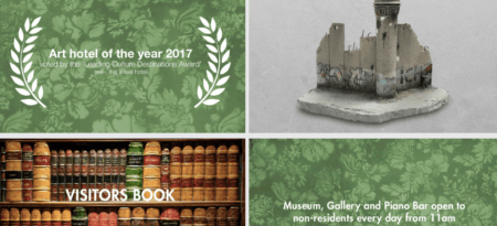
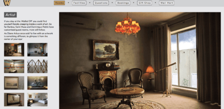
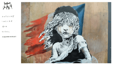 Navigation category clicks take you to a new site where the new window downloads quickly and opens to a beautifully styled and compartmentally simple website explaining his involved art hotel.
It is clearly designed with a blocky, bold type layout that creates continual visual interests.
Press
I love finding small coffee shops and bookstores because they give such an amazing aesthetic experience: quaint, relaxing, artsy and just personable. Press is an ecommerce website design that recreates the brick and mortar experience of a bookshop pretty well digitally.
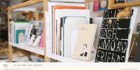
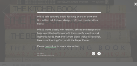
The shop has a website that makes use of beautiful photography to mimic the atmosphere of an artsy, hipster bookshop. Scroll down and the products appear in a striking black and white chequered grid.
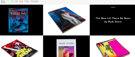
This stylization really makes me feel like I walked into an 80’s vintage bookshop, no?
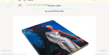
Each product has a visually detailed and stunning page full of helpful imagery.
Greats
The Greats home page opens with a direct message on what they sell…and it’s done well. Their website design grabs the attention of site visitors and appeals to their target market: millennials and sneaker shoe lovers!
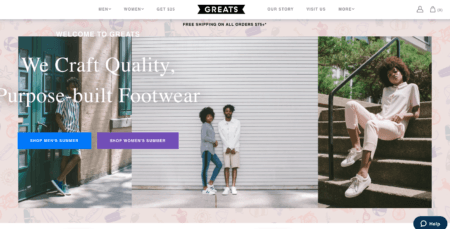
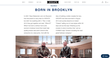
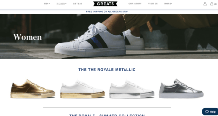
Greats’ quirky, inner city, high fashion photography reflects the nature of the brand and the types of products you’ll find there—quality, affordable and stylish ones. I love their quirky text describing their products in a fun and engaging way.
I mean, their shoes are the ROYALE—meaning “the best!”
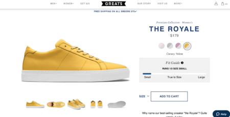
Their calls-to-action are prominently place on the page, with one at the centre of the page for the promoted product, plus collection pages for both men and women clearly placed directly below. They also use disrupting color choice to distinguish categories which is visually helpful to those trying to shop quickly for specific things.
Other Sites to CHECK OUT!
I could go on and on about ecommerce website design I love, but if you want to check out more rad examples of ecommerce businesses doing it right, make sure you check these sites out:
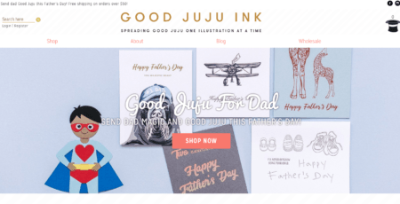
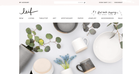
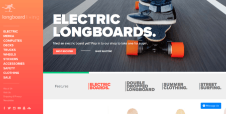
Sift Dessert Bar- OBSESSED WITH THIS SITE!
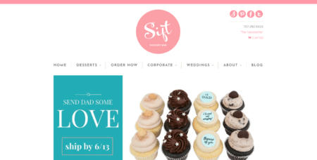
Ecommerce Website Design: More Than Just a Pretty Face
If you’re about to build a site or if you’re considering a redesign of a current one, I hope this article was enlightening to you on what makes not only a beautiful website but how you make it effectively convert sales and expand your business to target audiences.
Keep in mind, your ecommerce website design does not have to be the prettiest site on the block, but it does need to look good. It needs to convey quality and professionalism with a balance of craftsmanship and practical function.
Studies show that it’s worthwhile to invest in a good web design because in the end, customer perception is what really matters. Be more for not only your business, but for your intended audience.
If you want help with website design, contact me here! I love this stuff and would be happy to help you plan out a ecommerce strategy and design!
What do you love about website design? Do you have templates you love? Share below! I would love to see! (by the way, I am a typography and visual addict/nerd/enthusiast and love to see more).


