4 Ways to Get More Out of Your Hero Shot
by Allison Otting • August 17, 2015
Have you ever met someone and couldn’t stop looking at their face? Whether it was because they had the face of an angel or there was a bit of mustard above their mouth, the face is the first thing we look at and usually the first thing we remember about someone.
In fact, we’re hardwired to see faces, even on inanimate objects. On landing pages you can consider your hero shot the face of the page (with the headline being those dreamy eyes). Making a good impression with your hero shot can make all the difference to your conversion rate. Luckily for us marketers, we can decide what face you want to wear!
Your hero shot will dominate a large part of your above the fold experience and is one of the key emotional triggers on your page. Not every hero shot works for every company. To make sure your hero shot produces the effect you are looking for, here are the four basic categories of hero shots and when to use each:
The Happy User

The most common hero shot is the picture of a happy person enjoying whatever service or product the company is promoting. This category can be effective (we like seeing happy people), but it’s also filled with cliched stock photography, so be sure your images don’t look bland or generic.
One of the coolest aspects of using pictures of people is that we tend to look wherever they’re looking. You can use this to your advantage by placing your form, headline or CTA right in your hero’s line of sight. A hero looking straight at the user might actually distract them by meeting their gaze, while a hero looking at content gives a good directional cue.
This heatmap from KISSmetrics shows what I mean:
![]()
There’s a whole minefield when it comes to using generic stock imagery, but it is possible to choose a photo of someone that encourages your users to convert.
When you are picking a hero for your landing page, you’ll want to align it with the wants of your customer base. For example, we were working on a landing page for a client that helps veterans get home loans. The first variant featured a traditional head-on shot of an older vet with his canine friend.
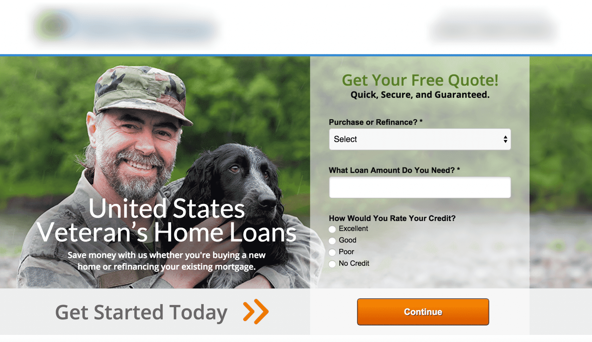
While it’s a good looking photo, we realized it doesn’t necessarily convey home ownership or speak to the kind of person who’s looking to buy a first home. The target demographic is probably a younger person with a family. So we went for a younger man with keys to his brand new house and a beautiful girl in his arms.

Along with a few other cosmetic changes, the new hero shot increased the conversion rate eleven times over (an 1148% increase)! That’s a massive win from picking a more relevant hero for your landing page.
The Product Shot
This is a photograph or a digital mock up of the finished product. This works well for eCommerce when you’re selling a specific product—would you buy a new shirt if you didn’t know what it looked like?
This product hero shot is especially effective in establishing trust, as long as the product actually looks like the picture. Simulations and sketches are a gray area.
Kickstarter, for example, prohibits product and hardware projects from depicting “simulated” capabilities. You must have a working prototype that people can see in action. After all, who wants to invest their money into something that’s only a sketch?
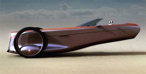
- Trust me, this car will be amazing when they figure out the whole physics thing…
For the picture itself, hiring a professional photographer for product shots is usually worth the money. But, if you can’t afford that, check out some free tutorials on taking great photographs without breaking the bank.
Finally, don’t forget to take photos of your product in context, especially if it’s an accessory. Woorank.com has a case study with KlusterShop.com where they added a hover over photo of a model wearing the bracelets to their product pages and saw a 271% increase in conversions. Good product hero shots will showcase your product in action!
“How It Works”

This hero shot is usually a diagram or chart that explains how a product works or shows the steps of a service. If you wanted to use this you might break your process up into three visual steps, create an illustration of how your product or service works or represent a few outstanding features of your offer.
This type of hero shot is really great at banishing users’ fears and answering questions. Here’s an example of a “how it works” hero shot from our partners at Unbounce.
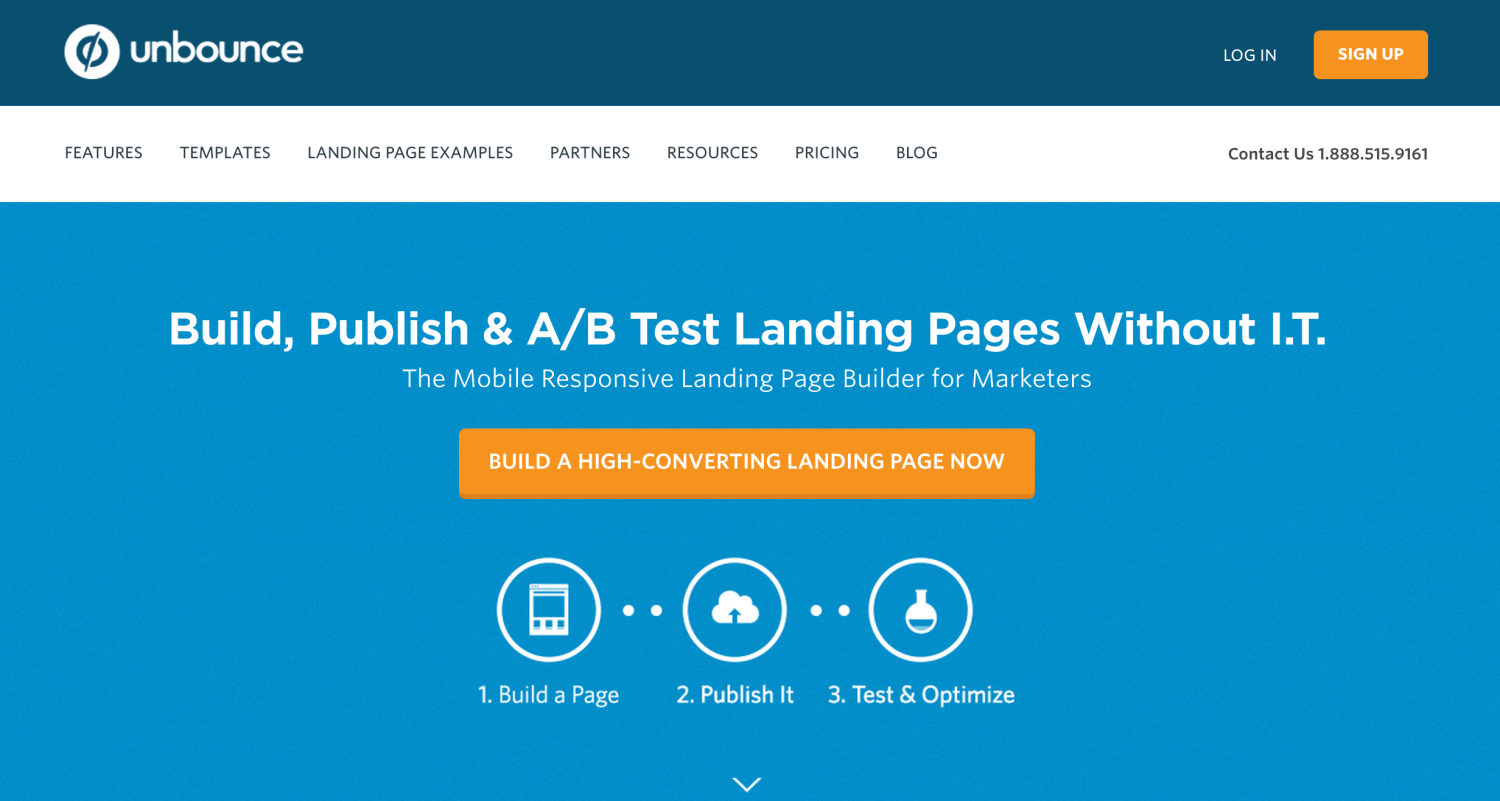
Not only does Unbounce tell you their process, but they showcase the benefits in three simple steps. Pictures may say a thousand words, but using text in your hero shot provides information that photos often can’t. These are especially helpful with online services.
Take a look at this landing page example from KISSmetrics.
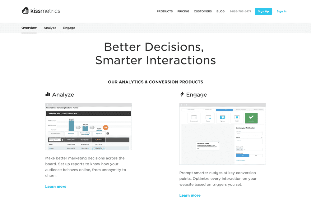
They combine screenshots of their actual interface with explanations of how their product works. This is a winning combination that is great for their software solution.
Don’t forget to explore illustrated diagrams as well. Illustrations can be a great way to integrate custom, high quality images into your landing pages.
Embedded Video

Video is sometimes considered the king of hero shots. You can make videos showcasing any of the methods discussed above. Video, when done right, can be massively effective: Eyeview Digital found an 80% increase in conversions on landing pages that use video.
It’s important to keep your hero video short and interesting, though. An irrelevant or distracting video might hurt more than it helps.
Sites like Wistia and Vidyard allow you to view in-depth metrics on your landing page videos, as well as add extras like buttons and email collection forms.
Just remember, your video should point to one big call-to-action and should focus on getting the user to convert, rather than showing them how rad your company is. You’ll need to figure out what speaks to your audience most through consistent A/B testing of your hero video.
Want more information on using video with landing pages? Check out Unbounce’s breakdown.
With Great Hero Shots Comes Great Conversion Volume
As you build your landing pages, you’ll have a lot of opportunities to test new hero shots. By applying the lessons here, you’ll be able to make smart decisions on what kind of hero shot will be most effective for your company. Then be sure to test for yourself to find out what works for your users!
Have questions about hero shots? Want to have me take a look at your landing page? Let me know in the comments or get a free landing page and conversion rate optimization review here!


