
5 Must-Haves for a High-Converting Mobile Landing Page
by Andrew Maliwauki


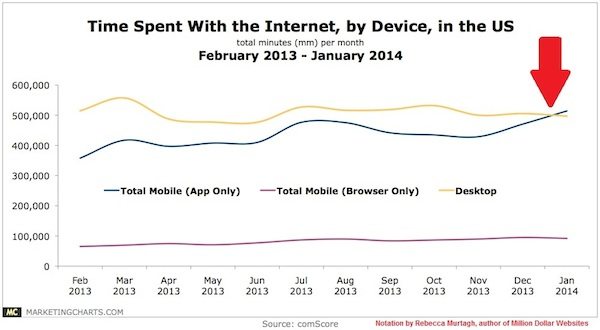
In early 2014, mobile web traffic surpassed PC internet usage for the first time in history. And since then, the number of mobile users has only increased.
In light of this shift, Google has restructured their search results based on mobile optimized websites. Not surprisingly, this “mobilegeddon” has sent companies across the globe scrambling to update their mobile web presence.
Despite the fact that Google’s renewed emphasis on mobile optimization was not nearly as apocalyptic as foretold, optimizing your site for mobile is still a vital and increasingly important part of good digital marketing strategy.
A huge amount of the traffic to your site is visiting on mobile, so it’s worth it to make your mobile experience great.
What does this mean for your landing pages? Well, for starters, everything! Landing pages are the first (and often only) impression a user gets of your website, so it’s especially important to set your landing pages up for success.
As a designer for Disruptive Advertising, optimizing landing pages is one of my top priorities. There is a lot to think about; but, today, I’m going to share five must-have elements that will give your landing pages a competitive edge.
1. Mobile-Optimized Layout
Back in May, I attended the Conversion Conference in Las Vegas. It was a great conference, but it was interesting that one of the most oft-repeated comments was “responsive web design is hurting your pages.”
How so, you might ask? Responsive web design is a pretty common mobile optimization shortcut. Rather than actually do the work to create a mobile-optimized site design, many websites simply squish their desktop page into a mobile screen layout.
While that certainly saves the company time, it usually creates a confusing and hard-to-navigate page that will frustrate the user.
It takes more work, but it’s always better to rethink your landing page design for mobile. Approach mobile-optimized website design the same way you approach your desktop page optimization.
Consider some of the following questions:
- Are there elements that need to be added or removed?
- Can you shorten text blocks to make them more readable?
- Which icons should be smaller?
- What sort of interface is most intuitive for your site on mobile?
- How can you change the flow of your site to improve the mobile experience?
If a desktop page is like a buffet, mobile is more like fast food. Most mobile users want to get in, get what they want and get out. They don’t need every imaginable option, so streamline their experience down to the most important elements.

2. Actionable Information
While you don’t want to overwhelm your reader, you also need to have all of the most important information readily available on your mobile page. This includes information such as the phone number, business hours and location.
Location is especially important on mobile because 50% of mobile users are looking for a close, readily accessible solution. They want the closest available service or product. If you’re the closest, you don’t want them to use a competitor just because your location was unavailable.
In addition to your phone number, business hour and location, your page should describe the most important parts of your business and explain why a user should choose you over Joe Schmoe across the street.
Engaging, highly relevant information that enables and motivates the user to do what you want them to do will give you the best chance of turning a click into a conversion.
3. Readable Text
This probably sounds like a no-brainer, but you would not believe the amount of mobile pages I come across that have teeny tiny, itty-bitty text that forces you to pinch, zoom and scroll just to read the opening block of text!

Okay, stepping off my soapbox now.
As a general rule of thumb, never make your body text smaller than 14 pt font size. This allows for a good amount of text per line without over-stressing the eyes. On the flip side, don’t make your text too big, as you run the risk of making your page much longer than it needs to be, which means more scrolling.
Make sure your text lines are well spaced and you’re well on your way to having a readable landing page. Remember, you only get one shot at a first impression, so don’t leave your visitors wondering if they need to get their eyes checked.
4. Click-to-Call Phone Number
When a mobile user lands on your page, they should have immediate access to a phone number for your company. Instant communication is often a major goal for mobile users, so I can’t overemphasize the importance of having a click-to-call number.
For example, if you were a locksmith company and someone just locked themselves out of their car, chances are they’re looking for help ASAP. If your page is one of the first choices in their search and you don’t have your number listed, you just missed out on a sale.
Adding an easily accessible, obvious click-to-call number to your mobile site allows visitors to contact you within seconds. It’s an ideal intent-based call-to-action. If they want to talk to you, they’ll click the number. If not, they won’t.
However, if you don’t have a click-to-call number, you’re missing out on a great way to get quality leads quickly and efficiently.
5. Call-to-Action
Now, visitors to your landing page aren’t always looking for a number to call, so you need to have a strong backup plan.
Cue the call to action!
There’s a lot of material out there on how to put together a good call to action (check out a couple of great articles here and here).
If you’ve already got a compelling headline and offer for the desktop version of your page, it’s time to optimize for mobile!
Make your call-to-action button stand out from the surrounding graphics and text. Also, make it easy to press. This is important, because users with thicker fingers might have trouble tapping a tiny button on an already tiny screen.
Another option you should consider is having a lightbox form that opens when a visitor clicks the button. This saves valuable real estate on the smaller mobile screen and allows you to write longer headlines when necessary.
Overall, it’s important to keep the user in mind when you are designing a call-to-action for mobile. Nothing kills mobile conversion rates like a visually awkward call-to-action!
Conclusion
A mobile-optimized landing page has a big effect on the conversion potential of your digital marketing, so it’s in your best interest to capitalize on the benefits of mobile optimization sooner rather than later.
Mobile optimization doesn’t stop with these 5 tips; but, by implementing this advice, you’ll be well on your way to creating high converting landing pages that get you faster and more qualified leads.
Now it’s your turn. What makes your mobile landing pages convert better than the rest? Let me know about your ideas in the comments below!


