Are Your Mobile Landing Pages Really Optimized?
by Sarah Rodriguez


Mobile-first landing page design is nothing new. In fact, mobile traffic surpassed desktop traffic in the beginning of 2015, so mobile optimization should be yesterdays news.
Hopefully, your mobile landing pages no longer look like this…
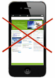
…but simply creating a mobile version of your page is not the same thing as creating a mobile-optimized landing page.
In this article, I’m going to go over a few points in mobile optimization that are often overlooked but can help create a more interactive and seamless experience for your mobile visitors.
Click-to-Call Buttons
Whether your users are on desktop or mobile, your call to action (CTA) is important. It lets your users know what they need to do next and how taking action will benefit them.
However, it’s important to remember that when someone is searching online on their mobile device, they are in a really easy position to call you. They literally already have their phone in their hands.
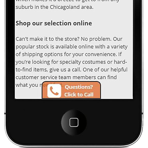
For many businesses, phone call leads even convert better than form leads, so why aren’t more people optimizing their mobile pages to have easily accessible click-to-call buttons? Make sure these buttons are obvious, in a good location to reach and large enough for fingers to click without trouble.
Scrolling CTAs
Desktop pages can show a lot more information, images and buttons above the fold then mobile. On mobile, it takes a lot more scrolling to see the same content, which means your CTAs can disappear above the fold and never be seen again.

However, by adding a scrolling or fixed CTA to your mobile landing page, you can keep your message in sight during their entire browsing experience. That way, your visitors don’t have to scroll back to the top or sift through the entire page to find your CTA.
Testing a scrolling CTA, message, or phone number on your mobile landing pages can be a great way to increase engagement and conversions.
Button Placement
In addition to screen size, mobile users hold and interact with your page differently than desktop users do. Most mobile users are holding their phone in their hand and using their thumb to scroll, click, and interact with your landing page.
As a result, on larger phones, certain areas on the screen are harder to click. For example, the top left corner can be a bit of a reach for right handed mobile users.
With that in mind, it’s a good idea to test out different locations for your CTA buttons and phone numbers. You never know, the difference in placement just might help your conversion rate.
Mobile users have also gotten used to certain action buttons in certain mobile screen placements. Keeping your button placement consistent with their expectations will allow users to interact with your page more instinctively.
For example many users are used to the “back” button being placed in the top left corner, if you put another button there users might be more easily confused and even frustrated.
The simpler and easier your mobile landing page is to interact with, the more comfortable they will feel and the more likely they will be to convert.
Optimized Overlays
On desktop, overlays can be a great way to catch a few extra conversions. A unique offer or deal popping up when entering or exiting a page can be the push that some visitors need to convert.
Mobile pop-ups can also be a great way to turn on-the-go casual mobile visitors into higher intent desktop users by capturing their email.
Thinking about your mobile audience and creating custom pop up offers or messages directed towards your audience will help grown conversions for not only your mobile page, but your desktop landing page and email campaigns as well.
Simplified Content
The biggest error I see on “mobile optimized” pages is trying to fit all of a desktop page’s content onto the mobile landing page.
Typically, content needs to be simplified to create a good mobile user experience. Whether that means condensing content or simply breaking it up into different pages or sections, the best mobile landing pages are simple.
Use visual cues to break up content and stimulate interaction. Things like images, small paragraphs, large indicative headlines, and clear content sections can all help to create a simpler and more user friendly user experience.
Conclusion
Putting together a set of effective mobile landing pages requires more than just a few reformatting tweaks. You have to think about your mobile user experience and modify your page and content to meet their specific needs.
Fortunately, adding click-to-call buttons and scrolling CTAs along with optimizing button placement, overlays and the complexity of your content can do wonders for the performance of your mobile pages.
By the way, if you’d like me to take a look at your mobile landing pages and give you some recommendations, let me know here or in the comments.
How do you improve the performance of your mobile landing pages? Let me know in the comments!