7 Simple Tests to Get More Conversions From Your Landing Pages
by Sarah Rodriguez • July 10, 2015
As a Conversion Rate Optimization designer, I’ve built and tested a lot of landing pages. Sometimes creating a successful landing page design happens right away; sometimes it takes time. Because every industry and business is unique, it takes a lot of testing and creative thinking to get a landing page that really works.
But there are a few principles that generally work for every industry. That’s why I’ve listed seven go-to tests that I run on most of my landing pages to get more conversions for just about any client. Hope you find some useful information and ideas for testing your own landing page!
1. Test Your Hero Shot & Above the Fold Layout
The hero shot and above-the-fold layout is probably what I test most often. It’s what your audience sees first when they land on your page, and first impressions are everything.
If you’re using a stock photo for your hero shot, try showcasing a picture of your own business or product to make it more personalized. If your landing page has animated elements for a hero shot, try a static photo–or vice versa. You won’t know what works until you test it, so be willing to try different things.
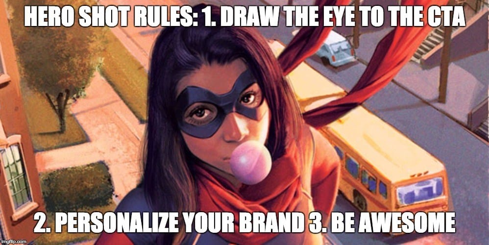
When using images of people in your hero shot, make sure they are facing or looking toward your call to action to draw the eye toward your form or button. Also try moving your form around. It may seem like a simple change (and it is) but I’ve seen dramatic changes in conversion rates from having the form on the left vs. the right side of the page.
2. Write a Better Headline & Landing Page Copy
In my experience, simply changing your landing page’s headline can make a huge different in increasing conversions. One common problem is that headlines are too long or don’t present your offer in a clear way.
I’ve often had clients who want to be clever, informative, and funny all in one headline, but the truth is that trying to be everything to every user often ends up confusing your audience. Instead, start with a headline that is simple and to-the-point. You’ll be surprised how quickly this can deliver more conversions.
Use your headline it to inform viewers about what your product or service can do for them. Focus on benefits you’ll provide, not just the features that make you unique. If your headline is already clear and concise, you can start testing more unique and creative messages, but start with the basics. And you don’t have to stop with your headline! Don’t be afraid to test different subheads, or change the landing page copy to make your page more direct and cohesive. Having your content and message focus on how users will benefit from your offer can be the make-or-break when it comes to converting.
Finally, don’t assume that just because a your current headline and landing page copy is working that there’s not another headline that can perform even better. Always be ready to test new ideas!
3. Have a Specific Call to Action
Test different offers on your landing page. I’ve seen many landing pages that use a very broad CTA like “Get More Info!” or “Buy Now!” I’ve definitely seen these perform well, but often you can increase conversion rates by changing the offer to showcase something specific that the user will get from clicking the button.
CTAs like “Download Your Free Guide!”, “Schedule a Free Consultation” and “Get Your Discount Code Today!” offer something concrete to the user in exchange for their information, which makes them more likely to trust you.
Even if your offer is something like “Get Your Demo”, try “Start Your Free Demo!” This makes your audience feel like they are getting a special deal and makes them want to take advantage of this “limited time” offer. Think like your audience and decide what offer sounds like the best value. Then test it out!
4. Better Social Proof
Most of the clients I’ve worked with focus on delivering informational content for their landing pages. But what people often overlook is the idea of establishing social proof to help users trust your business and become more likely to convert.
Social proof can include testimonials, brands you’ve worked with, and awards & titles. Try testing one or more of these on your landing page. Include testimonials from past clients, showcase large brands that trust you with their business, or highlight positive tweets or Facebook posts about you. All of these things add substance to any claims you make about your business.
Make sure your social proof is specific and concrete. A testimonial that reads “These guys are great – Bill M” is a lot less effective than “I had a problem with my car, and within ten minutes they diagnosed a hole in my radiator that cost a lot less to fix than I expected! – Bill Mitchell, Nashville, TN.”
If users believe that your customers are happy with you, they’re more likely to go with you too.
5. Try a Lightbox Form
If your landing page uses some kind of form, where is it located on the page? Is it above the fold right where people can see it, or maybe at the bottom after they’ve had a chance to read all your convincing content?
Well, one thing we’ve found effective for many of our clients is a lightbox pop-up form. Instead of the form being immediately visible on the page, your CTA button will prompt the form to pop up in its own little lightbox. Sometimes, just directly asking for a user’s information can come across as too direct, but by having them click a button to see the form, suddenly they become the ones initiating the conversion, which makes them more likely to be okay with providing their information.
This is something we have tested many times, and almost every time conversions have increased. So why not test this with your own landing pages? If you use a landing page platform like Unbounce, implementing a lightbox form is simple. You can find a quick tutorial and example here.
6. Test Different Page Lengths
If your page is really lengthy, try condensing info to make a shorter page. If your page is short, test adding more content!
Its all about figuring out what your viewers need to convert. This depends on your industry. For example, I once worked with a rehab center whose landing page was on the shorter side.
However, we thought that maybe with that big of a decision people would appreciate more information. So we added sections for More Info, a Virtual Tour of the campus, and a section about the center’s case workers. As a result, conversion rate rose by about 7% even though the page was less traditionally “focused” than before.
On the other hand, I’ve created landing pages with content that requires a lot of scrolling, and sometimes just shortening the page raises conversion rates. For example, a locksmith’s landing page doesn’t need a long list of accomplishments, just enough information to establish that they can get you back into your car! Those visitors are probably feeling more urgency and don’t need to do as much reading.
7. Just Try Something Different
If you only learn one thing from this post it should be that you need to be willing to test all sorts of different things on your landing pages. Be willing to add, remove, rearrange, or completely redesign. Each company is different, and there is no single fix-all formula for creating great landing pages, which is why testing is critical. Try to understand how different channels shape landing page expectations: a user clicking from a Google AdWords campaign might be looking for something different than someone who came from Twitter.
Don’t be discouraged if some of your tests fail: learning what doesn’t work is just as valuable as learning what does. If you’re not sure what to test on your landing pages, let us know and our team can help you create and test landing pages that will deliver more conversions for your business!
What have you done to get more landing page conversions? Let us know in the comments!


