How I Used a Lightbox Pop-Up To Increase Conversion Rates by 20%
by Adam Kaiser


If you aren’t testing—you aren’t trying. When it comes to online advertising, testing is a must and you can learn from the results no matter the outcome.
A large part of our success here at Disruptive Advertising comes from our approach to split testing landing pages to increase conversion rates as part of a broader Conversion Rate Optimization strategy.
We create landing pages for our clients that are designed to do one thing: convert. This is not a one and done deal, because we are always working to find a better solution. There are so many things within a landing page that we can test: the headline, call to action, color of submit button etc.… All of these are great because the data will tell us which options convert the best.
I’m going to show you a test that I ran that improved conversion rates for one client by 20%, with similar positive results for other clients.
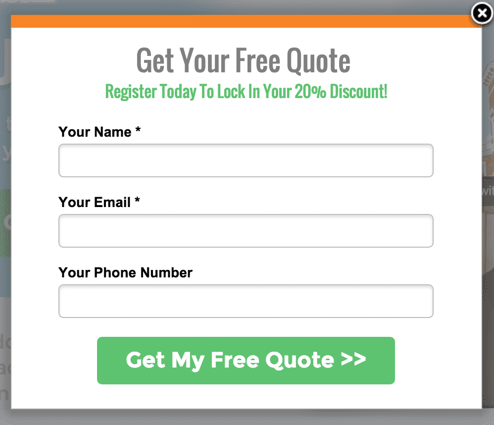
Often a landing page will have a lead generation form to obtain a customer’s information, like this:
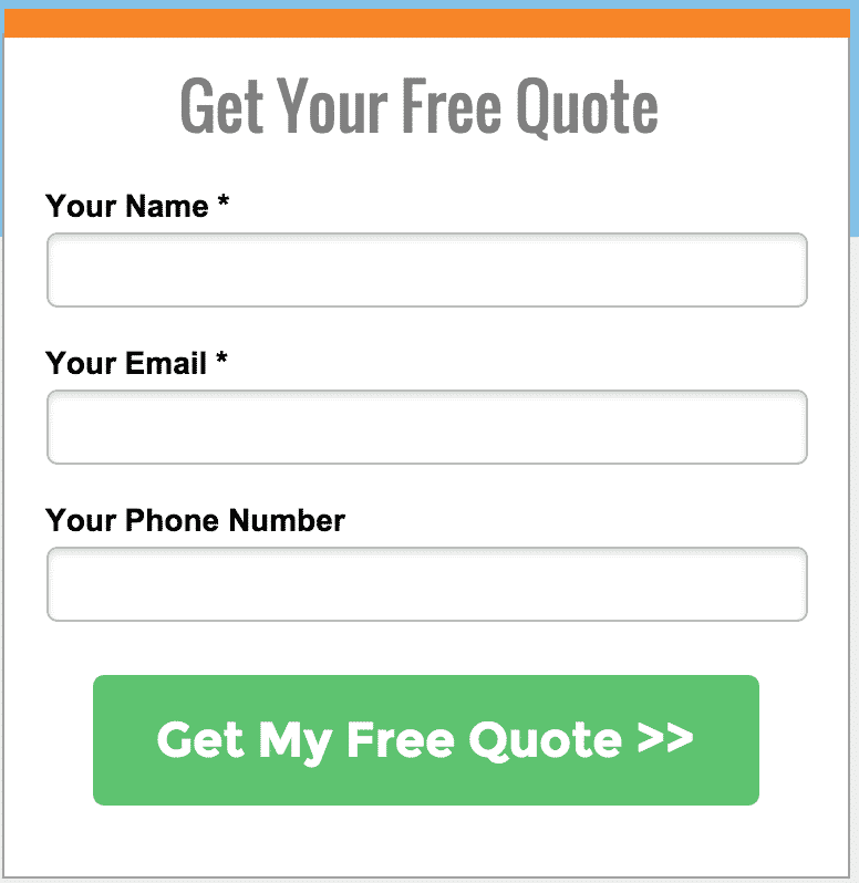
But it’s easy to forget that your form and landing page should include a clear reason why someone would want to give you their information in the first place. That’s why this innocent looking form can actually appear threatening to a potential customer. They probably just met your company, so how do they know they can trust you? The question is, how do we make them want to provide their information?
The test that I ran uses a psychological push and pull method that makes a potential user feel rewarded for doing an action, rather than just demanding their information up front. So rather than showing that intrusive form right off the bat, I simply showed them the button and asked them to click to proceed:

When they click the button, they are now rewarded with a form that pops up within the landing page.
The difference here is that the user has to initiate the transaction before we request any personal information. Once they’ve made the decision to click to get a free quote, they became more likely to actually provide that information.
I am not going to tell you that I know all the psychology behind why this works, but I do know that testing this against the static form increased my client’s conversion rate by 20%.
That is a great win no matter what kind of volume you are dealing with. Try this for yourself and see if it can increase conversion rates for you! Once you learn from your results and can move forward with the winning solution and come up with new tests to continue improving performance.
Also, we use Unbounce to build our Landing Pages, which makes this solution easy to implement!
One final note: don’t get this idea confused with a click through page where clicking the button loads a brand new page. I would avoid click through pages unless they’re absolutely necessary (for example, if you need to break up a long form) , because it ads an unnecessary step which usually leads to a higher bounce rate.
Let us know if you’ve tried this test for yourself and what results you got!