The 11 Best Lawyer Websites You Need To See
by Ana Gotter • April 17, 2020
If there is one industry where clarity matters most, it might just be the legal field. Perhaps no one understands the importance of nuance in words and phrasing like lawyers and attorneys. While lawyers can’t get interpretive with legal contracts, however, there is a lot of room for creativity on their websites.
Like all other industries, lawyer websites come in all shapes and sizes and are most successful when they creatively highlight a firm’s unique branding while still providing users with the information they’re looking for. Mobile design is also an absolute must.
Need a little inspiration before you give your own firm’s site an overhaul? Let’s take a look at 11 of the best lawyer websites that you need to see for a few great ideas.
1. West Coast Trial Lawyers
When it comes to the best lawyer websites, the West Coast Trial Lawyers firm’s homepage is a fantastic example of a lot of different things done well. They have easy-to-see navigation in the top right hand corner just underneath a prominent phone number that’s placed next to a “free consultations/ no fees until we win” message. This displays confidence in their abilities, but it also gives viewers a reason to call by reminding them there’s no risk and no cost.

They also have Yelp and Google rankings prominently placed, and clearly showcase their #1 ranking and amount of money won in trial. All of this is sure to impress site visitors.
2. Roulston Urquhart Criminal Defence
The entire website of this criminal defense law firm is bold, confident, and just a touch intimidating—exactly what you’d want your criminal defense attorney to be. Everything about it is simplistic, from the monochromatic color scheme to the copy.

This is true for their bios, too.

All of these women look strong and ready to take anything on and their bios are written exceptionally well to portray that they’re willing to fight for their clients, making this site an easy candidate for one of the best lawyer websites out there.
3. YLaw Group
YLaw Group offers diverse family law services, including divorce and custody services. These are all very serious concerns, especially to those in them, but their site is fun and can help break the ice. If nothing else, it immediately sets them apart.
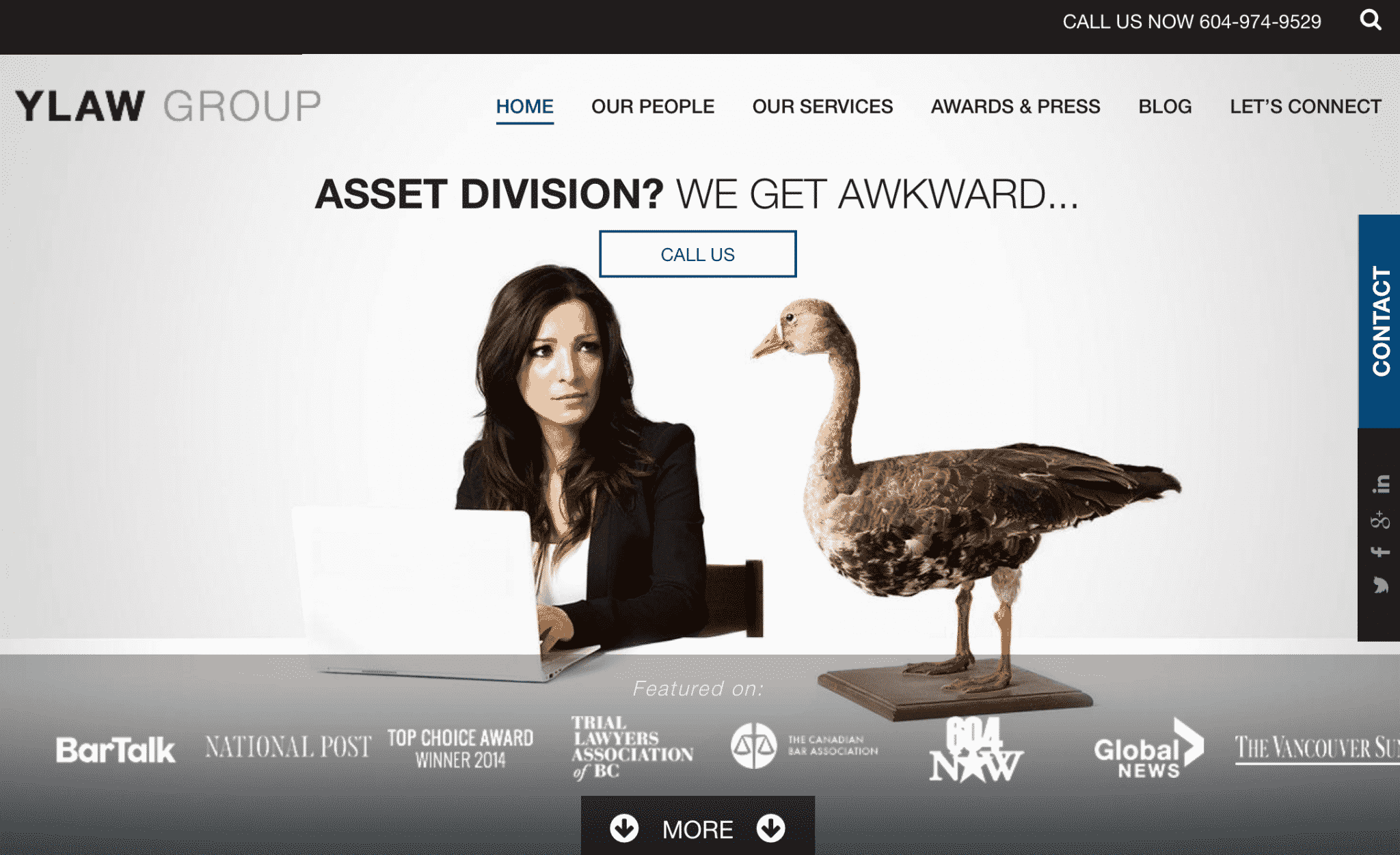
They have their phone number placed in the top right hand corner of every page, along with a contact bar on on the right side of the page for easy access.
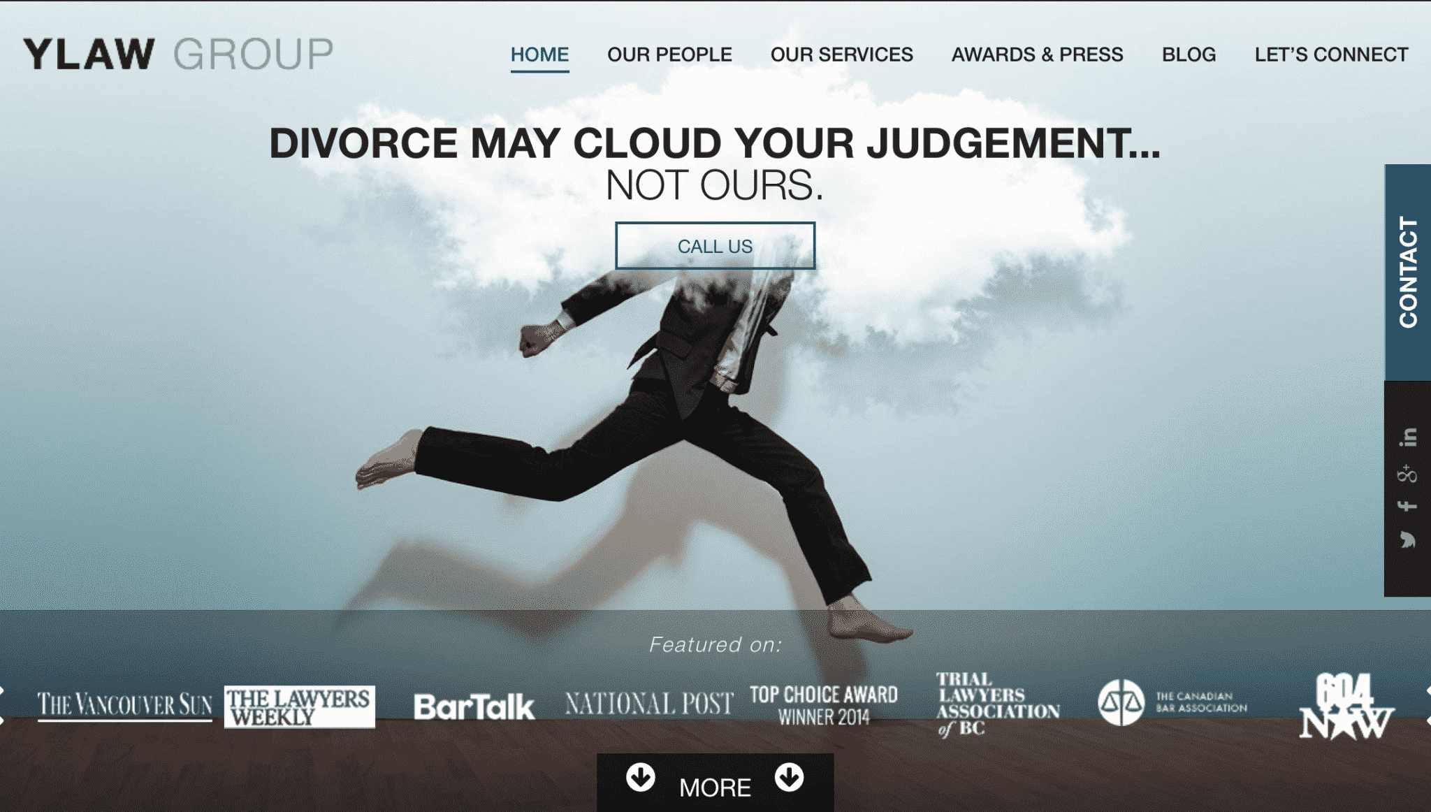
This law firm website also has a prominent “featured in” section showing all the different publications they’ve appeared in to build instant credibility. Between its quirky, memorable messaging and excellent site features, this is one of the best lawyer websites I’ve seen.
4. Bick Law LLP
Bick Law is an environmental law firm and they incorporate that into their branding. Their homepage features a sliding deck of different background images and catchphrases, all of which feature animals and relevant puns.
Labeling “exclusively environmental” under their name in the navigation bar is also a good choice, as it likely prevents site visitors from reaching out about other services and slows them down. This may not seem like a big thing, but as someone who has worked with a specialized law firm in the past, I can tell you that it is.
5. Bhatt Law Group
We’ve looked a lot at site branding and copywriting, but this firm makes our “best lawyer websites” list because of its actual design aspects. Even better, this one is a great example of how to incorporate multiple specialties seamlessly on one site.
Bhatt Law Group‘s website uses contrasting colors (orange and black) to guide users to their clickable CTAs and drive action.

Their homepage quickly shows site visitors what specialties the firm can offer, even listing specific attorneys that can help with each. This is an excellent way to funnel leads to the right place.
6. Robbins Firm
Customers are always looking for who is best and to be the best, you typically need to be doing something different. The Robbins Firm accomplishes this using custom cartoon drawings, but they really hit home with their messaging.
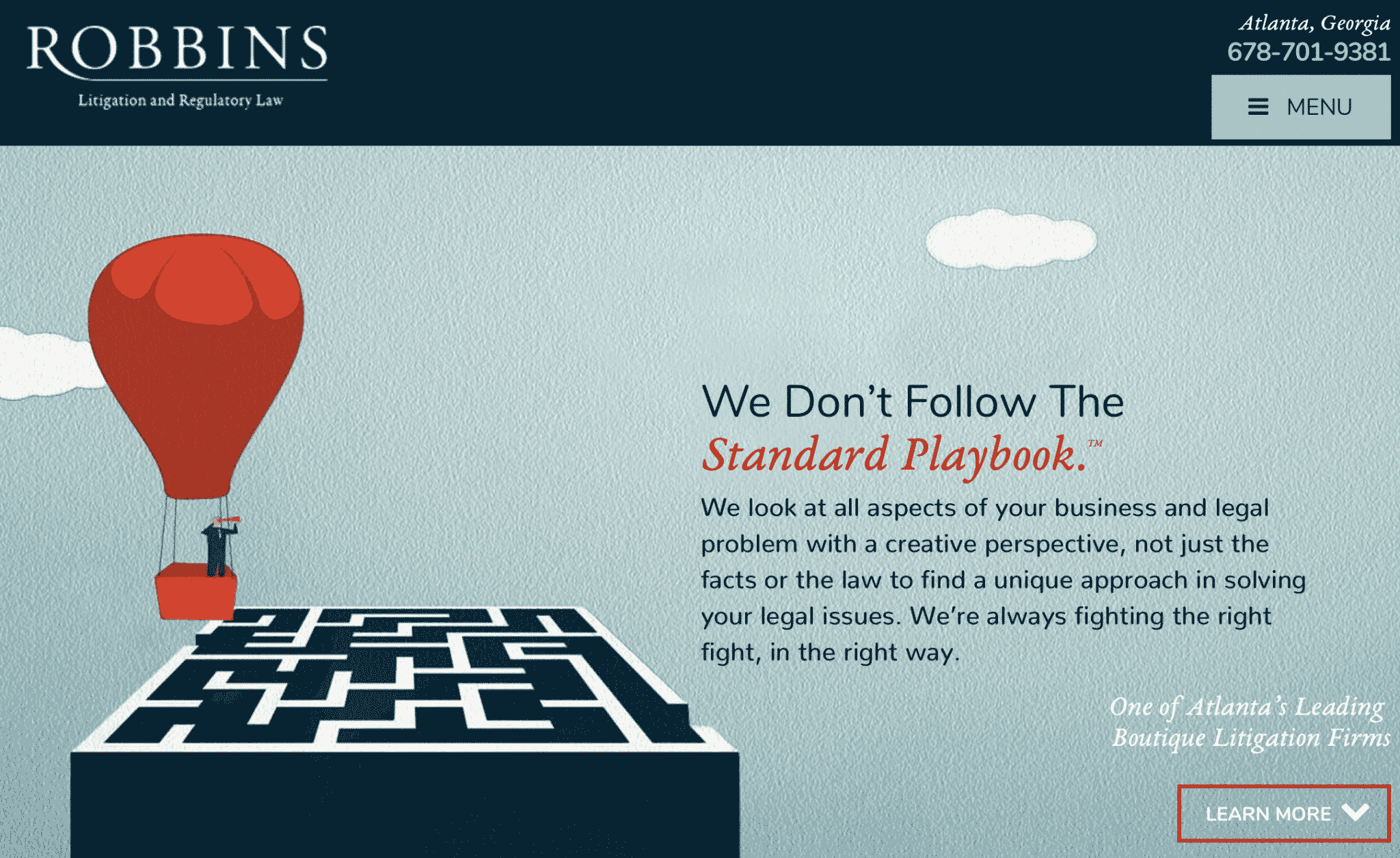
Not only do they refer to themselves as a “boutique litigation firm,” they use strong messaging like “creative perspective” and “we don’t follow the standard playbook.” The copy is enough to make you believe that they’ll find the absolute best solution out there and wins them a spot on our best lawyer websites list.
7. Tremain Artaza
The Tremain Artaza’s main page immediately addresses several common objections that customers may have when it comes to lawyers. The average person may have trouble trusting lawyers or be intimidated by the complexity of legal issues. This homepage attempts to put these concerns at ease.
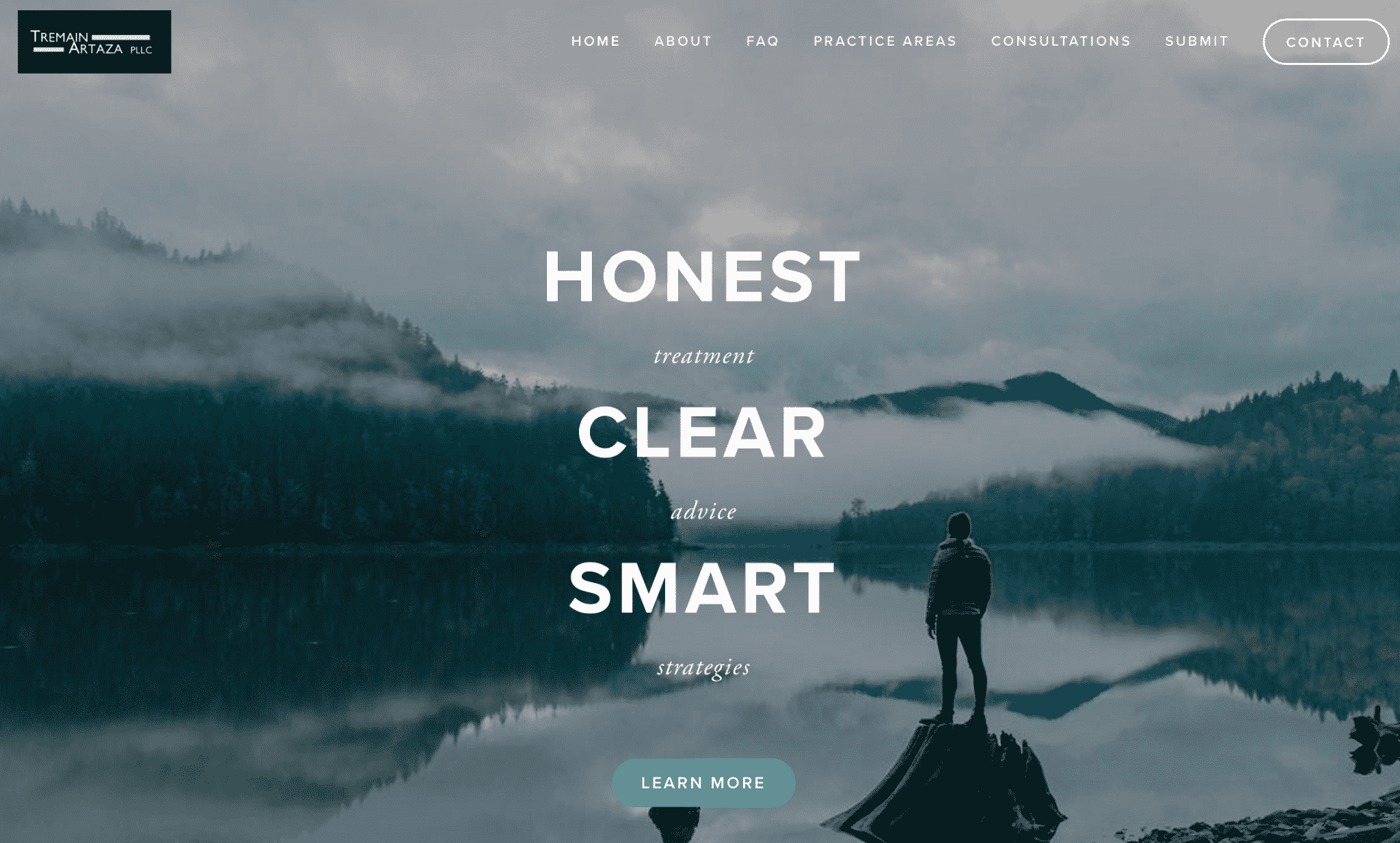
Another prominent feature of this site is their incredible FAQ section.
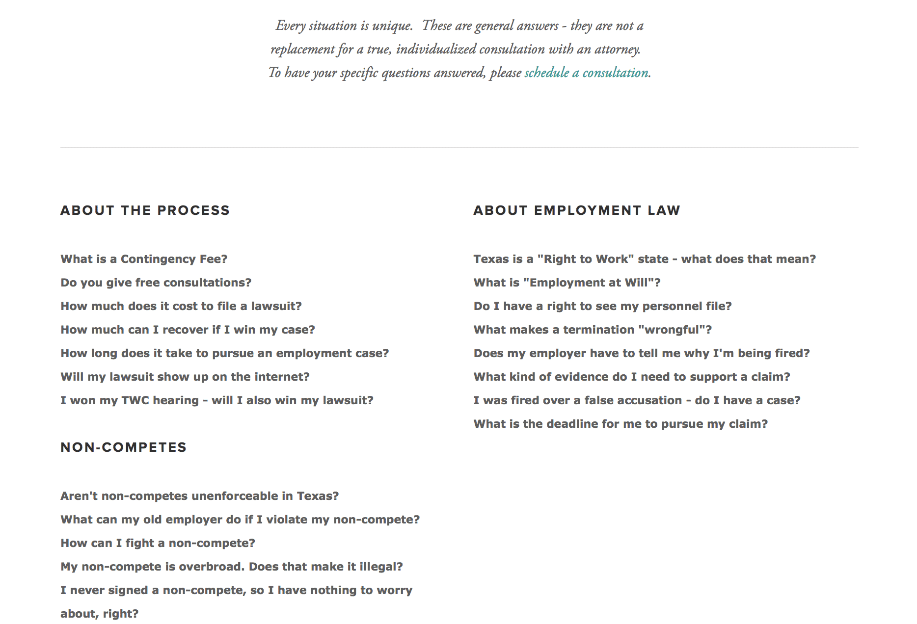
Because legal issues are so complex, having an FAQ available on a law firm’s site can significantly cut down on the questions clients may ask, saving everyone some time and money.
8. Parris
Parris law firm’s website is another one that capitalizes on a combination of simplicity and strong messaging. The site’s home page simply reads “Over $1.1 billion.” At that point, what more do you really need to know?
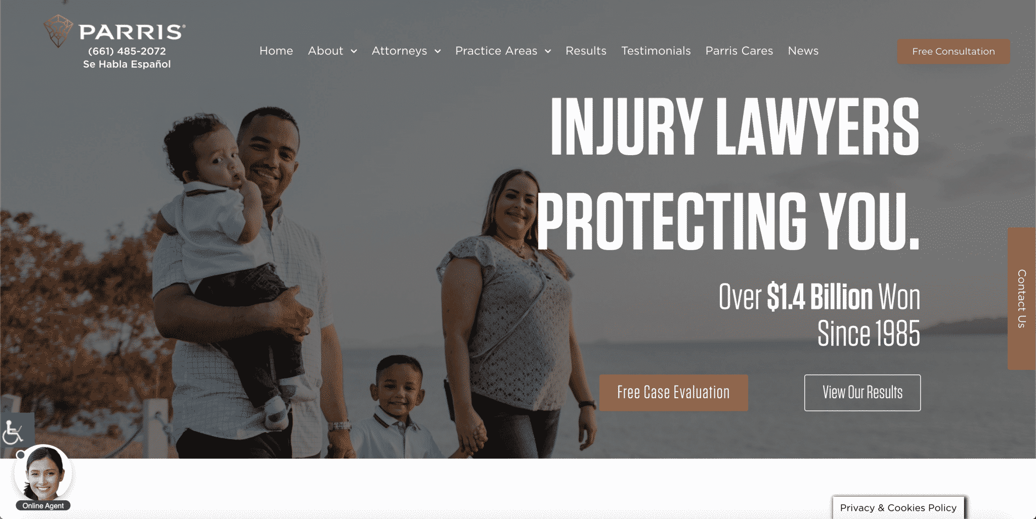
Underneath this, they then showcase their mission, framing themselves as lawyers who will protect their clients.
Many people coming to these particular lawyers may see themselves as needing protection or someone fighting on their behalf, and this will help build that rapport quickly.
9. Lash & Goldberg LLP
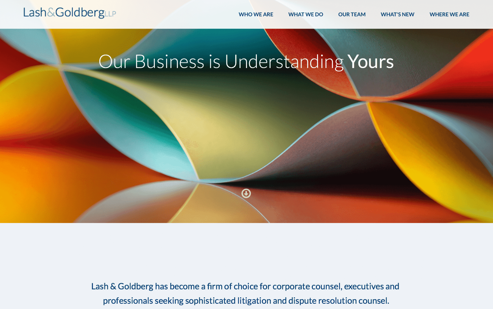
This business litigation law firm has a design that’s simplistic and messaging that is designed to put the customer at ease. They know their audience well, which consists of business executives, corporations and professionals who likely want someone to work around their schedule and their business.
10. Spring House Law
One of the first things that many people wonder about is how much a lawyer costs and when those charges kick in. When it comes to answering this question, Spring House Law has one of the best lawyer websites on this list, with an entire page designated just to answering this question, putting customers at ease by explaining the process.
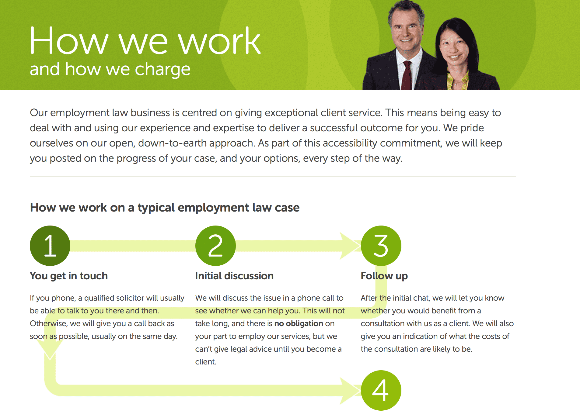
After this simple infographic that explains the process clearly, potential clients are unlikely to worry about being charged too soon.
11. W3IP Law
This law firm specializes in digital law and intellectual property law, and their homepage’s site design is about as strong as it gets. They have CTAs to call or leave a message, but they do something a lot of other sites don’t—they make navigation extremely intuitive.
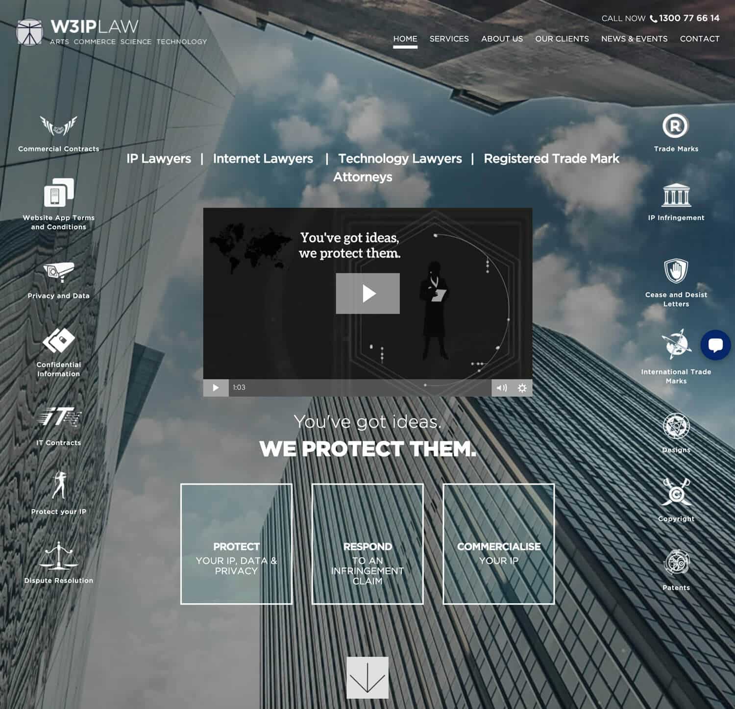
Their homepage has three different navigational cues: Protect, Respond, or Commercialize. These are three very separate services. By clearly showing users early on that they can help with all of them—and where to click for more info on each—they’re likely to reduce bounce traffic and get users moving through the site.
Final Thoughts
Laws can be cut and dry, but that doesn’t mean your law firm’s site has to be. These best of the best lawyer websites are proof of that and can each serve to inspire you before you create or overhaul yours.
Have your site up and running and still not getting the leads you want? Get in touch with us to see how we can help you improve your site design and traffic quality.
What do you think? Which of these law firm sites was your favorite? Do you have any other great examples you want to share? Let us know in the comments below!


