
3 Quick Tests to Ensure Your Landing Page is Crystal Clear
by Allison Otting • November 25, 2014


Does your landing page pass this 3 step check up? (image source)
It all starts with a goal. Your company wants to sell their new fanny pack. Convenient, functional and stylish: this bag has it all. Rather than making the terrible mistake of sending all your traffic to your website, you start building a landing page.

You’ve already spent tons of $ on this video (image source)
Making a new page can turn into a complicated process, though. Your boss doesn’t like the “vibe” of the demo video. Legal has the American Fanny Pack Bureau breathing down their neck about claims in your copy. Your mom really thinks that your headline isn’t funny enough. The fanny pack designer really needs you to include all the specs about the flawless Swedish zippers.
If you’re a landing page designer you’ve probably seen this all before.
After so many revisions you might have lost sight of your goal: selling fanny packs. How do you know what to change and eliminate?
I’ve come up with 3 quick and easy tests that will help you know if your page is really optimized for clarity.
#1 The Squint
It’s really easy to get lost in the details of a page, especially when you’re spending time on custom design elements. After a ton of revisions, how can you tell if your page is clear? Squint.

You don’t have to do it quite this intensely (image source)
It’s the quickest way to know if something is too big or if your CTA is overpowered by something else. What squinting does is blurs everything into general shapes and lets you see what appears to be the most important. Here are the two things that you need to really check for:
- Is your call-to-action hard to see?
- Does anything else stand out more than your headline and CTA?
If you say yes to either of these questions, then you have a problem. It means that you have too many elements that are competing for your attention. It can cause confusion for the user. If they can’t find the CTA, how are they supposed to convert?
For our purposes, I’m going to recreate the same effect in photoshop so we can look at a couple examples.

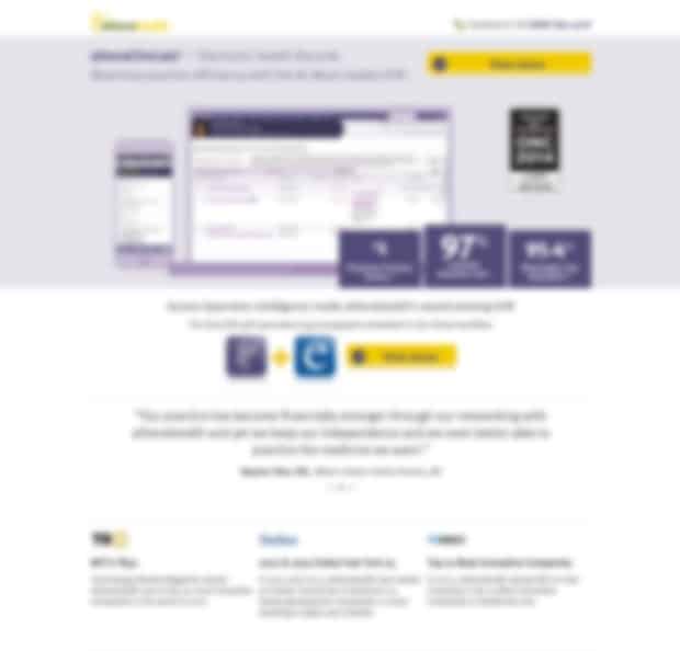
Kareo actually does a pretty good job with making their dark and bold headline visible. The hero shot competes a bit because of the black frame of the iPad, but since it’s featuring the actual EHR product, that doesn’t bother me too much.
What does bother me is the fact that their CTA just disappears. It stands out even less than the form fields, which at least have the benefit of their red asterisks. When we squint, the CTA suddenly turns into an optional form field. Not good.
The button that does pop out is the “Sign In” button in the top right, followed by those other blue site links. This is NOT what you want! All three of those blue elements are leaks out of your landing page, and lead to zero conversions. Plus, this landing page doesn’t even show up when you search the company name, so why are you putting a sign in link?
[Tweet “Is your landing page CTA as clear as you think it is? Try this squint test”]
Here’s a competitor that’s doing things well:
This is only the top half of Athena’s landing page, but there is a very clear hierarchy in their elements. The headline is the biggest copy on the page, pricing is bold, big and easy to find, and the CTA buttons are bright yellow. It’s easy to identify what information is most important.
Are your most important elements looking their part? Squint and find out!
#2 Five Second Flash
Any time I arrive at a hotel room I’m usually exhausted from the flight or drive. All I want to do is crash onto the bed and turn on the TV.
I could use the TV Guide channel to find something to watch, but I’m pretty sure that the text moves slower than the opening credits of Star Wars. I’m going to just risk it and start channel surfing instead.
How much time do you honestly spend watching each show to decide whether it’s worth your time? There might be some great stuff on, but it doesn’t catch your attention very quickly, it’s not getting another chance unless you come around again (it might be a terrible night for TV).
Landing pages are judged in a similar way, except instead of being a cure for boredom, it’s the solution for whatever you typed into google. You have seconds to keep that person on your page. Are you even conveying what your product or service is?
Usabilityhub has created a really cool way to put your page to the channel flipping test. After you sign up, you’ll be able to upload your page and ask a question. The page will then be shown to a random user for five seconds, and they’ll then be asked a series of questions that you’ve put in. Try it here.
This is a sure-fire way to determine whether your landing page makes sense or not. You can try this same approach with your friends, family or co-workers. Prepare your questions and do the test to identify your biggest weaknesses!
[Tweet “Is your landing page like a boring TV channel? Find out here…”]
#3 Draw Your Path
My favorite design professor once told me that all design is storytelling. There’s a beginning, middle and end, and everything has to be in its proper order. That all applies to your landing page, too.
Are you presenting the problem or pain point and then offering a solution? Does the order of your elements make sense and is it all easy to read? Any sort of confusion about what to read next or where to go is going to cause friction for your reader and make them bounce quick.
Billy, you are the worst (image source)
Awwwards recently posted a great post about visual hierarchy in web design. It identifies two different patterns for content organization: F and Z.
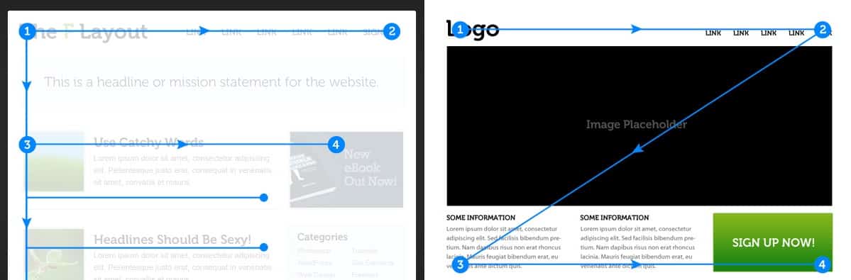
Both follow the concept that we, as a western culture, read left to right. So, your “story” needs to follow one of these patterns, with your important information to the left and creating a path to your CTA.
Sketch out your landing page layout, or print up a thumbnail. Ask people to draw the “path” of your page on top of your screenshot, or take heat mapping software like Crazy Egg for a spin. If there is a section where your flow is interrupted, you can say goodbye to your visitors.
Go forth and test!
All three of these tests are super effective at pointing out what’s working, and what is chasing your prospects away. If you use all three, I can guarantee you’ll find some problems that you can fix, or at least some new ideas to test.


