7 Keys to Creating High Converting Landing Page Forms
by Manny Lopez


When it comes to landing page design, remember, your landing page forms are the stars of the show. No matter how cool or compelling the rest of your page is, if people don’t actually fill out your landing page, your page didn’t do it’s job.
So, if you want your landing pages to be a success, your designs need to be built around your landing page forms.
But to do this, you need to take 7 different factors into account. Individually, each of the following design aspects is important, but together, they create truly effective landing pages and landing page forms.
1. Prominence
The easier it is to see your form, the easier it will be for people to find it and fill it out.
Many inexperienced marketers think that users are reluctant to give away their information, so they try to hide the form at the bottom right corner of their landing page.
Hate to break it to you, but if you’re hiding your form, you’re essentially telling your traffic, “Don’t convert on this page.”
If you’ve done your job right, people are on your page because—at some level—they want to convert. Sure, they want to do their homework before they convert, but they wouldn’t click on your ads if they didn’t have any interest in converting.
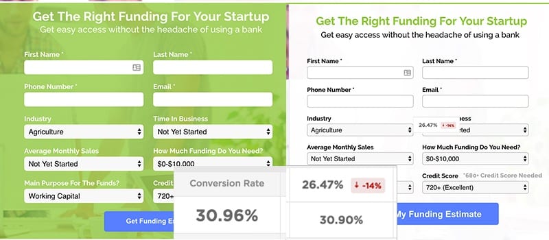
With that in mind, landing page forms typically perform best when they are obvious. For example, it often works well to visually separate your form from the rest of your content with a contrasting border.
As an experiment, I recently tried out a lower contrast form on a landing page. It reduced my conversion rate by 14%.
By the way, if you really want to make sure they don’t miss your form, try including your headline and subheader in the same box as your form. That way, as people read through your content, they’ll naturally encounter your form.
2. Positioning
Now, we just talked about how making your form easy to find is important, but does that mean you should always put it at the top of your page?
Not necessarily.
For years, landing page best practice has been to put your landing page forms right at the top of your page, preferably above the fold.
However, just because something is best practice doesn’t mean that it’s the best idea for your page.
For example, a couple of years ago, a speaker at Unbounce’s Call to Action Conference mentioned a test he ran on the Unbounce homepage. As an experiment, he decided to try making the page super long and informative…and put the form at the bottom of the page.
Now, conventional wisdom would suggest that this is a foolish idea. Most people don’t make it to the bottom of a lengthy landing page, so it’s unlikely that they would ever see the form.
In Unbounce’s case, however, a long page with the form at the bottom actually resulted in a higher conversion rate!
Inspired by this case study, I decided to run my own test. I compared conversion rates for a page with the form at the top and the form at the bottom.
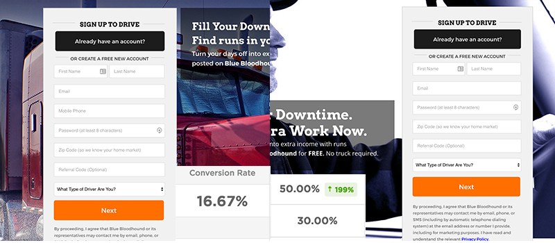
Incredibly, putting the form at the bottom of the page increased the conversion rate by 199%!
Does this mean you should always put your form at the bottom of your page? Not at all. But, where you place your form on your page can have a big impact on your conversion rate.
So, if you think your form might seem a little too pushy at the top of your page, try putting further down your page—maybe even at the bottom and see what happens!
3. Length
Form length is another situation where following best practice does not always guarantee you the best possible results.
However, in general, shorter forms tend to convert more traffic.
That being said, many industries like medicine or education need to ask for a lot of information in their form. The more info you need, the longer your form will be.
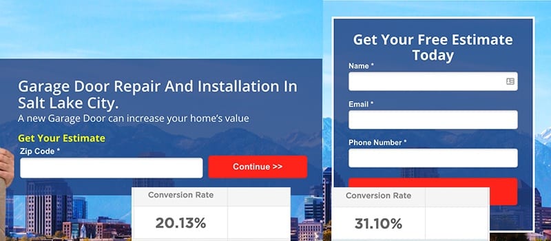
Fortunately, in situations like this, it can often be very helpful to break one long form up into several smaller pieces. With each step your visitors take in the conversion process, they feel more committed and are more likely to finish.
For example, with one of our clients, we started with a very simple form—all we asked for was their zip code. Then, once we had that information, we gathered the bulk of the information we were after on the next step.
The one downside to a multistep form is the fact that some people bail after the first step, so it’s often a good idea to ask for contact information early on. That way, your sales team still has their contact information even if they don’t finish completing the form.
4. Clarity
Of course, if you’re wrestling with a long form, it may be a good idea to take a look at your fields and ask yourself, “Do I really need to ask for this piece of information?”
If the answer is yes, is that information a required field? In general, if a piece of information isn’t important enough to be a required field, you probably don’t need it on your form.
Remember, you don’t need to know everything about a lead as soon as they convert. Your job is to get qualified leads to complete your form. Your sales team can get the extra details later.
5. Attraction
What makes completing your form worth your potential lead’s time? When you ask someone to fill out your form, you are asking them to give up time and information—make it worth their while!
For example, offering a white paper download or free quote with a form submission is a great value exchange. They share their personal information and you share some solid advice or recommendations.

One other advantage to adding an offer for form completers is the competitive advantage it can give you.
A lot of people comparison shop online. If your offer beats the competition’s offers, you stand a good chance of winning the lead.
6. Friction
Often, people don’t convert because there is a point of friction that causes them to bail. The easier and less painful it is for people to convert, the more likely they are to fill out your form.
To identify the points of friction in your form, you need to answer a few questions:
- How are the users interacting with the form?
- Are they dropping off at a certain field?
- Am I asking for something that people aren’t willing to provide?
- Is the CTA not clear?
You can run tests to get these answers, but the fastest way to find your friction points is to use heat mapping to see how people are interacting with your page.
With heat mapping, you can see which parts of your form are getting the most “heat.”
For example, if people spend a long time clicking around on your form, your design may be confusing them.
On the other hand, if potential leads spend a lot of time hovering over a particular field, that may indicate a field that is creating stress and/or frustration for your target market.
With this data in hand, you can come up with a variety of very specific form design tests that can do wonders for reducing the friction on your page. Sometimes, a simple wording change can have a dramatic effect on your conversion rate.
7. Resolution
No matter how slick your form design is or how attractive your offer is, people are going to have common questions or concerns that they want addressed before they feel comfortable converting.
But, if you’re smart about it, you can use the content in the immediate vicinity of your form to resolve those questions and concerns. This gives your potential leads the information they need to convert and proves that you really understand your market’s needs.
That being said, be careful to avoid cluttering your form with too much information. Focus on what matters most to the biggest segment of your audience and address other objections in other areas of your landing page.
Conclusion
Landing page forms are the stars of your landing pages and your whole page should be designed to set them up for success.
There are a variety of factors that go into making a superstar out of your forms, but by optimizing your page for each of the 7 points outline in this article, you’ll be well on your way to increasing form completions on your page.
By the way, if you’d like me to take a look at your landing pages and give you some recommendations on how to use your forms more effectively, let me know here or in the comments!
How do you get landing page visitors to fill out your forms? Are there any other factors you’d add to this list?