Exit Overlays – Your Last Chance for Marketing Love?
by Allison Otting • September 8, 2016
As a kid I watched a lot of romantic comedies with my mom. I once calculated that I’ve spent at least 80 hours of my life watching “You’ve Got Mail.” I’ll also watch “While You Were Sleeping” every year until I’m dead. #noregrets
One of the most common rom-com tropes is the final chase scene.
One half of the couple is disappointed or hurt and has decided to leave—and the other half realizes that if they don’t stop them now, they might lose their only chance.

CLASSIC example of this trope in “How to Lose a Guy in Ten Days”
In online marketing, we’re always trying to woo our customers into giving us a try. We believe that our product or service is their chance at happiness and we want to be with them forever.
But sometimes, even our best efforts fail and our customers head for the door…possibly forever.
If we really believe that it’s meant to be, then why aren’t we chasing our customers down?
We love to hate on exit overlays as much as we love to hate on rom-coms, but they let us persuade a potential customer to give us another chance.
Of course, not every final plea in a rom-com is a success…

…just like not every exit overlay is a guaranteed win, so let’s take a look at some good and bad exit overlay strategies and see why some tactics succeed while others fail.
The “You’re Making a HUGE Mistake” Exit Overlay
When it comes to exit overlays, all we need to do is convince the customer that you’re the best thing that has ever happened to them, right?
Sorry, you’ve just turned this from a happy-ending romance to a female empowerment story in which you end up dumped.
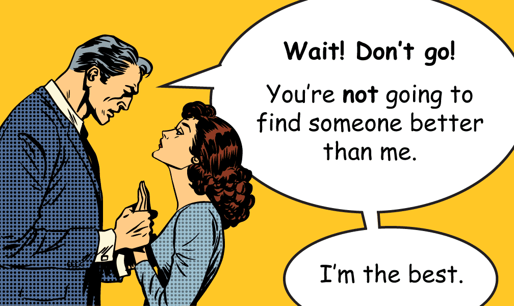
While you’re ranting on about your world-class service and revolutionary methods, your customer is rolling their eyes and clicking away from your page immediately.
They weren’t interested in hearing about how great you are to begin with, why use an exit overlay to annoy them with the same crap?
Use your last chance to emphasize meaningful benefits rather than your features. If you’re asking them for something small and not very committal, this could be enough to convince them to give you a second chance.
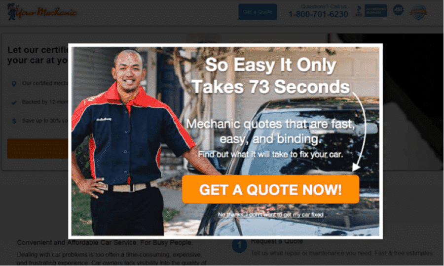
YourMechanic focuses on how fast and easy it is to get a quote on their site. (image source)
Your copy is going to make all the difference here.
To help you with this, Henneke Duistermaat—an expert copywriter who is constantly working to eliminate the “meaningless drivel” that plagues marketing of today—recently teamed up with Unbounce to build a Chrome extension that tells you exactly where you’re using language that is meaningless to users. Check it out!
Conclusion: Talk less about yourself and more about them. If you’re giving real reasons why this relationship will work, then your exit overlay might strike a chord.
The “We Can Make it Work” Exit Overlay
There are a lot of reasons a potential customer might bounce, but usually it’s boils down to one of two things:
- You just aren’t what they’re looking for.
- You’re asking for too big of a commitment.
Now, I can’t help you with the first problem, but exit overlays are a great way to address the second concern. Since they’ve already turned down your first offer, you have a chance to make a compromise.
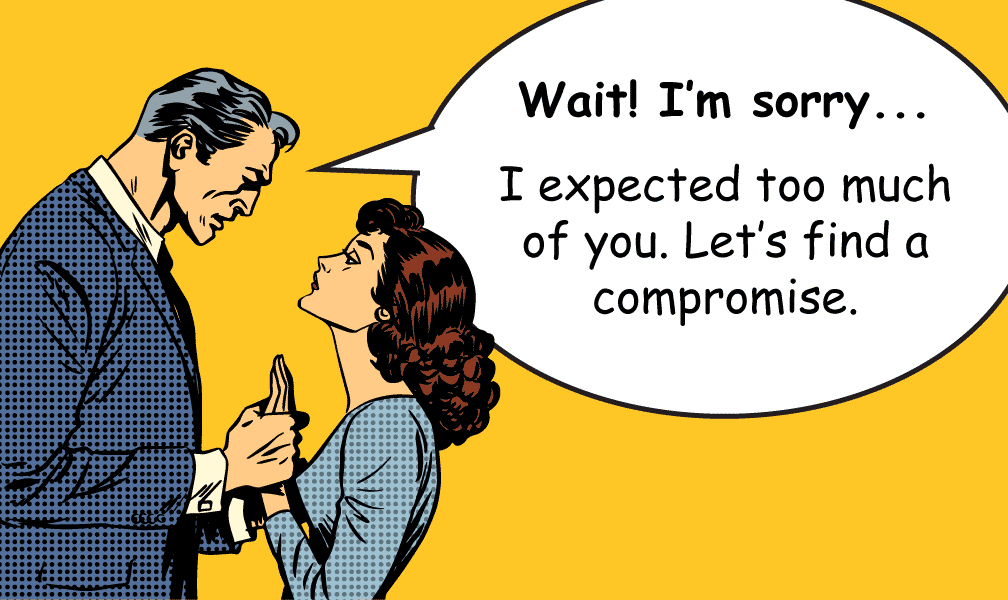
Here’s a few examples of some compromises that could earn you a second chance:
- A free trial
- A coupon code for checkout
- A free demo or whitepaper
- Exclusive access to additional content
- A price reduction
- An extra gift
Case in point, here’s how Cloudaways approaches their exit overlays.
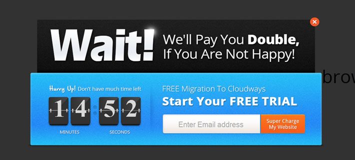
A great example of a compromise offered by Cloudaways. (image source)
Compromises will vary depending on your industry, but there’s always a way to convince a few extra people that you’re willing to do whatever it takes to make it work.
Not only will this net you some extra sales, but it can also help you establish a better relationship with your customer.
Conclusion: Make a compromise by offering something for free or a discount that might tip them over the edge. Essentially, make them an offer they can’t refuse.
The “I’ll Always Be Here for You” Exit Overlay
Let’s be honest, like many good rom-coms, the timing of your offer isn’t always right the first time someone meets you (or your business).
They might have interest in your product or service, but maybe they don’t need it for another month or they’re waiting until it makes sense financially.
Keep in touch with that potential customer. Having them sign up for a low-commitment mailing list, or encouraging them to follow you on social media, is a great way to keep them engaged with your brand.
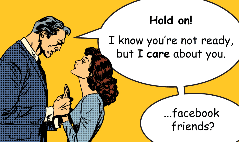
These actions are much lower pressure, and can be great for filling your nurture streams.
Make joining your mailing list worth their while, though. By telling them the type of content they can expect, and the benefits it could have on their life or business, you have a much better chance of getting sign ups.
For example, here’s how Conversion Sciences approaches their exit overlays.
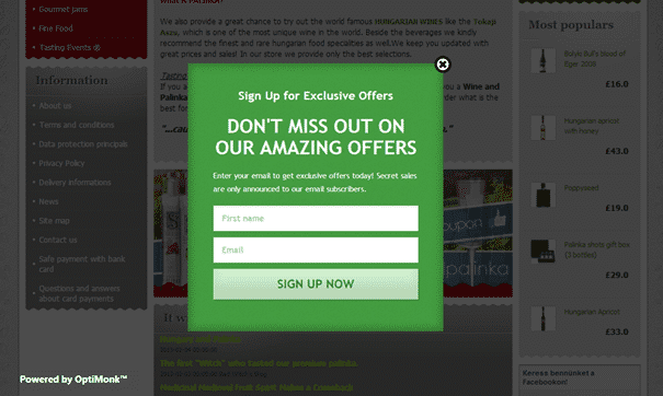
Notification of future sales can be a great way to entice users. (image source)
Once you have their email or social media follow, though, treat it with respect. Make your content exciting and periodic, rather than spamming them every day.

That’s way too much, Ryan Gosling.
Conclusion: If they’re not ready to commit yet, use an exit overlay to stay in touch. You’ll have a much better chance of making the sale if they’re interacting with your content.
Exit Overlays Don’t Have to be Annoying!
We often associate exit overlays with the awful pop ups of internet past. Google’s stance on them is a bit vague, but ultimately they’re judging your page based on what kind of experience you provide for your users.
How can you make exit overlays a good experience?
- Delight users by giving your overlays some personality. It’s hard to be mad when you’re laughing.
- Time the overlay trigger so that it only appears when it makes sense. Converting on a page and then getting an exit overlay is confusing at best and frustrating at worst.
- Always offer something of value in the overlay. No one likes having their time wasted.
- Never make an overlay difficult to exit. You’ve had to hunt for the invisible “x” before and you know it sucks.
If you follow these practices and choose a strategy that makes the most sense for your business, exit overlays can be a great way to catch a few more conversions before they walk out the door.
In the end, what marketer doesn’t want that?
By the way, if you’d like me to take a look at your landing pages and help you come up with a good exit overlay strategy, let me know here or in the comments. I’d love to put my rom-com know-how to good use!
How have you seen companies successfully use exit overlays?


