How to Get People to Click On Your Landing Page CTA
by Manny Lopez


What is the most important part of any landing page? Your headline? Hero shot? Form? All wrong. The most important part of any landing page is your landing page CTA.
To put it simply, your call-to-action (CTA) should be the star of your landing page and you should optimize your whole page it to get the best results possible from your landing page CTA.
What does that mean in practical terms? Well, when designing your call-to-action, there are different aspects of your page that can either help your CTA get more clicks…or make people less likely to click.
In this article, we’ll take a quick look into at how design, copy, placement and frequency affect the click-ability of your landing page CTA:
Your Landing Page CTA
Before we break down the anatomy of a good call-to-action, let’s quickly review a few CTA basics.
- Your CTA should be focused on driving your conversion goal
- Your CTA should be supported by your landing page design and ad copy
- You shouldn’t have more than one CTA on a page. If you want a form fill as a conversation don’t dilute that with a white-paper download stay focused on one or the other.
Now that we have those out of the way, let’s discuss what you can do to optimize your CTA.
The Design
The first key to an effective CTA is your design. Your CTA needs to be designed to stand out from the rest of your page. Ideally, you want to use contrasting colors on your CTAs—the bolder the move, the better.
Essentially, you want your CTA to stand out and be visible as soon as the page loads. Using strong contrasting colors is one of the easiest ways to make your CTA stand out.
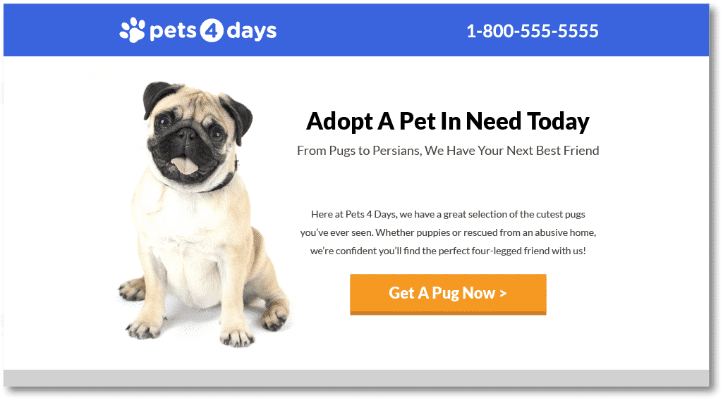
For example, on this page, the bright orange CTA is easy to spot because the color is so different from the rest of the page:
In addition to using contrasting colors, it’s also important to keep in mind the “space” surrounding your CTA. Remember, white space is good and your CTA should not be cluttered or surrounded by a lot of text/copy. There are certain elements that can help drive the click like visual cues or some supporting text but it is typically best to avoid cluttering up your CTA.
The Copy
What should the CTA say? How are we going to convince people to click my ad? These are questions that marketers and designers ask themselves daily.
Your copy is one of the most important components of your CTA. But what makes effective copy? That could be argued until the cows come home, but the most important thing to do is think beyond the standard “free download” “submit” and put yourself in your user’s shoes and address their pain point.
So, instead of “free download,” you can say something like “learn how to convert more users.” Using this type of wording, you are addressing the user’s pain point and offering them a solution. Remember, offer a user something more than just the standard generic “submit.”
Placement and Frequency
Knowing where to place a CTA on your page is important because you don’t want to come off as to pushy and turn people away. The frequency together with the placement should be a key consideration as you design your landing page.
As a rule of thumb, there should always be a CTA visible on the screen no matter where the user scrolls. You want to make sure that there is always an opportunity to click on a CTA if the user needs to.
Placement also plays an important role in mobile design. So don’t be to pushy with a CTA. Rather, strategically place your CTAs where they make since and surround that by supporting copy and images.
Conclusion
There are many ways to optimize your landing page CTA. Whether you are choosing to re-design your button with a strongly contrasting color or re-writing your button text you should always take a step back and consider trying something new.
By combining these principles, you should be well on your way to creating highly clickable CTAs on your landing pages!
Incidentally, if you’d like me to take a look at your landing page CTA and give you some feedback, let me know here or in the comments. I’d love to help!
What are some of your favorite landing page CTA examples? What do you do to get the most out of your landing page CTA?