5 Ways to Optimize Your Fashion Ecommerce Website for More Sales
by Radu Vrabie • May 15, 2018
If you’re like most fashion ecommerce retailers, you’re probably getting a lot of traffic to your website…but not nearly as many sales as you’d like.
Don’t worry, you’re not alone.
The average conversion rate for fashion ecommerce websites is 2.2%, while the cart abandonment rate is 71.4%. A UK study revealed that 75% of fashion customers would leave a website if that website is not easy to navigate.
With all that in mind, what can you do to ensure that your users don’t leave your website empty-handed? Here are five ways to get more people to make a purchase on your fashion ecommerce website:
1. Reduce the Number of Choices
This might come as a surprise, but offering your customers too many options can actually decrease your conversion rate.
In marketing, we refer to this as the paradox of choice: the more options users have, the more confused they become about what to choose, so the easiest choice is to simply choose to leave.
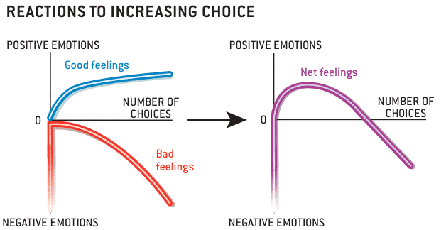
Barry Schwartz’s Paradox of Choice. Source.
You certainly don’t want your users to leave empty handed, so one way to solve this problem is reducing the number of choices a user has through filters and internal search.
Be careful how you implement them though—84% of the websites have a mediocre or poor filtering experience because they lack key filtering options, have poor filtering designs, or the filtering logic doesn’t align with the user’s expectations.
When it comes to internal search, many website owners see it as a nice-to-have, when in reality, site search is a very powerful conversion optimization tool.
On-site searchers are not only a lot more likely to convert (according to WebLinc, on-site searchers are 216% more likely to convert than regular users), but they spend considerably more money too.
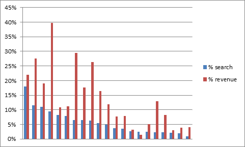
On-Site Search vs. Revenue. Source.
But how can you persuade your visitors to use the filters and internal search and thus push them down the funnel? By using exit-intent overlays.
Like the name suggests, exit-intent overlays are a type of pop-up that are triggered when a user leaves the site. Now you might be thinking: pop-ups? I don’t want to implement that, they’re annoying!
Unlike traditional pop-ups (that open in another tab or window), overlays open in the same tab, so the user is not redirected to some shady website and—when implemented right—they can reduce your bounce rate.
2. Reduce Check-Out Friction
If you are looking to treat the objections that make users abandon their carts, you might want to try chat prompt surveys with branching logic. Essentially, when your users are trying to abandon their carts because they have encountered a friction, a sales assistant will come in and help them overcome the struggle via chat.
For example, if they want more details about the product or the delivery and return policy, you can prompt them with your contact details, and if the price isn’t right, you can send them a discount code.
Another good idea would be to collect their email addresses as close to the beginning of the check-out process as possible. This will allow you to target them with abandoned checkout remarketing emails to remind them of their shopping cart items.
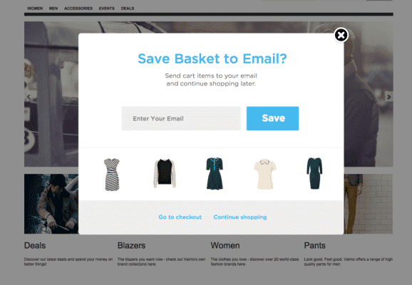
Checkout Email Capture Example. Source.
According to a case study by Sales Cycle, those types of email campaigns are highly effective: 50% of abandoned cart emails are opened and over a third of these clicks lead to purchase.
3. Do 1-On-1 Personalization Using The RFM System
What is the RFM System? The Recency, Frequency and Monetary value of a customer is based on the Pareto principle that 80% of business comes from 20% of the clients.
In order to personalize the conversation with each customer, you have to segment your audience according to their RFM score.
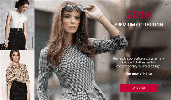
For example, a customer with high monetary value (a customer that spends lots of money on your website) can be welcomed with a VIP type of message (the same principle can be applied for email campaigns as well).
So, if a VIP customer visits your fashion ecommerce site, they might see the following:
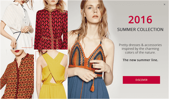
Non-VIP customers will see something more generic, like this:
To perform a RFM analysis, you will need all your customer purchase history data.
Using that data, you’ll need to divide your customers into four equal groups according to the distribution of values for recency, frequency, and monetary value. You should end up with 64 different customer segments.
Once you have divided your customers into groups, all there’s left to do is pick a category you want to focus on (most valuable customers, customers that you almost lost etc.), set up your online identifying criteria and create your custom experiences!
4. Use Web Push Notifications
Web push notifications work very similarly to mobile app push notifications, except that they work on websites instead of apps and can be accessed from all devices, including desktop (which still accounts for 42% of the time customers spend online).
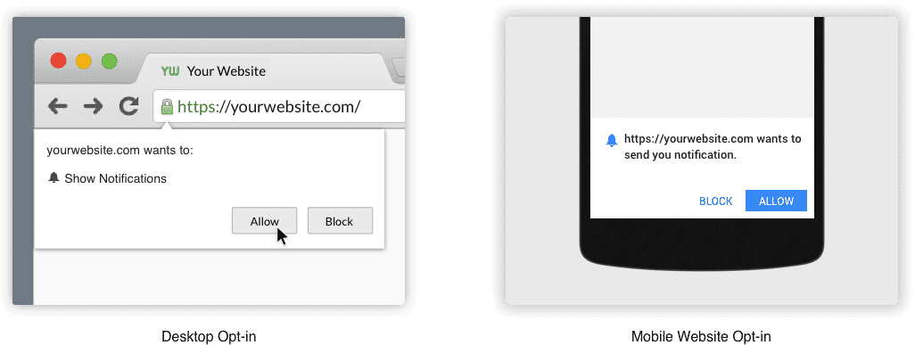
Web notifications example. Source.
Like overlays, web push notifications are a double-edged sword but—when used right—they can help you with customer retention and conversion rate optimization. You can use browser push notifications to present personalized offers, invite your users to events, promote your content etc.
A major plus for using web push notifications is that they don’t require a dedicated app, which can be expensive for small-to-medium sized companies. As a result, the implementation costs are minimal.
As with any other marketing channel, there are some aspects that you should keep in mind while creating your push notifications: copywriting, timing, frequency, segmentation and personalization, metrics to track, etc.
5. Include Visual Hierarchy
Psychologists have discovered that humans have the tendency to organize information based on its size and position in a document. This means that users will focus on the larger text first and they will continue to read the smaller text only if the larger text was of interest.
To take full advantage of this visual hierarchy concept, you can use the largest text for your headlines and calls-to-action (CTAs), and then slowly decrease the size for description, features etc.
Color also has an enormous influence on how users perceive your website as bright colors are more likely to draw attention. Then comes contrast—the bigger the contrast, the more it will attract the user’s attention. Textures and styles can also help prioritize content.
Finally, patterns have been used to hierarchize information even before the digital age. These patterns are based on the movements that our eyes tend to make when presented with a fresh page. There are two main patterns that you can use:
Z Pattern
This pattern is common on websites with a limited text content. The user will scan the page from the top left to top right, then glances down through the content (following a diagonal) to the bottom left, before moving to the bottom right.
To take advantage of this pattern, your most important information should be placed along the Z line.
F Pattern
The F pattern is commonly used on websites that include text-heavy content and/or video content.
Users will begin scanning the page from left to right along the top, but then scan down the left side of the page, looking for visual clues to the information they seek. When they find such a clue, they scan from left to right. They will repeat this process until they reach the end of the page.
Of course, you can use both patterns on your website, as long as you use them accordingly for each page.
Fashion Ecommerce Optimization
Conversion rate optimization can be a slow, hard process, but hopefully this article will give you some ideas on how to optimize your fashion ecommerce website. Thanks for reading and best of luck!
What are some of your favorite fashion ecommerce optimization tips? How do you approach fashion ecommerce site design? Leave your thoughts in the comments!

