Shopify Templates: An In-Depth Guide to Picking the Right Shopify Theme
by Cydney Hatch • May 25, 2018
As an ecommerce retailer, you are always looking for ways to improve your online store. In 2018, one of the most effective ways to do this is using visuals—particularly the visuals and templates you use in your online storefront.
Why?
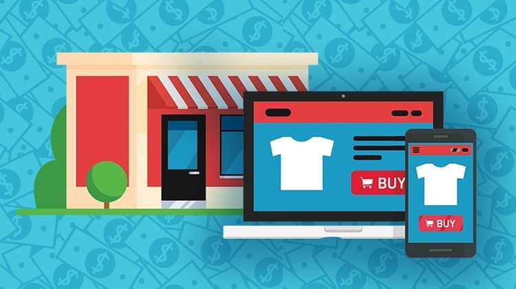
Unfortunately, physical storefronts have a leg up on ecommerce businesses in some ways because customers have the opportunity to physically view products in person, touch them and observe the quality.
It’s hard to compete with that in a digital store. As the owner of an online business, this is the challenge that you face: recreating the visual elements of your products and store experience in a technological way.

But, if you are struggling to create a strong visual experience for your customers, don’t sweat it!
The good news is, with the right Shopify templates, you can feature your products in a way that lets you compete with and even beat the brick-and-mortar experience.
In this article, I am going to review what makes a great Shopify template work so well and take an in depth look at several Shopify templates you can use to create a killer impression for your digital storefront.
Fair warning, though. This article isn’t going to be some “look how pretty this template is” listicle. There are plenty of those out there.
While we will cover a lot of different templates in this article, the goal of this post is to help you identify a template that will deliver results for your business, not just look nice.
What to Look for in a Shopify Template
The look and experience of your online storefront matters just as much as its functionality, particularly nowadays when 38% of people will leave a website if they find the layout unattractive or difficult to navigate!
So in this case, looks are everything…
Before we get into the details of how to pick Shopify templates, here are basic necessities your ecommerce storefront should have:
High Quality Visuals
Quality photography and video—particularly for products—is an incredibly important part of a good Shopify template. Why?
Your visuals help your customers decide if they want to purchase a product. Since they can’t see the item first-hand, photos are the only real experience a customer will have with your product prior to making a purchase, so it’s crucial that your visuals are high quality, clear and engaging.
Sadly, balancing quality and quantity is a struggle most ecommerce businesses face, especially with mobile. Out of 50 popular online retailers, around 25 percent provide only one photo for each product and they lack interactive media like image zoom.
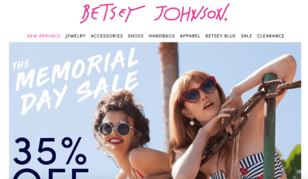
As customer attention spans are shortening, it’s important to grab their interest in a matter of seconds when coming to your site storefront. For that, you’ll want to look for a template that allows you to offer promotions.
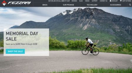
A big fat promotion slapped on your home page can really help draw customers in to browsing and buying something on your digital store.
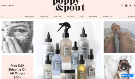
On top of promotions that will invite customers to purchase, it’s important to have high quality banner images as well as snappy taglines that will introduce your storefront in an exciting way.
Here are some things to consider when it comes to picking Shopify templates for featuring photo and video in your ecommerce storefront:
- Does the template allow the use of GIFS and/or short videos to display products?
- Is there a place for promotional images specially geared towards products desired for promotion?
- Can you share snappy taglines in readable fonts?
- Can you create photo galleries to highlight product features?
- Does the template offer a zoom function for product phos?
Mobile-Experience
People now use their mobile phones to shop more than they use desktop computers, so you need a Shopify template that is designed to provide a great mobile experience.

Here are some things to consider when it comes to picking a mobile-friendly Shopify template:
- Is the shopping cart experience seamless and easy to use on a phone?
- Is the site navigation clear on mobile?
- How do images look on mobile?
- Are buttons large and easy to use—especially for people with large fingers?
- How quickly can users scroll through the template?
Intuitive Design
A good Shopify template should easily guide customers to the products they want and through the purchasing experience.
Poorly structured storefront sites don’t result in sales and conversions because they don’t make the shopping experience easy. Your ecommerce site should be categorized, site pages should be clear and your customers should be able to easily get the information they need to purchase from you!
Shopping is hard enough without having to fight your way through the store.

Here are a few things to consider when it comes to visual navigation options in a Shopify template:
- Can you include links to important pages on the main page?
- Is the template organized in a neat and intuitive way?
- Does the design naturally guide people through your site?
- Does the template make it easy to find key action buttons? (like “add to cart”, etc).
- Is the template cross-browser compatible, mobile-responsive and SEO-friendly?
Easy Checkout and Functionality
The biggest thing that will hurt your sales is a terrible checkout experience. You could easily be losing more than half your customers if your checkout is poorly designed.
Functionality is the key to a good checkout experience. This can include account logins—especially through social media check ins—obvious buttons, clear cost breakdowns, shipping calculations and follow-up purchase materials buyers can use to learn more.
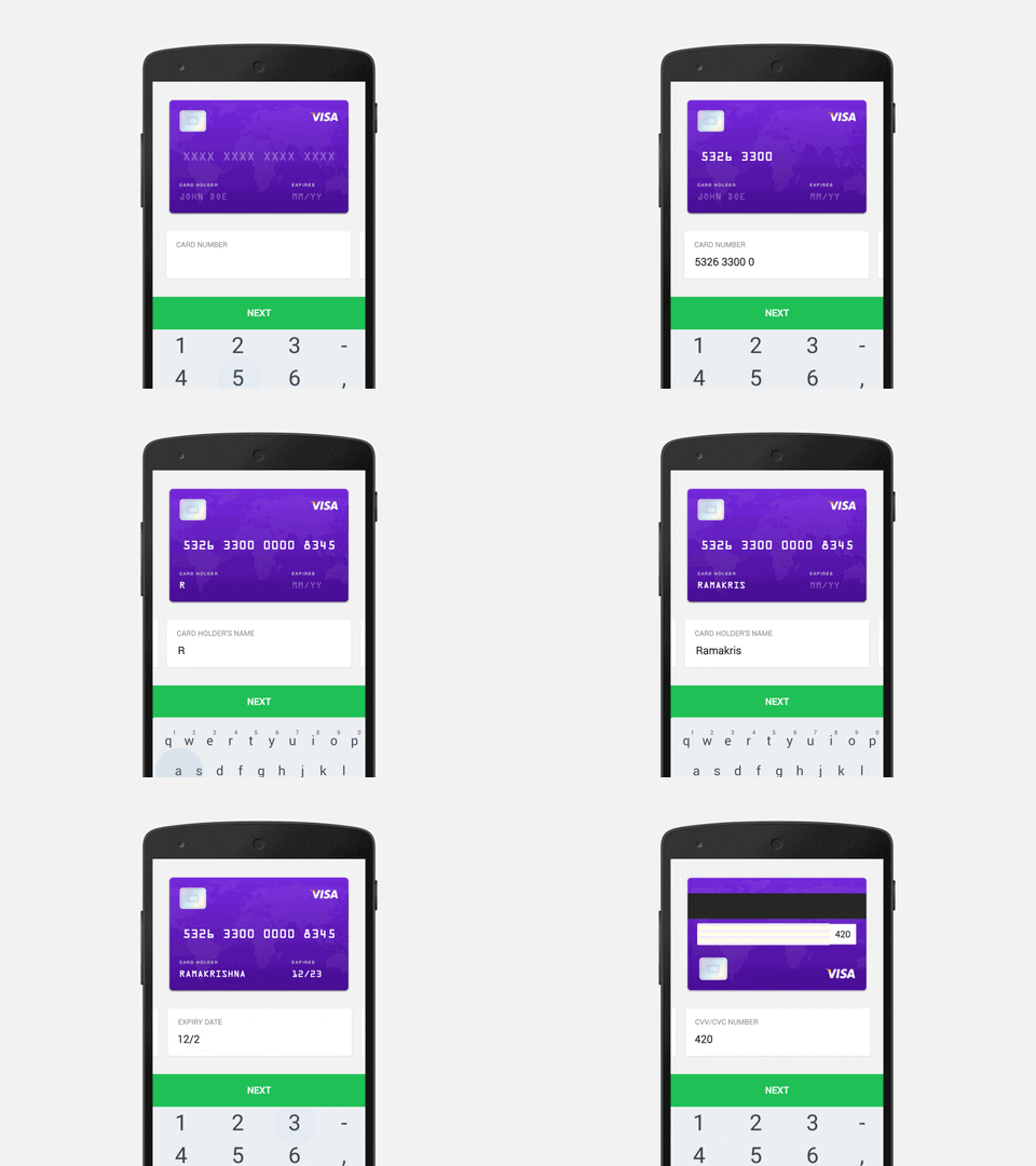
Here are some things to consider when it comes to cart checkout for your ecommerce storefront:
- Are the checkout buttons overwhelmingly large and in your face?
- Can customers quickly get a clear picture for their expected total cost?
- Is the checkout process speedy and intuitive?
- Are shipping times, products and timelines displayed in easy-to-find, readily accessible places?
7 Killer Shopify Templates to Consider
So, now that we’ve covered what to look for in a good Shopify template, let’s take an in-depth look at 7 free and paid Shopify templates that meet these criteria.
Now, every business is different, so you may not find your ideal template on this list. However, my goal is to help you find a Shopify template that will help you get the results you’re looking for, so I’m going to do a detailed analysis of these 7 templates. This should give you a great feel for what you should be thinking about as you evaluate different Shopify templates.
Before we begin, it’s important to note that all Shopify themes in Shopify’s online store come with the following features (to look for Shopify templates on the official Shopify Theme Store click here):
- Customizable content sections on home page
- Mobile-friendly design
- Search engine optimization
- Social media icons
- Drop-down navigation support
- Built-in styles and color palettes
- Free theme updates
- Free stock photos by Burst
- Shopify Team help if you run into problems creating the storefront
While all that is certainly a step in the right direction, simply having a “mobile-friendly design” isn’t the same thing as having a well-designed mobile experience. What matters is execution.
With all that in mind, let’s take a look at 7 of the best Shopify templates on the Shopify store:
1. Brooklyn (Free)
“Tailor-made for modern apparel stores”
Brooklyn is a responsive, sleek and modern Shopify template that adjusts to look great on all screen resolutions. Brooklyn is made specifically for apparel/accessory stores with a focus on brand imagery.
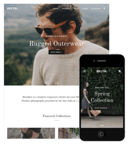
Brooklyn has two styles: Classic and Playful. The difference between the two styles is classic style is serious and the playful style is more colorful and vibrant.
Some of this template’s best features are:
- A Slideout Cart: Customers can easily add to their cart without leaving their current page.
- Home Page Slideshow: Showcase multiple product or brand images at the top of your home page.
- Video Usage: Tell your story by featuring a YouTube or Vimeo video front and center.
Where Brooklyn Shines
Brooklyn kills it when it comes to visuals! This template showcases your visuals in a beautiful way that gives customers a contemporary and high fashion feel.
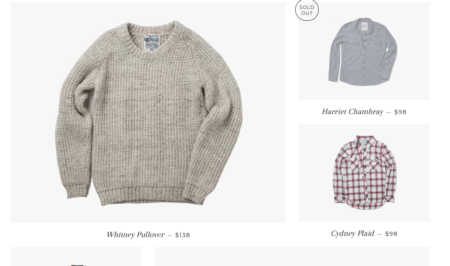
Product imagery is clear, simple and comes in a variety of sizes—which keeps things visually interesting. This is available through a dynamic product grid system that is customizable to meet your needs!
Varying product size photos is a great way to show off specific items for promotions, features and collections. On top of visually appealing product photography, the pricing and names are clear and direct, so customers can quickly make purchasing decisions.
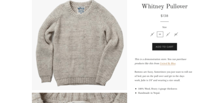
When looking at a specific product, Brooklyn does a great job at listing available sizes and offers multiple photos for quality assurance with zoom capabilities as well as descriptions and customer care information.
These features make it easier for potential customers to trust that the products they are looking at will be the ones they receive in the mail. This is a great example of product inventory visuals.
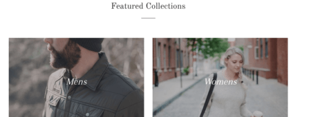
When it comes to the home page, Brooklyn makes feature collections for sorting through inventory easy. On top of categories like gender, feature collections can also be grouped for promotions and other events you are hosting on the storefront.
If you are using an influencer campaign to sell specific lines of product, you can also have the influencer images grouped in sections like this.
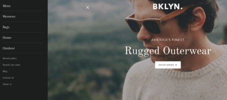
Functionally, Brooklyn offers a straightforward and informative user experience. The storefront pages are listed clearly in a side scrolling bar and they are clear to understand.
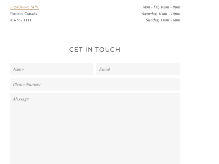
Brooklyn’s contact page is simple, clean and direct. They also list phone numbers, addresses and store hours to help customers understand the best ways to contact, visit and communicate with the store.
It is also helpful that this shopify template lists payment options at the bottom which helps customers know their planned payment options are available through this ecommerce storefront.
2. Minimal (Free)
Minimal is a beautiful, trendy shopify template that looks great on any device.
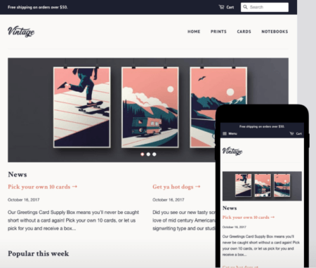
Loaded with key features designed for flexibility, Minimal allows you to customize your storefront with multiple layout options, product views, navigation styles and font choices. Minimal also has three style options: Vintage, Fashion and Modern.
The vintage style gives a mod vintage and compartmentalized style while the fashion and modern are more clean, minimal and bright.
Some of the best website features are:
- Product Zoom: Give customers a closer look and extra product details when they hover over an image.
- Product Filtering: Allow customers to filter products by type and sort by best sellers and price on the collection page.
- Home Page Slideshow: Showcase multiple product or brand images at the top of your home page.
- Related Products: Display products from the same collection on your product pages so customers can continue shopping.
Where Minimal Shines
Minimal does an amazing job of focusing on the product experience. It is high quality, stylized and offers engaging options for featuring products.
For example, placing products on a sleek white background looks high quality and focuses user attention on the products themselves.
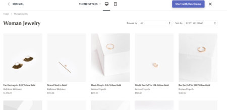
When looking at specific products, Minimal does a great job at presenting the products in a meaningful way. They have zoom capabilities that make seeing the quality of the product easy.
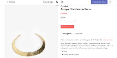
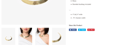
Minimal also has helpful product descriptions, quantity scroll bars and social media share buttons. All of these features are quick and easy to navigate which makes the shopping experience that much nicer!
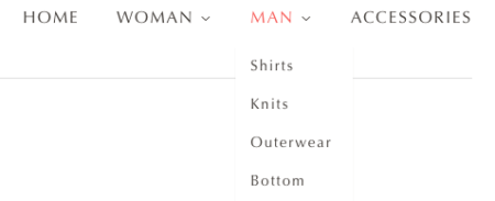
The main page for Minimal is clean and easy to navigate with the drop down page menu. All of the pages are categorized for an easy experience to find that you are looking for!
This Shopify template also offers informational pages and banners you can use to further improve the customer experience.
FAQs are popular pages many customers like to check out when buying things online. Whether it’s questions about quality, shipping times, locations, sales or other procedures, why not answer them all in one place?
Creating an FAQ page not only saves you time responding to emails, it also creates added trust from customers by instilling a sense of transparency.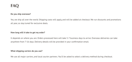
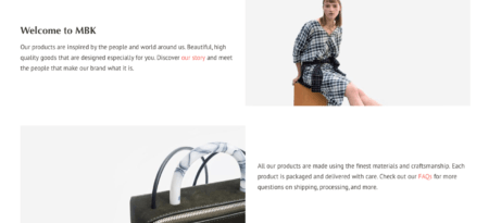
Visual banners are a great way to share these information packed storefront pages through quick clicks and navigation on the home page.
“About Us” and FAQ banners are an easy way to navigate customers to information they need! Minimal does this in a visually appealing way that engages customers like the photo below.
Like most Shopify templates, Minimal also shares their hours, location and contact information creatively and easily. It also lists their payment channels which helps customers prepare for payment and letting them know what the ecommerce storefront accepts.
 Using a map application for your ecommerce storefront also helps customers plan for their visit and helps sign in the address easily onto their phones if they want to visit your brick and mortar location (if you have one).
3. Showcase ($180)
Showcase is perfect for boutiques, artisans and visually focused ecommerce businesses. It showcases your products in a full image screen storefront.
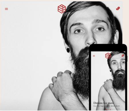
Featuring overlayed multi-level menus, full-screen product galleries, retina display graphics and versatile options for customizing your store, Showcase is fantastic for showing off your products in a unique way.
Showcase is cutting edge and visually interesting which can be a positive or negative depending on the business. It comes in four styles: Native, Betty, Luna and Beard.
The main difference between the styles are stylization of website title and some are more feminine and masculine looking.
Some of the best website features are:
- Built In Catalogs: Ideal for stores with a small number of products.
- Multi-Level Menus: Feature a multi-level menu in a stylish overlay window to help customers easily navigate your store.
- Large Imagery: Showcase high-resolution product imagery throughout your store.
- Video Usage: Tell your story by featuring a YouTube or Vimeo video front and center.
- Fullscreen Product Galleries: Showcase your products and photography in a fullscreen product gallery.
- Sticky Navigation: Keep menus fixed to the top of your page as you scroll down.
Where Showcase Shines
Showcase does a great job at making navigation easy. The website has a sticky navigation bar that includes the shopping cart and makes scrolling and shopping easy and visually clear.
![]()
Having a clear shopping cart that follows you to every page regardless of scrolling helps customers be aware of their shopping items and nudges them towards making a purchase.
Showcase’s home page allows you to put quality product image of your products in large, eye-catching formats to create a stunning first impression. This is a unique feature that might set your ecommerce storefront apart from others. It can also be more appealing to younger shoppers who particularly enjoy strong visuals.
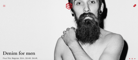
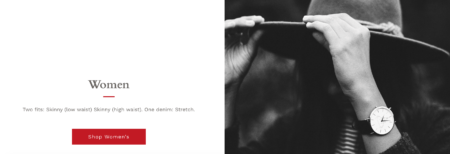
If you scroll down the main page you will see large, formatted scroll photos you can use to list “best selling” products. Using photos like this makes navigating shopping categories easy.
Another wonderful visual component is the red “for SALE” sticker you can use to mark discounted items. Sale items shouldn’t be buried in your site—they should stand out! Make em pop!

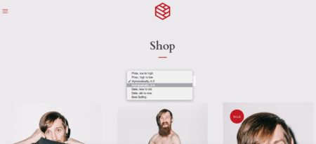
Yet another great feature of this Shopify template is the sorted drop down categories tab. By using this feature, customers can easily sort through the products as they desire whether its old or new, pricing, alphabetic or best selling!
Again, making the shopping experience easy and helping customers find the items they are looking for is a great way to increase your chances of making a sale.
One shortcoming of Showcase is the actual product pages, which aren’t quite as user friendly as those found in other templates in this article.
However, the product pages are very different and eye-catching, so if that’s a priority for your business, you may actually like Showcase’s unique approach to product pages.
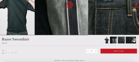
As seen above, the item’s product photos are in a scroll gallery on the top while the sizing and other information is listed on the left hand side.
Although it is different than a typical storefront we see, this can add a new experience certain customers might enjoy. It all depends on your business!
Another area where Showcase really shines is in the social media department. Showcase is amazing at connecting storefronts with meaningful social media.
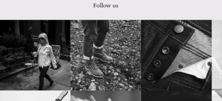
With this template, you can include social media photos showcasing products on Instagram. This helps customers connect with you on your social media channels which can then help them stay up to date on sales and events happening with your business.

Promoting your social media channels is a great cross promotional tactic that can drive sales and traffic to your storefront!
Lastly, like most Shopify templates, Showcase also shares their hours, location and contact information creatively and easily with maps and listed information.
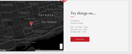
Finally, Showcase also lists their payment channels which helps customers prepare for payment and letting them know what the ecommerce storefront accepts.
4. Icon ($140)
“Perfect for visually striking brands with image-focused content”
Icon is a parallax Shopify theme packed with lots of features that allow Shopify storeowners to create unique shopping experiences with ease.
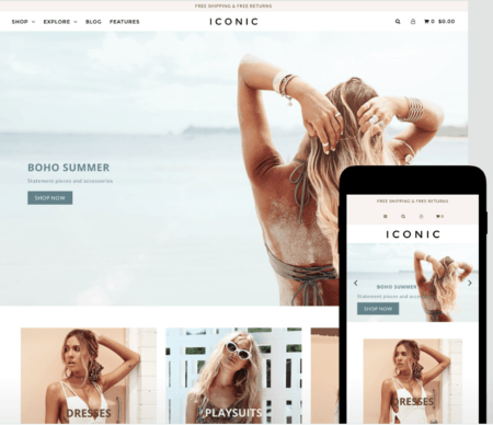
Icon includes helpful features like a sticky header, sticky sidebar, parallax scrolling images and much more. Icon has three styles: Dolce, Yves and Christian.
The main difference between the styles are stylization of the website menu bar and overall coloring.
Some of this template’s best features are:
- Sticky Navigation: Keep menus fixed to the top of your page as you scroll down.
- Instagram Feed: Share your latest Instagram posts in a full-width feed.
- Slideshow: Showcase multiple product or brand images on your home page.
- Product Quick View: View product details in a popup so customers don’t have to leave their current page.
- Multi Column Menu: Feature product images in a large, multi-column drop-down menu.
- Parallax Effect: Create an animated depth effect as you scroll down the page.
Where Icon Shines
Icon does an amazing job at creating a holistic visual and content experience. This Shopify template features quality imagery, social media and content blogging in integrated ways that can help your ecommerce site be more than just a online store.
This is a store for the visually inclined ecommerce business!
Icon’s front page has beautiful scroll banners that run through a moving slideshow that features promos, collections and other important information. The storefront navigation bar is clear, readable and makes navigating pages easy!
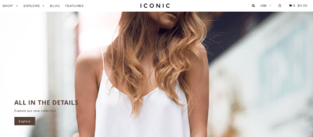
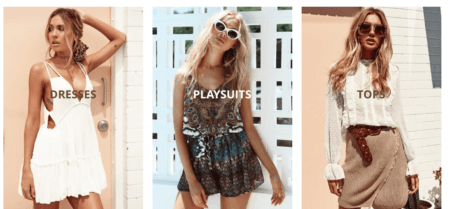
Scrolling down the main page, Icon displays beautiful image buttons that take customers to specific shopping pages based off of products they are looking for.
Having visual buttons is a great way to draw attention to featured products. These can also be switched out for seasonal promotions and other creative campaigns outside of your regular inventory.
On the search results page, products are displayed with a quick shopping view which customers can use to see items quickly without leaving the main search page. This is a helpful tool you can use to keep customers on the main browse page while still allowing them to check out specific products.
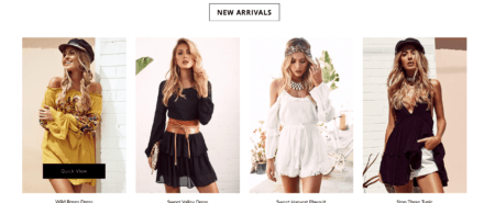
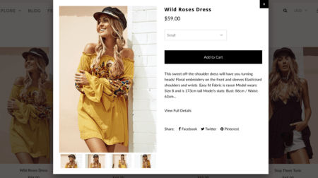
This option alleviates a common complaint customers have about needing to click “go back” to see other products. A quick pop up that lets them see an individual product is so helpful!
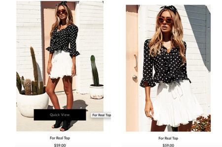
As customers mouse over various products, they can see multiple product images when the mouse scrolls over specific listings which adds another visual element to the shopping experience.
These multiple looks help customers decide whether or not the product is something to look further into. When using this feature, however, you’ll want to be careful with what photos you choose and look for dynamic angles to compliment the featured product.
After a customer clicks on a specific product, Icon gives customers a visual zoom on the product as well as important detail information. Zoom function really adds to quality assurance and helps recreate the experience of holding an item in your hands in a digital way. This is an extremely helpful feature to have for your ecommerce storefront!
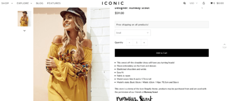
If you want more items like the one selected, customers will also see related items below that can help customers shop in the same collections.

Most customers enjoy the feeling of tracking down the perfect item, so this feature creates a sense of “finding” gold!
Another great feature of the Icon Shopify template is that Icon also makes it easy to put together a well-designed blog.
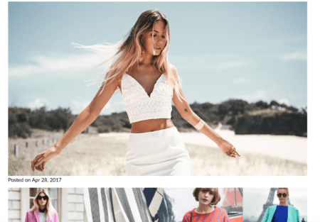
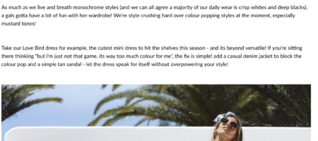
As you can see above, the blog design is focused on visuals, but you’ll also want to include helpful tips in your copy for visitors. For example, you may want to write blog posts about your business, popular items, upcoming events, FAQ and influencer marketing opportunities!
Although blogging is something many ecommerce businesses forgo as they do not have a direct financial benefit, it is a helpful tactic to become a leader in the industry and helps create the sense that you are a brand,not just a shop.

Icon also includes social media banners that have clickable interactions with their social media pages. This can help increase brand awareness and gives you a place to display promotions to customers.
5. BlockShop ($140)
Blockstop is a responsive and retina display Shopify template that draws on flat UI design to create simple, customizable layouts for your store.
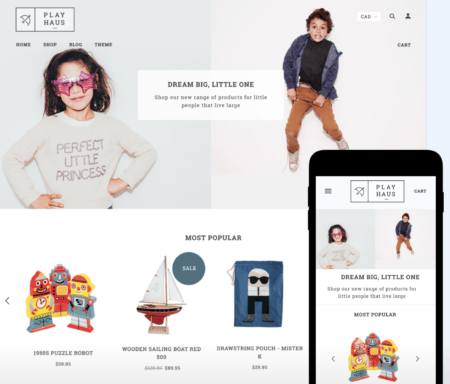
Blockshop is a unique, premium Shopify theme, perfect for established businesses, start-ups, boutiques and independent artists. BlockShop has four styles: Deli, Beauty, Playhouse and Moto.
The main difference between the styles are industry-specific style changes to the storefront.
Some of this template’s best features include:
- Instagram Feed: Share your latest Instagram posts in a full-width feed.
- Multi Column Menu: Feature product images in a large, multi-column drop-down menu.
- Video Useage: Tell your story by featuring a YouTube or Vimeo video front and center.
- Multiple Slideshows: Feature brand and products images in multiple slideshows on your home page.
- Wide Layout: Make the most of large imagery with a full-width layout.
- Header Slideshow: Showcase multiple product or brand images at the top of your home page.
Where Blockshop Shines
Blockshop’s template gives a visual WOW effect with its wide photo banner so you can really “wow” your customers with their first experience with the storefront. The site also quickly shows popular items along with sale buttons that can influence them to add additional sales items to their shopping cart.
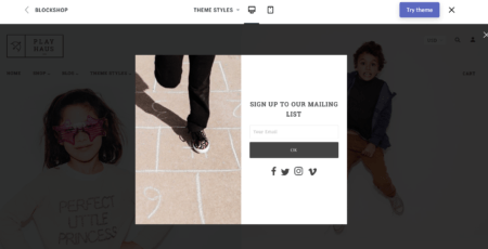
Blockshop also offers a site entry pop up that encourages potential customers to sign up to mailing list in exchange for promotions, etc. This tactic has become popular with a lot of ecommerce sites and can be used to obtain client information in exchange for promos they will use to buy from your shop.
Double wins for your storefront!
Once you have someone’s email address, you can then email them newsletters, sales and other information you want to share with potential customers visiting your site.
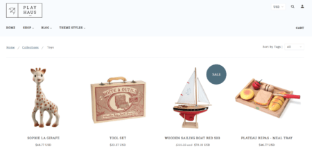
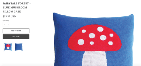
Like many modern storefronts, BlockShop has a straightforward product page that offers detailed product descriptions, high quality zoomable photos and easy to shop buttons.
BlockShop allows you to add meaningful content with a storefront blog.
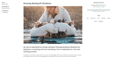
The blog is easy to navigate as it shares recent posts, tags and other ways customers can click on content most relevant to them. This blog also features shareable buttons that can help customers share your content on social media.
6. ShowTime ($160)
ShowTime is a mobile-friendly and SEO-optimized Shopify template that includes three header styles, helpful product filtering, product video and quick view, Instagram galleries and much more.
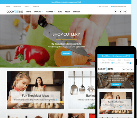
ShowTime is optimized for fast page loading and works for any business industry. It is also highly reviewed from business owners on the Shopify website. ShowTime has three styles: CookTime, FunishTime and FashionTime.
Some of this template’s best features include:
- Multi-Level Menu: Feature a multi-level drop-down menu to help customers easily navigate your store.
- Home and Product Page Videos: Tell your story by featuring a video on your store’s home or product page.
- Product Quick Review: View product details in a popup so customers don’t have to leave their current page.
- Product Filtering: Allow customers to filter products by type, and sort by best sellers and price on the collection page.
- Home Page Collection Grid: Feature products from multiple collections to allow customers to easily browse and shop from the home page.
Where ShowTime Shines
From video and social to blog content, ShowTime is more than just a storefront, it’s a solid brand builder. It also has an engaging storefront with great photos and organization to help your potential customers navigate your storefront with ease.
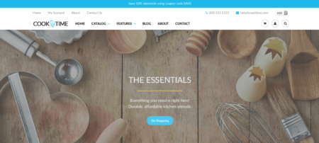
The storefront home page has beautiful slideshows that provide meaningful information and offers easy access to contact information. Overall, the layout is clean, straight forward and user friendly!

This Shopify template also allows you to make good use of video to inform potential customers about your products an business. Video is an extremely useful way to keep your customers attention and helps build trust in your brand and business.
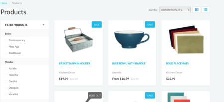
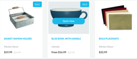
When it comes to products, this Shopify template does it beautifully! The product page is clearly categorized and broken down in helpful ways.
On top of that, you can also easily highlight sales items, which is helpful to customers who are looking for deals.
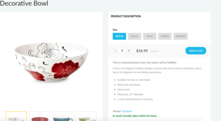
As seen above, this Shopify template allows you to customize your item descriptions in detail and easily offer multiple options for customization. Having more information about a single product helps a customer feel well informed about the options and item itself.
On top of product information, ShowTime gives you even more security by providing user reviews on every item as well as other informative information like FAQ and refund policies!
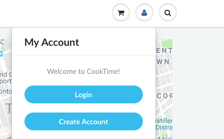
To help share content and to make it easier for the customer and you as a business owner, this Shopify template provides Account Logins for customers. This allows you to easily track customer information and makes the shopping experience quick for your potential customers as well!
One of the biggest complains of most shoppers is having to enter personal information to complete a purchase, so this feature can remove the painpoint of re-entering contact information.
7. Expression ($150)
Expression is a fully responsive Shopify template that works on all devices! The template comes with features such as drop down menu bars, search functionality and a dynamic slideshow to show off those beautiful images you have created for business.
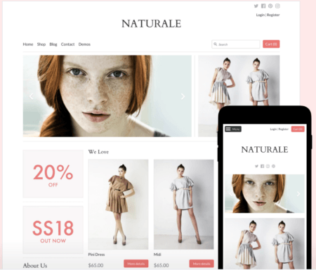
This Shopify template if you are trying to promote sales. Expression has four styles: Innovate, Oxford, Naturale and Ocean. The main difference between these styles are industry-specific stylization and color changes.
Some of the best website features is:
- Multi Level Menu: Feature a multi-level drop-down menu to help customers easily navigate your store
- Home and Product Page Video: Tell your story by featuring a video on your store’s home or product page.
- Slideshow: Showcase multiple product or brand images on your home page.
- Versatile Sidebar Area: Display blog posts, images, advertisements and more in the sidebar of your store’s home and blog page.
- Product Image Rollover: Reveal different product images when you hover over products on your home and collection pages.
- Grid-Style Layout: Feature multiple products or promotions in a grid-style layout throughout your store.
- Home Page Video: Tell your story by featuring a YouTube or Vimeo video.
Where Expression Shines
As you can see in the image above, the Expression storefront is beautifully sectioned with visual content and promotions! As you saw in the examples above and in Expression’s template, promotions draw attention and give a small shot of dopamine to shoppers wanting to shop or at least browse.
I mean, why give up a sale or promotion?
In addition, Expression offers the ability to do rollover image switching, which can allow customers to quickly see how an item looks in different colors or styles.
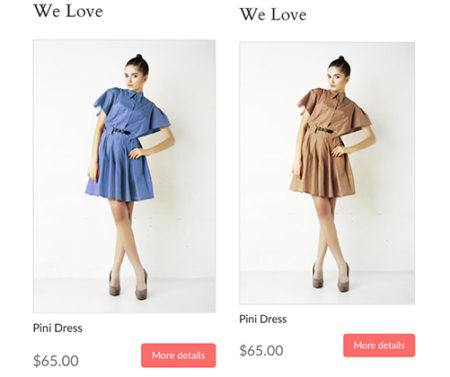
This creates a nice “at a glance” effect that can make users more likely to buy. The more detail button also encourages a customer take further action to learning more about the product.
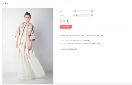
When looking at specific products, Expression offers multiple options for viewing. Purchasing options are clear with bright, colored buttons and the selection is process featured drop down menus for custom item choices.
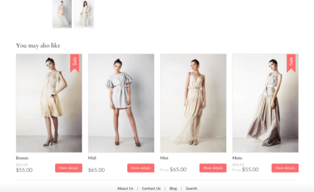
On top of seeing the product you selected, this Shopify template also shares items “you may also like” that can inspire your customers to add additional items. This helps your customer become familiar with your inventory without the “hard work” of browsing through your products.
In addition, the shopping cart is present and available across the template. This placement will help customers see items they have chosen and helps the checkout process run smoothly.
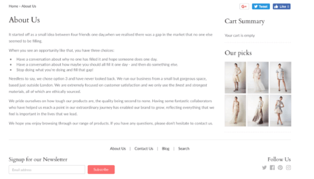 The “Our Picks” feature allows you to you can creatively choose popular items that customers can easily browse. This section also follows customers around!
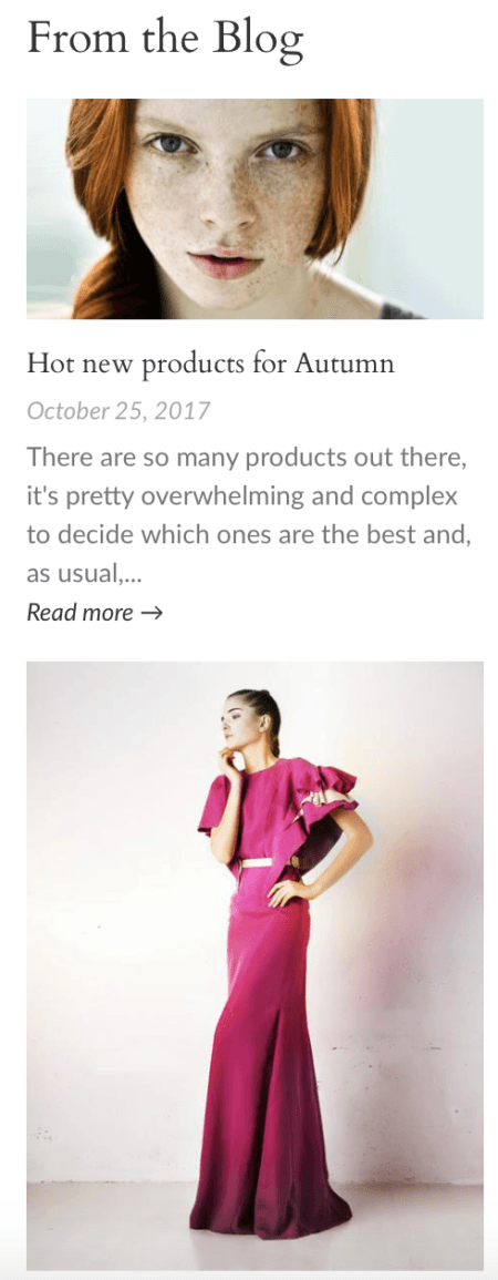
Like a lot of Shopify templates, utilizing Expression’s blog feature to highlight the products you are selling as well as your business will help customers trust, engage with and love your business! I particularly like this template because the blog listings are well organized and visually appealing to customers looking to read articles.
Customizing Shopify Templates
At the end of the day, many of these Shopify templates can be tweaked and changed completely based off of your needs. That is the joy of templates, they give you a great place to start.
If you picked a Shopify template that reflects your brand beautifully, you can easily customize your template by following these steps:
Go to the Online Store > Themes > Customize Theme and on the right-hand sidebar, you’ll see each section of your theme: Header, Body, Footer, etc.
Play around with each to get the feeling of what can be done with the Shopify theme. If you need help there are many forums to read through as well as a Shopify Help Center where you can be directly supported by Shopify through the Theme Support team!
ADVANCED: If you want to take your customizing to the next level you can change your template code (I would suggest this only if you know what you are doing or have someone do it for you). A lot of the time, changing the code without experience can result in you creating errors on the theme which will also affect other elements on the other side of your page.
Conclusion
Between free and priced Shopify templates, you can develop a beautiful and functional storefront for your ecommerce company. As your business grows, you can re-invest money in new templates and other storefront features. That is one nice thing about Shopify, you can always upgrade and add additional gadgets to improve your storefront!
Once you know what to look for, Shopify templates offer everything you need to get started with your digital storefront. With the above tips and information, you can create an amazing customer experience that mimics the brick and mortar experience that customers want.
If you feel we have forgotten about an amazing Shopify template, feel free to share your favorites in the comment below and why you love them!

