21 Amazing Facebook Ads Examples that Actually Work
by Ana Gotter • December 4, 2018
Creating Facebook Ads can be a daunting challenge. You need to get the targeting right, manage a complicated budget, and make a ton of decisions about where you want your ad to show up and when.
And that’s all before you actually get to the creatives.
The copy, images, videos, offers, and ad formats that you choose will each play an important role in how effective your ad campaigns are and whether or not they’ll get you results. There are a lot of strategies out there for how to do this well, but a lot of your success will depend on how well you use different marketing elements like urgency, storytelling, and emotional or logical appeals in order to connect to your target audience.
We wanted to take some of the guesswork out of it, so in this post we’re going to look at 21 different examples of Facebook Ads that are well-structured and likely to get results. Each ad does what it sets out to do extremely well, but they all use different strategies in structuring their creative, so there’s a lot of great inspiration to learn from on this list.
Most ads on this list do everything right, but a few have some areas that could be improved upon. We’ll comment on those as well.
1. Dermaclara
Dermaclara uses a smart format of a combination of a video and a bulleted list to make its point quickly. They show how easy it is to apply the product and then list some of the key benefits of the product while mentioning that it’s been clinically proven to work for scar reduction.
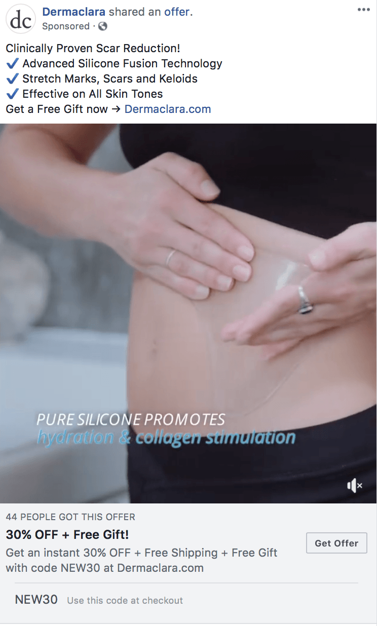
What’s particularly smart is the way they use the bullet points to explain what the product can treat and overcome a potential objection that it wouldn’t work on all skin types.
To finish up the strong ad, they increase the likelihood of conversion by offering a discount and a free gift and show that 44 people have already claimed the offer for some valuable social proof.
2. Allbirds
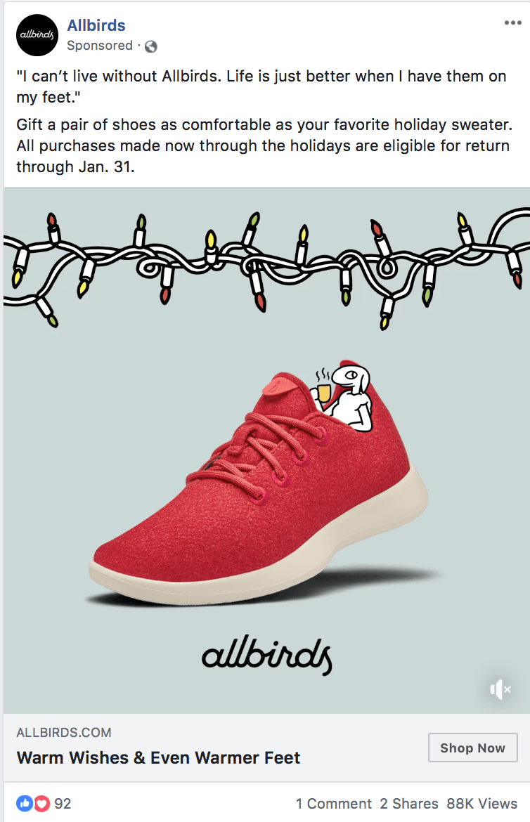
The copy in this Allbirds ad is phenomenal.
Here’s what they do well:
- They start with a testimonial in quotes, making it easy to identify. People trust testimonials more than ad copy, so this is already a win.
- They address a pain point—finding shoes that are comfortable—right off the bat.
- Their note about return eligibility appeals to potential objection of someone who wouldn’t want to give a gift that wouldn’t go over well.
- Seasonal imagery and language is used, creating an emotional connection to the thought of “warm wishes and warm feet.”
3. ButcherBox
This is a company who knows how to start with the big sell to draw people in. They immediately emphasize the secondary offer that comes with a purchase of FREE BACON.
I don’t even eat bacon and that was a tempting one. Once they have your attention, they talk about the other benefits (best meat ever coming to your door, organic, high quality). But they know enough to start with that so-tempting offer that will demand that you pay attention.
4. Lola
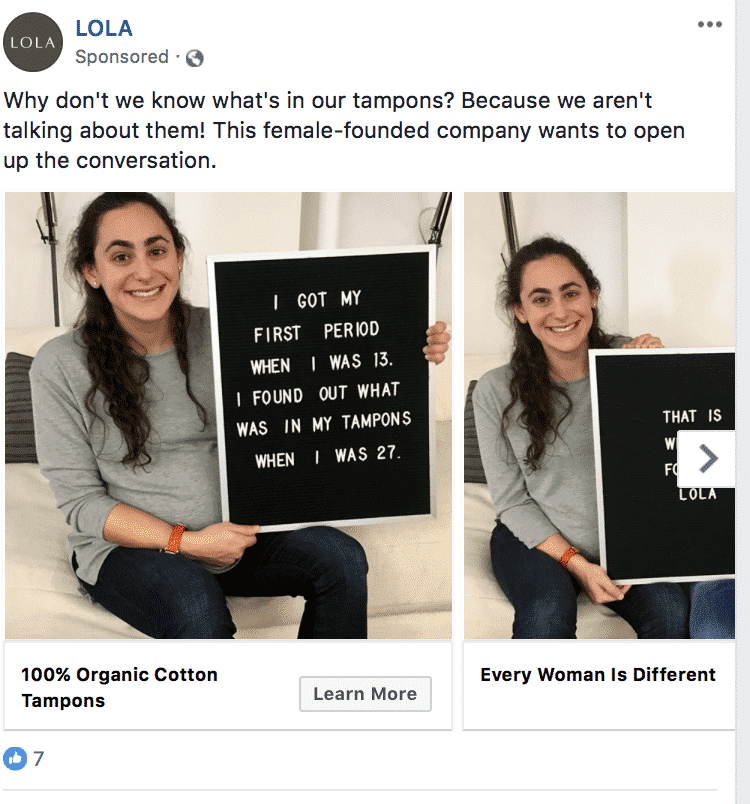
Lola uses a carousel ad format to tell a story of why their company was started and show why their mission is so important to them. The ad features the actual founders of the company explaining how long they used tampons before realizing what was in them (a crap ton of terrible-for-you chemicals, in some cases), and then explaining that that’s why they started their company.
Everything about this ad feels transparent and authentic, especially with the personal stories involved. This creates an emotional connection, and hearing that there is stuff in tampons you may not know about will get their audience interested in what that might be enough to get some clicks.
5. Voloom
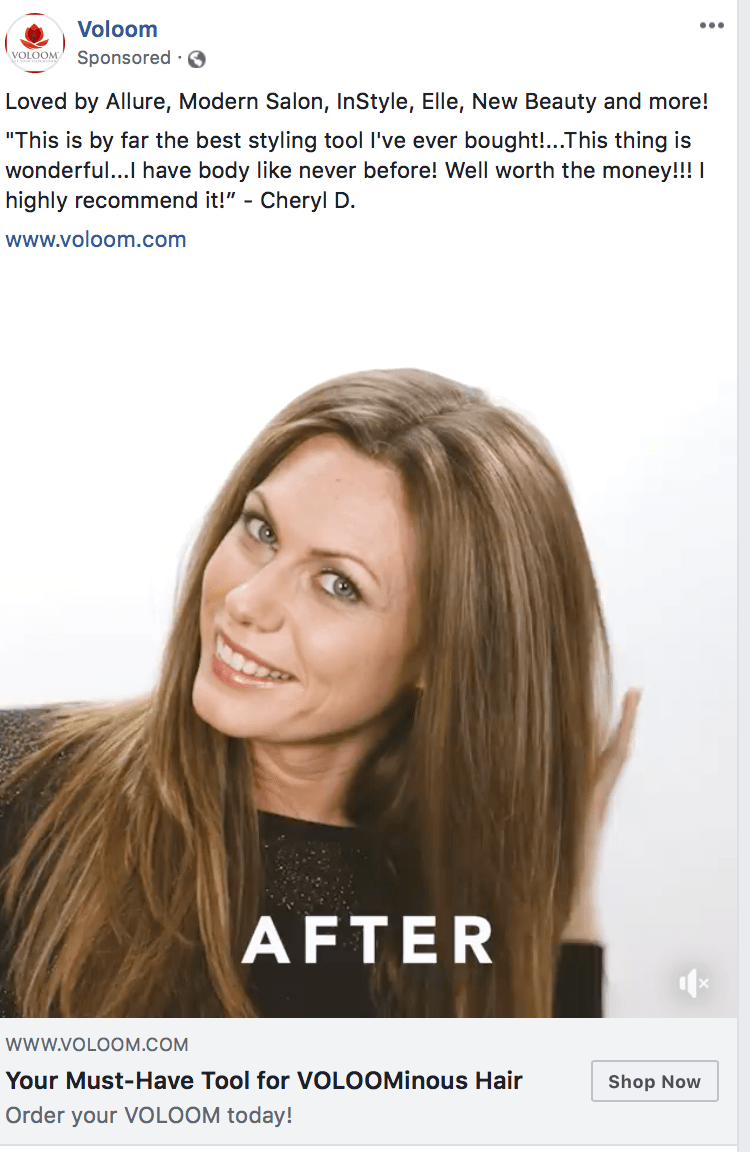
Voloom’s video ad shows before and afters of how their product gives more volume to hair, with a video tutorial in the middle showing how easy to is to use the product.
While people are watching the tutorial, they can read the critical acclaim from big-name influencers in the industry like Allure, Elle and Modern Salon. It’s demonstrating value while adding in some testimonials to show that it works.
6. The Undress
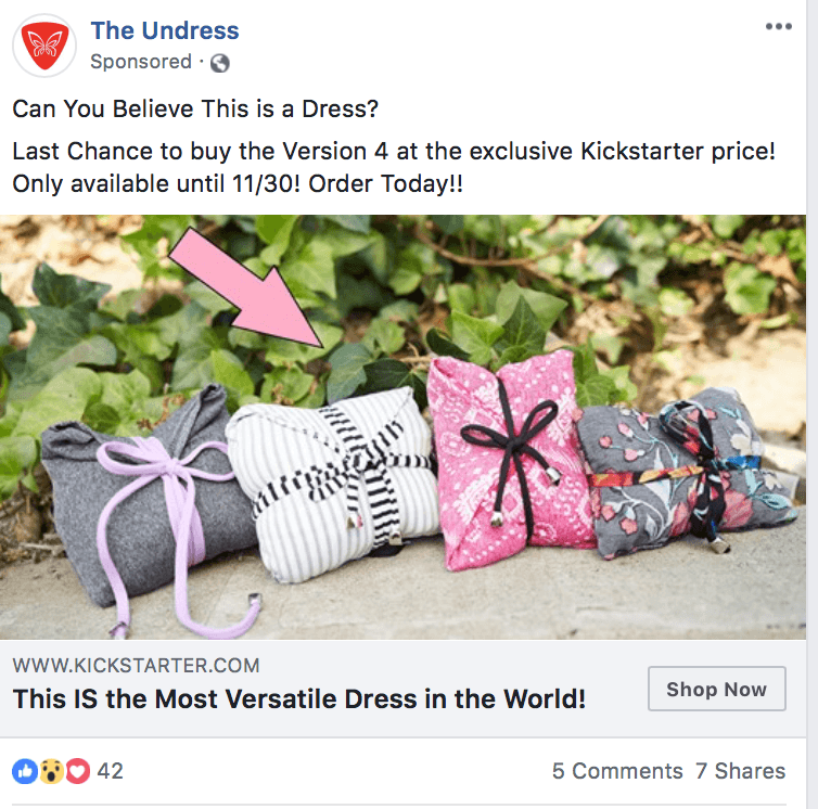
One strategy that I always test when writing copy for ads is asking a question. When you ask even a simple question at the beginning of the ad, it automatically gets people to think.
“Can you believe this is a dress?” pretty much guarantees that people will look at the image and read the rest of the text and want to find out exactly why the dresses are bundled up like a package.
Then, to finish off the ad, they highlight versatility as a benefit and throw in some urgency to get people to take advantage of the sale right now.
7. Livia
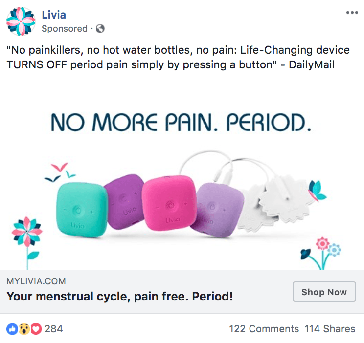
I know, a lot of these ads are going to be geared towards a female-audience, but that’s what shows up in my feed, y’all.
This ad immediately appeals to a literal, physical pain point that many women experience and offers an instant solution to dealing with pain. Many women are familiar with trying methods to ease bad cramps that either don’t work well or come with side effects. This product promises to do it with a single press of a button. Appealing to pain points is one of the best things you can do in an ad.
8. True&Co
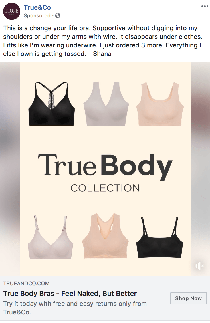
True&Co gives us another example of an ad that uses testimonials to drive conversions, but here they choose a really smart review. This review addresses a lot of pain points than women may have—that the bras may show up under clothes, or that they dig into the shoulders or rib cages, or that they just don’t work.
They sweeten the deal by adding an offer that you can try it for free and return it if you don’t like it. This lowers the risk involved for customers and makes them more likely to purchase.
9. Well and Good
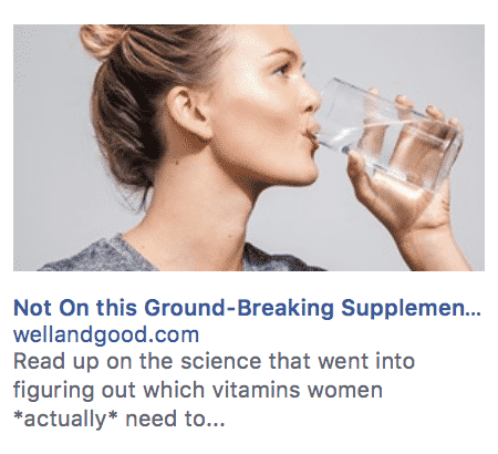
I live a really health-conscious life, and part of that means knowing that a lot of supplements don’t actually do what they claim to. This ad acknowledges the dishonesty that affects the industry, but instead of going in with big claims, they advertise information about the science of how their supplements were developed and the proof that it will be effective. They also hint at the misinformation that plagues the industry by saying “which vitamins women *actually* need.”
One thing I want to flag about this ad that could be improved: it was not formatted well for side column ads. The text is cut off in both the headline and the description text. Adjusting this could have made it more impactful.
10. Eco Terra Beds
The copy on this ad is okay. Aside from the testimonial, it could be improved by cutting back on the actions it’s trying to get people to take. There’s no need to try to get someone to read reviews, call, and press a CTA.
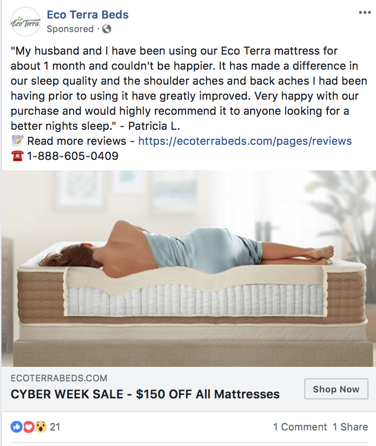
That being said, I wanted to include this ad specifically for the image that they’ve chosen. They’re using the image to show why the mattress works, and how it delivers those promised benefits. It just looks comfortable and giving users an inside-look (literally) at the product can be beneficial.
11. MM.LaFleur
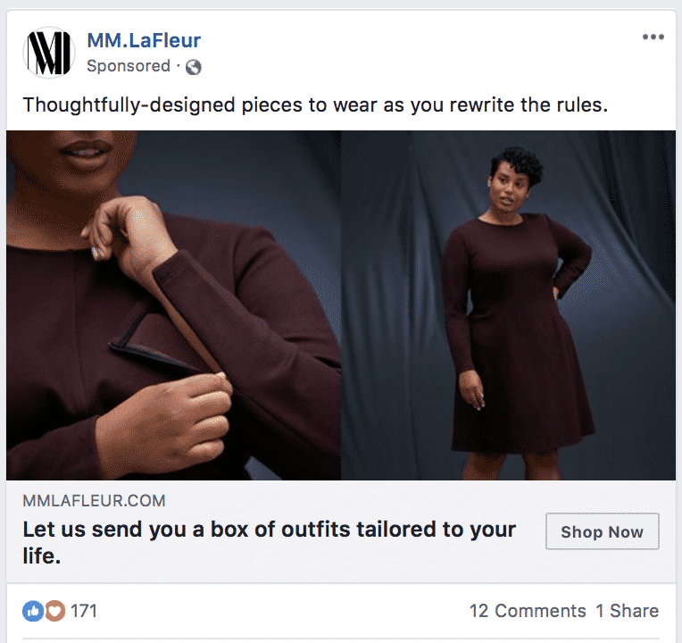
Knowing that the clothing subscription market is oversaturated and competitive, this company didn’t want to go for the same appeals as others: personalized clothing, less time, try new things. Instead, they went for an emotional appeal.
The copy goes after a feeling: being a powerful person who gets to call the shots. We all know that looks are part of a powerful impression, and this ad implies that their clothing can help you make that impression. This is all emotional appeal, and while it’s subtle, it’s effective.
12. James Allen Jewelry
This video ad was extraordinary and it hit a lot of emotional appeals in all the right ways.
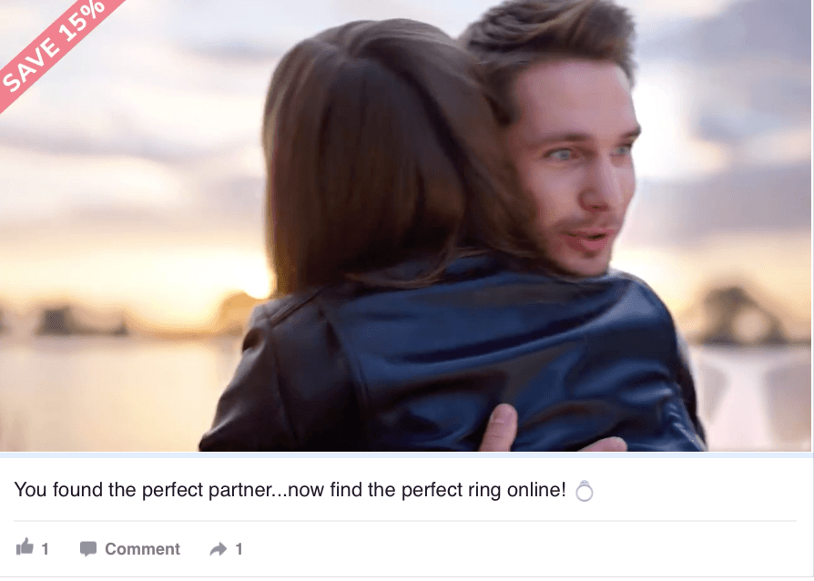
The video shows a man proposing to his girlfriend and him suddenly imagining her showing her ring to everyone she interacts with for the rest of their lives while other people react. The relief of her having a ring she loves almost outweighs the relief of her saying yes.
Believe it or not, when working in jewelry, I saw that was the biggest concern! People were more worried their fiance-to-be wouldn’t like the ring more than they worried about them saying no. This ad shows the importance of this moment and reassures you that you can get it right, all while appealing to those warm-and-fuzzy feelings that will help close an engagement ring sale.
13. Marketo
From experience, I know that a lot of small businesses struggle to scale their email marketing well. Marketo’s ad offers easy solutions to improve email marketing by making it more automated, more responsive and more personalized.
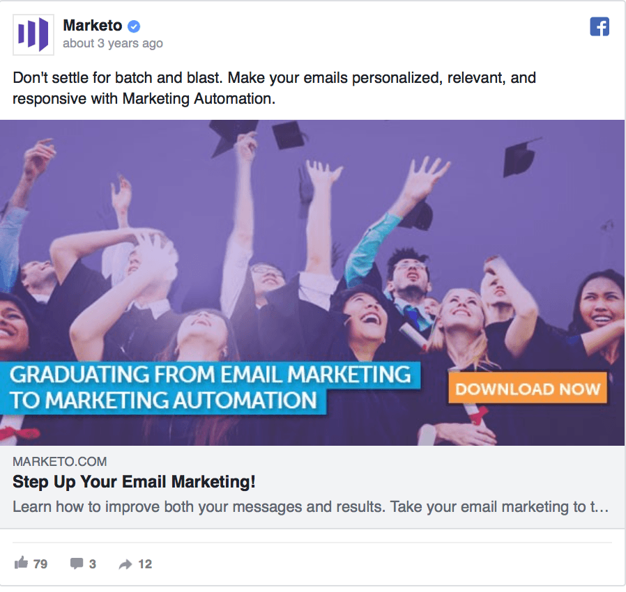
Marketo is reminding people “not to settle,” which actually goes after an emotional appeal. You want to know what else you can do and it might make some business owners or marketers feel a little competitive and a little excited at the same time.
14. Purple Carrot
Purple Carrot is a boxed-meal kit and they use an emotional appeal of being downright exhausted and a little overwhelmed in order to help sell their product. Everyone always has enough to worry about during the holiday season, so this is a pretty broad appeal, making it effective in this case.
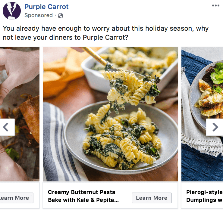
In order to increase the likelihood of conversions, they use carousel ads to show multiple meal options. If someone really hates kale, for example, they might not be too interested if they only see recipe with kale in the title. Seeing multiple options will help draw in more potential customers.
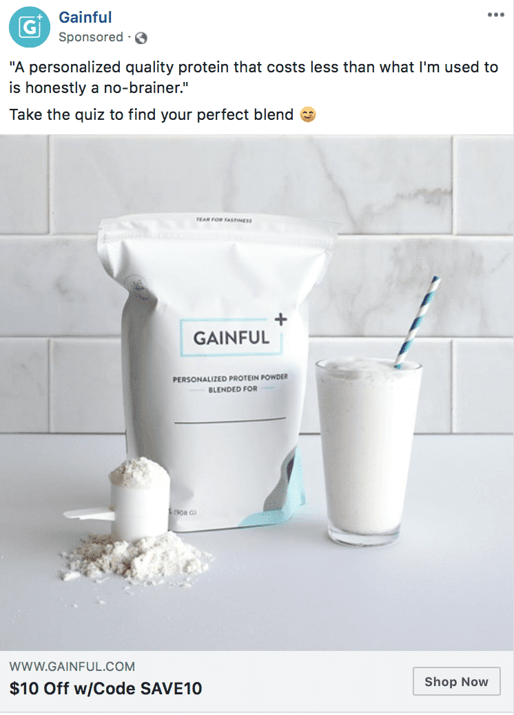
15. Gainful
Personalized is the name of the game right now. Companies are adverting made-for-you products in everything from skincare to shoes to fitness plans. Not all of them advertise it well, however.
Gainful puts their customization abilities front and center. It’s not just right for everyone—they make sure that it’s right for you specifically. To capitalize on this, they tell users they’ll be sending them to a quiz (which is less risk and low-obligation) and that they can get a coupon code if they purchase. They’ve essentially created a mini-funnel that can be completed quickly while giving customers a personalized product—exactly what everyone wants.
16. Bombas
Remember how I mentioned earlier on that right column ads will be most successful when they’re formatted correctly? This campaign is the perfect example of how to do this.
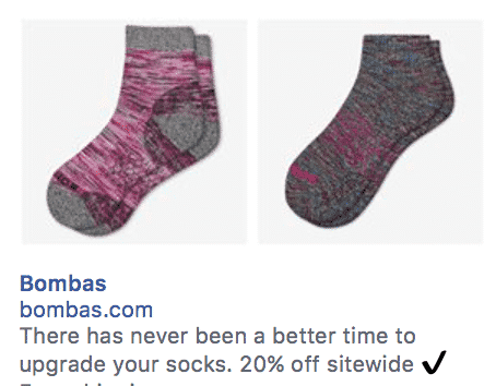
Right column ads are not the place for complex storytelling. You show what you have to offer and you immediately slap on an easy-to-understand appeal/offer/solution to a pain point. Upgrade your socks for 20% off is short, sweet AND it fits in that tiny spot for copy.
17. Daily Harvest
This one is all about knowing your audience while adding in a little urgency. The idea of a gluten-free, plant-based, no-refined-sugar cookie is some people’s nightmare. That doesn’t matter, because they’ll all be big benefits for the audience the company wants to connect with. Whether their audience is on a limited diet for strict medical reasons or by choice, they let people know up front what these cookies can offer that’s different.
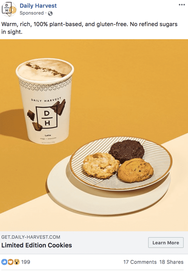
They overcome objections, too, and remind people that while they’re giving up gluten and refined sugars, they aren’t losing out on any of the warm, rich flavors that you would come to expect. This copy provides a high-reward, no-sacrifice offer that will appeal to their audience.
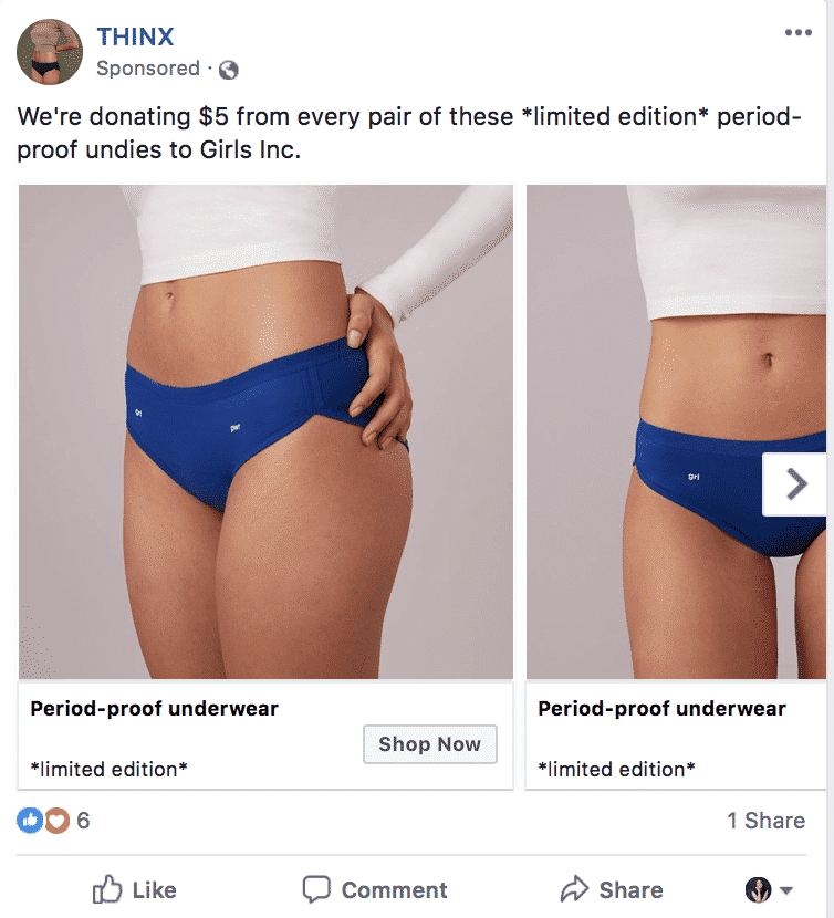
18. THINX
THINX does something really smart with this carousel ad format. They use their main ad text to use an emotional appeal, saying they’ll give $5 for every pair to a charity, while also leveraging scarcity in the form of “*limited edition*” to get people to purchase.
Meanwhile, they use the text on the carousel image slides to appeal to the logical part of the brain, explaining what the product is. A lot of customers are willing to spend more if it means their money is doing some good, so this was a smart campaign that will help THINX get more sales while boosting their brand reputation, too.
19. Ocean Basket Mediterrasian
Facebook canvas ads (now rebranded as “Instant Experiences”) are used to their full potential in this example.
They use exciting, upbeat theme music on each slide, engaging video, and a series of organized content to explain what the brand has to offer. The high-quality video, the music and the ability to get more information as you see fit all comes together when the final product comes together, just in time for you to see a CTA at the end.
20. HubSpot
Sometimes, one of the best ad concepts will be one of the simplest ideas on the drawing board. This ad is a great example.
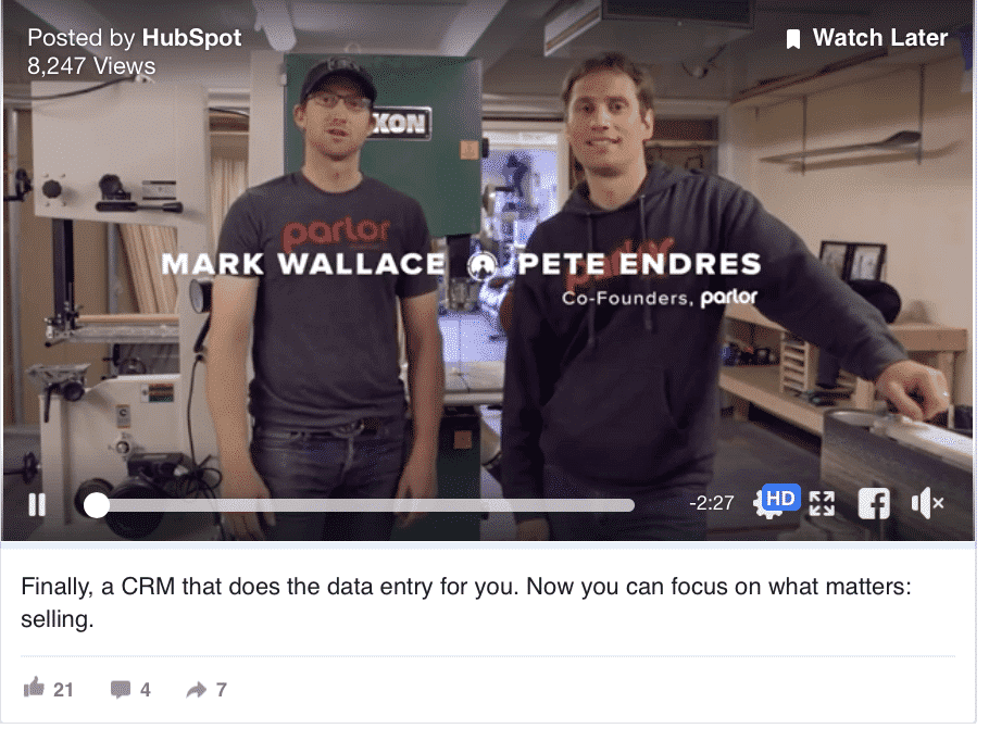
The video is a little on the long side, but it explains how having the right CRM can help you sell more. The copy is kept simple because the video elaborates, but it hits the nail right on the head—data entry is a huge time suck for a lot of businesses, so mentioning that you can now focus on more important tasks and skip the trivial ones appeals to an enormous B2B pain point: inefficiency.
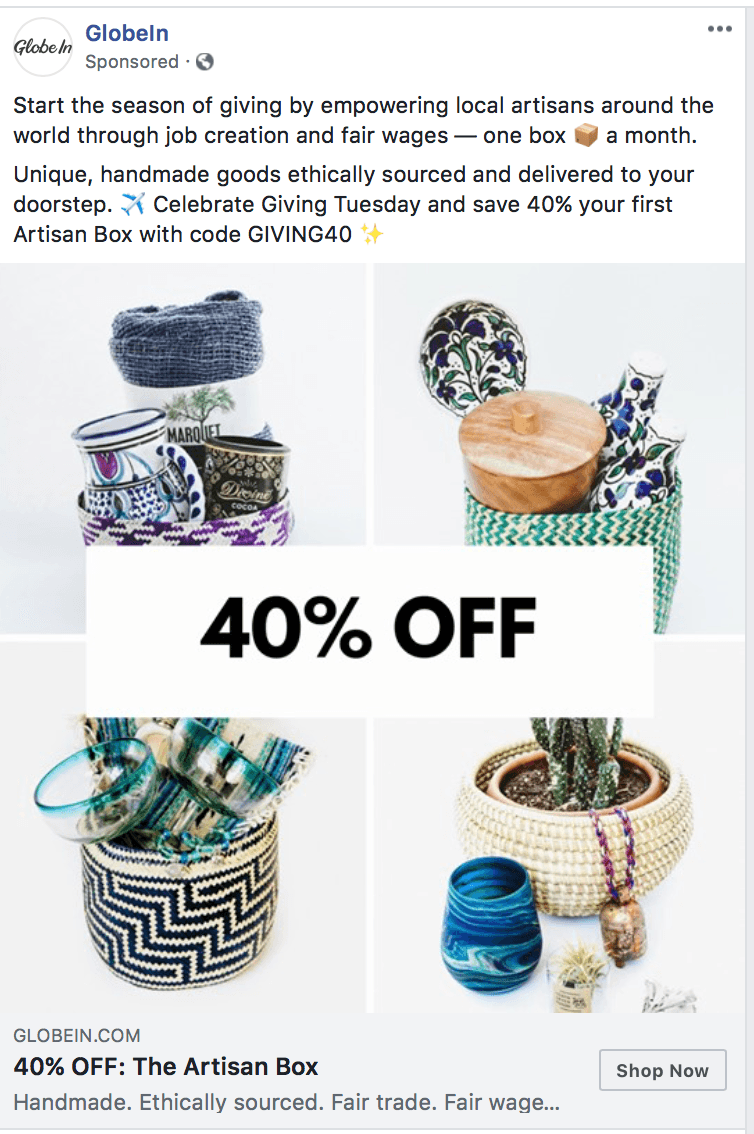
21. GlobeIn
The last ad on the list from GlobeIn does an outstanding job highlighting how their product will benefit customers and the overall community at once. People love investing in businesses that do good in the world, because it makes them feel like they’re doing good, too.
This ad capitalizes on that, reminding customers that when they make a purchase (and at a discount!) they can help support fair trade, ethical wages, and the idea of pulling hardworking people out of poverty. They do this while featuring images of the products to show that they’re true luxury, artisanal products that would make a beautiful addition to their home. There are a lot of emotional appeals here, and they work well to entice viewers.
Conclusion
Facebook Ads has so many options for you when it comes to the creatives that the sky is the limit. It’s just up to you to determine how to best combine the available features with strong messaging in order to connect with your audience. I think it’s incredible that each of these 21 examples of Facebook Ads used different strategies, or implemented them in slightly different ways. Hopefully these ads gave you some inspiration or an idea that you can adapt for your own campaigns in the new year.
Are you ready to use Facebook Ads to best connect with your target audience in 2019? Get in touch with us and see how we can help.
What do you think? Which of these Facebook Ads examples was your favorite? Do you have another example that you want to share with us? Which strategy are you most excited to replicate? Share your thoughts and questions in the comments below!


