How to Separate Mobile and Desktop Scripts on Unbounce
by Manny Lopez • November 17, 2015
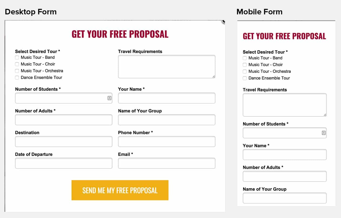
When designing a landing page in Unbounce’s landing page builder, you can use snippets of code to add extra features and elements. These can create better experiences for your visitors, and even increase conversions. For example, a great way to drive phone calls on a landing page is to use a scrolling or “sticky” header to follow people down the page as they scroll. This tactic can work great on the desktop page, but how does it look in a mobile view?

As you can see from the image above, the header just takes up too much real estate on a mobile screen.
What do you do now? We are continuing the never ending “year of mobile” in 2016. Not only do we have to make sure that our mobile experiences work, but they have to be delightful in order to capture more conversions.
If you use Unbounce like we do, there is a simple workaround that allows you to activate a piece of code on desktop, while excluding it on mobile (and vice versa). I’ve put this guide together to show you how it works, and to help you install it on your page.
Step One:
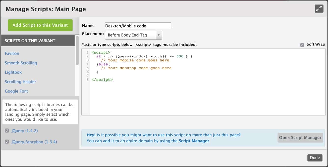
First, copy this snippet of code.
<script>
if ( lp.jQuery(window).width() <= 600 ) {
// Your mobile code goes here
}else{
// Your desktop code goes here
}
</script>
Step Two:
Once you have copied the snippet of code, go into your Unbounce page and click on the javascripts button at the bottom left of the window.

Step Three:
Once the javascript window loads, click “Add a Script to this Variant” and paste the snippet you copied above into the main input field.

This part is easy to miss, but very important: Above the code there is a dropdown menu with options on where we would like this snippet of code to be placed in relation to the rest of the page’s HTML. It is important to add snippets of code in the right place to ensure that the new javascript will not interfere with any other scripts running on your page.
For this script we want to select “before the body end tag.”
You’ll see a field to name your script. Always remember to label all your added scripts so you (or Unbounce support) can navigate if things go wrong.
Step Four:
Now that our snippet of code has been labeled and placed in the correct location, we are ready to target our code.
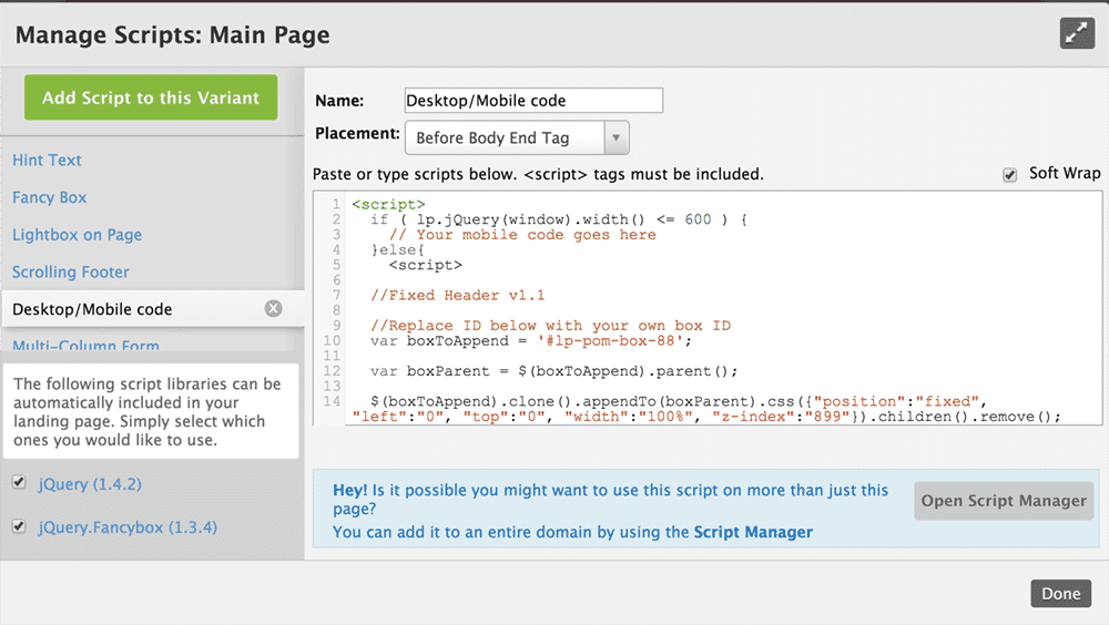
For this example I want my scrolling header to only load when a user is seeing the page on a desktop or tablet screen.
To apply this code exclusively to desktop, I’m going to to paste the scrolling header javascript where it said “Your desktop code goes here.” Don’t forget to remove those extra script tags before and after your inner script.

Now the scrolling header will only be applied on a desktop or tablet screen.
Remember to save and republish your page so you can see the effects.
Step Five:
Lets test out the page on desktop and mobile to ensure we are getting the results we are looking for. You can view this in Unbounce’s preview feature, or you can load the page on your nearest computer and mobile device.
The images show that the same header changes from scrolling to static header when you view it on mobile.

Conclusion:
This doesn’t have to be limited to scrolling headers. This script is really helpful whenever you need a page to look different on the mobile or desktop version. It gives you complete control over your visitors desktop AND mobile experience.
I hope this helps you optimize your Unbounce landing pages and bump up those conversion rates.
Want to learn more about optimizing your landing pages? Follow our blog here!


