A 7 Step Guide to Creating an Awesome Landing Page
by Sarah Rodriguez • July 29, 2014
My job requires me to create A LOT of landing pages. Sounds fun, right? Right! Maybe you haven’t had as much fun with your own landing pages, or maybe you are a beginner just looking for somewhere to start.
Well look no further! Using my own experiences, I have put together this easy 7 Step Guide that breaks down the overwhelming task of creating a landing page!
1. Competitor Research
Before I even start a new landing page, I will take at least 15 minutes to search competitors sites and landing pages. What stands out? What seems to be working? What doesn’t?
You can often see trends among certain industries. For example, while searching through some real estate investing sites, I noticed a lot of simple, minimalistic landing pages, which was very different from the current page we had for our client.
I tried using this style that I kept seeing and the page performed with a 20% higher conversion rate! This is just one way that I’ve seen competitor research greatly improve you landing page’s performance before you even begin to create it!
2. Layout
The first thing I do, after competitor research is to draft a layout.
In other words, what will my page look like and what sections do I want to include? Is it a long page with lots of information? Or maybe its just a simple form and call-to-action.
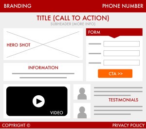
Either way, lay it out. This will make it so much easier for you to fill in your landing page info without missing anything. Here is a list of some sections & pieces of a landing page you might want to consider when choosing your landing page layout:
- Header (Logo)
- Hero Shot
- Call-to-Action
- Title/Subhead
- Testimonials (Social Proofs)
- Video
- Product/Service Information
- Footer (Copyright, Privacy Policy)
3. Call-to-Action
BUY MY PRODUCT! SIGN UP NOW! GET YOUR FREE TRIAL! This is what we need to see.
Add a good call-to-action or clear instruction to your audience to provoke an immediate response. This is an important part of your landing page and an essential part of increasing your conversion rate.
That’s what you want, right?! More clicks! More leads! More sales!
Take some time to write a relevant and assertive call-to-action for your landing pages, and don’t be afraid to test a couple different CTA’s. You’ll thank me later. Also check out this post for a more tips on writing effective CTAs.
4. Conversions
What is the main goal with your landing page? Are you generating leads? Selling your product? Once you have determined your goal and write an appropriate CTA, you will want to make sure you have a button or form to collect and track your conversions.
In my experience, I’ve found placing your form above the fold (at the top of your landing page), usually drives a higher conversion rate. But again, DON’T BE AFRAID TO TEST!!!
No two landing pages work the same. Its also a good idea to place a form that matches the design and style of the rest of your LP. Why would you place a dull standardized form against the beautiful landing page that you’ve spent so much time working on?! You wouldn’t.
Add a colored border or change the form font to match. Make sure your form is relevant, pretty, and that the button is something that will stand out on your page. For even MORE information on conversion rate optimization check out this post!
5. Content
Now your page is starting to look like something! One of the last steps will be to fill in your layout (which you should have done in step 2) with content.
Whether that be product information, client testimonials, or a showcase of past projects, now is the time to fill it in! Again make sure the information is clear and valuable to your audience. Often icons, bullet points, and pictures can help simplify your information and increase readability.
6. Confirmation Page
For lead generation pages, this is the page or pop-up that your audience will see after submitting their information. This assures the customer or client that their info was successfully submitted.
It is important that on the conformation page, you clarify what will happen next. “We’ll be in contact with you soon”, “Your E-Book was sent to your email”, or “You have successfully registered”.
It can also be useful to add content that will keep your potential customer on your site. Maybe a video or more information about your product or service. You can also add a phone number that they can call if they want to talk to someone about your product or service NOW. There’s no time like the present!
7. Testing
You’re almost there!! On your way to finishing your awesome landing page. This is a step that I have learned through trial and error.
Proofread your content, double-checking your heading, making sure you have the right links and integrations set up.
If your landing page has more than one step, make sure that it transitions correctly from step to step. Is your URL working correctly? Did you add a page title? Are your leads going to the right place? Does your conformation page work? Do you have a privacy policy link?
This step can often take a while but I almost always find a mistake. Yay for double-checking! Taking this extra step will ensure that your client or your audience will have a smooth, user friendly experience while visiting your landing page! YAY!
Conclusion
Phew! You made it. And by following these seven steps when you are creating a landing page will not only increase your conversions but also make your life a little bit easier.
And who doesn’t want that? Be sure to comment below if YOU have any special tips that have helped you with your landing page creation process!

