How to Determine Which Landing Page Elements to A/B Test
by Brandon Weaver • May 11, 2016
A/B testing: It’s not just a term marketers use to sound smart or to be “in the know.” Successful marketers practice A/B testing because they want to see which variables produce a higher conversion rate. Plus, it requires you to understand your audience and build your buyer personas.
And yet, when it comes to PPC ads and landing pages, A/B testing an ad can be much more limiting than A/B testing landing pages.
Take a basic AdWords ad for example: You have a headline, 2 lines of copy, and a display URL. Only the headline and copy can be tested against each other.
Landing pages, on the other hand, have a headline (sometimes a sub-headline), image, copy, form, CTA, testimonials, social proof, alignment, and more.
You already know these 9 PPC advertising tips and that A/B testing is highly recommended for ads and landing pages (if you’re new to A/B testing, don’t worry, there’s a free online guide for that).
Therefore, I’m not going to walk you through how to A/B test. Rather, I’m going to share three methods and processes you can take advantage of when A/B testing your landing pages.
Here are three tips to help you determine which elements to A/B test.
1. Google PageSpeed Insights
Google PageSpeed Insights is a handy tool that can quickly scan any URL to help you determine which page elements are creating a positive user experience and which elements are causing a negative user experience.
If there are items to fix, PageSpeed Insights shows you how to correct them.
Why is a tool like this important for advertisers? Because when your prospects are browsing the internet for a solution to their problem, they want answers faster than ever.
Research shows that humans now only have an average of an eight second attention span. When it comes to website performance, that attention span and patience level drops significantly:
- 47% of consumers expect a web page to load in two seconds or less
- 40% of people will abandon the page if it takes more than three seconds to load
If your page loads slowly (three seconds or more) — and nearly half of all visitors leave immediately/bounce — that tells AdWords that people are having a negative experience on your landing page.
That negative experience factors into your ads’ quality score and can ultimately lower your ranking (not to mention fewer conversions and sales).
I mention this because image optimization is one of the biggest factors that causes slow page loads. Fortunately, there are tools available like Kraken and TinyPNG that will compress your images before you upload them to your page.
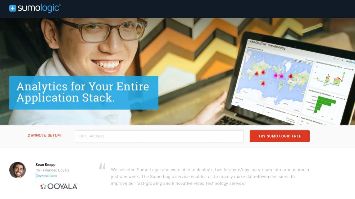
For example, let’s look at this landing page for a free website analytics tool (click through on the link to see the full landing page):
When we plug the URL into PageSpeed Insights we see the following results, scoring 57 out of 100 on desktop:
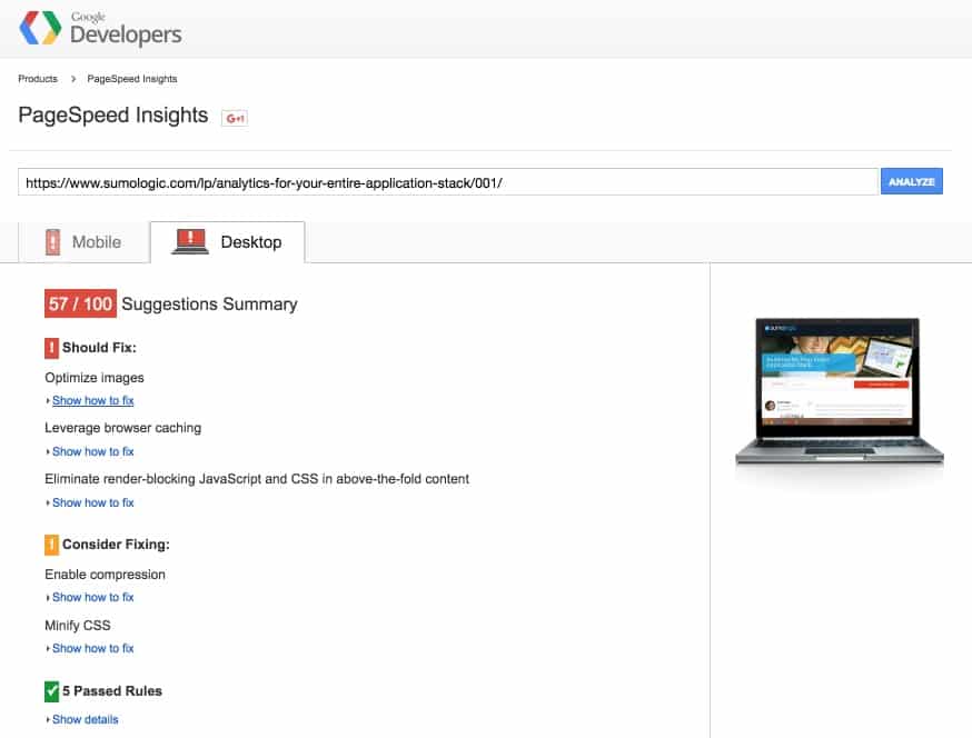
Listed at the very top of the “should fix” section is for the page to optimize its images. Digging a little deeper into that, we see a number of images on the page that could be compressed and resized:
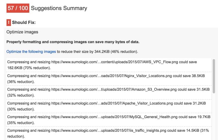
Since Sumo Logic’s page has a low score and may load slowly, compressing and resizing images could be their first element to A/B test.
As you can see in the first screenshot above, there are other items to consider fixing — such as browser caching and CSS — but since images was listed first, this would be my recommendation as a starting point.
You can also toggle the results between mobile and desktop — and the overall scores for each device type are often different. The key thing to remember with Google PageSpeed Insights is that there are rules and things to consider. Don’t take everything the tool says as hard and fast requirements.
2. Heatmapping Technology
Heatmapping technology allows you to see a visual representation of data. Heatmaps are more of a scientific approach to A/B testing than simply choosing on a whim to change an element (e.g. your form alignment).
There are 3 general types of heatmaps that can help you make educated decisions on your pages:
- Hover maps (mouse movement tracking)
- Click maps
- Scroll maps
All three types of heatmaps help you learn which parts of your page is being looked at and being clicked on — and which parts are being ignored.
For a traditional landing page with very few clickable elements, it may make more sense to implement a hover map because you may think that people hover with their mouse where they’re looking on a page. However, one study showed that only 6% and 19% of people showed any vertical or horizontal correlation, respectively, between mouse movement and eye tracking.
So what about using a click map? Well, again, since landing pages don’t typically have many clickable elements, it may not be the best map to implement. But wait, no so fast!
Conversion XL’s Peep Laja identifies one particular case where click maps can help marketers, “you can see when people click on things that are not links,” and if you discover lots of “white and yellow” — consider making it a link.
To demonstrate, look at Upwork’s landing page that features a picture, headline, minimal copy and a CTA above the fold:
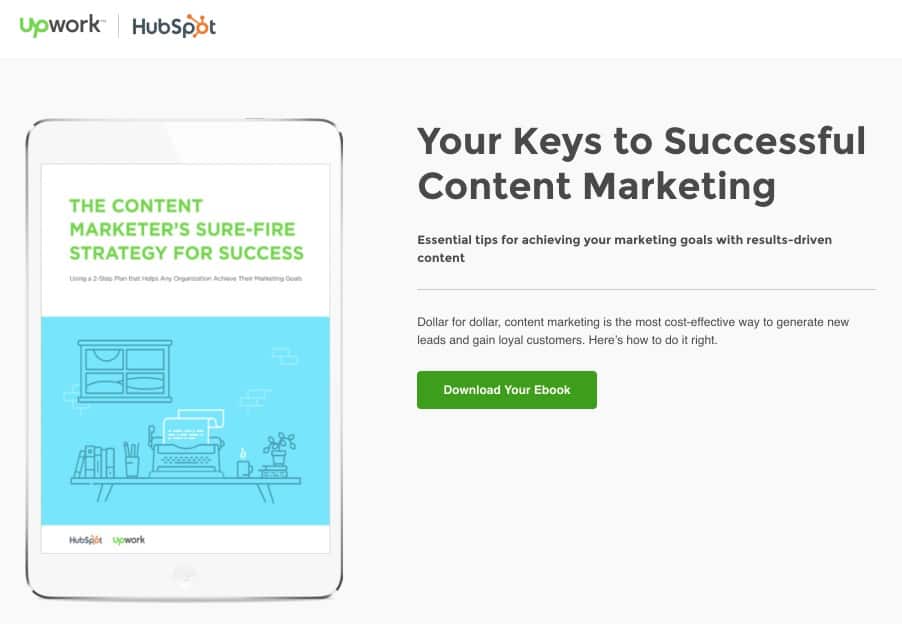
At first glance, there is no form on the page, but if you click on the tablet or the CTA button, it takes you directly below the fold which has the form.
They use an anchor element on both the picture and CTA to direct visitors to the form:
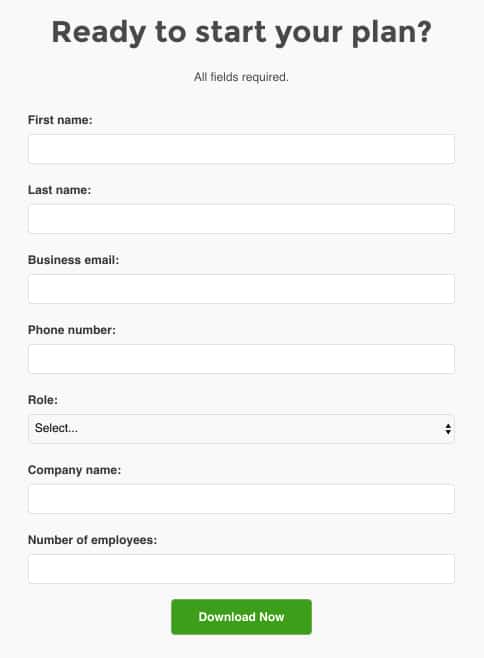
Why do I mention this as an example? Because I’m willing to bet Upwork and HubSpot tested this page with a click map and found that visitors were clicking the tablet to access the content marketing ebook.
Finally, scroll maps are probably best used for sales pages, since they are typically longer than your average landing page. This is because you can see how far people are scrolling down your page and how to modify the design based on certain elements’ priority (e.g. your CTA).
3. Test the Most “Disruptive” Elements
When all else fails, test the most disruptive page elements.
In my previous job, I worked very closely with HubSpot and when talking about A/B testing, they would always ask me, “what are the most disruptive elements on your landing page?”
Initially, I didn’t know what they meant but it became clear pretty quickly.
The most disruptive elements on a landing page are the most obvious, like:
- Image
- CTA (size, copy, color)
- Form length
- Page alignment (left versus right)
- Headline
Speaking of testing headlines, look at the results Movexa enjoyed by adding the word “supplement” to its landing page headline:
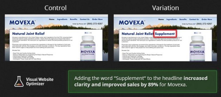
That’s right, Movexa increased its sales by 89% just by adding one word to its headline!
When I built the Top 10 Lead Gen Tips landing page, I decided to use the “funnel” aspect in the title as a play-on words when creating another page variation.
I started with the baseline variation (which only included the title of the offer, large image of the ebook, five sentences of copy, and a two-step opt-in form via the green CTA button):
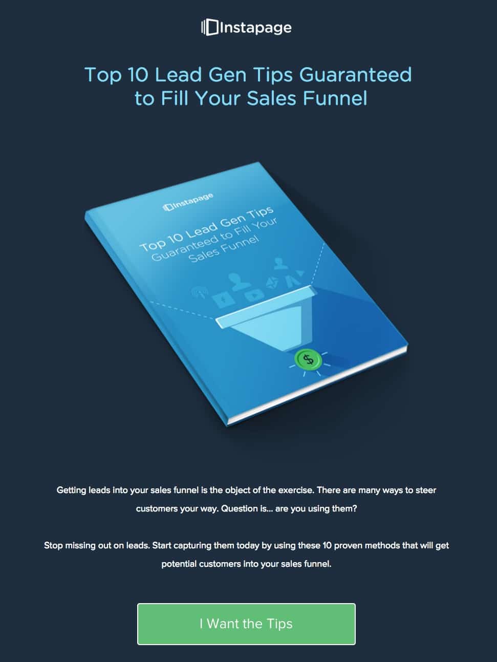
For my “B” variation, I made a mirror image of the book, placed the copy in the middle, and “funneled” the visitor’s eyes to the bottom. This visual play-on words directed visitor’s eyes to the most important thing on the page — the CTA!

The results?
Not exactly what I hoped. My creative design didn’t perform as high as I expected because the “two book covers” is losing to the baseline variation:

The moral of the story is, even if you think your creative design is great, you won’t really know how visitors will respond until you test!
What About You?
Even if you don’t know how to A/B test — that’s okay — everybody has to start somewhere.
The important thing is to start testing, monitor your analytics, and continue to test. After all, spending just 10 minutes A/B testing your landing pages can be the best time you spend on all of your marketing campaigns.
How do you determine which landing page elements to test? Have you tried Google PageSpeed Insights or heatmapping technology? Please feel free to share any tips and tricks you do when A/B testing your landing pages. We like to learn from you, too!


