Message Match: The Good, the Bad and the Ugly
by Andrew Maliwauki • July 30, 2015
If there’s one thing that anyone has learned from their time in online advertising, it’s that conversion rate optimization is a tricky and sometimes unpredictable thing.
I’m sure you’ve heard the claims before: “increase conversions by 250% guaranteed!” or “5 tricks to instantly get you 100 quality leads a day!”
Well, after trying out a range of “sure-fire” conversion rate tactics, I’ve learned that there are no “secrets” to conversion rate success. Case studies are just reports on what worked for one site in a specific industry, and the results aren’t necessarily generalizable.
What seems to work best is a principle-based approach to conversion rate optimization. Look at enough case studies and you start to see themes emerge.
One of the most prevalent themes is message match. If there’s one sure-fire way to help out struggling landing pages, it’s making sure that your online marketing is consistent from click-to-close.
To demonstrate the importance of message match, we’ll discuss a bit of the theory behind message match and then look at a few different examples of good, bad and downright ugly message match.
Why Is Message Match So Important?
Let’s start by using an example to illustrate the concept of message match.
Say you’re driving on the freeway one morning and you see a billboard on the side of the road advertising “The Best Pancakes in the World!” at Joey’s Diner.

The thought of pancakes reminds you of how hungry you are and how long it’s been since you had a good pancake, so you get on the off-ramp, pull up to the restaurant and excitedly open the front door.
To your surprise, your nose is immediately overpowered by the smell of onion rings. Onion rings? You frantically scan the menu, but, there’s no mention of pancakes there, either. Depressed, you shuffle back outside, still thinking about warm maple syrup on freshly cooked flapjacks.
The concept of message match is simple: your landing page should always deliver what your ad promises.
Joey’s Diner did a great job with their ad. It caught your interest and got you to the restaurant; however, their content was dead wrong. Maybe they only sell pancakes from 8-10 in the morning and you arrived at 10:30. Maybe pancakes was an old promotion.
The reason why the ad didn’t match reality doesn’t matter. You were promised pancakes and given onion rings. That’s not a great way to win customers.
Message Match and Pay-Per-Click
For PPC campaigns, message match applies to everything from the header and subheader of your page to the all-important call-to-action (CTA). Basically, your landing page should reaffirm to the potential customer that, “Yes, this is page you were looking for.”
In order to avoid being the next Joey’s Diner, you have to be cautious and detail-oriented about how you set up your ads and landing pages.
Yes, this takes more work than reusing old ads for new landing page variants or vice versa, but it’s well worth the effort. Nothing gets rid of traffic faster than feeling like, “I’m in the wrong place.”
The Good, the Bad and the Ugly
Now let’s go over some examples of message match examine the effect message match has on the effectiveness of landing pages.
In this situation, the user is being retargeted for adopting a pug by “Pets 4 Days.”
The Good

This is a great image ad-landing page combo. Right away you can see that the headline, subhead, CTA and hero shot of the image ad match 100% to the landing page. It’s also important to note that the branding lines up with that on the ad as well.
As soon as someone clicks on the ad, they immediately know that they’ve come to the right place. That’s a win!
The Bad
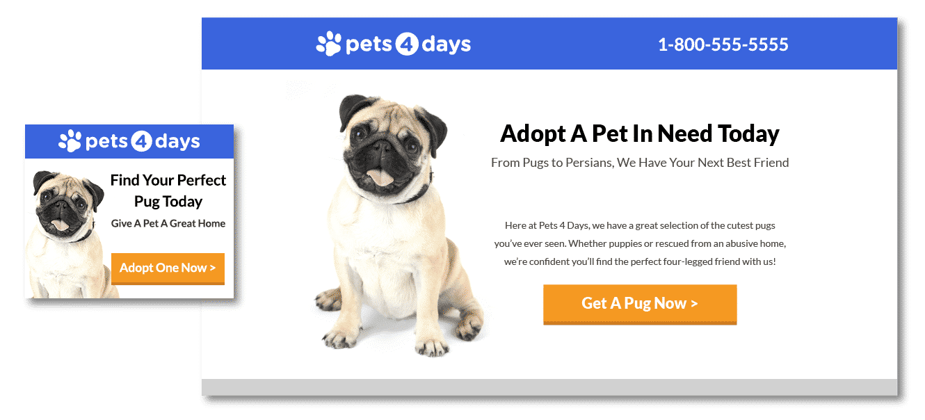
Okay, here’s where the lines start to get a little blurry. Upon first inspection, this seems visually right—the hero shot is consistent between the ad and the landing page. The same goes for the branding elements.
Things get hairy when you look at the copy, though. For example, the headline and subhead are not targeted towards pug adoption but to dogs and cats. Huh? I thought I was clicking on a pug ad!
Then, to make matters worse, the CTA goes back to encouraging viewers to “Get a Pug Now.” Now I’m all sorts of confused. What exactly do they want me to do here?
With a few tweaks, this landing page could work for a more general ad, but for a pug-specific ad, it definitely needs work. This is a great example of the confusion that can arise when new ads are not created for updated campaigns.
The Ugly
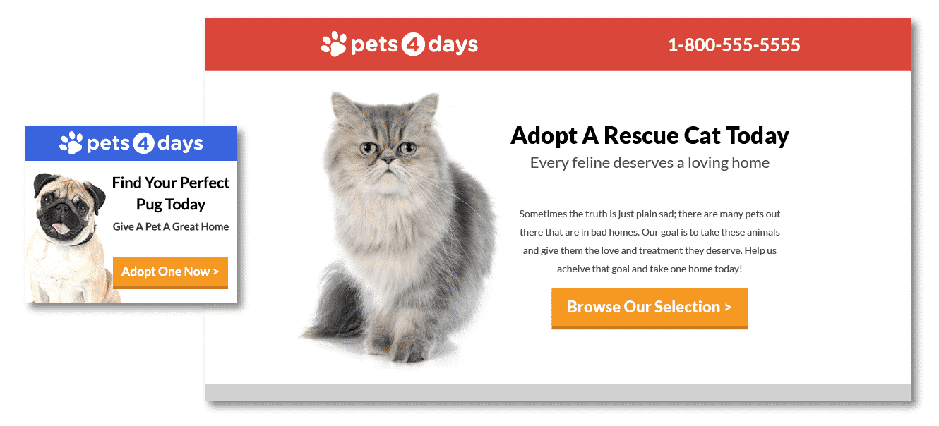
This one is truly horrible. I clicked on a blue ad for pugs and ended up on a red page for cats?
To make matters worse, the headline, subhead and CTA do not match at all. The only way this could be more confusing would be if the page was advocating euthanasia!
Conclusion
The moral of the story is: if you’re advertising pancakes, sell pancakes. If you’re advertising pug adoption, don’t send traffic to a page featuring cats!
Great online advertising is all about message match. People click on your ads because they’re looking for something specific. If they don’t get it, they’ll leave. You paid to get them to your site, so don’t waste the clicks on the wrong landing page.
If you’re looking for help developing ads and landing pages with great message match, let us know! Click here or leave a comment below.
Now it’s your turn. What good, bad or ugly message match examples have you seen?


