The PPC Landing Page Optimization Series – Simplify Your Page
by Sarah Rodriguez • May 10, 2016
A good pay-per-click (PPC) marketer knows that the right PPC landing page strategy can be worth millions.
Different marketing channels produce different traffic with unique goals, expectations and pain points. If you want to optimize your conversion rate, you need to understand which page elements matter for which traffic sources.
Since PPC advertising is often one of the most expensive ways to get traffic on your page, you need to get every possible conversion out of your visitors.
In this series of articles, we are assessing the 6 most important elements of a successful PPC landing page. In part one, we discussed how to effectively use your call-to-action. In part two, we looked at how message match affects your traffic and conversion rates.
Now let’s see how streamlining your landing page content can improve your conversion rate.
Simplify Your Landing Pages
In our last section, we explored the PPC marketing journey from the perspective of your customer.
Essentially, your customer clicks on your ad because they think you can solve a problem for them. When they get to your landing page, they expect you to solve that problem.
If your landing page makes them feel like they are in the right place, they’ll stick around and hopefully convert. If your landing page leaves them feeling confused, they’ll bail.
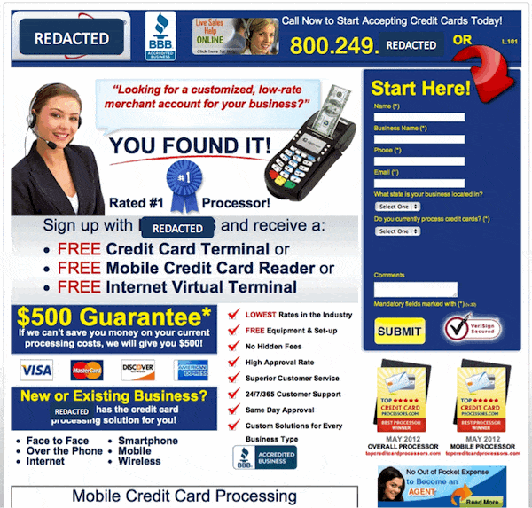
For example, this page has way too much information:

Perhaps some of this content is relevant, but there is so much content that it is almost impossible to tell what is important and what isn’t.
Your Page is for Your Audience, Not You
Hopefully, your page isn’t this overloaded with information, but most marketers and businesses struggle to separate what matters to their audience from what matters to them.
Your company has put a lot of time and effort into creating an awesome product or service and it’s hard not to want to tell your audience all about what makes you great. However, your audience doesn’t care about that.
What do they care about? They care about how you will solve your problem.
Your potential customers didn’t come to your landing page to hear about your features or a bunch of marketing speak. They want solutions. If your extra content gets in the way of communicating how you solve their problem, you’ll lose their interest.
Instead of focusing on your company, focus on the need that brought your potential customers to you in the first place. And, this information should naturally lead them to your call-to-action.
So, as a general rule, if your content doesn’t address your audience’s pain point and lead them to your CTA, it probably doesn’t need to be on your landing page.
You can’t risk an overwhelmed customer deciding they don’t want to take the time to sort through a ton of information in order to find what they need.
Conclusion
When people ask me if their page should be long or short, my answer is always different. Every offer is different and has it’s own unique selling points to address.
That being said, most pages have too much content, so I find that with most landing pages, the first thing I do to optimize the page is to simplify and focus the page on what matters most.
Ultimately, regardless of how much content your page needs, the key is to understand your specific audience and what they need to see before converting.
By the way, if you’d like me to help you optimize your PPC landing pages for better conversions, let me know here or in the comments! I’d love to help.
How have you seen page simplification improve your conversion rates?


