Is Your Website Design Scaring Off Potential Customers?
by Andrew Maliwauki • October 20, 2016
In today’s world, whether you are a local grocery store or an enterprise-level B2B company, your website is the face of your business.
If someone hears about your business and wants to know more, you can pretty much bet that they’re going to Google it (and probably on their phone). Yet, despite this, you probably see a lot more poorly designed websites (or lack thereof) than you would like to. Maybe you even fall into this category! 😉
Thanks their poor website design, many businesses struggle to turn online interest into sales, so it’s important to understand the design elements that could be holding your website back.
Let’s go over some industry-standard practices just to make sure your website is up to par with not only your competition, but your target audience as well.
Building Trust Through Great Design
As any half-decent marketer knows, building credibility with your audience is key to engaging with and getting your message across effectively. Along those lines, a well designed website can do wonders for showing that you run a legitimate, safe business.
Don’t just take my word for it: according to Adobe (who knows just a little about running an online business), over 38% of people will stop engaging with a website if the content and layout is unattractive.
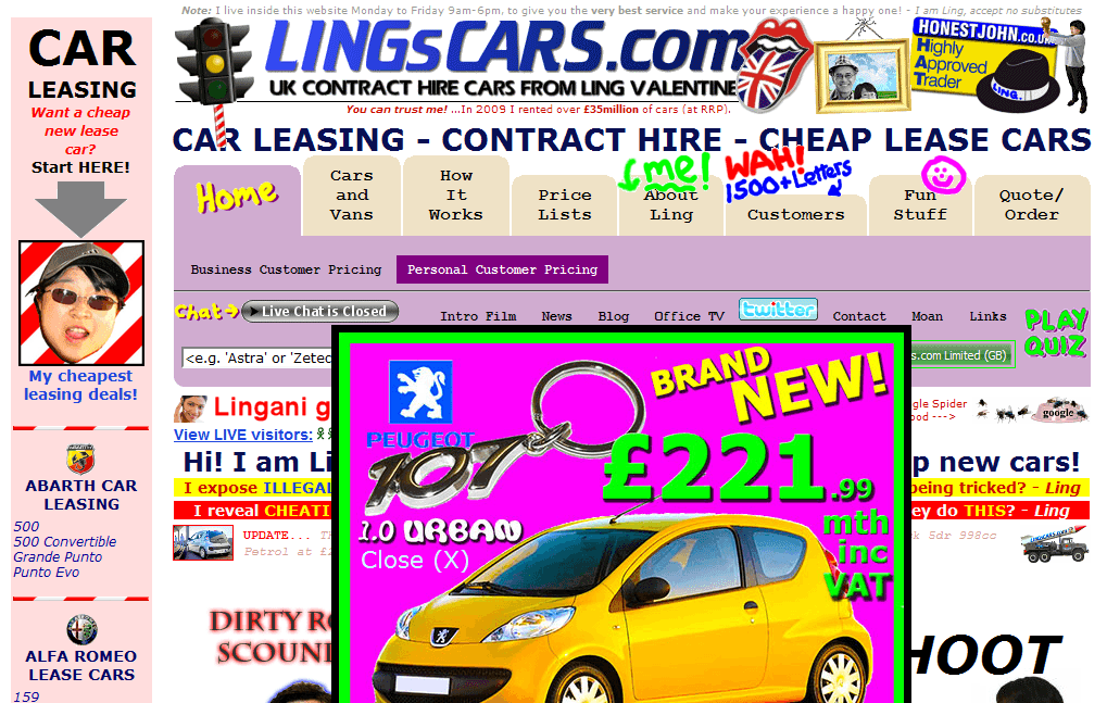
I mean, doesn’t a website like this just scream, “Buy here, you can trust us!”

Credibility through design is often achieved by going simple with color choices, a healthy amount of white space between content and an effective, prominent site navigation.
The only problem is, most people don’t know where to go for current web design practices to implement on their own site. If your company doesn’t have a dedicated graphic designer (if you need one, let me know, I know a few…), you can find great inspiration for clean, modern designs on sites such as Awwwards, Pinterest, or one of my personal favorites, From Up North.
However, great design in and of itself is only part of the battle. You also need to keep in mind the load times your site has for different internet connections. For example, Kissmetrics reported that 47% of consumers expect a web page to load in 2 seconds or less, with 40% of people abandoning a site that takes more than 3 seconds to load.
With that in mind, it’s a good idea to stay aware of the strain your images or other elements are putting on people’s bandwidth (yet another reason to keep your page simple and uncluttered with extra, usually useless information).
Mobile-Friendly Design is a Must
With mobile traffic now driving 56% of traffic to top sites, as well as Google’s preference for mobile-friendly pages, it’s more important than ever to make sure your company website is mobile-friendly. I am amazed by the number of sites I see on my phone that make me to pinch, zoom and ultimately leave the site in frustration.

A few years back, you used to be able to just scale down your text and squish some images together (aka, responsive design), but these days, that just doesn’t cut it. Instead, for a mobile-friendly page, you may need to make fundamental changes to your desktop page layout.
Whether you alter the content or even remove sections that don’t absolutely need to be on the mobile side, make sure that you’re keeping usability as your number one priority.
Typically, a mobile page should feature your company’s contact information more prominently (especially for click-to-call phone numbers) and the content should be arranged nicely for a variety of different screen sizes. It can be a pain to get every screen dimension just right, but in the end you won’t regret spending some extra time just to make sure that every visitor is getting the same experience.
As a general rule moving forward, you should always think about how your mobile layout will look before you even get started on desktop view. Planning ahead will make it that much easier to design a cohesive site that flows naturally on any device!
Testing and Updating Consistently
Unfortunately, even if you create the most attractive, fastest loading, mobile-friendliest website you can imagine, that still doesn’t guarantee that your website will be right for your potential customers.
At this point, its time to start testing new ideas.
Leaving a site alone for extended periods of time is never a good idea. The digital marketing world is constantly in a state of change and you don’t want to get left behind.

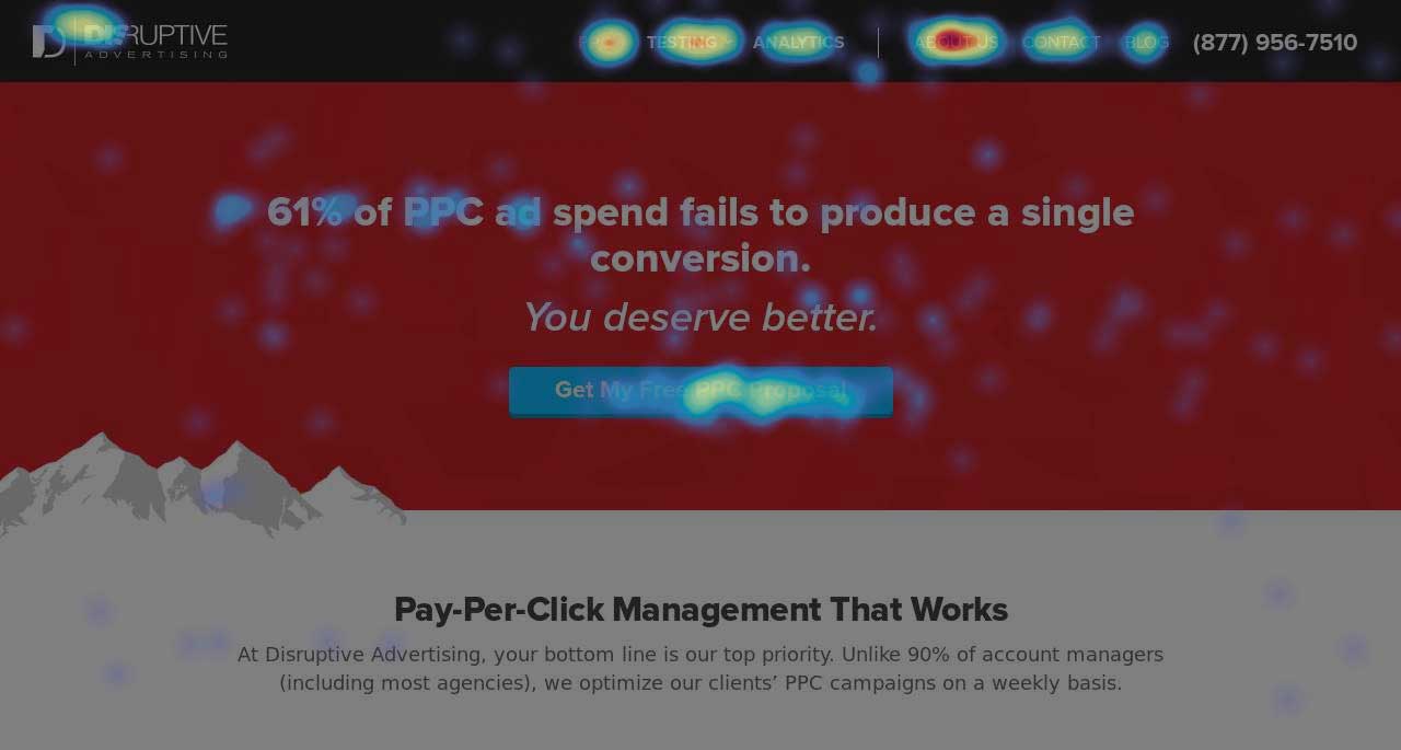
Figuring out what to test can be stressful, but luckily we have the ability to see what visitors are doing with heat mapping. By having the data available to see where your viewers are or aren’t clicking, or how far they’re actually scrolling down on your page, testing is now easier than ever.
For example, here is a heat mapping result from an old version of our site. What do you think our visitors were the most interested in?

Updating your website consistently (which at the minimum should be once a year) doesn’t mean drastic design changes, either.
While it’s good to keep your look and feel fresh, don’t feel pressured to completely redesign your site every six months—this will make it impossible to know what is and isn’t working on your current website. Some simple things you can update on a regular basis are headlines, section content and imagery.
Wrapping Things Up
So, does great website design matter? Absolutely!
Investing in a clean, effective website design will not only make you look better to your friends, but will also drastically improve your credibility with those who aren’t familiar with your company’s offerings.
By the way, if you’d like me to take a look at your site and give you some design recommendations, let me know here or in the comments. I’d be happy to help!
Thanks for reading! What other aspects of web design have you found effective on your site? Share in the comments below.


