Magento Review: Is Magento Right for Your Business?
by Aden Andrus • June 16, 2018
Magento is one of the most widely-used ecommerce platforms out there. Used by hundreds of thousands of businesses (including some of the biggest names in retail), Magento is an incredibly mature and effective ecommerce platform.
But is Magento right for your business?
While Magento clearly has a lot going for it, Magento isn’t for everyone. In fact, it’s lost a lot of market share in recent years to other ecommerce platforms like Shopify or WooCommerce that are a better fit for certain types of ecommerce businesses.
In this article, we’re going to help you decide whether or not your ecommerce business should seriously consider using Magento. We’re going to talk about what Magento is, where it really shines and which types of companies are best suited to using Magento.
Sound like a plan? Let’s get started!
What is Magento?
To really understand Magento’s niche in the ecommerce platform market, you need to understand what Magento is and where it came from.
Magento is Open-Source
Unlike most of its competitors, Magento is an open-source ecommerce platform. If you’re not familiar with how open-source software works, think of it like this: Magento is like a restaurant that publishes its recipes (ie, software code) online for free. With the right skills and know-how, any decent cook (or developer) can create their own variations that meet their particular tastes and needs.
The recipe is the same, but the details are all up to you.
Whether it’s Magento or some other digital platform, open-source software is a lifesaver for many businesses because it saves them the trouble of having to create everything from the ground up. They can tweak what needs to be changed and trust that everything else will run the way its supposed to.
In addition, open-source software is essentially crowd-sourced software. Most ecommerce platforms can only really be improved on by the companies that are developing them. Magento’s code is available to anyone in the world, so clever developers in the community are constantly coming up with new tweaks or fixes that are often integrated in platform updates by Magento.
The Downside of Open-Source
Because open-source software is designed by developers for developers, most open-source software isn’t very user-friendly for, well, non-developers. Magento is no exception. It might offer more features and extensions than any other ecommerce platform, but if you don’t have some real technical expertise on hand, you’ll struggle just to create and launch an ecommerce store.
Even if you hire a developer, if they aren’t familiar with the Magento platform and all the little tweaks the platform needs to be truly effective, you may still find Magento to be a less-than-inspiring ecommerce platform.
In addition, to use Magento, you’ll need to install and run it locally, which usually means you’ll need your own server to use Magento. Again, for someone with decent technical expertise, this isn’t a big deal, but for a non-technical user, this can be a huge headache.
To make things easier, Magento does offer a paid “Magento Commerce” plan where they help you set up, host and maintain your store. However, since you’re basically hiring a part-time developer, you can expect to pay thousands of dollars a month for this service.
How to Make the Most of Magento
The good news is, unlike some ecommerce platforms, Magento knows exactly what it is and where it shines. Magento works best if you fall into one of two groups: 1) established retailers or 2) small business owners with intermediate technical expertise.
Let’s take a look at each of these categories and how each of these types of businesses can make the most of Magento.
1. Established Retailers
By now, it’s probably become clear that Magento’s primary target market is well-established retail companies. Most new-to-small ecommerce businesses simply don’t have the technical expertise or revenue to support hiring a developer. These businesses are much better off with a cheaper, more user-friendly platform like Shopify.
Well-established retailers, however, usually have both the desire and the means to create the kind of custom online shopping experience Magento can provide.
If your business falls into this category, you’re probably hiring a developer or development team to create the website of your dreams. Magento can make that happen, but as you create your website, it’s important to focus on creating a shopping experience that your customers will love.
To do that, you’ll want to keep the following in mind:
Eliminate Diversions
One problem many Magento stores struggle with is too many diversions. Diversions are anything that has the potential to distract your user from reaching their destination.
Contrasting buttons, images, other offers, menus, links, content, pop ups…if it leads people off course, it’s a diversion.
For example, take a look at the page below. There are 5 major elements on the page competing for your attention—none of which take a potential customer to view a product—and that’s just above the fold!
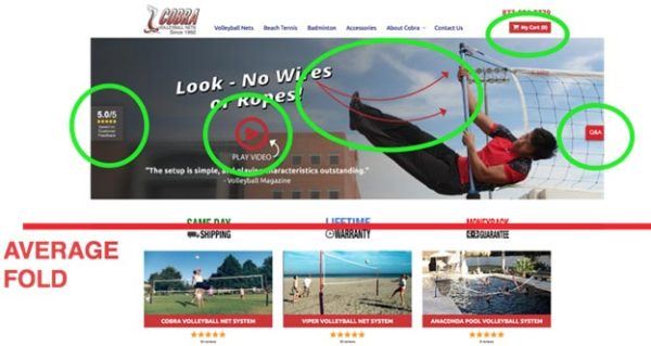
What does this business really want people to do? Watch a video? Read a review? Look at the picture? Read the Q&A? Visit their cart?
As it turns out, the answer is “none of the above”.
This page is from a client of ours who—like most e-retailers—simple wanted people to come to their site, look at their products and make a purchase. But, with all the diversions on their site, people were getting lost before they even had a chance to see the client’s products.
To put the focus where it belonged—on the products—we tried eliminating all of the diversions by redesigning the site experience to focus on product call to actions. That way, when people came to the page, they immediately saw Cobra’s products and a simple call to action (CTA) that said “Shop Our Products”.
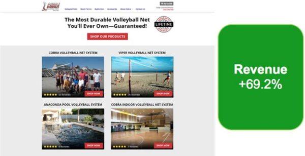
The new page design increased revenue (not just conversions) by 69.2%!
We’ve seen similar results with many of our ecommerce clients. For example, we often test to see how removing different elements and offers from a client’s homepage affects their conversion rates (this is called “existence testing”).
Existence testing is one of the easiest, fastest ways to discover what is distracting from conversions and what is helping conversions.
If you remove something from your page and conversion rates go down, that item is helpful to the conversion process. If you remove something and conversion rates go up…bingo! You found a distraction.
The GIF below shows you how this works. Essentially, you just remove a page element and then see which version of the page performs better. Easy enough, right?

For this particular client, we tested to see how removing 8 different elements from their home page would affect their revenue. As it turned out, 6 of the 8 elements were actually decreasing their revenue!
By eliminating those elements during our test, their revenue-per-visit (RPV) increased by 59%.
Why? Well, once again, we discovered things that were diversions to the user experience (as it turns out, the diversions were other products!).
Unfortunately, you can only do existence testing after your site is up and running. However, even without testing your store, minimizing diversions is almost always a good way to get more out of your theme.
Simply take a step back from your site and ask yourself, “What do I want people to do when they visit this page?”
If you have page elements that are distracting or diverting people from doing what you want them to on your site, you need to make a change.
Reduce Anxiety
Ever have that moment when you’re driving a car and you suddenly get hit by a huge gust of wind? What happens to your heart rate?
Whether you’re in the driver’s seat or an office chair, anxiety is ne]ver a good thing. Unfortunately, when it comes to your site, people are already in a state of high alert. Anything that adds to their stress level (clicking on something that isn’t clickable, feeling confused or swindled) may lead to you losing a customer.
As a quick example, one of our ecommerce clients had a mobile page that forced users to scroll all the the way back up to the top of the page to make a purchase.
So, we decided to try a floating “Buy Now” button that people could use to quickly buy the item once they’d read all about it:
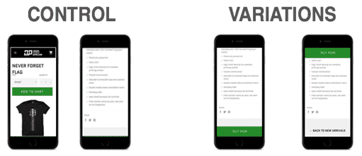
Yes, scrolling to the top of the page seems like a relatively small inconvenience, but eliminating this source of anxiety improved the conversion rate by 6.7%.
Even more importantly, it increased the RPV by $1.54.
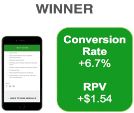
Given the client’s traffic volume, this was a huge win!
As you can probably imagine, the less confusion, alarm, frustration and work your site creates for users, the more likely they are to buy.
When you get right down to it, making a purchase should be a seamless, almost brainless process. If a potential customer ever stops to think, “Wait, what?” on their buyer journey, you’ve got a real problem.
To identify potential anxiety-inducing elements on your site or page, try going through the whole purchasing process on your site (better yet, have someone else do it and describe their experience to you). Watch for situations or content that force you to think. Odds are, you’ve just discovered a way to improve your theme.
Make Things Simple
Nothing frustrates potential customers more than having to fight with your site to find the products they want to buy. To avoid this, it’s a good idea to create “collections” of similar items.
For example, I might have an “armor” collection, a “swords” collection and “clearance” collection in my hypothetical costuming store. I could then use those collections in a template to create focused pages for customers interested in those items.
To create collections, click Products > Collections in the left-hand sidebar. Once you’ve created your collections, you can assign products to them on the product set-up page.
Offer Discounts
Any good retailer knows that discounts sell product. As you put together your discounts, remember, purchase decisions are often not made based on the actual discount you give—they’re based on how your discount is perceived.
So, even if the final price is the same, if your potential customers believe that your offer is better, they’ll pick you over the competition.
Approaching Discounts the Right Way
To get the most out of your discounts, all you have to do is remember one simple truth: people don’t like math.
Sure, your customers may be bargain hunters, but if you phrase your deal the right way, many people won’t bother to do the actual math—they’ll just assume you’re selling things for cheaper than the other guys.
Take the “Rule of 100”, for example.
This rule states that, for products with a price under $100, displaying the discount in terms of a percentage (a relative metric) is more powerful because the percentage will be a larger number than the actual dollars saved with the discount.
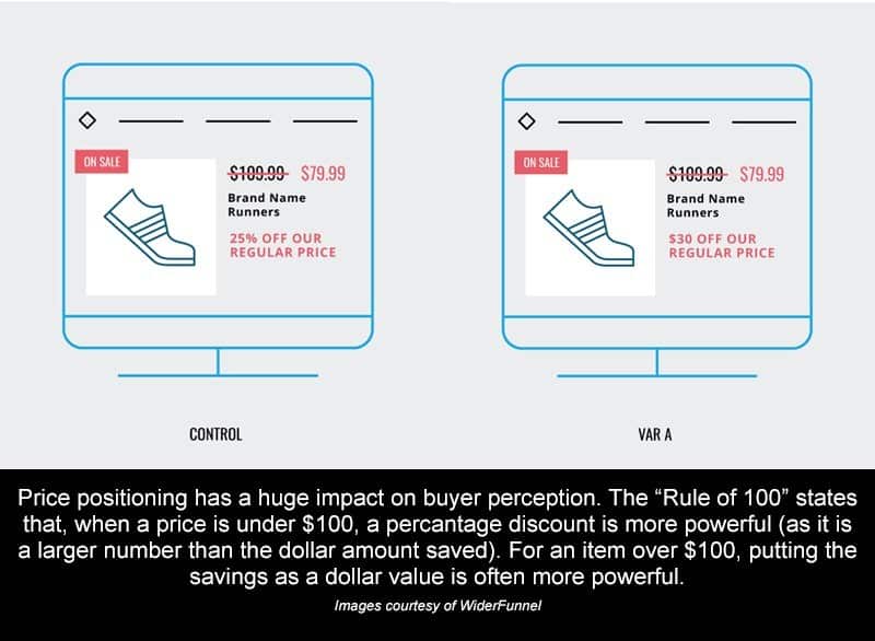
If a product costs $10, a $1 discount represents 10% off the price. Getting 10% off may be perceived as a larger discount than the $1 savings (since 10 is bigger than 1).
On the other hand, for products that cost over $100, showing the discount in terms of dollars off the original price (an absolute metric) is more powerful since the dollar amount will be a larger number than the percentage of actual discount.
The Power of Discounts
Now, this isn’t all just a nice theory. One of our clients sells high-end parts and accessories for outdoor, all-terrain vehicles. Most of their products have a high price point (over $100), so their customers are sensitive to sales and promotions.
However, since this client’s margins are fairly slim (typical for this industry), they can’t really afford to do the sorts of mega-sales you see stores like Hobby Lobby or Wal-Mart offer. But, they do offer the regular wholesale discount a manufacturer passes on to them on every product (around 10% on most items).
With a fairly fixed discount price like this, we knew we had to make every deal look as compelling as possible.
Originally, the client had been using a basic “percent off” model to advertise their discounts. So, if a part cost $300 and the discount was 10% ($30), the page said “You Save 10%”. If a part cost $3,000 and the discount was 10% ($300), the page still said “You Save 10%”. Unfortunately, this meant that while the actual savings could vary significantly, the perceived savings were identical.
Taking all of that into account, we decided to give the “Rule of 100” a shot.
Instead of listing the percent off for products over $100, we decided to list the actual discount. That way, potential customers could easily see exactly how much they were saving and how good of a deal they were getting.
For this test, we tested the original “percentage off the original price” model…
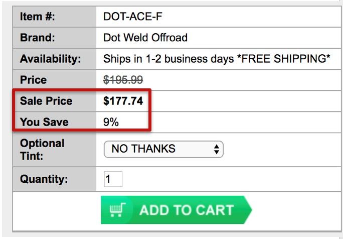
…against a percentage discount model (since almost all products cost over $100):
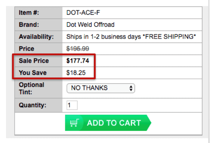
After testing 40,000 visitors, the “$ off” discount increased cart visits and sales by 12% and produced $15,000 of additional sales in just two weeks!
We didn’t offer crazy deals. We didn’t cut into their profit margin. All we did was take their existing discounts and offer them in a more compelling way…and you can, too!
Testing Your Store
Even if you have the resources to build the Magento store of your dreams, every ecommerce business should be constantly testing their site to improve their user experience.
As we just mentioned, even small changes can have a big impact on your sales, so if you’re going to invest in creating a great store with Magento, you should also invest in site testing (if you’d like us to help you test your site, let me know here!).
2. Small Business Owners with Intermediate Technical Skill
If you’re handy with code and a keyboard (or have ready access to someone who is) and want to set up a great, cheap online store, Magento can be a fantastic option. Magento Open-Source is free and gives you complete control of your site.
By tapping into Magento’s extensive online community, you can find countless free and paid extensions and themes to customize and enhance your website.
To help you get off on the right foot, here are some tips on how to make the most of your Magento store:
Pick the Right Magento Theme
Since you probably can’t afford to pay a designer and developer thousands of dollars to custom-create the look of your site, you’ll probably want to pick a pre-made Magento theme that is already fairly close to what you need. You can search for Magento themes on the Magento marketplace or on a third-party site like Themeforest.
However, as you pick your theme, there are a few things you’ll want to keep in mind:
Smaller Banners = More Sales
Smaller banners let you move from vanity to salesmanship fast. In our site testing, we’ve found that this means more sales for your business. There’s a temptation to want to pick a theme that will really feature your logo, but remember, your site is about creating a user-friendly experience, not just promoting your brand.
For example, the Ves Unicraft theme keeps the header banner content short and puts the focus on the products:
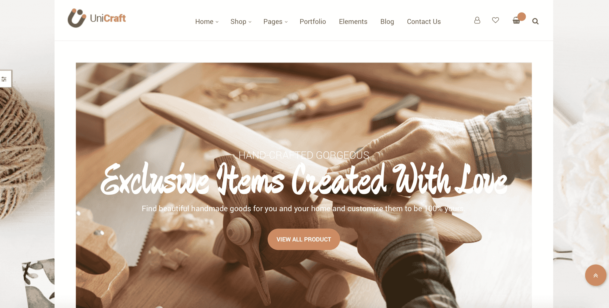
However, while small banners tend to perform better, keep in mind that a small banner doesn’t give you a lot of room to talk about your unique value proposition or place a call to action. But, by inserting images onto your pages with text overlaid on top of them, you should be able to still address those points on your pages.
Make Sure the Search Experience is Great
In our experience, people who search for things on ecommerce sites are often 2-4x more likely to buy than visitors who use navigation buttons, so a search bar that blends into the page is a waste of potential. From our experience, moving the search bar to the top of the page can increase internal searches by 15-40%.
For example, the Kavir theme does a good job of making the search bar easily accessible:
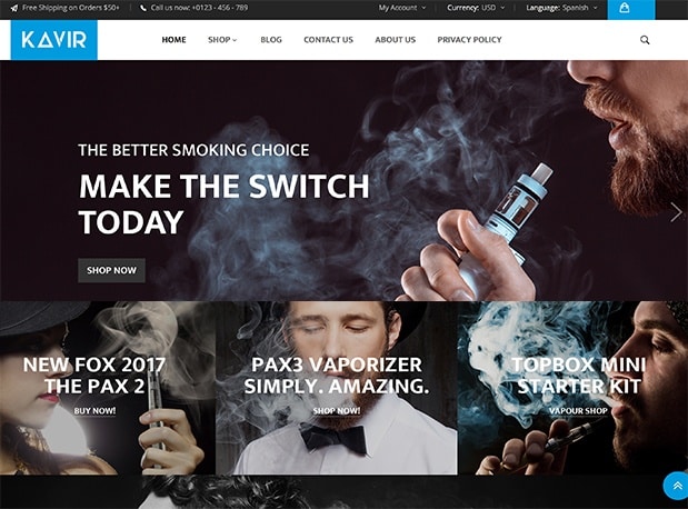
Of course, some templates make the search bar easy to find on desktop and then bury it inside the menu on mobile, so keep an eye on that as you pick your theme.
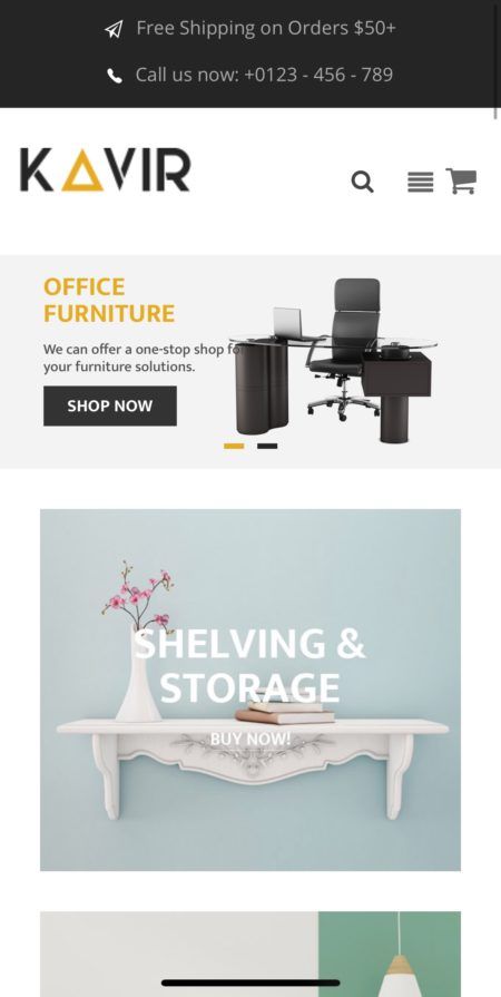
Unfortunately, Kavir’s search results page leaves something to be desired. Grid format search results limits the information that can be displayed prior to the user clicking through to a product display page (PDP). In contrast, a list format allows the user to see at least part of the product description to determine which is the right product, increasing the likelihood that they’ll make a purchase.
Look for “Quick View” Buttons
“Quick view” buttons on search and/or category pages that open a simplified product page are a great way to enhance your store experience. If you sell low price items (or items with little customizing), the “quick shop” window can increase cart additions substantially.
You can find this feature in several Magento themes, including Athlete (this option is also available as a paid extension, if you don’t like any of the themes that come with “quick view”):
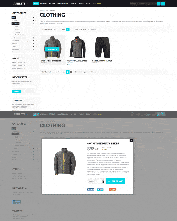
In our site tests, we’ve found that removing “quick view” windows decreased cart additions by 17% and conversion rates by 6%. Placing more prominence on the quick shop option increases cart additions by +8% and conversion rates by +3%.
While cart additions from a “quick view” window are not as high-intent as those from a product page, the volume of cart additions resulting from this option creates enough conversions to outperform the alternative.
Of course, if you really want to make the most of your category and search results pages (and you should), look for a theme that pairs “quick shop” buttons with great filtering options like the ones found in the Magetique theme.
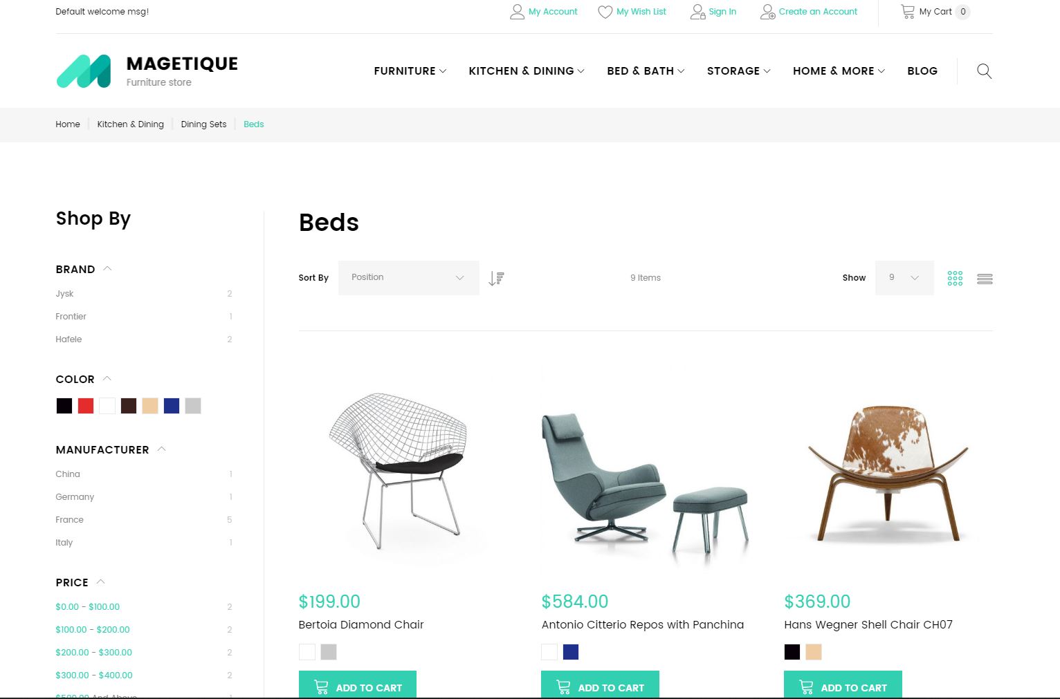
The ability to filter down options and find the perfect product is particularly important if you’re selling for high-price, highly-customizable items (think auto parts, technology, instruments, etc).
Avoid “Ghost” Buttons
One thing to watch out for in a Magento theme is ghost buttons (transparent buttons with a thin border) in the home page banner. Our tests have shown that swapping a ghost button for a brightly colored button can increase clicks on the button up to 50% (that’s a lot, considering it’s the main button people see when they arrive on your page).
For example, be very careful with a theme like Fona:

Fona is actually a pretty customizable template, so the author has created a lot of visual contrast between the text and the image in this particular screenshot, but just imagine what it would look like if the image was dark!
Overall, while you can work around “ghost” buttons in your final design, you’ll want to be aware of whether or not your theme has ghost buttons and make sure that your banner buttons are clearly visible at all times.
Optimize Your Product Pages
Most of the fields on your product pages are fairly straightforward. You should be able to complete these fields using the information in your product catalog.
However, getting your title, description and images right can have a huge impact on the success or failure of your store. Outside of work, I create and collect costumes, so let’s use a pair of pauldrons (medieval shoulder armor) to discuss how to effectively complete these fields.
Title & Description
Your title and description field contain text that tells your potential customers what your product is, how it’s made, what it does and other important information.
In addition to telling your customers about your product, your title and description are what Google will look at for determining which organic searches your product can show up for.
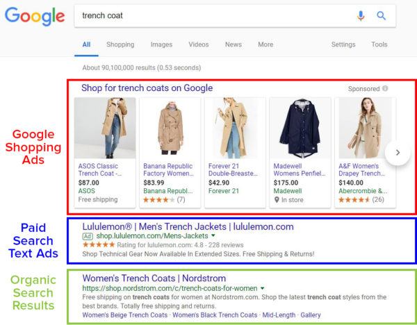
It’s important to note that these organic search result placements are different than paid search text ads or Google Shopping ads.
If your product page ranks organically for a particular search, you can get clicks to your page for free. However, there’s no guarantee that your product page will rank organically—even if your product is a perfect match for someone’s search.
You can improve the likelihood that your product page will show up for a relevant search by optimizing your title and description (this is called “search engine optimization” or “SEO”), but even the most optimized page can still struggle to rank—especially there is a lot of competition for your target keyword(s).
With Google Shopping ads and text ads, you have to pay for every click. However, if you’re willing to spend enough, you can guarantee that your product page shows up for relevant searches.
There’s a lot of debate out there about what constitutes a “good” product title and description. But, most experts agree, your product page content should cater to your customers.
So, if you’re selling an expensive product to an audience that cares all about the specific details and features of that product, your description should cover all of those features in detail. On the other hand, if you’re selling a cheap, run-of-the-mill item, you might want to keep your description short and sweet to avoid overwhelming potential customers.
Images
In online shopping, image quality matters…a lot! Since people can’t actually examine your product in person, they are forced to rely on your images to make a decision.
So, if you don’t have great images, you probably won’t have great sales, either.
Image Optimization
Ideally, it’s best to have high-quality, clear images taken from a variety of angles. In addition, if your product has special features that you want to highlight (detailed embroidery, hand-carved trim, etc), it’s a good idea to include specific photographs of those features on your page.
Another great way to get more out of your images is to feature them in actual use. This helps people envision what owning or using the product will be like.
For example, most people who are interested in buying medieval armor want to look like (or have their significant other look like) a studly, manly knight, so including pictures like this might help convince people to buy:

Images used with permission (Source).
As you photograph your products, make sure that your lighting and color schemes match the feelings you want people to associate with your product. Hi-tech products look best in clean or high-contrast environments, while eco-friendly products work better with more natural hues, tones and backgrounds.
If photography isn’t your thing, many products come with high-quality photos from the manufacturer. If that isn’t the case (or you think custom photos will sell better), consider hiring a professional photographer to help you out.
Loading Speed Optimization
Unfortunately, images are something of a double-edged sword. While high-quality images are great at convincing people to buy, they can also slow down your website.
Most people will only tolerate a page load time of about 2 seconds, so if those beautiful photos don’t load quickly, they could end up killing off potential sales instead of aiding them!
As a general rule of thumb, each image should be less than 70 kb.
Now, most high-quality photos are a lot bigger than 70 kb, so you’ll probably need to resize them for your product page. The easiest way to do this is to use photo-editing software like GIMP (free, but clunky) or Adobe Photoshop (easy, but costs money).
To resize your photos in Photoshop, open your image in Photoshop and click File > Export > Save for Web:
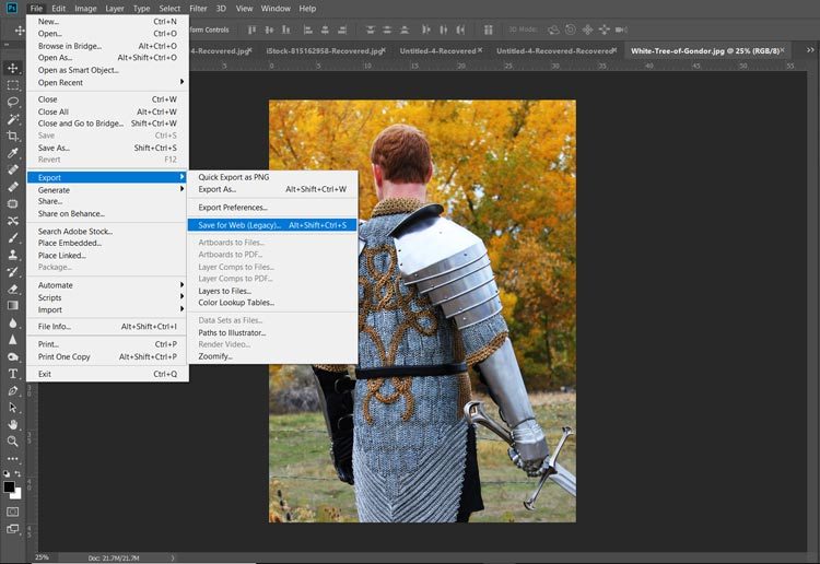
From there, you can play around with a variety of settings until you find the right balance between file size and image quality (color-coded to match where they show up in the image below):
– Quality. Lower numbers = lower image quality and lower file size.
– File format. In terms of file size, JPEG < GIF < PNG. But, the same rule applies to image quality.
– Optimization. Checking the box tells Photoshop to optimize your image for web use (decreases image size).
– Color. Fewer colors = lower image quality and lower file size.
– Image size. Allows you to choose the actual number of pixels in your image. Fewer pixels = smaller image and lower file size. Keep in mind that if you save an image at smaller size than it will be shown on your page, your image may be stretched to fit your page, resulting in heavy pixelation and/or image distortion.
You can see the file size in the bottom left-hand corner of the window. This number—along with a preview of your final image—will update as you make changes to your export settings.
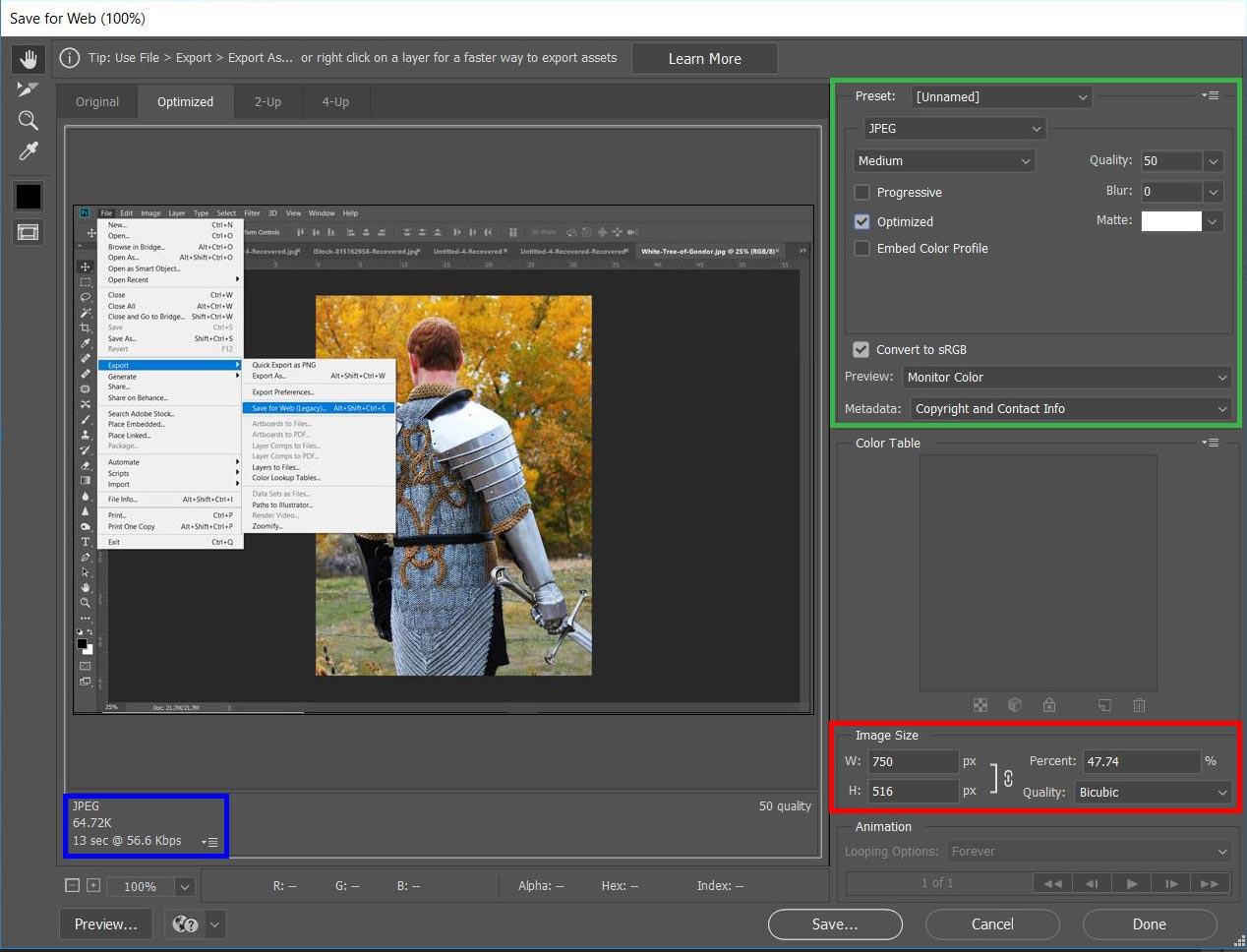
Yes, I’m saving my “Save for Web” screen shot in the “Save for Web” window. I just couldn’t resist adding an “Inception” moment here…
Photoshop’s “Save for Web” tool (other photo editing programs have similar tools) make it fairly easy to balance image quality and file size. That way, you can make sure that your pictures really sell your products without compromising on load speed.
Choose the Right Magento Extensions
Magento extensions can make your life as a store manager easier, they can improve the ease-of-use of your site or add great features for your customers. Sometimes they can even do all three. Here are a few extensions to consider
MageMob App Builder
There are plenty of benefits to having a mobile app for your store, especially since it can help increase sales. With MageMob’s Mobile App Builder, you don’t have to spend thousands of dollars to have one created.
If you want or need a mobile shopping app for your store, MageMob can help you create one quickly and affordably. It allows you to showcase your products on various types of blocks and it even has advanced features like showing customers recently-viewed products to help increase conversions.
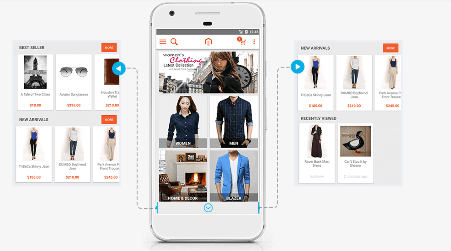
There is also the option for customers to search for products and filter out the search results to find what they’re looking for quickly. The checkout process is also simple and lets users save information like address for faster checkouts moving forward.
SEO Hub
Search engine optimization is important for all businesses and SEO Hub is an incredible extension to help you improve your search engine rankings.
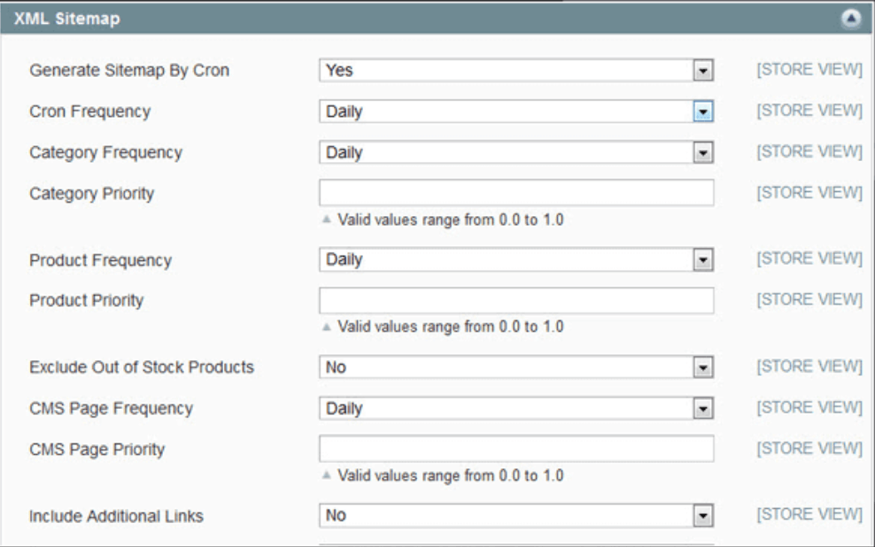
This extension will help you manage and optimize meta descriptions, heading tags, data feeds, URL redirect, and more. It will even help with the backend side of SEO and can generate a sitemap for you that can be updated automatically.
Language Translator
Ecommerce has done incredible things for business owners—we can now sell our products to anyone anywhere in the world. That’s great in and of itself, but overcoming language barriers can be a huge problem for many international businesses.
Enter Magento Language Translator. This extension automatically translates your pages, product details, and even product attributes into the languages of your choice.
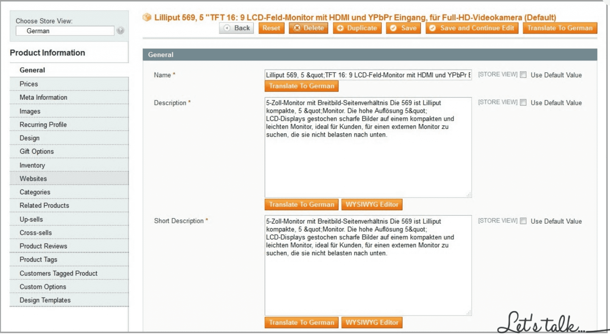
As a result, you will be able to reach a larger audience much more effectively and potentially sell a lot more product.
TaxJar Sales Tax Automator
Sales tax is a nightmare to keep up with. Using extensions and tools to help is the only way to make sure you don’t end up in a world of hurt by not charging the right amount of sales tax.
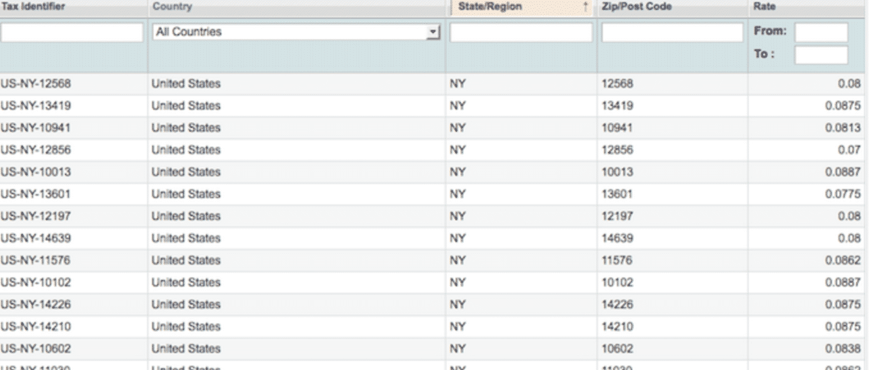
TaxJar’s Sales Tax Automator is a simple but highly effective solution to this problem. It automates tax charging, filing, and calculation. Not only will you be able to automatically charge the right amount of taxes to your customers, you’ll also be able to easily sort them by state or zip code and file them appropriately.
Tawk.to Live Chat
The importance of live chat can’t be overstated. Being immediately available to answer customer inquiries not only improves customer satisfaction, it can also drive sales, too.

Tawk.to Live Chat is a great free Magento extension that gives you this ability. It allows you to provide real-time customer support with a simple, user-friendly interface. To make things even better, you can collect a customer’s name and email when you start the chat, so if you get disconnected, you can follow up.
You can login through desktop, and mobile apps are also available so you can offer customer service excellence everywhere you go.
Apptrian Social Integrator
Social media is an important part of a lot of ecommerce businesses’ marketing strategy, so being able to fully integrate your social media with your ecommerce storefront is important.
That’s where Apptrian’s Social Integrator comes into play.
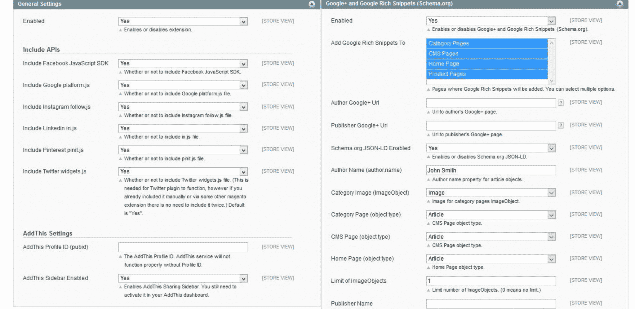
With Apptrian, you can add the social buttons of your choice to your site in a variety of different locations, including Follow buttons for LinkedIn, Instagram, Google+, Twitter, Facebook, and more. Again, simple idea, but so important, and this extension gives you a lot of customization options and control.
Magewares Abandoned Cart Email
Abandoned carts are a huge source of lost revenue…especially if you don’t follow up. Magewares Abandoned Cart Email Extension can automate the follow up process for you, sending triggered response emails after a designated period to remind users that they left something in their cart.
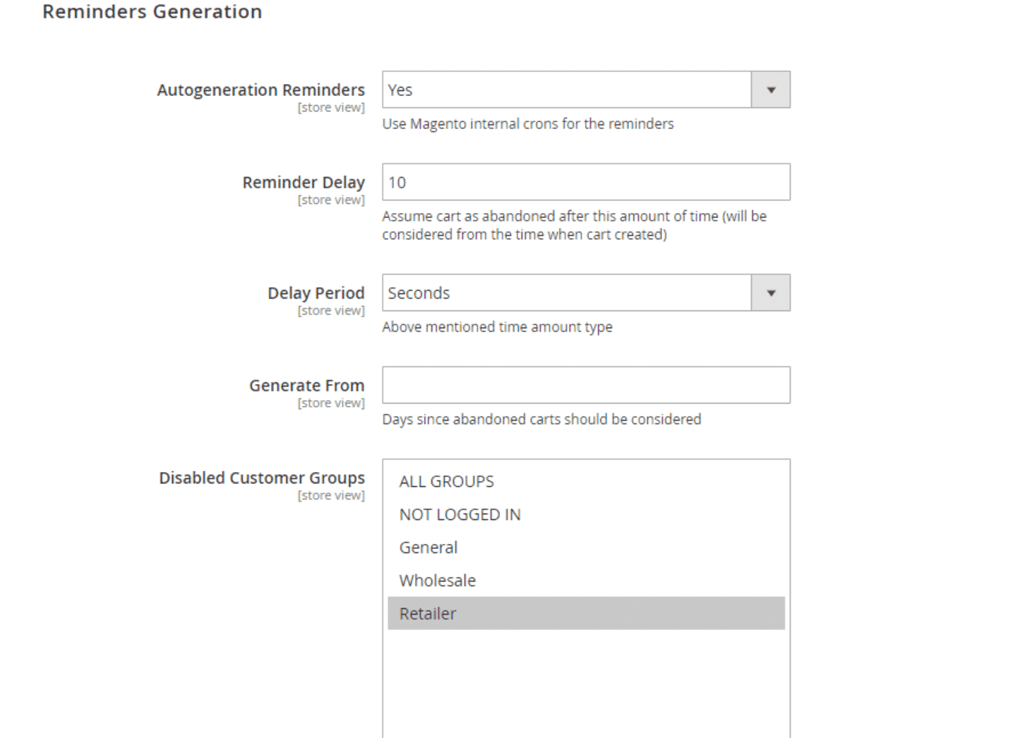
This extension is fully customizable and you can choose how many follow ups customers receive, when they get them, and so much more.
Gift Card
Gift cards are good for businesses. In addition to putting money in your pocket today, users also have a tendency to spend more than the gift card in order to ensure they get the full value, so gift cards also often mean more money in the future.
The Gift Card extension will help you give this option to your customers.

It’s a simple extension and not a lot of information is necessary here. It has a great, user-friendly interface that lets customers send digital gift cards along with messages, pre-selected or custom card values, and pre-set images.
As you can see, although Magento isn’t designed for technical novices, if you have some technical expertise, putting together a Magento store isn’t terribly difficult. If you expect your store to really grow in the future, this can be a great way to set yourself up for future success—especially if you’re testing your store design along the way.
Conclusion
So, what’s the verdict? We’ve taken a look at what Magento is, where it shines, who it’s right for and how to make the most of your Magento store.
To put it simply, if you don’t have a lot of technical know-how or the money to hire someone who does, Magento isn’t for you. If, however, you have solid development resources on hand or can afford to pay Magento’s premiums, Magento can be a solid option for a large-to-enterprise class retailer.
That being said, putting together a beautiful, functional store is just the beginning. To really get the most out of your ecommerce site, you’ll need to market your store, optimize it for maximum conversions and sales and much, much more.
Finally, remember, whether you choose Magento or a more user-friendly option like Shopify, the key to ecommerce success is site testing. If you’d like some help testing your site, let me know here or in the comments. We’d love to help!
How do you feel about Magento? What has your experience with this ecommerce platform been like? Anything you’d add to this article? Leave your thoughts in the comments!


